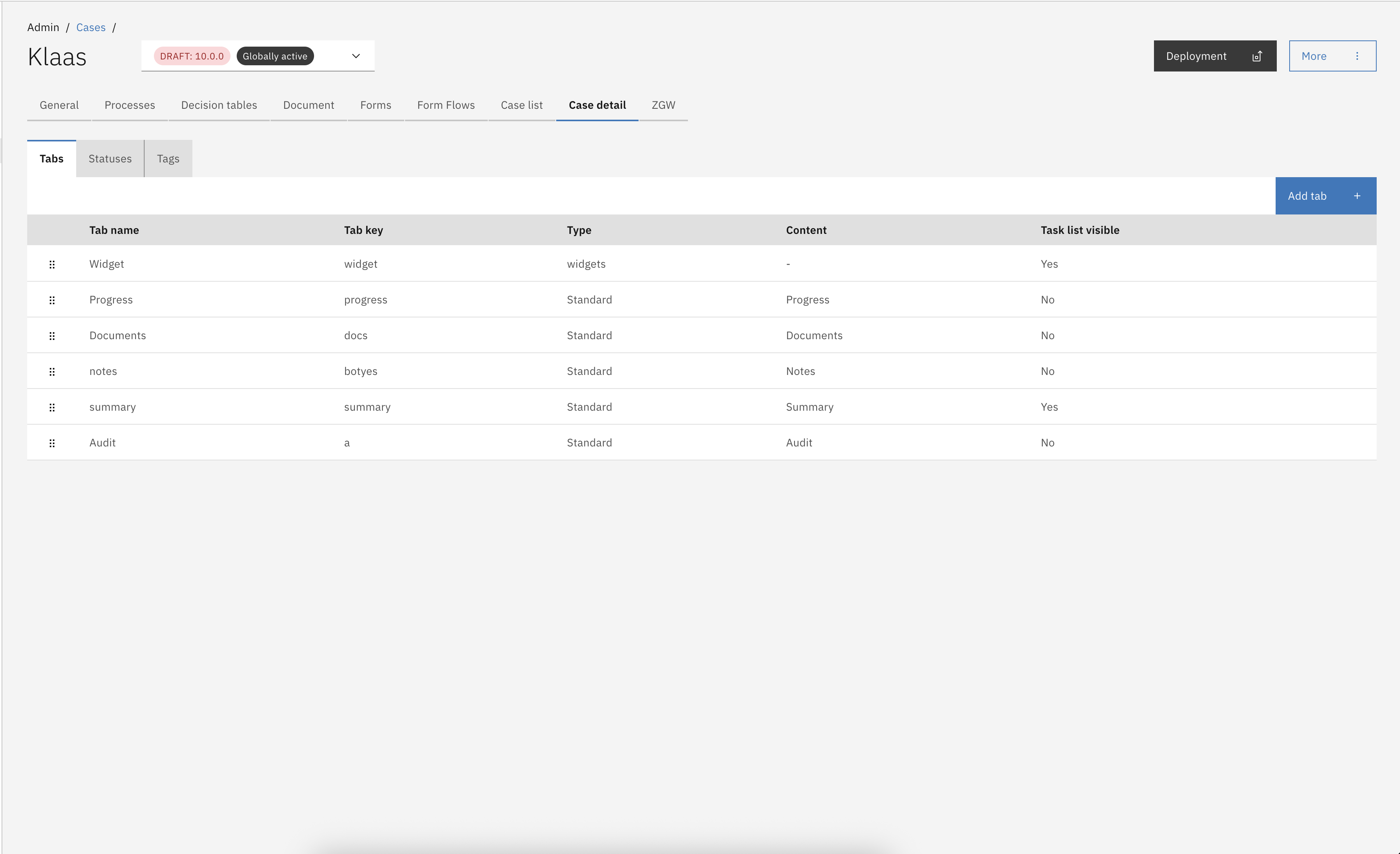
Tabs
Each case and version of a case in Valtimo can be configured with a specific set of case tabs. Valtimo includes a standard set of tabs preconfigured for each case, which can be customized to meet specific case requirements. Standard tabs can be removed from the tab configuration, but they can also be easily re-created through the user interface (UI). In addition to the standard tabs, custom tabs can be added to the case tab configuration to provide further customization.
Configuring case tabs
Go to the
AdminmenuGo to the
Casesmenu and select the case you want to configureSelect the
TabstabClick on Add tab

The Add tab button opens the Add new tab in <case> modal, beginning with the configuration step to select the tab type. In this modal, standard tabs are available and next to this a Form.io, Custom or Widget component can be configured as a case tab.
Click on the Add tab button.
Select which tab type you want to configure.

Case tab types
Tab name (optional) _Configured name that will be used to identify the Case tab in the UI._
This field is not mandatory and if left blank a translation of the key will be shown if configured. Each tab name follows this logic:
Show the Tab name if configured
Get the translation for the key if available
Display the key
Key _This is the identifier of the tab and needs to be unique within a case definition. Possible translations need to be configured with this key._
Choose standard content _A list of available standard tabs is presented in a dropdown menu. Already configured tabs are filtered from this list._
Task list visible on tab _When set the task list will be displayed on the right side of the tab in the UI._
Case tabs can be auto-deployed from a JSON file at startup. This is useful to keep the case tab configuration identical across multiple environments. Case tabs are auto-deployed by scanning files on the classpath that end in .case-tab.json.
Deployment file hierarchy
In order to auto-deploy a tab configuration, the JSON with the above mentioned extension needs to be placed under a specific hierarchy: */resources/config/case/{case-definition-key}/{version-tag}/case/tab/
This will make sure that the tabs are deployed to a specific version of the case definition.
Example
You can find an example of the JSON below.
In this example a tab is created with type standard. Different tab types can be used to customize the tab.
Disabling case tabs
Case tabs are enabled by default since Valtimo 13. This feature can be disabled with a feature toggle in the front-end implementation. Set the enableTabManagement feature toggle to false to disable the ability to add tabs next to the Valtimo standard case tabs. For more information on available feature toggles, visit this page.
Case tab types
Valtimo supports the following types of case tabs.
Standard
standard
A collection of tabs is available to support various Valtimo features. These tabs include options for displaying a summary form, viewing an audit log, and displaying the current state of the BPMN process. The available tabs are listed below.
Form.io
formio
Form.io tabs can be configured to display a Form.io form as the tab content. These tabs are intended solely for information display, as there is no functionality to submit data from these tabs, even if a submit button is included in the form definition.
Custom
custom
Custom tabs can be configured to show a custom Angular component.
Widgets
widgets
Case data, external source data, tables, collections and custom angular components can be presented on a case widget page. Each widget on a case widget tab can be configured separately.
Standard tab
The standard tab option is only available if all standard tabs have not yet been added to the case. When all standard tabs are already included in a case definition, this option will appear grayed out. In the modal to configure a standard tab, a dropdown menu displays the available standard tabs for selection and configuration.

The following tabs are created by default for each new case in Valtimo. These case tabs are standard across all Valtimo editions; however, additional standard tabs may be available depending on the specific edition. Standard tabs can be deleted as needed, as they can be easily re-added using the Add tab button.
Valtimo standard tabs
Summary
Displays case specific data from the case JSON document or external data sources. This page links to a specific Form.io form with the name <caseDefinitionKey>.summary
Progress
Shows the current state of any active process and the history of all processes that have been executed while handling the case
Audit
Shows a log of all performed case actions. Information on who did what and when was that action done is logged and displayed on this tab.
Documents
Displays all files that where generated or uploaded while handling the case.
Notes
Allows case handlers to leave case specific comments for internal use.
GZAC edition additional tabs
Case objects
Lists all JSON objects that are linked to the "Zaak" that is connected to the case. A "Zaak" can be created in "OpenZaak" and linked to the GZAC case. Objects connected to this "Zaak" are displayed on this tab.
Form.io component
This case tab type makes it possible to select any Form.io form within the implementation. Configurable options are exactly the same as for a standard tab except for selecting the component. Now a dropdown menu is shown with all available Form.io forms that exists within the implementation.
Custom component
The Custom component button gives access to the available custom components within the Valtimo implementation. Custom components need to be added to the codebase via plugins or implementation specific code. Once added to the codebase these will become available in this modal to configure as a tab.
Widgets component
The widgets component makes it possible to configure a case tab with widgets that can be configured via the UI. Multiple widget types are available to present case data. When a widgets component is selected only the Tab name, Key and task list visibility can be configured for the tab.
When a widgets component tab is added the tab will be listed as a configured tab. Normally when an item in the list is clicked the tab configuration modal opens. A widget type tab however opens the widget configuration when clicked. Tab configuration is still available by clicking the 3-dotted (kebab) menu on the far right of each item in the list and click Edit.
Below a screenshot of the widget configuration UI for a newly created widgets tab. This page opens when a widget type tab is clicked on the tab configuration page.
For widget configuration, check this page.

Access control
Access to the case tabs and case notes can be configured through access control. More information about access control can be found here.
Resources and actions
Case tabs
com.ritense.case.domain.CaseTab
view
Allows viewing tabs of a case.
Case notes
com.ritense.note.domain.Note
view_list
Allows viewing notes.
create
Allows creating a note
modify
Allows modifying a note
delete
Allows deleting a note
Examples
Last updated