Widgets
Configure data display widgets within tabs.
Overview
Widgets display the actual data within a tab. Each widget can be configured with a specific type, layout, and data mapping. Widgets can also have display conditions to control when they are shown, and actions to allow users to perform operations.
The detail screen is divided into 4 columns. Each widget occupies a configurable number of columns, allowing you to create layouts with multiple widgets side by side.
Widget types
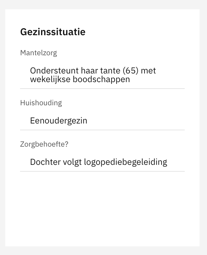
fields
Key-value fields in columns.
Customer data, Address.
collection
List of items with pagination.
Nationalities, Partners.
table
Data in table format.
Contact moments.
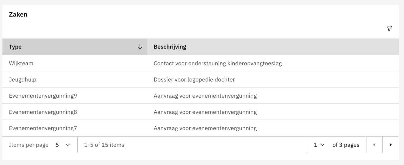
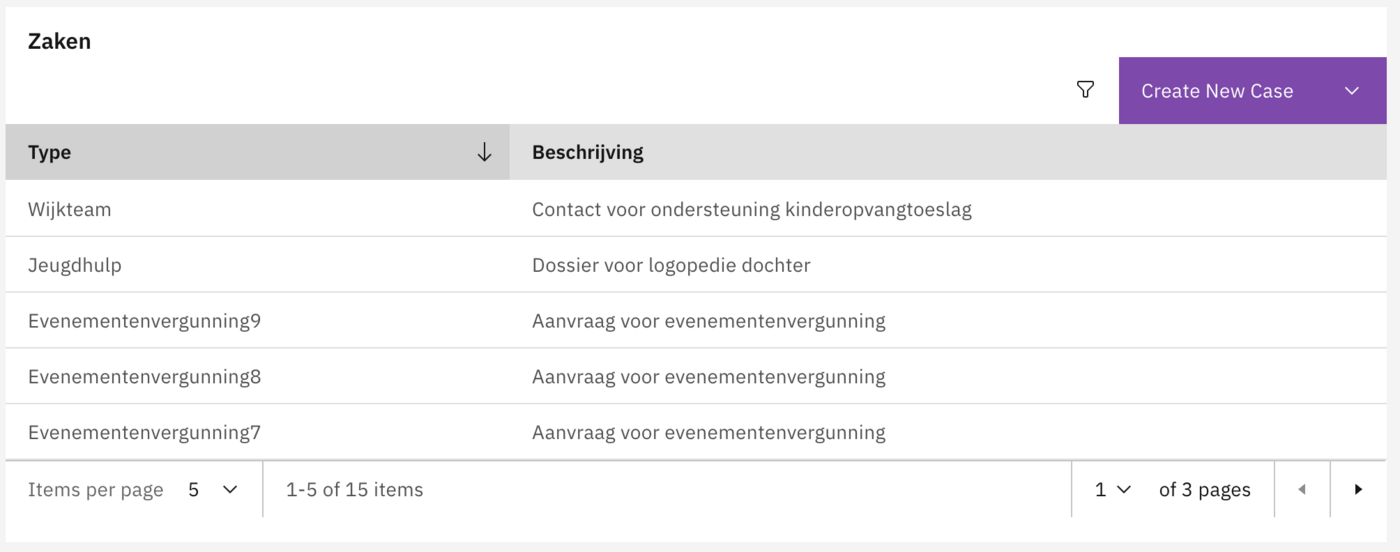
interactive-table
Table with sorting and filtering.
Running cases.
map
Geographic map display.
Location.
metroline
Ordered sequence of steps showing progression.
Case progress for the customer.
divider
Visual separation between widgets.
Grouping related widgets.


Configuration
Widget configuration wizard
The widget configuration goes through 6 steps. When configuring an interactive table an additional filters step appears between the Content and Display Conditions steps.
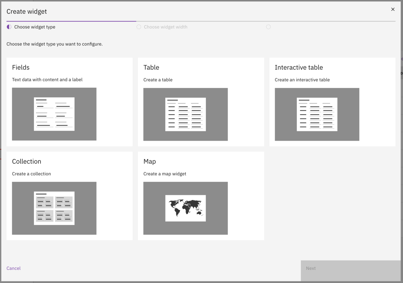
Step 1: Choose widget type
Select from: Fields, Collection, Table, Interactive table, Map, or Metroline.

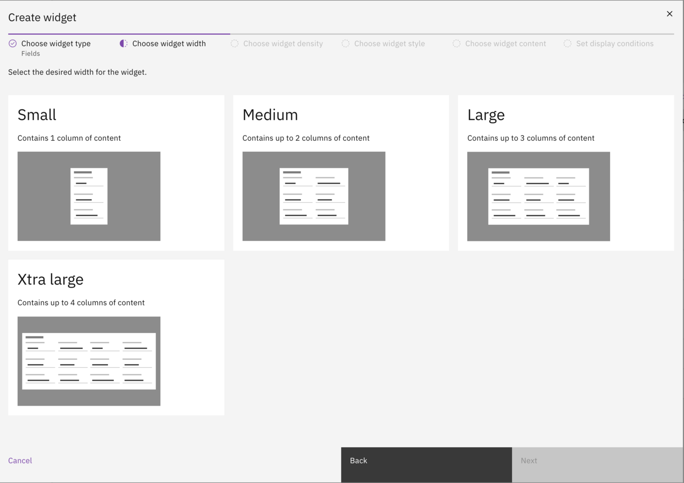
Step 2: Choose widget width
The screen is divided into 4 columns. Select how many columns the widget should span:
Small
1
Quarter width.
Medium
2
Half width.
Large
3
Three-quarter width.
Extra large
4
Full width.

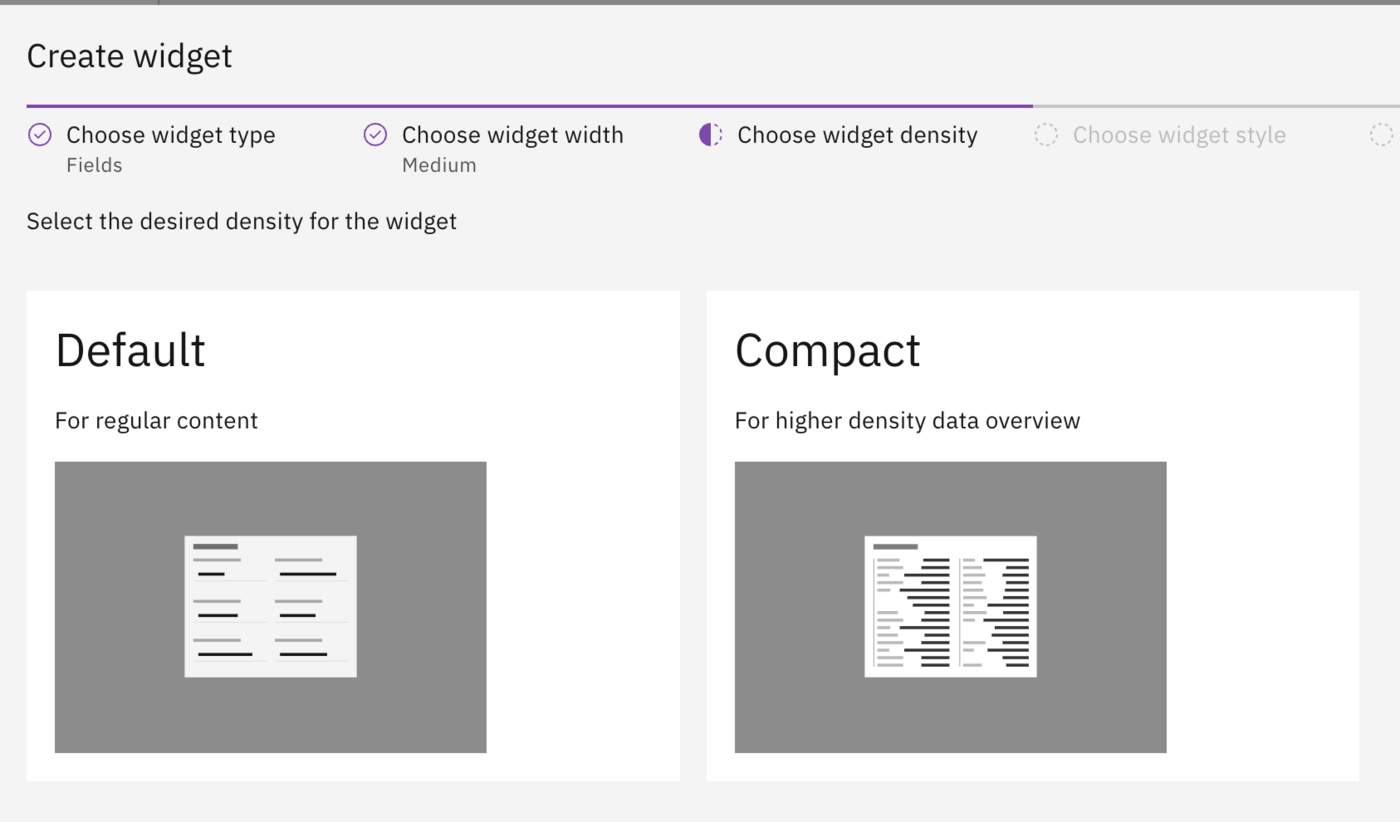
Step 3: Choose widget density
Default
Normal spacing between elements.
Compact
Reduced spacing for more content in less space.

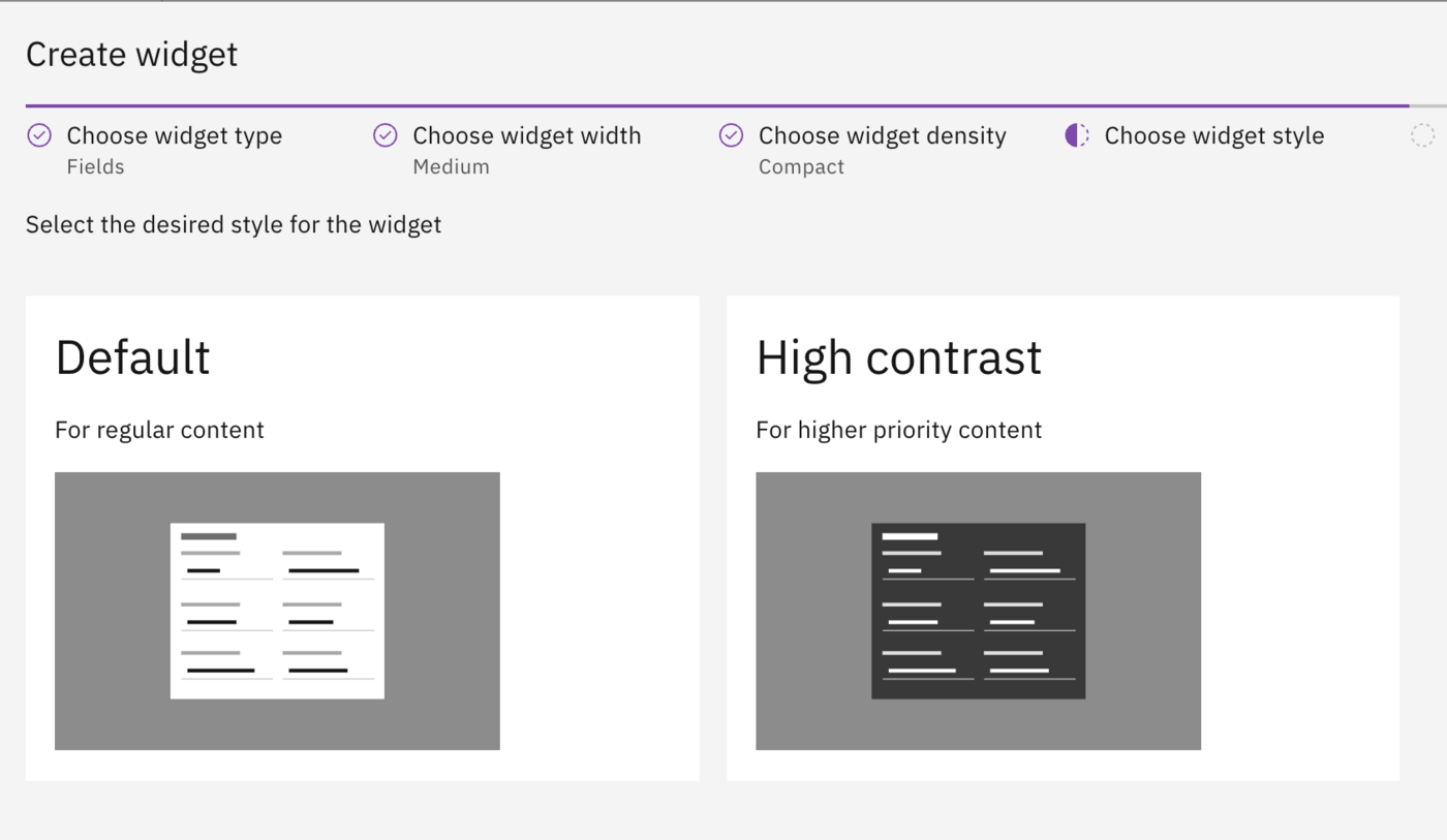
Step 4: Choose widget style
Default
Normal display for regular content.
High contrast
Inverted colors for emphasis. In light mode the widget appears dark, in dark mode the widget appears light.

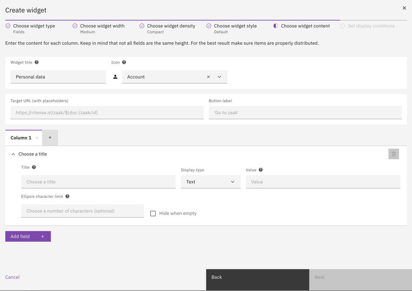
Step 5: Choose widget content
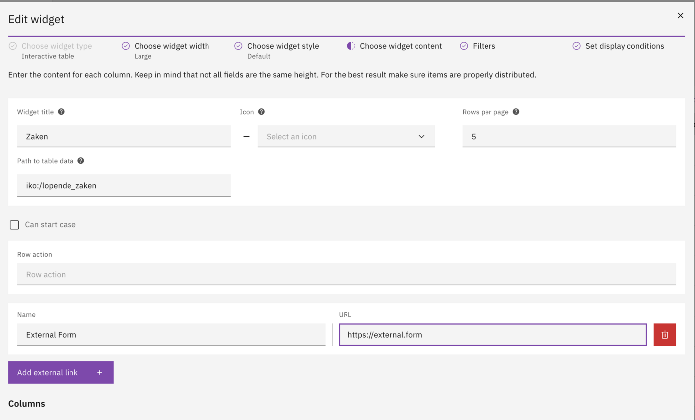
Configure the widget title, icon, data path, and fields.

Widget properties:
Widget title
Title displayed above the widget.
Icon
Optional icon (select from list).
Link action (optional):
Target URL (with placeholders)
URL for link action.
Button label
Label for the link button.
Field configuration:
Title
Label for a field row.
Display type
How the field value is displayed (e.g. Text, Date).
Value
Data path to the field value.
Ellipsis character limit
Maximum characters before truncation (optional).
Hide when empty
Hide the field when value is empty.
Interactive table filters (interactive table only)
When configuring an interactive table, an additional wizard step is available to define filters. These filters allow users to quickly search and narrow down the data displayed in the table. By adding filters, you can provide a more tailored search experience, enabling users to find relevant cases based on specific criteria like dates, statuses, or custom identifiers.
During this configuration step, you can define one or more filters.
Supported data types:
Text
Free text values, optionally matched exactly or with a contains/like query.
Single input, single-select dropdown, multi-select dropdown.
Number
Whole numbers or decimals.
Single input or range.
Date
Calendar dates (no time).
Single input or range.
Datetime
Combined date and time values.
Single input or range.
Boolean
Yes/No flag rendered as translated radio buttons.
Single input.
Field types:
Single
Renders a single input field to filter by the entered value.
Range
Renders start and end input fields to filter between two values.
Single-select dropdown
Dropdown populated manually or via the dropdown database provider. Sends the option id.
Multi-select dropdown
Tag-style selector populated manually or via the dropdown database provider. Sends an array of option ids.
Boolean filters automatically render a translated Yes/No selector, while dropdown filters can use hard-coded values or reference a data provider to stay in sync with external lists.
When using the interactive table, users can combine several filters and clear them with a single click. Every change immediately refreshes the table content, allowing cases to be located quickly without leaving the widget.
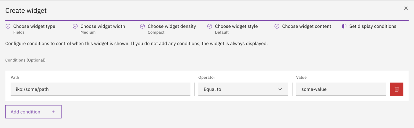
Step 6: Set display conditions
Configure conditions that determine when the widget is shown. If multiple conditions are configured, all must be met for the widget to display.

Path
Data path for the condition.
Operator
Comparison operator (e.g. Equal to, Not equal to, Greater than).
Value
Value to compare against.
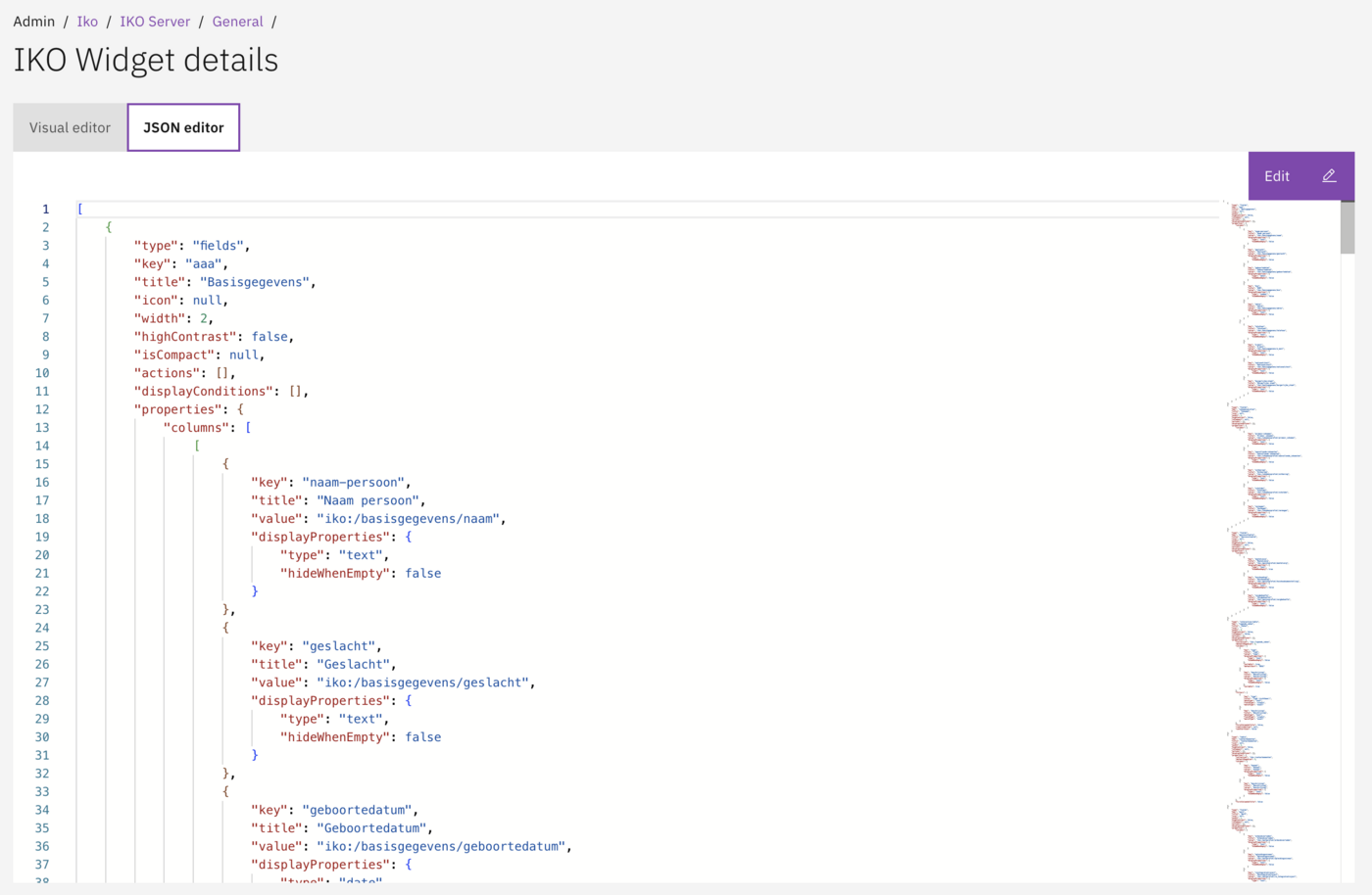
JSON editor
For advanced configuration, switch to the JSON editor. The JSON editor allows direct editing of the widget configuration.

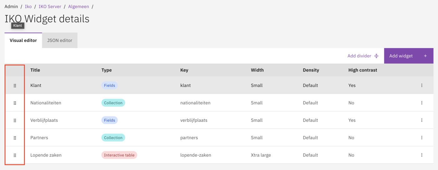
Widget order
The order of widgets within a tab can be adjusted via drag & drop. Widgets are displayed from left to right, top to bottom, filling the available columns.

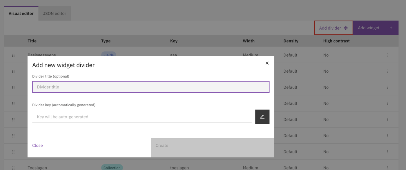
Dividers
A divider is a special widget type that creates visual separation between groups of widgets. Add a divider from the widget list to create a horizontal line spanning the full width.

Widget actions
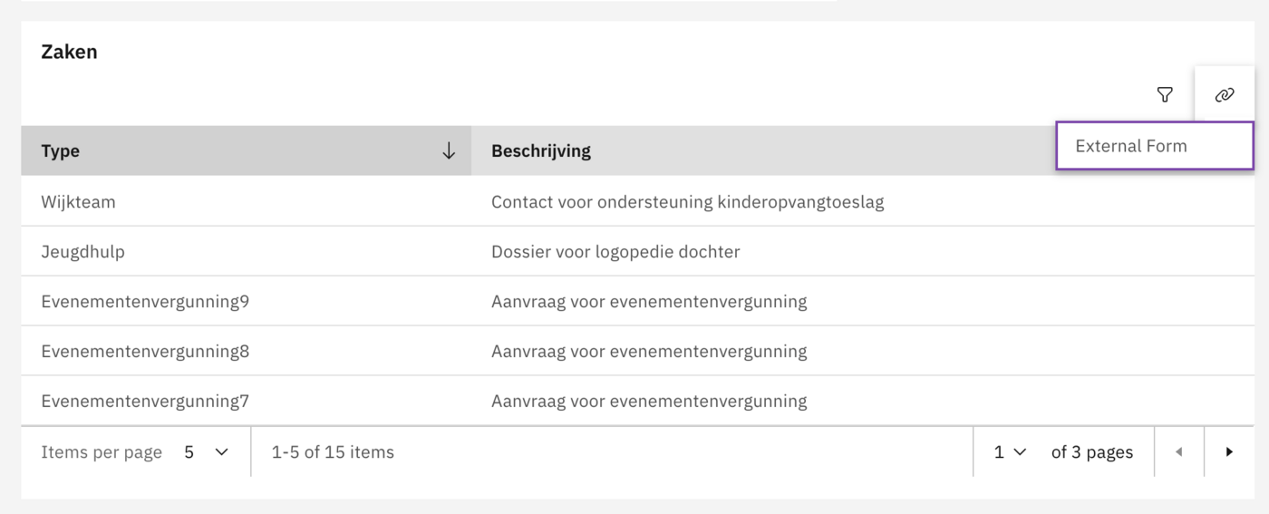
Actions add buttons to a widget that allow users to perform operations. Actions appear in the top-right corner of the widget.
Action types
Link
Navigate to a URL.
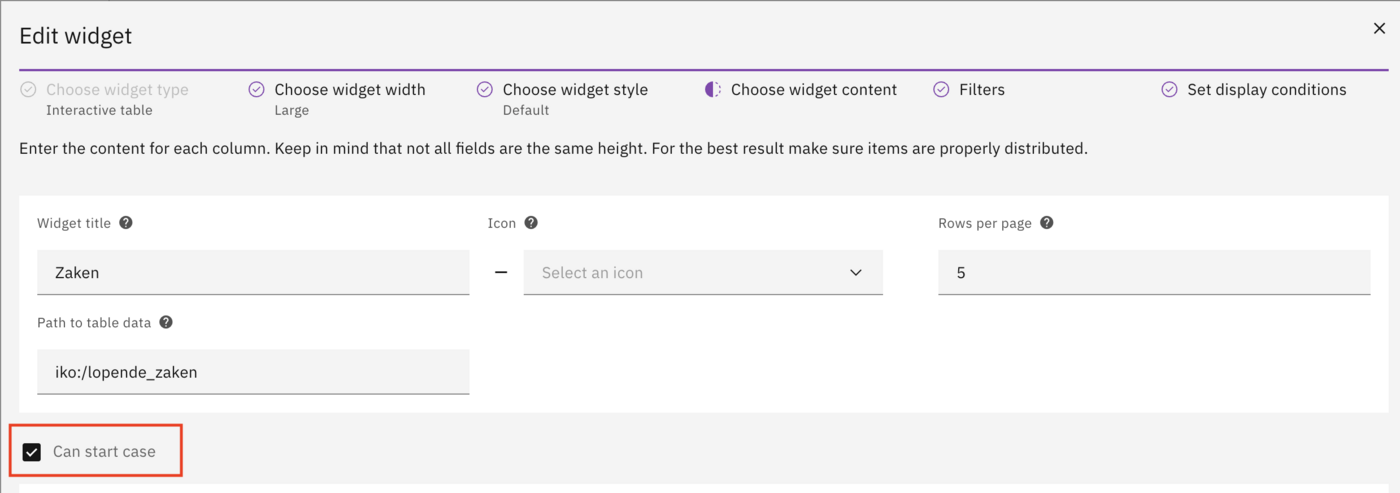
Can start case
Show a dropdown with available case definitions. User selects one and the start form opens.
Configuring a link action
Link actions navigate the user to a specified URL. The URL can contain placeholders to include dynamic data.


Link-URL (with variables)
The target URL. Use placeholders like ${iko:/person/bsn} for dynamic values.
Button label
The text displayed on the button.
Example configuration:
Link-URL (with variables)
https://example.com/details/${iko:/person/bsn}
Button label
View details
Configuring can start case
The "Can start case" action displays a button with a dropdown menu. The dropdown shows all available GZAC case definitions. When the user selects a case definition, the start form for that case opens.
Enable this action by setting canStartCase to true in the widget properties.


Display properties (optional)
Display properties control how field values are rendered. If not specified, values are displayed as plain text.
text
hideWhenEmpty
Standard text display.
number
hideWhenEmpty
Numeric display.
date
format, hideWhenEmpty
Date display.
datetime
format, hideWhenEmpty
Date and time display.
boolean
hideWhenEmpty
Yes/No display.
currency
hideWhenEmpty
Currency display.
percent
hideWhenEmpty
Percentage display.
link
hideWhenEmpty
Hyperlink display.
Date formats
DD-MM-YYYY
Day-Month-Year.
31-12-2024
YYYY-MM-DD
Year-Month-Day.
2024-12-31
DD/MM/YYYY
Day/Month/Year.
31/12/2024
Value resolvers
Values in widgets are retrieved using the iko: prefix, which indicates the value should be retrieved from the IKO data context.
iko:/path/to/field
Absolute path from the root context.
/path/to/field
Relative path within a collection item.
Examples:
Display conditions
Display conditions determine when a widget is shown based on data values. If multiple conditions are configured, all must be met.
Path
Data path for the condition.
Operator
Comparison operator (e.g. Equal to, Not equal to, Greater than).
Value
Value to compare against.
Example: Only show a widget when the person has Dutch nationality:
Path
iko:/person/nationality/code
Operator
==
Value
NL
Related
Last updated