Widgets
Widgets enable the presentation of case-specific data, either from the case's own data objects or from external data sources. This approach standardizes the display of case data across all cases and eliminates the need for knowledge of Form.io or HTML to present case data effectively.
Configuring widgets
Widget configuration is part of tab configuration for a case definition.
Go to the
AdminmenuGo to the
Casesmenu and select the case to configure widgets forSelect the
Tabstab
The list of configured tabs for a case is displayed within the case settings. To configure widgets, select an existing tab with its type set to Widgets, or add a new widget-type tab to the configuration by clicking the Add tab button as documented in the tabs documentation. Upon selection, the widget configuration for the chosen tab will open, displaying a list of widgets created for that tab.

Layout algorithm
The way a widget tab's widgets are arranged can be chosen per tab. The same options are available for dashboards and IKO tabs.
Selector label
Stored value (widgetLayout)
Behaviour
Default (less gaps)
MUURI_GAP_FREE
An algorithm that fills small gaps, while keeping widgets in their configured order as much as possible. Used when nothing is configured (the original behaviour).
Default
MUURI
Plain layout algorithm without gap filling. Keeps the configured order, but empty gaps can remain.
Gap free
BEAUTIFUL
Custom dense-packing algorithm. May reorder widgets within a section to remove gaps and almost always produces a clean layout without holes.
Trade-off: Default and Default (less gaps) keep the widgets in the order you configured (predictable) but can leave empty space, while Gap free reorders widgets to eliminate gaps at the cost of changing their order.
Open the widget tab and click Edit widget tab. Pick an option in the Layout algorithm dropdown of the modal and save. An information block underneath the dropdown summarises the trade-off.
Add the optional widgetLayout property (one of the stored values above) to the tab object in the *.case-widget-tab.json file. When omitted, the layout falls back to MUURI_GAP_FREE.
Adding widgets
Click Add widget to open the create new widget modal that will guide the widget creation in 4 steps.
Choose widget type
Five types of widgets are currently supported:
Fields _A set of single data elements in a widget._
Custom component _An option to direct to a custom Angular component in de codebase._
Form.io form _This type makes is possible to display a Form.io form within a widget._ The form is prefilled with case data.
Table _Present array case data in a table within a widget._
Collection _Present array case data in a collection of cards within a widget._

Choose widget appearance
For the Fields, Collection and Table widgets an appearance color can be chosen in the Appearance tab. This color controls the background, accent and text colors rendered by the widget. The available options are Default, High Contrast, Blue, Periwinkle, Purple, Turquoise, Green, Brown, Red, Orange and Yellow.
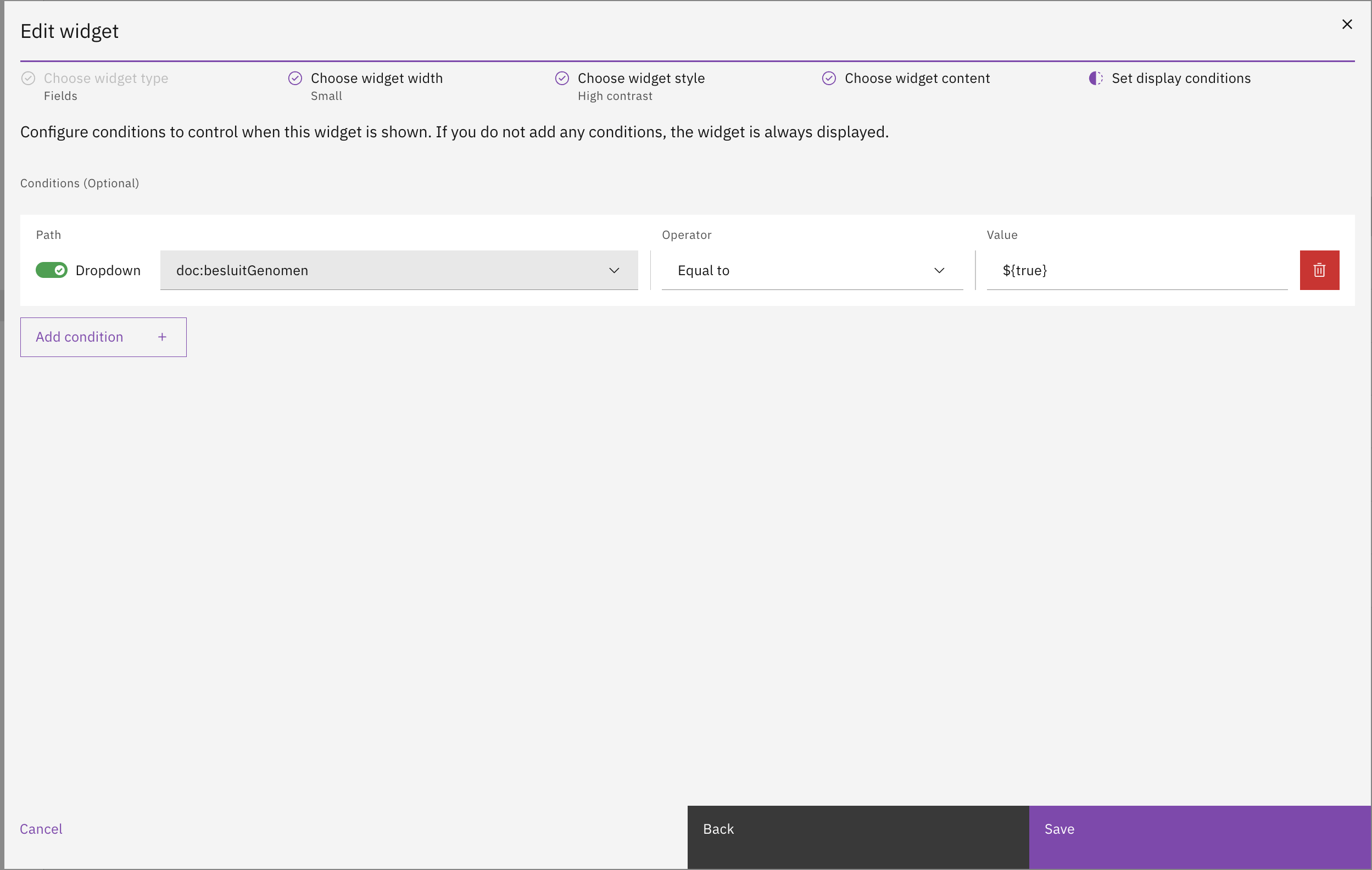
Choose widget conditions
By default each widget is shown in the UI. However, it is possible to add conditions to a widget that need to be met in order for the widget to be shown. This helps keep the widget page clean by hiding widgets that are not relevant to the current case.

JSON Editor
Widgets for a case can also be configured directly through a JSON editor. For process engineers, configuring widgets in JSON may offer greater control and efficiency. In the second tab of the Widget configuration UI, a JSON editor displays the complete widget configuration in JSON format. This editor includes error-checking functionality to ensure the JSON structure is correct.

Access control
Access to the case widgets can be configured through access control. More information about access control can be found in the access control documentation.
Resources and actions
com.ritense.case_.domain.tab.CaseWidgetTabWidget
view
Allows viewing a case widget
Examples
Last updated