.png?alt=media)
Widget configuration UI
Widget configuration UI
.png?alt=media)
Choosing widget type
.png?alt=media)
Choosing widget width
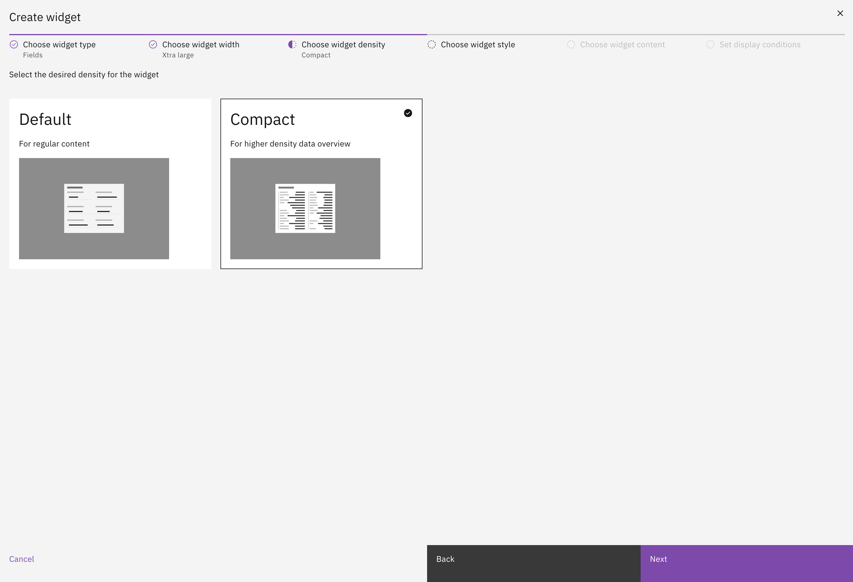
Choosing widget density
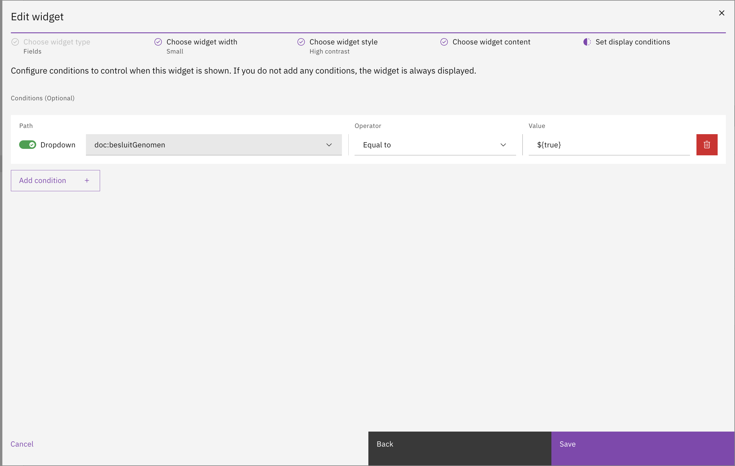
Choosing widget conditions
| Display type | Presentation |
|---|---|
| Text | Value is presented in the UI as regular text. |
| Yes/No | This converts a Boolean value to "Yes"/"No". |
| Date | Accepts a UTC date string as input. A format can be specified for how you wish the date to be displayed (this is optional). |
| Number | The number display type is based on the DecimalPipe* from Angular. Optional formatting can be specified for how you wish the number to be displayed. |
| Percentage | The percentage display type is based on the PercentPipe* from Angular. Optional formatting can be specified for how you wish the percentage to be displayed. By default any value is divided by 100, unless a format is specified. This has been done because of the values that the Angular PercentPipe* expects. |
| Currency | The currency display type is based on the CurrencyPipe* from Angular. Optional formatting can be specified for how you wish the currency to be displayed. |
| Enum | Enum (or enumerate) is meant to assign a value to a key as to display data more accurately. The key is stored in the JSON document, the value is configured in the enum, based on the key the corresponding value is displayed. |
.png?alt=media)
.png?alt=media)
.png?alt=media)
.png?alt=media)
Uploaded files table widget configuration
.png?alt=media)
.png?alt=media)
Uploaded files with first column set as title column
.png?alt=media)
Uploaded files collection widget configuration
| Status source | Description |
|---|---|
| Internal status | The steps are derived from the case's internal case status history. Each entry in the history becomes a step, in chronological order. The most recent entry is rendered as the current step; all earlier entries are rendered as completed and show the date and time at which the case moved into that status. The step title comes from the configured internal status title, with the status label shown in an info toggletip next to the step. |
| Zaak status | The steps are derived from the statustypen of the zaaktype linked to the case. All statustypen for the zaaktype are rendered in their defined order, so future statuses are visible up-front as incomplete steps. A step is marked complete once the matching status has been set on the zaak, and shows the date and time it was reached. The first not-yet-reached status is rendered as the current step. This source is only selectable when the zaken-api module is on the classpath; without it, the status source dropdown will not offer this option and the widget will fail to load data if it has been configured for it via JSON or autodeploy. |
.png?alt=media)
| Resource type | Action | Effect |
|---|---|---|
com.ritense.case_.domain.tab.CaseWidgetTabWidget | view | Allows viewing a case widget |
{
    "resourceType": "com.ritense.case_.domain.tab.CaseWidgetTabWidget",
    "action": "view",
    "conditions": []
}