# Welcome to Valtimo

Valtimo is an open source, low-code process automation platform. It enables organizations to execute operational processes faster, with less manual work. Valtimo orchestrates processes from start to delivery, with people, AI agents, and IT services working together.

Processes are modeled and executed through configuration rather than custom-built code — enabling teams to build and maintain solutions in-house. Building processes takes days, not weeks or months.

***

## Why organizations choose Valtimo

### Execute processes as designed

When regulations require you to prove that processes are being executed correctly, Valtimo provides the structure and audit trails you need. Every action is tracked, every decision is documented.

### Control lead times

With clearly defined and automated processes, you know exactly where work stands. Bottlenecks become visible. Deadlines are trackable. Nothing falls through the cracks.

### Build and maintain in-house

Configuration-based process design means your team can build and adjust processes without extensive development resources. Changes that used to take months now take days.

***

## A platform, not just a product

While Valtimo can run as a single application, it's designed to be part of a larger enterprise architecture. Components are replaceable — you can mix and match with your existing systems.

### Core components

| Component                 | Purpose                                                                                                                     |
| ------------------------- | --------------------------------------------------------------------------------------------------------------------------- |
| **Valtimo**               | The core platform for process orchestration. Users manage cases and tasks through the Valtimo interface.                    |
| **Valtimo Designer**      | Design processes and decision models visually during the business analysis phase.                                           |
| **Valtimo Plugin Server** | Manage plugins that extend Valtimo's capabilities. Add integrations with your internal systems or domain-specific features. |
| **Valtimo Coworker**      | Manage AI assistants that can help with tasks — without depending on external AI services.                                  |

### Common additions

These third-party components are frequently used alongside Valtimo:

| Component      | Purpose                                                                                                      |
| -------------- | ------------------------------------------------------------------------------------------------------------ |
| **IKO**        | Build a complete view of a customer, organisation, or object by gathering information from multiple sources. |
| **OpenSearch** | Handle large volumes of cases — tens of millions — when standard database storage isn't enough.              |
| **Keycloak**   | Manage user access and permissions, typically connected to your organisation's directory service.            |

***

## Next steps

* [**What can you build with Valtimo?**](/introduction/use-cases) — See real-world examples and find your starting point
* [**Valtimo's core features**](/introduction/core-features) — Understand the building blocks of the platform
* [**What is a case?**](/valtimo-fundamentals/case) — Dive deeper into Valtimo's central concept


# What can you build with Valtimo?

Valtimo is used for organizations' core processes — the work that matters most. From citizen services to client management, Valtimo helps teams handle complex workflows efficiently.

***

## Use cases

### Government and public sector

**Benefit applications** — Citizens apply for social benefits, housing support, or financial assistance. Valtimo manages the entire journey: receiving applications, validating eligibility, requesting documents, routing to reviewers, and communicating decisions.

**Civic integration** — Supporting newcomers through integration programmes requires coordination across assessments, training, progress tracking, and milestone verification. Valtimo keeps all parties informed and processes moving.

**Objections and appeals** — When citizens challenge decisions, careful tracking of deadlines, documents, hearings, and formal responses is essential. Valtimo ensures nothing is missed and everything is properly documented.

**Permits and licenses** — From building permits to business licenses, applications flow through multiple review stages, inspections, and approvals across departments.

### Business and enterprise

**Client onboarding** — Bringing new clients on board involves collecting information, verifying identity, setting up accounts, and coordinating across teams. Valtimo streamlines the process while meeting compliance requirements.

**Product development** — Moving a product from idea to launch requires coordination across research, design, engineering, legal, and marketing. Valtimo tracks each stage and keeps stakeholders aligned.

**Regulatory oversight** — Organisations responsible for compliance need to manage inspections, findings, corrective actions, and follow-ups. Valtimo provides the structure these processes require.

### Common patterns

Whatever your specific use case, most processes share common elements that Valtimo handles well:

| Pattern              | Description                                              |
| -------------------- | -------------------------------------------------------- |
| Request handling     | Receiving, validating, and processing incoming requests  |
| Multi-stage approval | Routing work through sequential or parallel review steps |
| Document collection  | Gathering and validating required documents              |
| Deadline management  | Tracking due dates and escalating when needed            |
| Status communication | Keeping stakeholders informed of progress                |
| Audit and compliance | Maintaining records of who did what and when             |

***

## Who uses Valtimo?

This documentation serves everyone who works with the platform. Find your role below to discover where to start.

### Business analysts and process designers

You design how work flows through your organisation. You understand the business rules, decision points, and stakeholder needs that shape a process.

**Start with:** [What is a case?](/valtimo-fundamentals/case) and [What is a process?](/valtimo-fundamentals/process)

### Administrators and configurators

You set up and maintain Valtimo for your organisation. You configure cases, manage access control, and ensure the platform runs smoothly.

**Start with:** [Configuration guides](/configuration-guides/cases)

***

## Getting help

### Community

The world of process automation can be overwhelming at first, but there's a community ready to help.

{% hint style="info" %}
Join the conversation at [valtimo.slack.com](https://valtimo.slack.com/) to ask questions and connect with other users.
{% endhint %}

### Video learning

Prefer watching over reading? The Valtimo Academy offers video tutorials and courses.

{% hint style="info" %}
Visit [academy.valtimo.nl](https://academy.valtimo.nl/collections) for video content.
{% endhint %}

***

## Learn more

* [**What is a case?**](/valtimo-fundamentals/case) — Understand how Valtimo organises work
* [**What is a process?**](/valtimo-fundamentals/process) — See how automation works
* [**Configuration guides**](/configuration-guides/cases) — Start building your own processes


# Valtimo's core features

Valtimo brings together several features that work as a unified system. Understanding these core concepts helps you see how the platform fits together.

***

## Cases

A case is the central concept in Valtimo. It represents a piece of work your organisation handles — an application, request, complaint, or any other workflow.

Every case:

* Is started by an event (an incoming order, a submitted form, an API call)
* Contains all related information in one place
* Progresses through defined stages
* Eventually reaches completion

Cases are defined by **case definitions** — blueprints that specify what data a case contains, which processes run on it, and how it appears in the interface.

{% hint style="info" %}
Learn more in [What is a case?](/valtimo-fundamentals/case)
{% endhint %}

***

## Processes

Processes are the workflows that drive cases forward. They define the steps, decisions, and actions that move work from start to finish.

Valtimo uses BPMN (Business Process Model and Notation) — a visual standard for modeling processes. This means:

* Processes are designed visually, not coded
* Business analysts can understand and modify workflows
* The same model that's designed is the one that executes

A case definition can have one or multiple processes. They work together to handle different aspects of the case lifecycle.

{% hint style="info" %}
Learn more in [What is a process?](/valtimo-fundamentals/process)
{% endhint %}

***

## Building blocks

Complex, long-running processes can become difficult to manage. Building blocks solve this by packaging reusable process components.

A building block contains:

* Process models
* Decision models
* Forms
* Related configuration

Teams can create building blocks for common patterns and reuse them across different case definitions. This keeps complex processes maintainable and promotes consistency.

***

## Forms

Forms capture and display case data. When a process reaches a step that needs user input, a form appears for the user to complete.

Forms in Valtimo:

* Are configured visually
* Connect directly to case data
* Support validation and conditional logic
* Can be reused across different processes

{% hint style="info" %}
Learn more in [What is a form?](/valtimo-fundamentals/form)
{% endhint %}

***

## Plugins

Plugins extend Valtimo's capabilities beyond its core features. They're used to add domain-specific functionality or integrate with other systems.

**What plugins can do:**

* Connect to external services (document management, email, notifications)
* Add specialised features for your domain
* Integrate with your organisation's existing systems

Plugins come in two types:

* **Embedded plugins** — Built into Valtimo, offering deep integration
* **External plugins** — Run separately, providing isolation and independent updates

***

## Access control

Valtimo includes a policy-based access control system that determines who can do what. Rather than simple role assignments, policies can include rules and conditions.

This allows fine-grained control over:

* Which cases users can see
* What actions users can take
* Which data is visible or editable

{% hint style="info" %}
Learn more in [Users, roles and permissions](/valtimo-fundamentals/roles-permissions)
{% endhint %}

***

## Dashboard

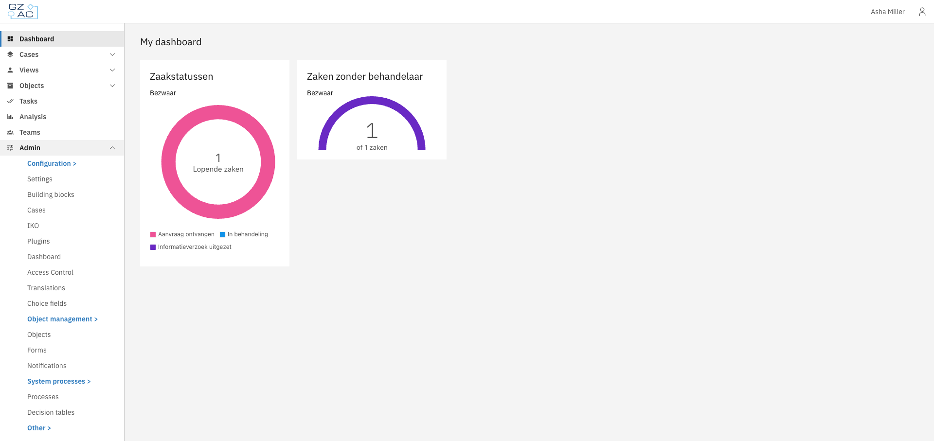
The dashboard provides insights into operational information — how cases are progressing, where bottlenecks occur, and how the team is performing.

Dashboards help managers and teams:

* Monitor workload and capacity
* Identify delays before they become problems
* Track performance over time

***

## How features work together

These features don't operate in isolation. A typical flow might look like:

1. An event creates a new **case**
2. A **process** starts automatically
3. The process creates tasks and collects data through **forms**
4. **Plugins** handle external integrations along the way
5. **Access control** ensures the right people see the right information
6. The **dashboard** shows progress to managers
7. **Building blocks** provide reusable components throughout

Understanding this connected system helps you design effective solutions in Valtimo.


# What is a case?

A case is the central unit of work in Valtimo. It represents a business process — such as an application, request, complaint, or any other workflow your organization handles. Each case contains all the information, history, and tasks related to that specific piece of work.

Cases give organizations a structured way to:

* Track work from start to finish
* Store all relevant data in one place
* Automate progression through processes
* Assign work to the right people

***

## How cases work

Think of a case as a container that holds everything related to a piece of work:

* **Document** — The structured data (applicant details, request info, decisions)
* **Processes** — The workflows driving progress
* **Tasks** — Work items waiting for someone to act
* **Files** — Attached documents and evidence
* **Audit trail** — Complete history of what happened

When someone submits a request, Valtimo creates a case. A process starts automatically, creating tasks for users. As users complete tasks, the process updates the case data and moves forward. Everything stays connected to that one case until the work is done.

### Case definition vs case instance

A **case definition** is the blueprint that describes what a case looks like and how it behaves. It defines:

* What data the case contains (the document schema)
* Which processes can run on the case
* How the case list and detail views are configured
* What statuses the case can have

A **case instance** (or simply "case") is an actual piece of work created from that definition. When someone submits a request or a process creates a new case, Valtimo creates a case instance based on the case definition.

### Case data

Cases store data in several places:

**Document** — The primary data store. A structured JSON object that holds core case information like applicant details, request data, and decisions. The document follows a schema defined in the case definition, which validates data and ensures consistency. Forms write to the document, and widgets display from it.

**Process variables** — Temporary data that exists while a process runs. Useful for workflow decisions and intermediate values that don't need to persist after the process completes. Each process instance has its own variables.

**Files** — Attachments like PDFs, images, or other documents. Files are linked to the case and can be stored locally, in S3, or in an external document management system.

**Notes** — Free-form comments added by users. Notes provide a way to capture observations, decisions, or context that doesn't fit the structured document.

For example, a subsidy request case might have:

* **Document**: Applicant name, requested amount, decision outcome
* **Process variables**: Current review stage, temporary calculation results
* **Files**: Uploaded proof of income, signed agreement
* **Notes**: Reviewer comments about edge cases

### Case lifecycle

Cases progress through a lifecycle:

1. **Creation** — A case can be created manually by a user, through a form submission, via an API call, or automatically by a process
2. **In progress** — Processes run, tasks are completed, and the case data is updated
3. **Completion** — The case reaches its final state when all work is done

***

## Key components

### Status

Each case has a status that indicates where it is in its lifecycle (for example: "Request received", "In review", "Approved"). Statuses help users quickly understand the state of a case and can be used to filter case lists.

<figure><img src="https://3330064618-files.gitbook.io/~/files/v0/b/gitbook-x-prod.appspot.com/o/spaces%2Fq5dx9HWFJGshztp4binE%2Fuploads%2Fgit-blob-8bd0744f13493a14ca0ff64f8764ae20aa839f0f%2F01-case-list.png?alt=media" alt=""><figcaption><p>Case list with status column</p></figcaption></figure>

### Assignee

Cases can be assigned to a user or team. This indicates who is responsible for working on the case. Unassigned cases appear in a separate view so they can be picked up.

### Tags

Tags provide a way to categorize cases with labels. They help with organization and can be used to filter or group cases.

### Tasks

Tasks are individual work items within a case. When a process reaches a user task, Valtimo creates a task that appears in the case detail view. Users complete tasks to move the case forward.

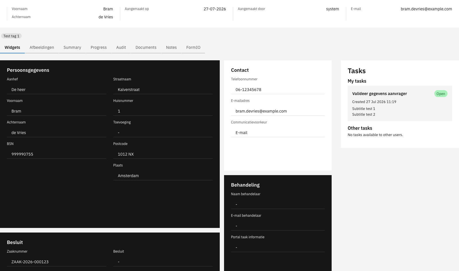
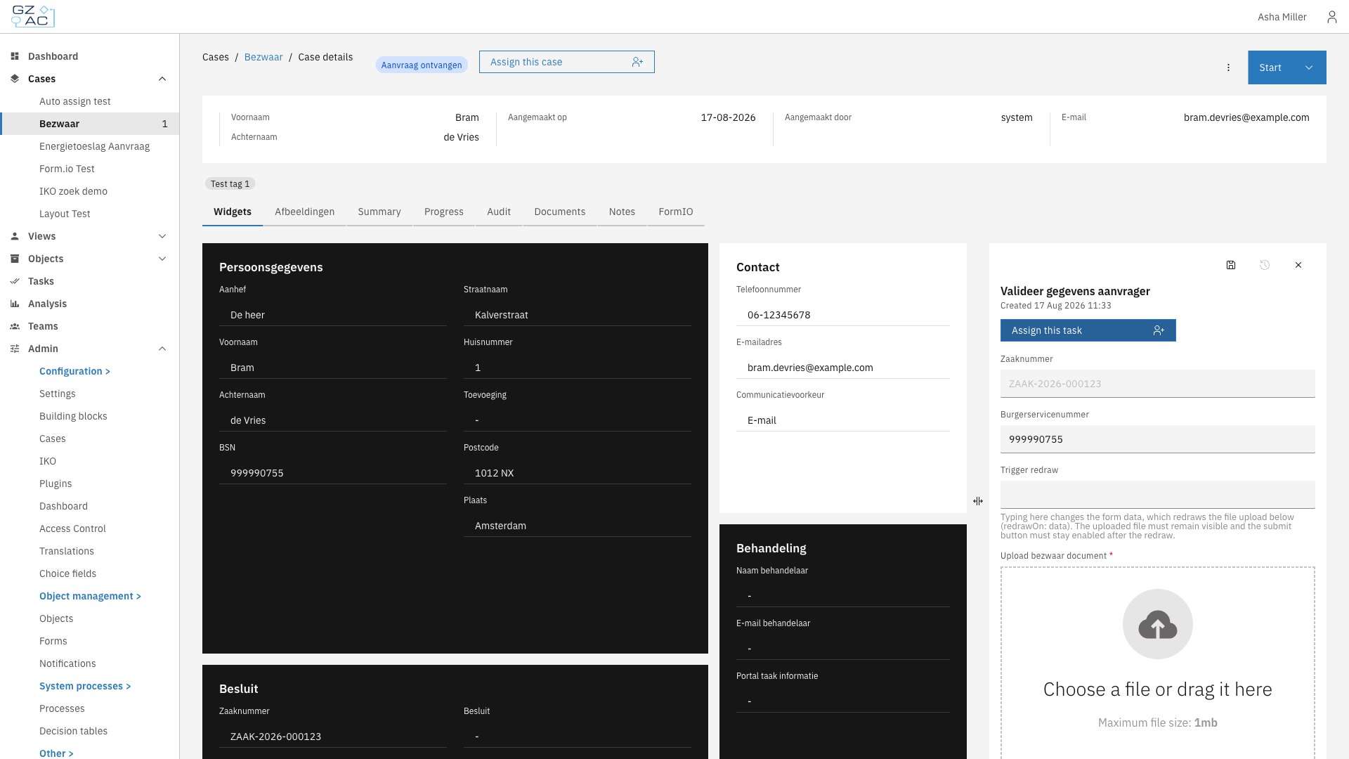
<figure><img src="https://3330064618-files.gitbook.io/~/files/v0/b/gitbook-x-prod.appspot.com/o/spaces%2Fq5dx9HWFJGshztp4binE%2Fuploads%2Fgit-blob-f36778e1b95bc2ff9dcd13f28a6fcf0aefbf77e2%2F02-case-detail.png?alt=media" alt=""><figcaption><p>Case detail view with tasks</p></figcaption></figure>

### Tabs

The case detail view is organized into tabs. Common tabs include:

* **Widgets** — Displays case data in a configurable layout
* **Summary** — Shows key case information at a glance
* **Progress** — Visualizes the case's progression through processes
* **Audit** — Lists all events and changes made to the case
* **Documents** — Shows attached files
* **Notes** — Allows users to add comments and observations

***

## Relationship to other concepts

* [**Processes**](/valtimo-fundamentals/process) — Automate case progression by defining the steps and logic that move a case forward
* [**Forms**](/valtimo-fundamentals/form) — Capture and display case data through user-friendly interfaces
* [**Users, roles and permissions**](/valtimo-fundamentals/roles-permissions) — Control who can view, edit, or manage cases

***

## Learn more

* [Tutorial: Setting up a case](https://github.com/valtimo-platform/valtimo/tree/v13-stable/documentation/tutorials/setting-up-a-case.md)
* [Configuration guide: Cases](/configuration-guides/cases)


# What is a process?

A process is a workflow that automates how cases move through your organization. Built using BPMN (Business Process Model and Notation), processes define the sequence of steps, decisions, and actions that drive a case from start to finish.

Processes give organizations a way to:

* Automate repetitive tasks and decisions
* Ensure consistent handling of every case
* Integrate with external systems through plugins
* Provide visibility into where each case stands
* Reduce manual handoffs and delays

***

## How processes work

Processes are the engine that drives cases forward. When a case is created, a process typically starts automatically. The process creates tasks for users, makes decisions at gateways, calls external systems, and updates case data along the way.

A case can have multiple processes running at the same time. For example, the main application process might run alongside a separate review process or a notification process. Each process instance is linked to the case and can read from and write to the case document.

### Process definition vs process instance

A **process definition** contains the BPMN diagram with all the activities, gateways, and connections that make up a workflow. It describes the steps to follow, the decisions to make, and the integrations to call.

A **process instance** is a running execution of a process definition. When a case is created or a user starts a process, Valtimo generally creates an instance that follows the defined steps.

### BPMN basics

BPMN is a standard notation for modeling business processes. Valtimo uses it to make workflows visual and understandable. A process diagram consists of:

* **Events** — Starting points, ending points, and triggers (circles)
* **Activities** — Work to be done (rounded rectangles)
* **Gateways** — Decision points and parallel paths (diamonds)
* **Connections** — Arrows showing the flow between elements

<figure><img src="https://3330064618-files.gitbook.io/~/files/v0/b/gitbook-x-prod.appspot.com/o/spaces%2Fq5dx9HWFJGshztp4binE%2Fuploads%2Fgit-blob-964710ffa088e66c598cd90f7f5f3f47cf1d0087%2F02-process-builder.png?alt=media" alt=""><figcaption><p>Process builder with BPMN diagram</p></figcaption></figure>

### Process lifecycle

1. **Start** — A process begins when triggered by creating a case, a user action, an API call, or another process
2. **Execute** — The workflow progresses through activities, makes decisions at gateways, and waits at user tasks
3. **End** — The process completes when it reaches one or more end events

### Process data

Processes work with two types of data:

**Process variables** — Temporary values that exist only while the process runs. Use these for workflow decisions, intermediate calculations, or data that doesn't need to persist after the process ends. Each process instance has its own separate variables.

**Case document** — The permanent data store shared across all processes on a case. Processes read from and write to the document using the `doc:` prefix in expressions. Changes to the document persist even after the process completes.

For example, a process might:

* Store a temporary `approvalScore` variable for a gateway decision
* Write the final `approvalStatus` to the document so it's visible on the case

***

## Key components

BPMN offers many element types. Below are some of the more commonly used ones in Valtimo.

### Activities

Activities are the work items in a process:

* **User task** — A step that requires human action. Creates a task that appears in the task list and case detail view
* **Service task** — An automated step that executes a plugin action, calls an API, or performs a calculation
* **Call activity** — Starts another process as a sub-process

### Gateways

Gateways control how the process flows:

* **Exclusive gateway** — Takes one path based on conditions (if/else logic)
* **Parallel gateway** — Splits into multiple paths that execute simultaneously
* **Inclusive gateway** — Takes one or more paths based on conditions

### Events

Events mark significant points in the process:

* **Start event** — Where the process begins
* **End event** — Where the process completes
* **Intermediate event** — A trigger or pause in the middle of the process (timers, messages, signals)

### Process links

Process links connect activities to external handlers. What process links can be configured depends on the selected activity. When a process reaches an activity with a link, Valtimo executes the linked action:

* **Form link** — Opens a form for the user to complete
* **Form flow link** — Starts a multi-step form wizard
* **Plugin action link** — Executes an action from a configured plugin
* **URL link** — Redirects to an external system

***

## Viewing process progress

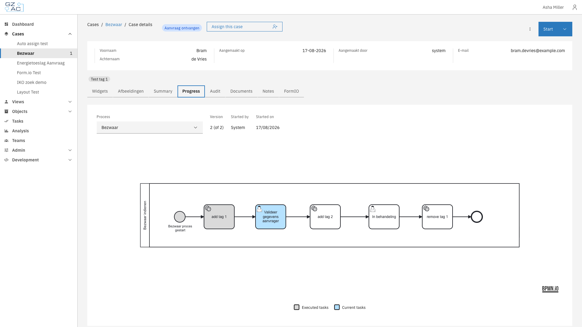
Users can see how a case is progressing through its process on the Progress tab. The diagram highlights which steps have been completed and which are currently active.

<figure><img src="https://3330064618-files.gitbook.io/~/files/v0/b/gitbook-x-prod.appspot.com/o/spaces%2Fq5dx9HWFJGshztp4binE%2Fuploads%2Fgit-blob-572cf098dfcc0fba59bf576af9c7469a1499b6d2%2F01-progress-tab.png?alt=media" alt=""><figcaption><p>Progress tab showing process execution</p></figcaption></figure>

***

## Relationship to other concepts

* [**Cases**](/valtimo-fundamentals/case) — Processes drive case progression. Each case can have multiple processes running on it
* [**Forms**](/valtimo-fundamentals/form) — Forms capture user input at user tasks in the process

***

## Learn more

* [Configuration guide: Processes](/configuration-guides/cases/processes)


# What is a form?

A form is the user interface for collecting and displaying data in Valtimo. Built using [Form.io](https://form.io), forms provide a visual, drag-and-drop way to create input screens without writing code. When a user completes a task, submits a request, or starts a new case, they typically interact with a form.

Forms give organizations a flexible way to:

* Collect structured data from users at any point in a workflow
* Validate input before it reaches the case document
* Pre-fill fields with existing case data

***

## How forms work

Forms are the bridge between users and case data. When users fill in a form, the data flows directly into the case document. When they open a form, existing (case) data is pre-filled automatically. This two-way connection means forms both capture new information and display what's already known.

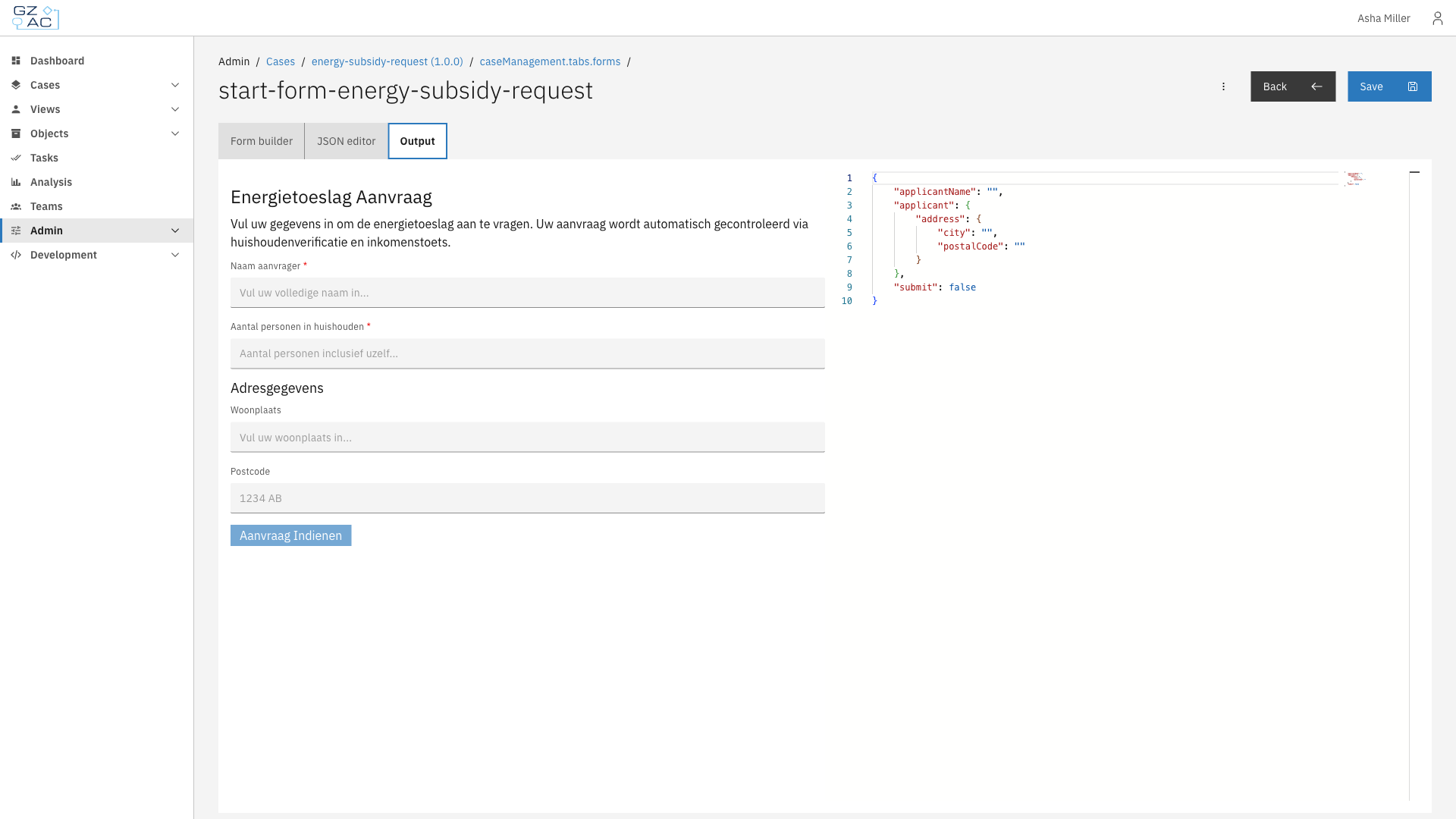
Valtimo uses Form.io as its form engine. Each form is defined as a JSON structure that describes:

* Which fields appear (text inputs, dropdowns, checkboxes, file uploads, and more)
* How fields are laid out on the page
* Validation rules (required fields, patterns, min/max values)
* Conditional logic (show or hide fields based on other values)

The JSON definition is what Valtimo stores and deploys. At runtime, Form.io renders the definition into an interactive form that users can fill in.

<figure><img src="https://3330064618-files.gitbook.io/~/files/v0/b/gitbook-x-prod.appspot.com/o/spaces%2Fq5dx9HWFJGshztp4binE%2Fuploads%2Fgit-blob-c47c4ecc3063ae4342a147ac97f9aed68ae2e32a%2F03-form-output-preview.png?alt=media" alt=""><figcaption><p>Form preview with JSON output</p></figcaption></figure>

### Forms in case workflows

Forms appear at several points in a case's lifecycle:

* **Start forms** — Collect initial data when creating a new case
* **User task forms** — Capture input during a process step that requires human action
* **Case tab display** — Show read-only case information in a structured layout on a case details tab

When a form is submitted, the data flows into the case document. The form's field keys map to paths in the document's JSON structure, ensuring data ends up in the right place.

<figure><img src="https://3330064618-files.gitbook.io/~/files/v0/b/gitbook-x-prod.appspot.com/o/spaces%2Fq5dx9HWFJGshztp4binE%2Fuploads%2Fgit-blob-515fe4fd3d4fe7dcd739d38235864f795a0c6af3%2F02-user-task-form.png?alt=media" alt=""><figcaption><p>Form in user task</p></figcaption></figure>

### Form data

Forms connect to case data through field keys:

**Document fields** — Most form fields write directly to the case document. The field key becomes the path in the document. For example, a field with key `applicant.name` stores its value at that path in the case's JSON document.

**Process variables** — Fields with the `pv:` prefix store data in the running process instead of the document. Use this for temporary values that shouldn't persist after the process ends. For example, `pv:approvalDecision` stores a decision that controls process flow but doesn't need to stay in the case.

When a form opens, Valtimo automatically pre-fills fields with matching data from the case document or process variables. When the form is submitted, the data flows back to update the document and complete the task.

***

## Form builder

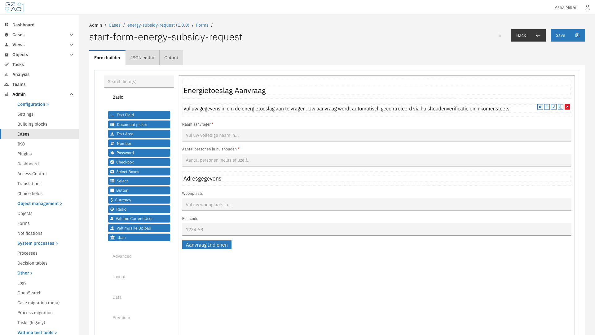
The form builder provides a visual editor for creating and modifying forms. A component palette on the left offers field types like:

* Text fields, text areas, and numbers
* Dropdowns, checkboxes, and radio buttons
* File uploads and date pickers
* Layout components (panels, columns, tabs)

Drag components onto the canvas to build your form. Click a component to configure its properties: label, placeholder text, validation rules, and data binding.

<figure><img src="https://3330064618-files.gitbook.io/~/files/v0/b/gitbook-x-prod.appspot.com/o/spaces%2Fq5dx9HWFJGshztp4binE%2Fuploads%2Fgit-blob-ef33ed3633305a44579ec6ff2be610a46ca645fe%2F01-form-builder.png?alt=media" alt=""><figcaption><p>Form builder</p></figcaption></figure>

***

## Form flows

For complex data collection that spans multiple screens, Valtimo offers form flows. A form flow is a wizard-like sequence of forms where:

* Users progress through steps in order
* Conditional branching can show different follow-up forms based on input
* Actions can run when a step opens, completes, or the user navigates back

Form flows are useful when a single form would be too long or when the next questions depend on earlier answers. Like single forms, form flows connect to processes through process links.

***

## Relationship to other concepts

* [**Cases**](/valtimo-fundamentals/case) — Forms capture and display case data. When a form is submitted, its values are stored in the case document
* [**Processes**](/valtimo-fundamentals/process) — Forms connect to user tasks via process links. When a process reaches a user task with a linked form, Valtimo displays that form to the user

***

## Learn more

* [Configuration guide: Forms](/configuration-guides/cases/forms)
* [Configuration guide: Form flows](/configuration-guides/cases/form-flows)


# Users, roles and permissions

Access control determines who can see and do what within Valtimo. It connects users from your identity provider to roles, and roles to permissions that grant access to specific resources and actions.

A well-configured access control setup helps organizations:

* Protect sensitive case data from unauthorized access
* Follow the principle of least privilege — users get only the access they need
* Meet compliance requirements with auditable permission structures
* Support different user groups with different responsibilities

***

## How access control works

Valtimo uses permission-based access control (PBAC). The system evaluates permissions at runtime whenever a user tries to view or act on a resource. If no permission grants access, the request is denied.

When a user opens a case list, for example, Valtimo checks their roles, finds the matching permissions for "view case", applies any conditions, and returns only the cases they're allowed to see. The same check happens for every action: viewing tasks, modifying documents, accessing dashboards, etc.

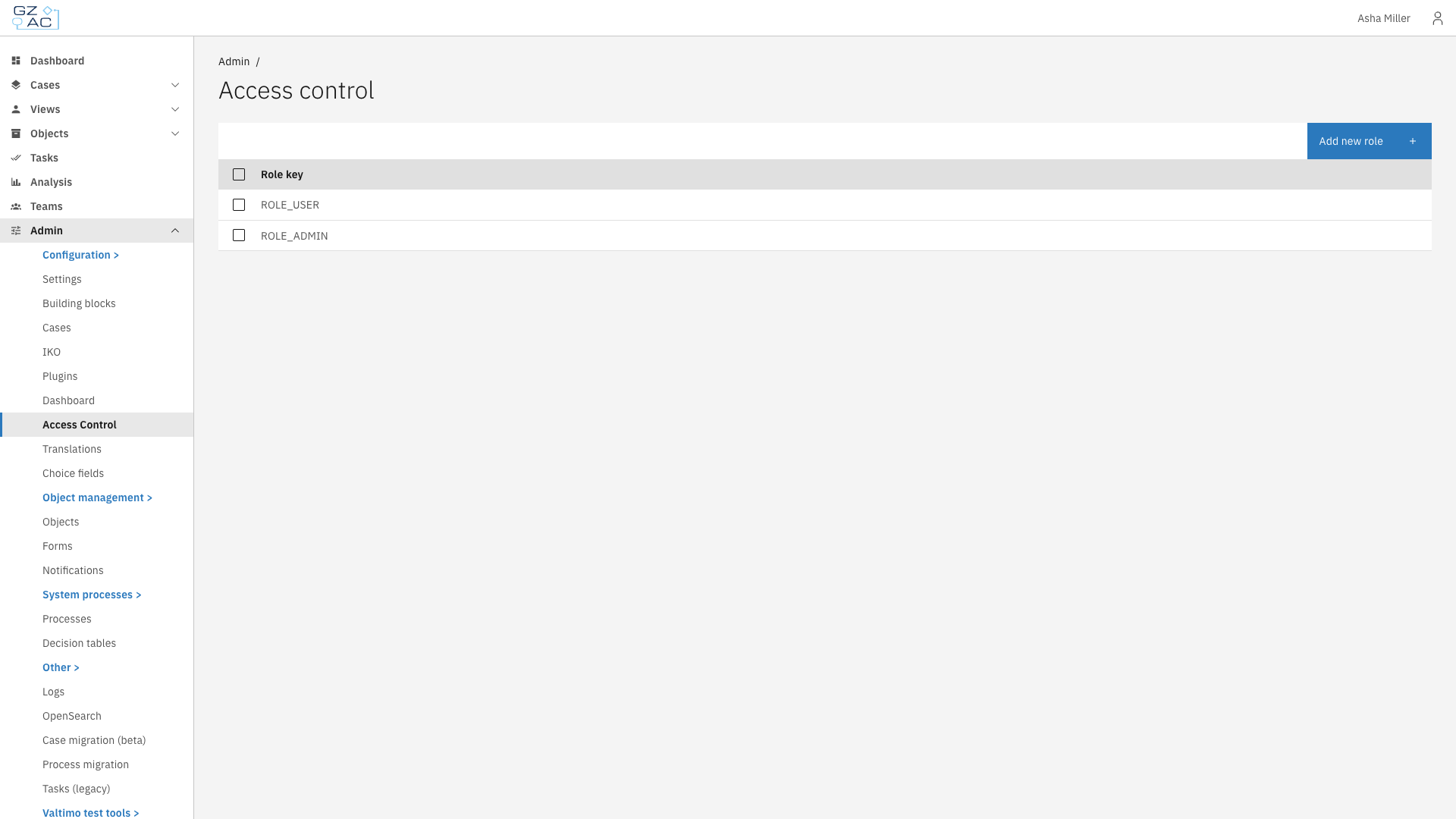
<figure><img src="https://3330064618-files.gitbook.io/~/files/v0/b/gitbook-x-prod.appspot.com/o/spaces%2Fq5dx9HWFJGshztp4binE%2Fuploads%2Fgit-blob-5a9f4180d9690d83f46a6189c0c38735588c5d7e%2F01-access-control-overview.png?alt=media" alt=""><figcaption><p>Roles configured in access control</p></figcaption></figure>

***

## Key components

### Users

Users exist in Keycloak (or your identity provider), not in Valtimo itself. Keycloak handles authentication, password policies, and role assignments. Valtimo trusts the roles that Keycloak provides when a user logs in.

This separation keeps user management centralized. Add a user to a Keycloak role, and they immediately inherit all permissions configured for that role in Valtimo.

### Roles

A role groups permissions together under a meaningful name. Common examples include:

* **Administrator** — Full access to configuration and all cases
* **Case worker** — Can view and work on assigned cases
* **Manager** — Can view reports and reassign work

Roles in Valtimo must match role names in Keycloak. When you create a role in Valtimo's access control, you're defining what permissions that role grants — not creating the role itself. The role must also exist in Keycloak for users to be assigned to it.

### Permissions

Each permission connects a role to a resource type and one or more actions. A permission answers the question: "Can this role perform this action on this resource?"

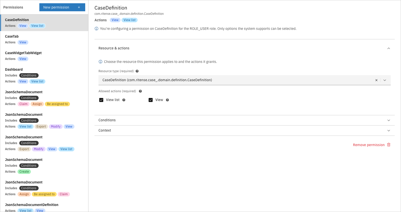
<figure><img src="https://3330064618-files.gitbook.io/~/files/v0/b/gitbook-x-prod.appspot.com/o/spaces%2Fq5dx9HWFJGshztp4binE%2Fuploads%2Fgit-blob-cc652d63aad5b84969fee79afd488a5af34e1f58%2F02-permission-editor.png?alt=media" alt=""><figcaption><p>Permission editor showing resource and actions</p></figcaption></figure>

**Resources** are the things users interact with: cases, tasks, documents, dashboards, notes, and more. Each resource type has its own set of available actions.

**Actions** are what users can do: view, create, modify, delete, assign, claim, and others depending on the resource type.

A single permission might grant:

* View and modify actions on cases
* View action on tasks
* Create and delete actions on notes

### Conditions

Permissions can be further restricted with conditions. Instead of granting access to all cases, a condition might limit access to:

* Cases with a specific status (e.g., only "In progress" cases)
* Cases assigned to the current user
* Cases belonging to a specific case definition

Conditions turn broad permissions into precise access rules without creating dozens of separate roles.

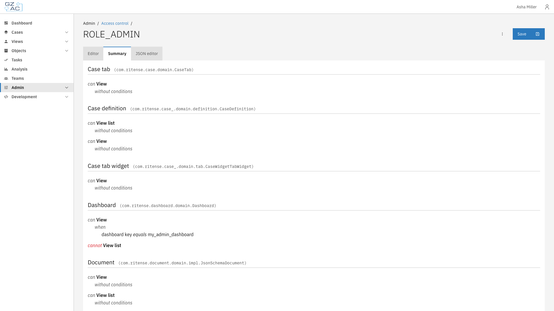
<figure><img src="https://3330064618-files.gitbook.io/~/files/v0/b/gitbook-x-prod.appspot.com/o/spaces%2Fq5dx9HWFJGshztp4binE%2Fuploads%2Fgit-blob-022d93722e381af7e7c12bba28d7354e37333af2%2F03-summary-tab.png?alt=media" alt=""><figcaption><p>Summary showing permissions with conditions</p></figcaption></figure>

***

## Relationship to other concepts

* [**Cases**](/valtimo-fundamentals/case) — Permissions control which cases users can view, create, modify, or delete. Conditions can restrict access based on case status, assignee, or other fields
* [**Processes**](/valtimo-fundamentals/process) — Permissions determine who can start processes and view process progress
* [**Forms**](/valtimo-fundamentals/form) — While forms themselves don't have permissions, the tasks that display forms do — users only see task forms for tasks they have permission to complete

***

## Learn more

* [Configuration guide: Access control](/configuration-guides/access-control)
* [Configuration guide: Roles](/configuration-guides/access-control/roles)
* [Configuration guide: Permissions](/configuration-guides/access-control/permissions)
* [Configuration guide: Conditions](/configuration-guides/access-control/conditions)


# Setting up a case


# Cases

The Cases configuration area lets you manage case definitions — the templates that define how different types of cases behave in your Valtimo implementation. Each case definition specifies its document structure, linked processes, forms, and how it appears to end users.

From here you can configure:

* [**General**](/configuration-guides/cases/general) — Case handler settings and external start form
* [**Processes**](/configuration-guides/cases/processes) — BPMN process definitions linked to the case
* [**Actions**](/configuration-guides/cases/actions) — Startable items (processes and building blocks) users can trigger from a case
* [**Decision tables**](/configuration-guides/cases/decision-tables) — DMN decision tables for automated decisions
* [**Document**](/configuration-guides/cases/document) — JSON schema defining the case's data structure
* [**Forms**](/configuration-guides/cases/forms) — Form definitions available for the case
* [**Form flows**](/configuration-guides/cases/form-flows) — Multi-step form sequences
* [**Tasks**](/configuration-guides/cases/tasks) — Task list column and search field configuration
* [**Case list**](/configuration-guides/cases/case-list) — End-user case list columns and search fields
* [**Case details**](/configuration-guides/cases/case-details) — Tabs, statuses, tags, and header configuration
* [**ZGW**](/configuration-guides/cases/zgw) — Dutch government standards integration

***

## Configuring cases

{% stepper %}
{% step %}
Expand **Admin** in the left sidebar
{% endstep %}

{% step %}
Click **Cases** under the Configuration section

<figure><img src="https://3330064618-files.gitbook.io/~/files/v0/b/gitbook-x-prod.appspot.com/o/spaces%2Fq5dx9HWFJGshztp4binE%2Fuploads%2Fgit-blob-4b7b26803140f191d90cbd91b1842423c6575bd5%2F01-admin-cases-navigation.png?alt=media" alt=""><figcaption><p>Admin sidebar with Cases navigation</p></figcaption></figure>
{% endstep %}

{% step %}
Click a case row to open its configuration
{% endstep %}

{% step %}
Use the tabs to navigate between configuration areas

<figure><img src="https://3330064618-files.gitbook.io/~/files/v0/b/gitbook-x-prod.appspot.com/o/spaces%2Fq5dx9HWFJGshztp4binE%2Fuploads%2Fgit-blob-fba611a43768f511315bf387aeadce2021928e6e%2F02-case-configuration-tabs.png?alt=media" alt=""><figcaption><p>Case configuration tabs</p></figcaption></figure>
{% endstep %}
{% endstepper %}

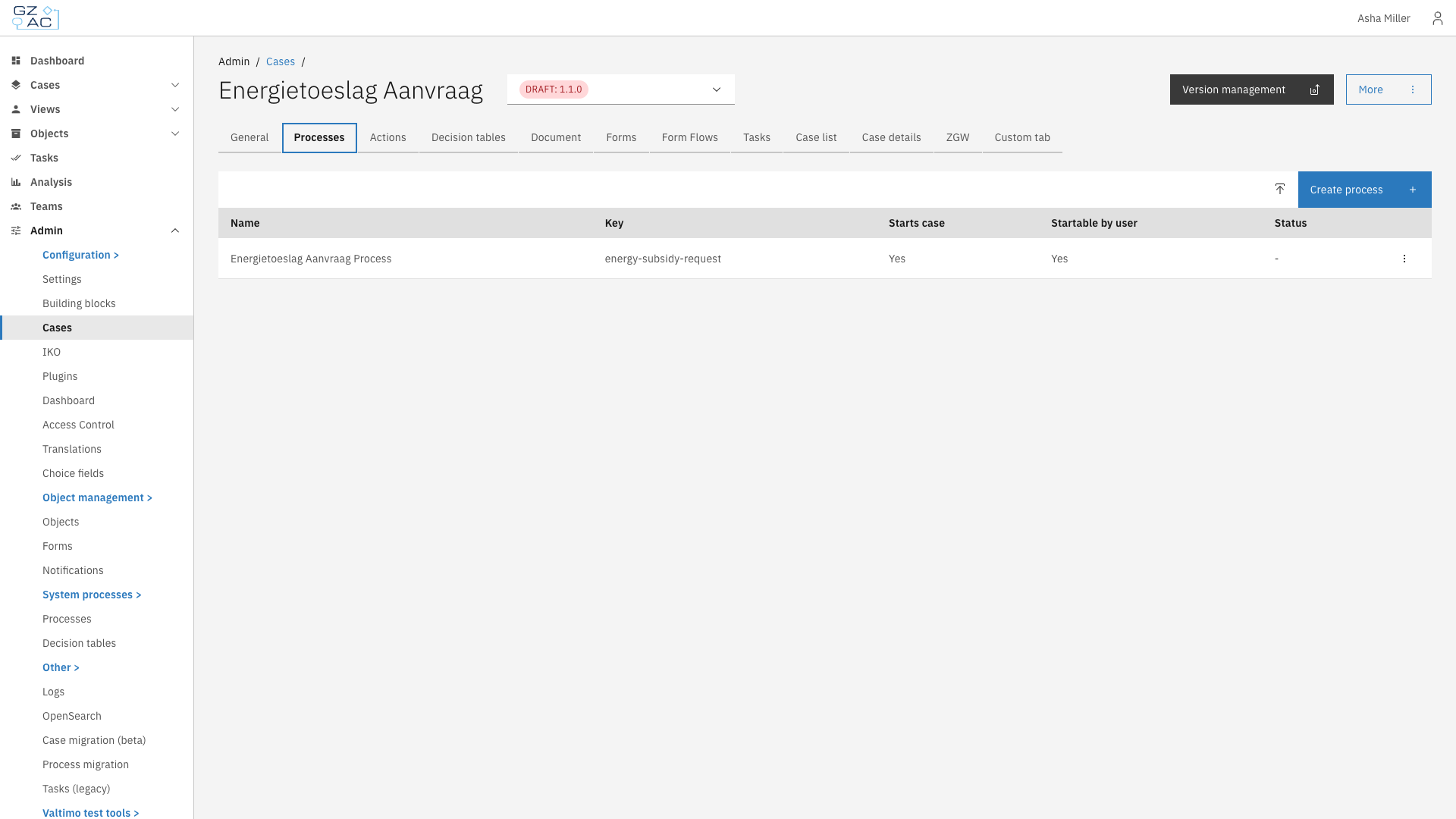
The cases list shows all defined case types with their name, key, current version, and status. Cases marked "Needs configuration" have unresolved configuration issues that should be addressed.

### Creating a case

To create a new case definition from scratch:

{% stepper %}
{% step %}
Click the **Create** button in the toolbar
{% endstep %}

{% step %}
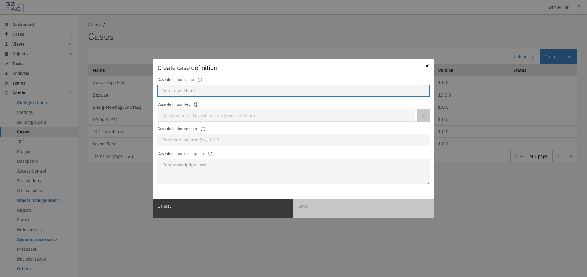
Fill in the case definition details:

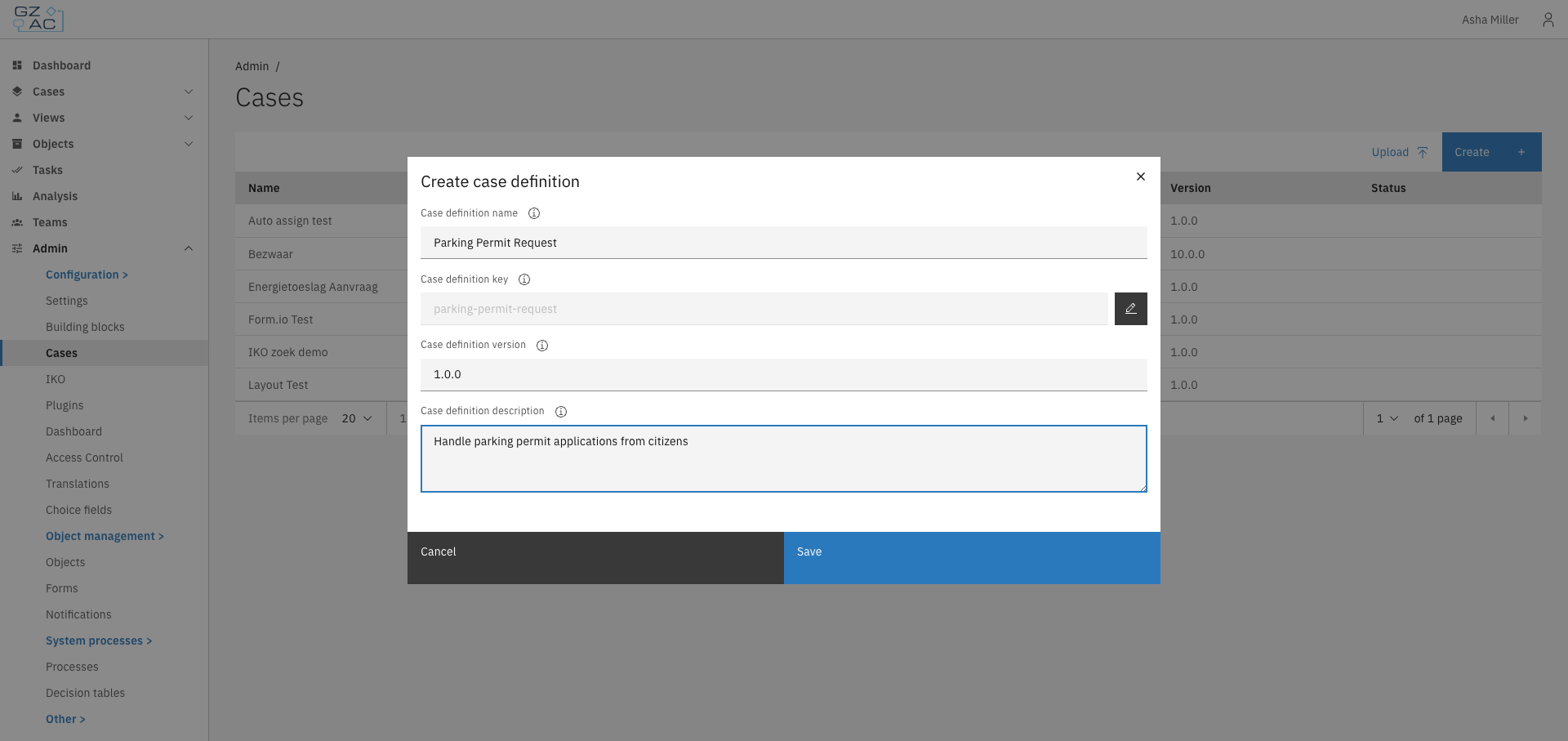
<figure><img src="https://3330064618-files.gitbook.io/~/files/v0/b/gitbook-x-prod.appspot.com/o/spaces%2Fq5dx9HWFJGshztp4binE%2Fuploads%2Fgit-blob-9d9853f42eaf679e775f8655997f26cdd1f3cc33%2F03-create-modal-empty.png?alt=media" alt=""><figcaption><p>Create case definition modal</p></figcaption></figure>

* **Name** — Display name for the case definition
* **Key** — Unique identifier (auto-generated from name, can be edited)
* **Version** — Semantic version number (e.g., `1.0.0`)
* **Description** — Optional description of what this case type handles

<figure><img src="https://3330064618-files.gitbook.io/~/files/v0/b/gitbook-x-prod.appspot.com/o/spaces%2Fq5dx9HWFJGshztp4binE%2Fuploads%2Fgit-blob-7f6266fe027d5a37d4223d21c61ccd3140792c87%2F04-create-modal-filled.png?alt=media" alt=""><figcaption><p>Create case definition with filled fields</p></figcaption></figure>
{% endstep %}

{% step %}
Click **Save** to create the case definition
{% endstep %}
{% endstepper %}

The new case opens in draft mode, ready for configuration.

### Uploading a case

To import an existing case definition package:

{% stepper %}
{% step %}
Click the **Upload** button in the toolbar
{% endstep %}

{% step %}
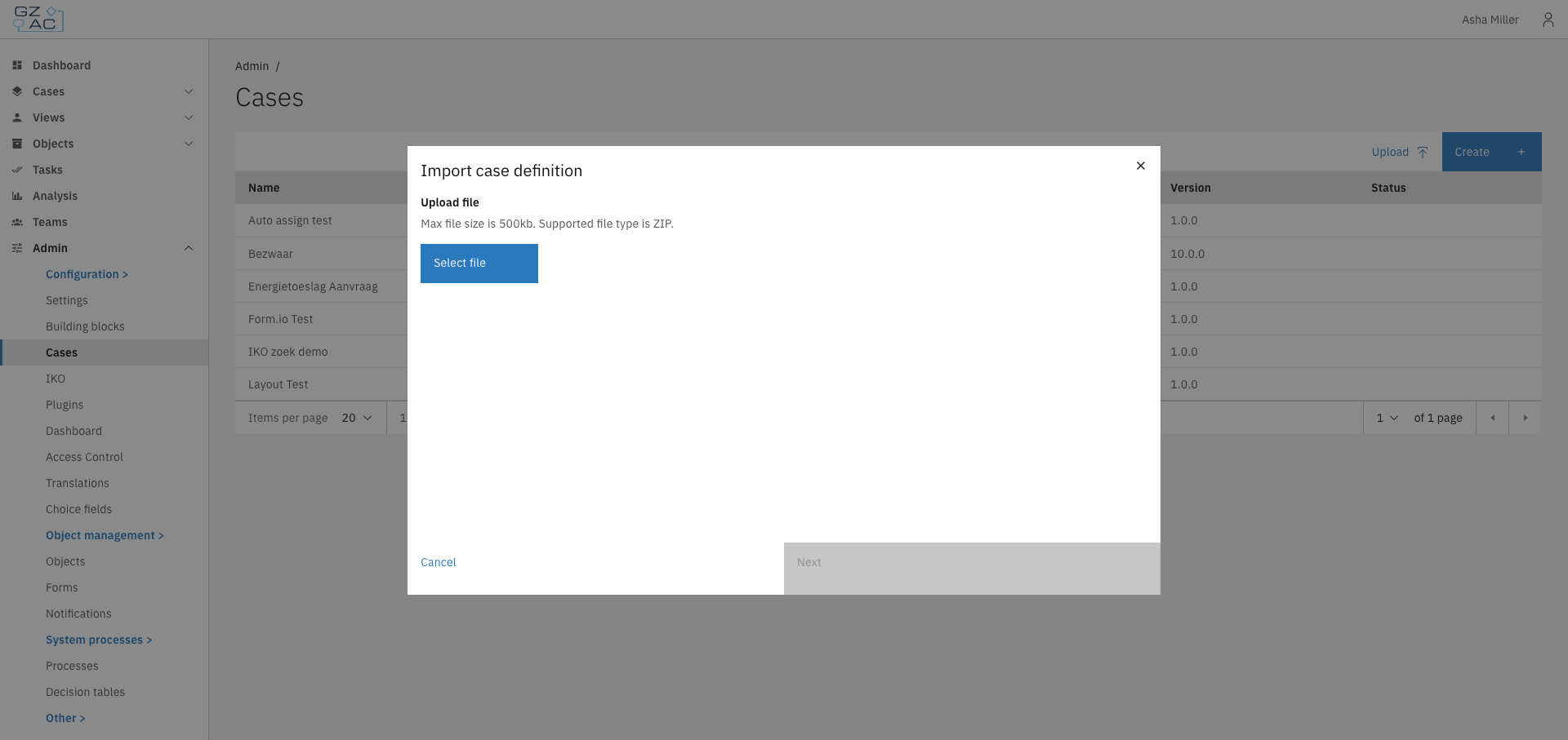
Select a `.zip` file containing the case definition

<figure><img src="https://3330064618-files.gitbook.io/~/files/v0/b/gitbook-x-prod.appspot.com/o/spaces%2Fq5dx9HWFJGshztp4binE%2Fuploads%2Fgit-blob-bfa4e0843c8934ac0c5db366f746fa74ee4e9051%2F05-upload-modal-file-select.png?alt=media" alt=""><figcaption><p>Upload case definition file select</p></figcaption></figure>
{% endstep %}

{% step %}
Configure the import settings:

* Review or modify the case name and key
* Map plugin configurations if the package uses plugins
  {% endstep %}

{% step %}
Click **Next** to proceed through the wizard steps
{% endstep %}

{% step %}
Click **Start upload** to import the case definition
{% endstep %}
{% endstepper %}

***

## Version management

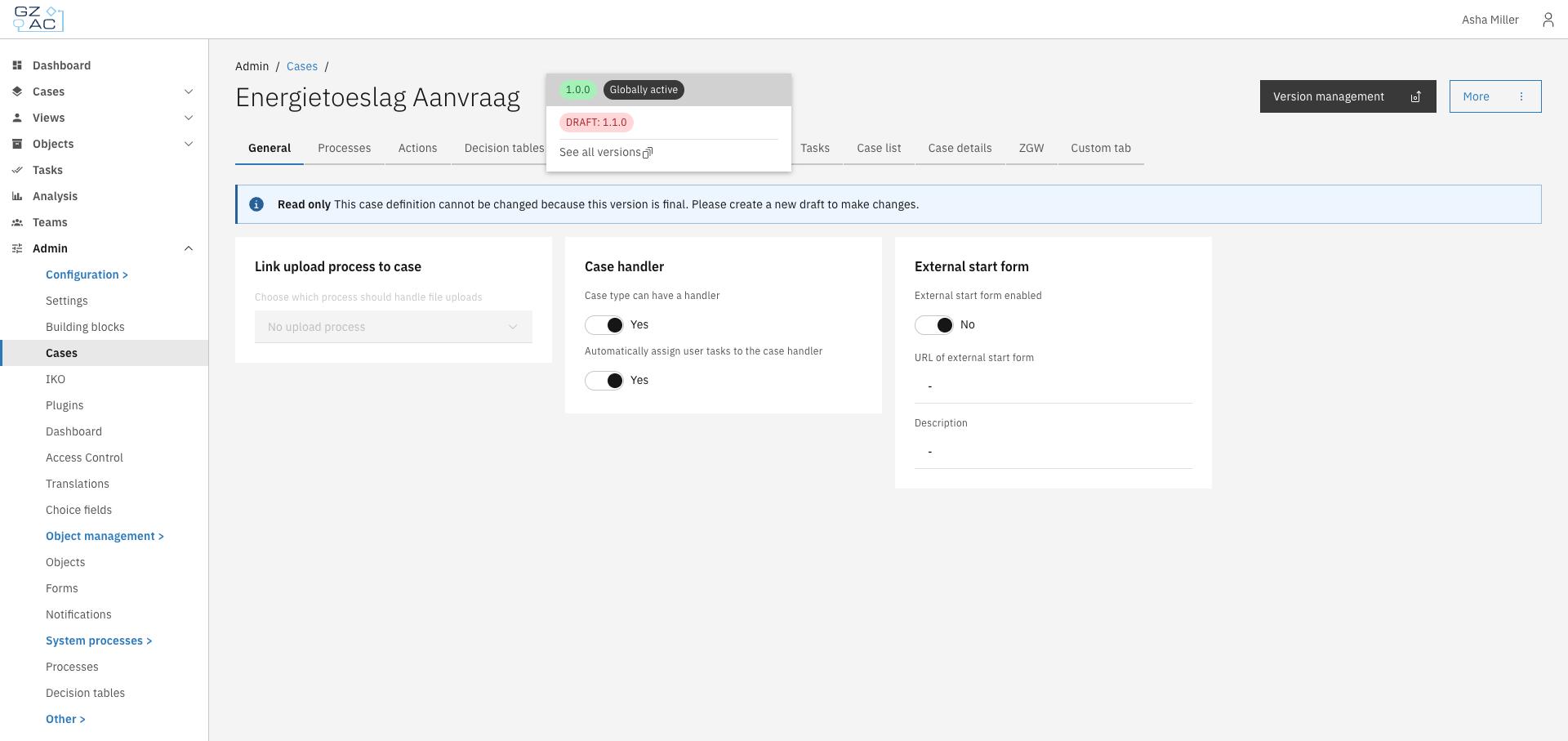
Case definitions support versioning. The version selector in the header shows the current version and allows switching between versions.

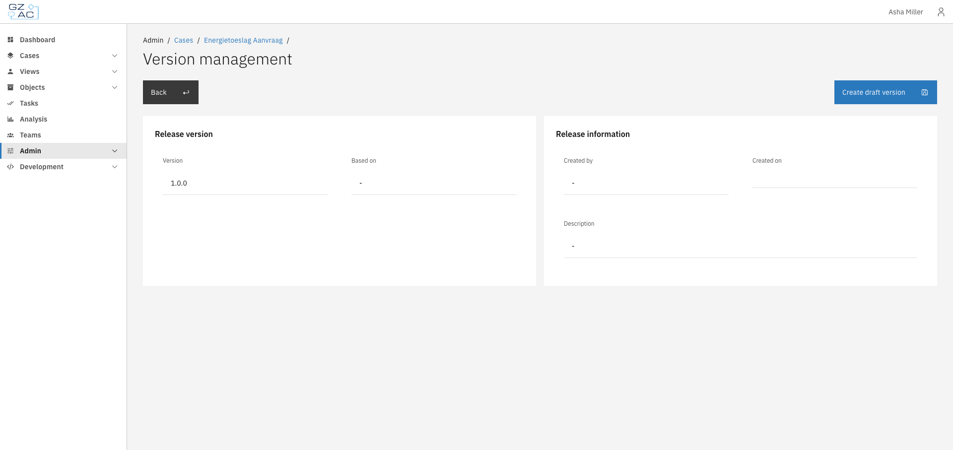
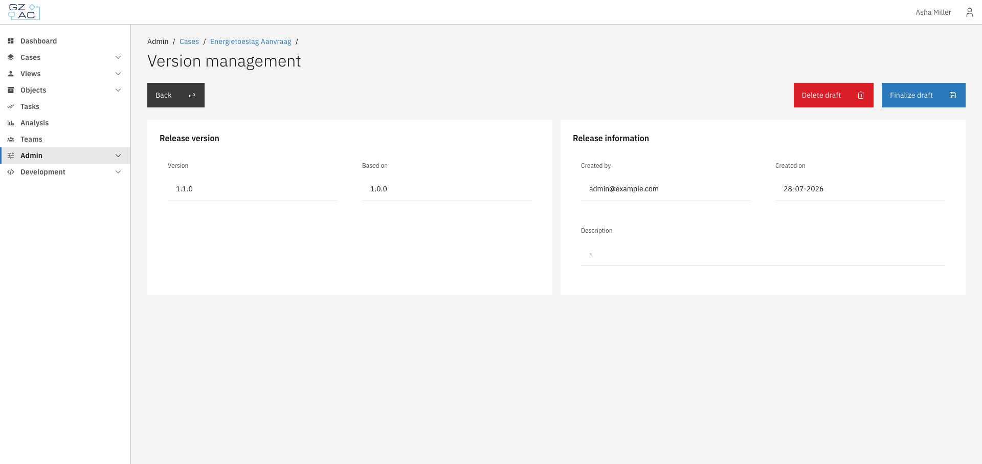
Click the **Version management** button to access version management options.The deployment page shows version information and provides actions depending on the version status:

<figure><img src="https://3330064618-files.gitbook.io/~/files/v0/b/gitbook-x-prod.appspot.com/o/spaces%2Fq5dx9HWFJGshztp4binE%2Fuploads%2Fgit-blob-6e2590d07747638beb4b523c919ee5a5654931cc%2F06-version-selector-dropdown.png?alt=media" alt=""><figcaption><p>Version selector dropdown</p></figcaption></figure>

#### For published versions

* **Create draft version** — Create a new draft version based on this published version

<figure><img src="https://3330064618-files.gitbook.io/~/files/v0/b/gitbook-x-prod.appspot.com/o/spaces%2Fq5dx9HWFJGshztp4binE%2Fuploads%2Fgit-blob-8accff520d6f6845d314cacffd4f581530051925%2F10-deployment-published.png?alt=media" alt=""><figcaption><p>Published version deployment</p></figcaption></figure>

#### For draft versions

* **Finalize draft** — Publish the draft version (makes it available for new cases)
* **Delete draft** — Remove the draft version

<figure><img src="https://3330064618-files.gitbook.io/~/files/v0/b/gitbook-x-prod.appspot.com/o/spaces%2Fq5dx9HWFJGshztp4binE%2Fuploads%2Fgit-blob-648d935a141a561b7f56493f786e3f8db1ecd78e%2F08-deployment-draft.png?alt=media" alt=""><figcaption><p>Draft version deployment</p></figcaption></figure>

### Viewing all versions

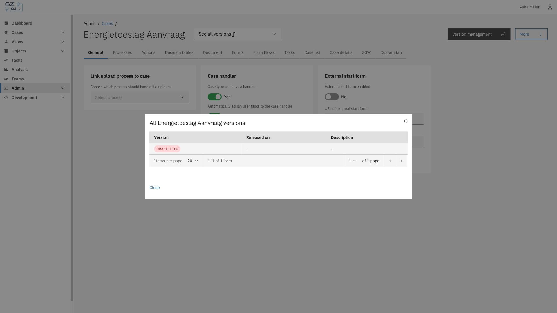
Click **Show all versions** in the version selector to see a complete list of all versions for the case definition. This opens a modal with a paginated table showing all versions and their status (draft or published).

<figure><img src="https://3330064618-files.gitbook.io/~/files/v0/b/gitbook-x-prod.appspot.com/o/spaces%2Fq5dx9HWFJGshztp4binE%2Fuploads%2Fgit-blob-5cc523e6766a504b6c3494b0203e1dfc7015f2d7%2F13-show-all-versions-modal.png?alt=media" alt=""><figcaption><p>Show all versions modal</p></figcaption></figure>

{% hint style="info" %}
Most configuration changes are version-specific. When you modify a setting, it applies to the selected version only.
{% endhint %}

### Creating a draft version

To create a new draft version from a published version:

{% stepper %}
{% step %}
Navigate to the deployment page of a published version
{% endstep %}

{% step %}
Click **Create draft version**
{% endstep %}

{% step %}
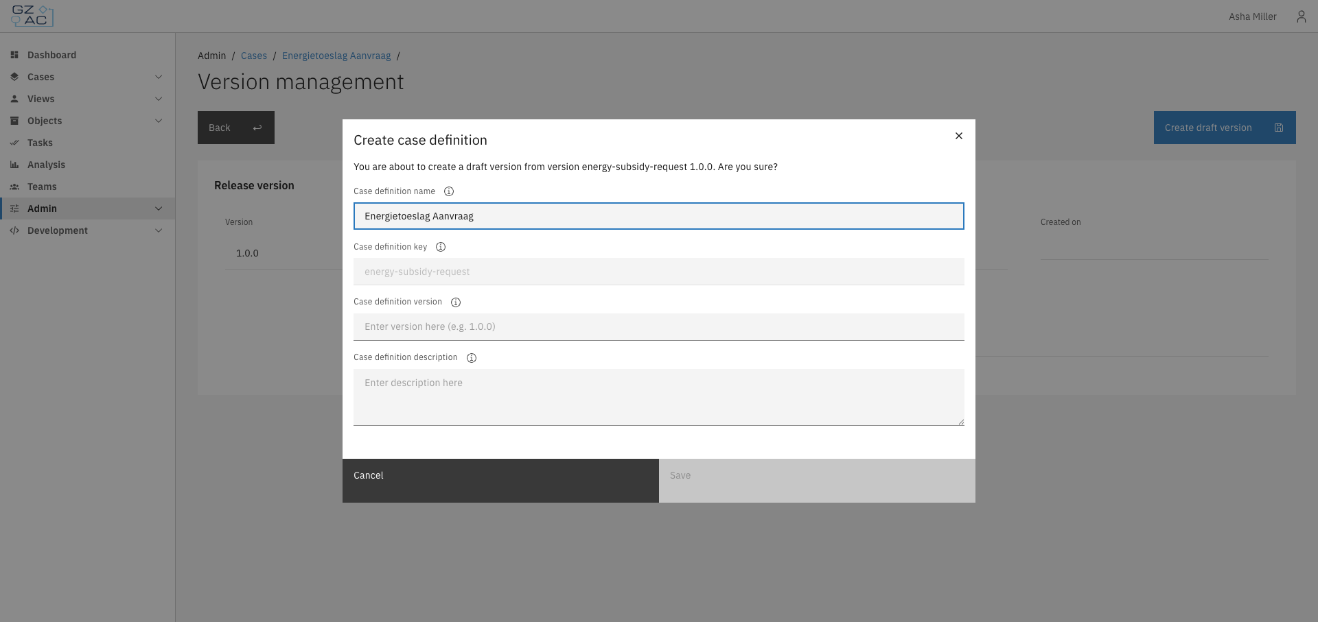
Fill in the new version details:

<figure><img src="https://3330064618-files.gitbook.io/~/files/v0/b/gitbook-x-prod.appspot.com/o/spaces%2Fq5dx9HWFJGshztp4binE%2Fuploads%2Fgit-blob-f9f8016e796d5582ccc1f0d27a2f317bdc879d50%2F11-create-draft-modal.png?alt=media" alt=""><figcaption><p>Create draft version modal</p></figcaption></figure>

* **Name** — Display name for the case definition
* **Key** — Unique identifier (cannot be changed)
* **Version** — New version number (e.g., `1.1.0`)
* **Description** — Optional description of what this version changes
  {% endstep %}

{% step %}
Click **Save** to create the draft
{% endstep %}
{% endstepper %}

The new draft version opens in edit mode, ready for configuration changes.

### Finalizing a draft version

To publish a draft version:

{% stepper %}
{% step %}
Navigate to the deployment page of the draft version
{% endstep %}

{% step %}
Click **Finalize draft**
{% endstep %}

{% step %}
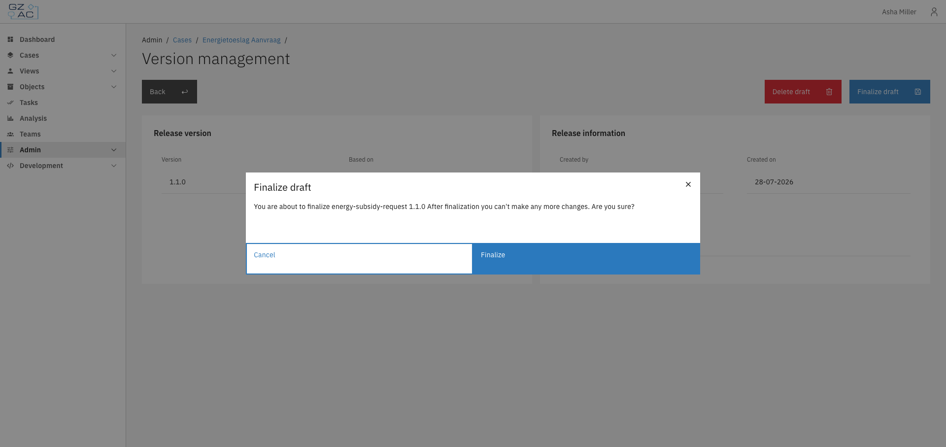
Review the confirmation message

<figure><img src="https://3330064618-files.gitbook.io/~/files/v0/b/gitbook-x-prod.appspot.com/o/spaces%2Fq5dx9HWFJGshztp4binE%2Fuploads%2Fgit-blob-96f26cbd33039084921252d34a0a91b149618923%2F09-finalize-confirmation.png?alt=media" alt=""><figcaption><p>Finalize confirmation modal</p></figcaption></figure>
{% endstep %}

{% step %}
Click **Finalize** to publish
{% endstep %}
{% endstepper %}

{% hint style="warning" %}
After finalization, the version becomes read-only. Create a new draft to make further changes.
{% endhint %}

### Deleting a draft version

To delete a draft version:

{% stepper %}
{% step %}
Navigate to the deployment page of the draft version
{% endstep %}

{% step %}
Click **Delete draft**
{% endstep %}

{% step %}
Confirm the deletion in the modal
{% endstep %}
{% endstepper %}

{% hint style="warning" %}
Deleting a draft cannot be undone. All configuration changes in the draft will be lost.
{% endhint %}

### Setting the globally active version

The globally active version determines which version is used when creating new cases. To change it:

{% stepper %}
{% step %}
Select the version you want to activate
{% endstep %}

{% step %}
Click the **More** menu
{% endstep %}

{% step %}
Select **Set as active version**

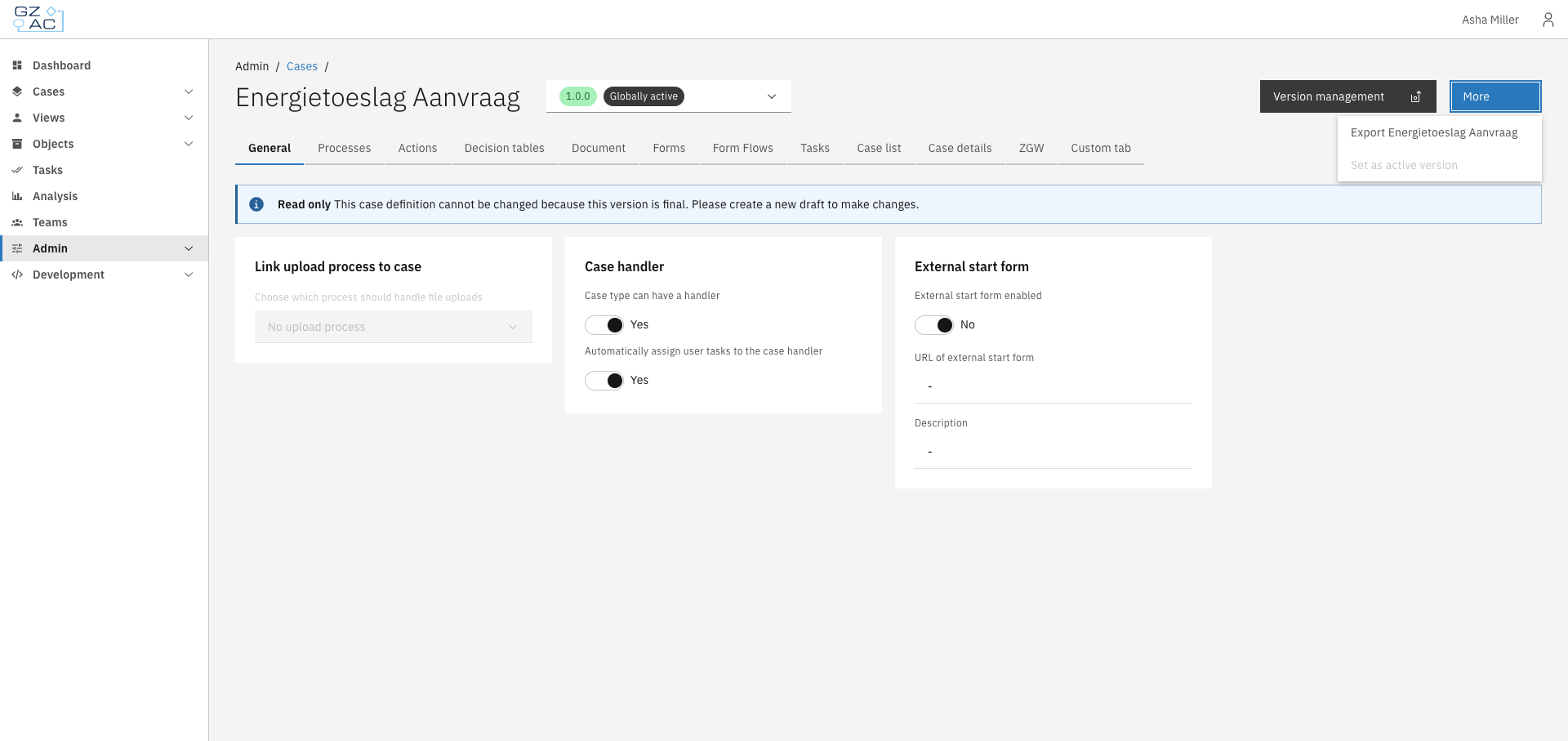
<figure><img src="https://3330064618-files.gitbook.io/~/files/v0/b/gitbook-x-prod.appspot.com/o/spaces%2Fq5dx9HWFJGshztp4binE%2Fuploads%2Fgit-blob-c04d57020117e649ea0a124406d53780da0d1f1f%2F12-more-menu.png?alt=media" alt=""><figcaption><p>More menu with Set as active version option</p></figcaption></figure>
{% endstep %}

{% step %}
Confirm the change in the modal
{% endstep %}
{% endstepper %}

{% hint style="warning" %}
Setting an older version as globally active may affect new case creation if the older version lacks features or fields present in newer versions.
{% endhint %}

***

## Access control

Case access is controlled through the access control system. See [Access control](/configuration-guides/access-control) for details on configuring permissions.

| Resource type                                        | Action      | Description                    |
| ---------------------------------------------------- | ----------- | ------------------------------ |
| `com.ritense.case_.domain.definition.CaseDefinition` | `view`      | View a case definition         |
|                                                      | `view_list` | View case definitions in lists |


# General

The General tab configures case-level settings that affect how the case behaves across the application. These settings include case handler assignment, external start forms, and document upload handling.

***

## Configuring general settings

{% stepper %}
{% step %}
Expand **Admin** in the left sidebar
{% endstep %}

{% step %}
Click **Cases** under the Configuration section
{% endstep %}

{% step %}
Click a case definition to open it
{% endstep %}

{% step %}
Click the **General** tab

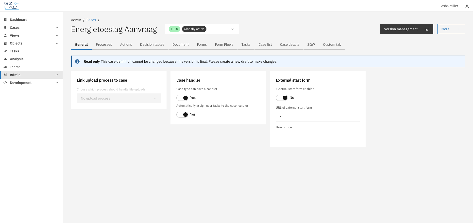
<figure><img src="https://3330064618-files.gitbook.io/~/files/v0/b/gitbook-x-prod.appspot.com/o/spaces%2Fq5dx9HWFJGshztp4binE%2Fuploads%2Fgit-blob-d1d94e2a0692e1367b0565df8ccd1957aedcfb3e%2F01-general-tab-overview.png?alt=media" alt=""><figcaption><p>General tab overview</p></figcaption></figure>
{% endstep %}
{% endstepper %}

{% hint style="info" %}
Settings on this tab can only be modified in draft versions. Published versions are read-only.
{% endhint %}

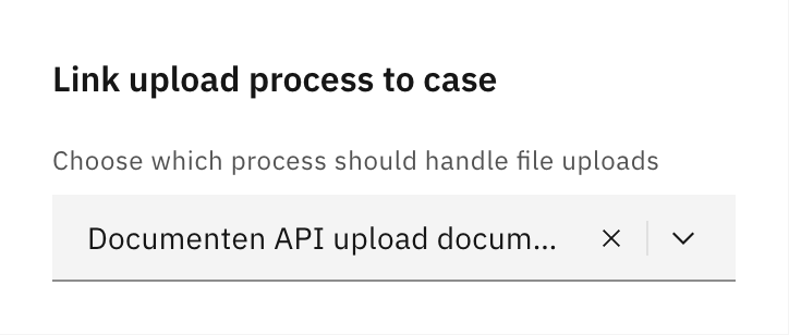
### Link upload process to case

Select which process should handle file uploads for this case type. When users upload documents to a case, the selected process is started to handle the upload.

<figure><img src="https://3330064618-files.gitbook.io/~/files/v0/b/gitbook-x-prod.appspot.com/o/spaces%2Fq5dx9HWFJGshztp4binE%2Fuploads%2Fgit-blob-1f21fc2dec4ca02c715f0255342300b0bc01a07d%2F06-upload-process.png?alt=media" alt=""><figcaption><p>Upload process configuration</p></figcaption></figure>

| Property | Description                                                             |
| -------- | ----------------------------------------------------------------------- |
| Process  | The BPMN process to start when files are uploaded to cases of this type |

Leave empty if document uploads should not trigger a process.

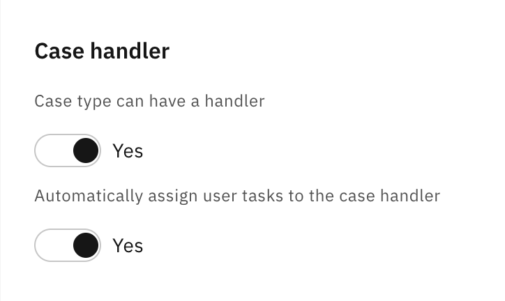
### Case handler

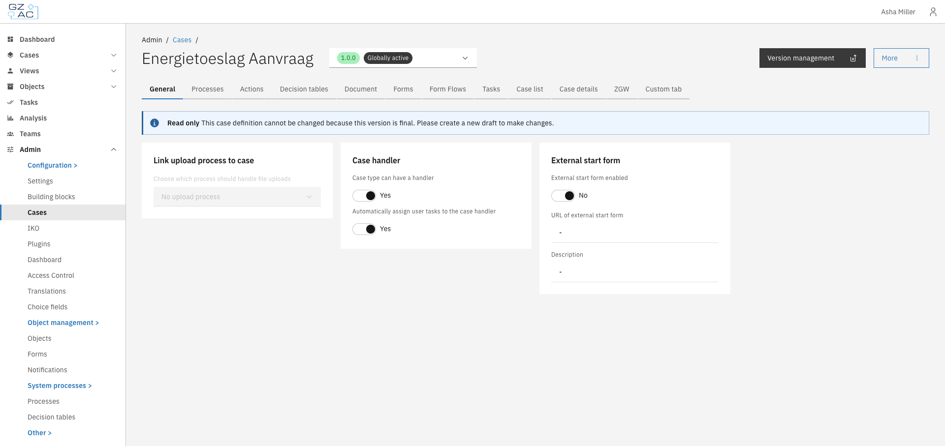
Configure whether cases of this type can be assigned to a handler (case worker) and whether tasks should automatically be assigned to the case handler.

<figure><img src="https://3330064618-files.gitbook.io/~/files/v0/b/gitbook-x-prod.appspot.com/o/spaces%2Fq5dx9HWFJGshztp4binE%2Fuploads%2Fgit-blob-44ee2cc5904b7a11564fc2715a1511560c49f873%2F02-case-handler.png?alt=media" alt=""><figcaption><p>Case handler settings</p></figcaption></figure>

| Property                                            | Description                                                                                                                                         |
| --------------------------------------------------- | --------------------------------------------------------------------------------------------------------------------------------------------------- |
| Case type can have a handler                        | When enabled, cases can be assigned to users. This enables the assignment UI in the case detail view.                                               |
| Automatically assign user tasks to the case handler | When enabled, new user tasks are automatically assigned to the current case handler. Only available when "Case type can have a handler" is enabled. |

### External start form

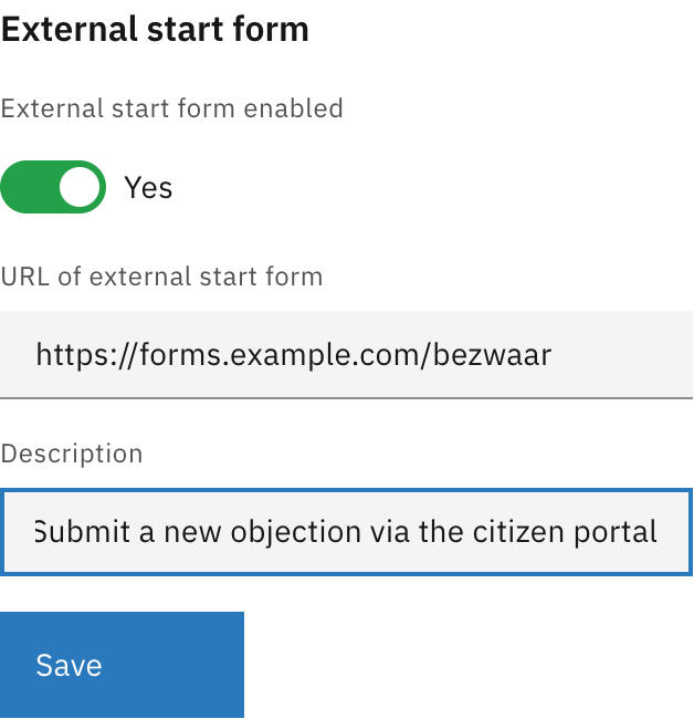
Configure an external form URL that users can access to start new cases. This is useful when case creation happens through an external portal or citizen-facing form application.

<figure><img src="https://3330064618-files.gitbook.io/~/files/v0/b/gitbook-x-prod.appspot.com/o/spaces%2Fq5dx9HWFJGshztp4binE%2Fuploads%2Fgit-blob-4053c01f70451f686ed900b744580aefe80dec26%2F05-external-start-form-filled.png?alt=media" alt=""><figcaption><p>External start form settings</p></figcaption></figure>

| Property                    | Description                                                                                                                                                                                              |
| --------------------------- | -------------------------------------------------------------------------------------------------------------------------------------------------------------------------------------------------------- |
| External start form enabled | Toggle to enable or disable the external form link                                                                                                                                                       |
| URL of external start form  | The full URL where users can access the form (e.g., `https://forms.example.com/request`)                                                                                                                 |
| Description                 | Label shown in the "Start new case" modal as a clickable tile. When users have multiple ways to start a case (external form + linked processes), this text helps them identify the external form option. |

When enabled, click **Save** to apply changes.

### Missing plugin configurations

When importing a case definition from another environment, plugin configurations referenced in process links may not exist in the target environment. When this occurs, a notification appears at the top of the General tab allowing you to map the missing configurations to existing ones.

For each missing plugin configuration:

1. Select an existing plugin configuration from the dropdown
2. Click **Save** to apply the mapping

This resolves the "Needs configuration" status shown in the case list.


# Processes

The Processes tab manages BPMN process definitions linked to the case definition.

Processes define the workflows that drive a case. Each case definition can have multiple linked processes that handle different aspects of case processing.

## Configuring processes

{% stepper %}
{% step %}
Expand **Admin** in the left sidebar
{% endstep %}

{% step %}
Click **Cases** under the Configuration section
{% endstep %}

{% step %}
Click a case definition to open it
{% endstep %}

{% step %}
Click the **Processes** tab

<figure><img src="https://3330064618-files.gitbook.io/~/files/v0/b/gitbook-x-prod.appspot.com/o/spaces%2Fq5dx9HWFJGshztp4binE%2Fuploads%2Fgit-blob-1ed097d5a0de2a613519e2149db78f8ee33af0cf%2F01-processes-tab-overview.png?alt=media" alt=""><figcaption><p>Processes tab overview</p></figcaption></figure>
{% endstep %}
{% endstepper %}

### Creating a new process

{% stepper %}
{% step %}
Click **Create process**
{% endstep %}

{% step %}
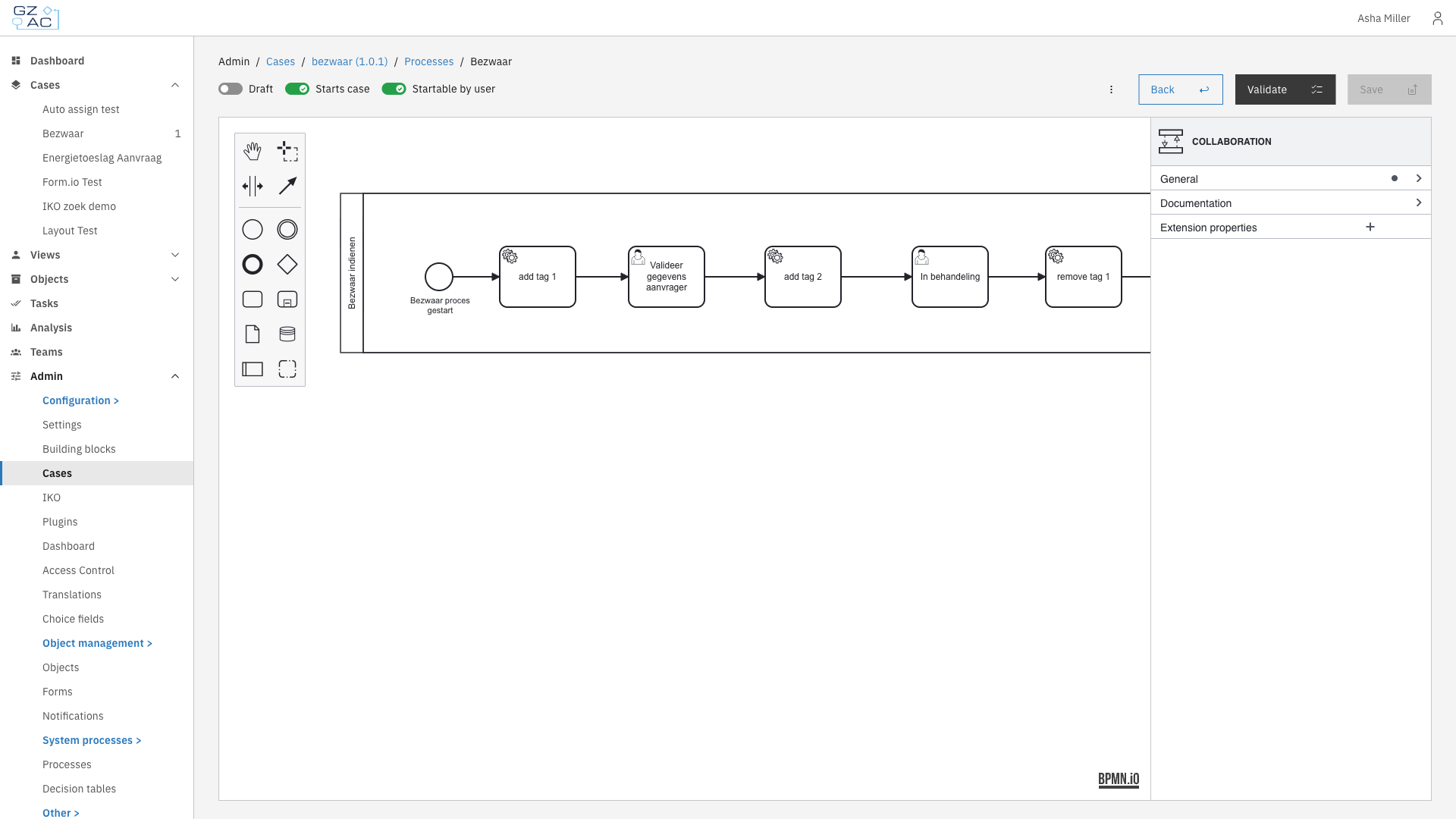
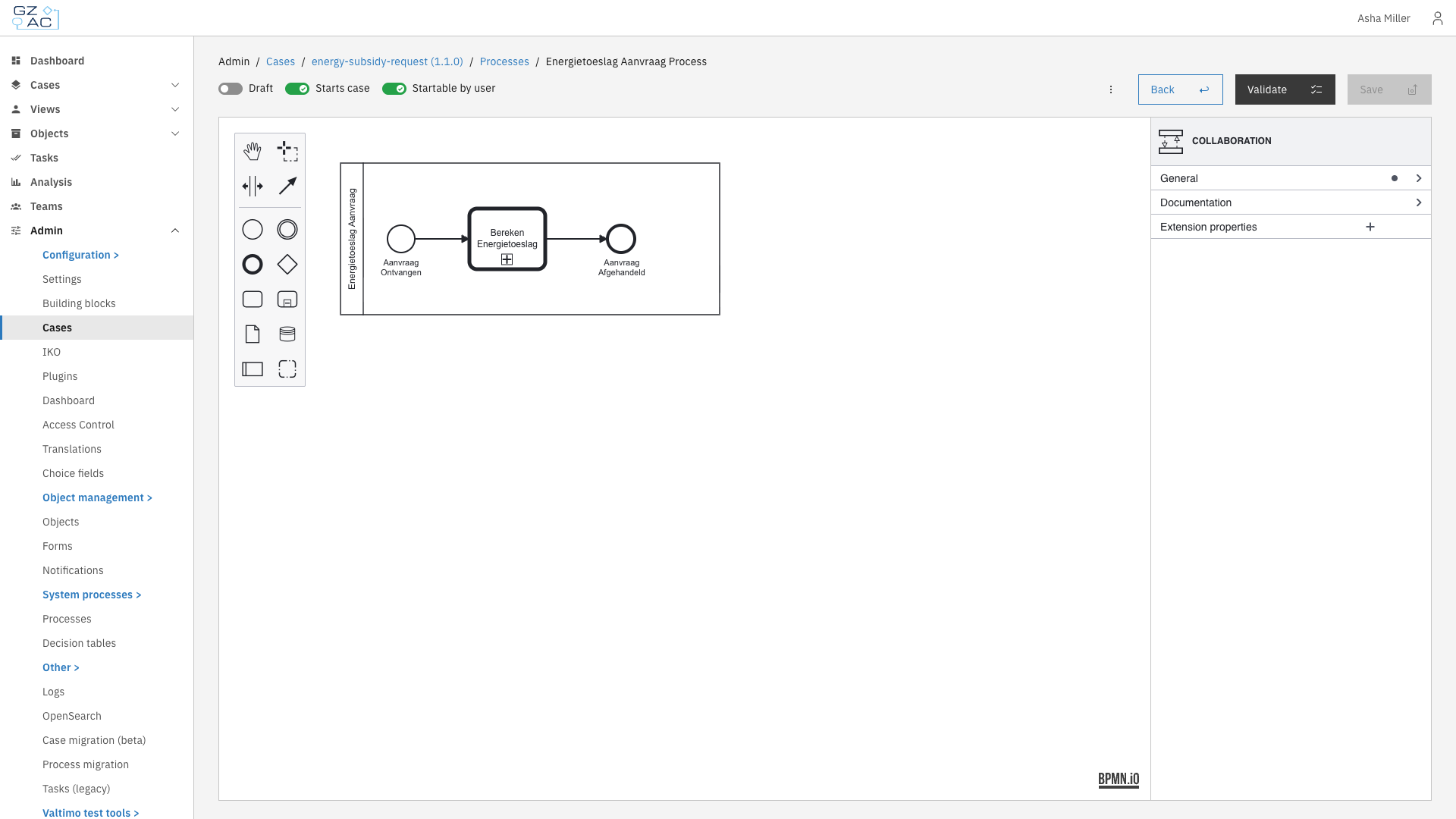
Design your process using the BPMN modeler

<figure><img src="https://3330064618-files.gitbook.io/~/files/v0/b/gitbook-x-prod.appspot.com/o/spaces%2Fq5dx9HWFJGshztp4binE%2Fuploads%2Fgit-blob-09d1964029f4fdd52d36ac1a8f7aebf431ff539b%2F03-process-builder.png?alt=media" alt=""><figcaption><p>Process builder</p></figcaption></figure>
{% endstep %}

{% step %}
Configure process settings using the toggles in the header
{% endstep %}

{% step %}
Click **Save** to deploy
{% endstep %}
{% endstepper %}

### Uploading a process

{% stepper %}
{% step %}
Click the upload button in the toolbar
{% endstep %}

{% step %}
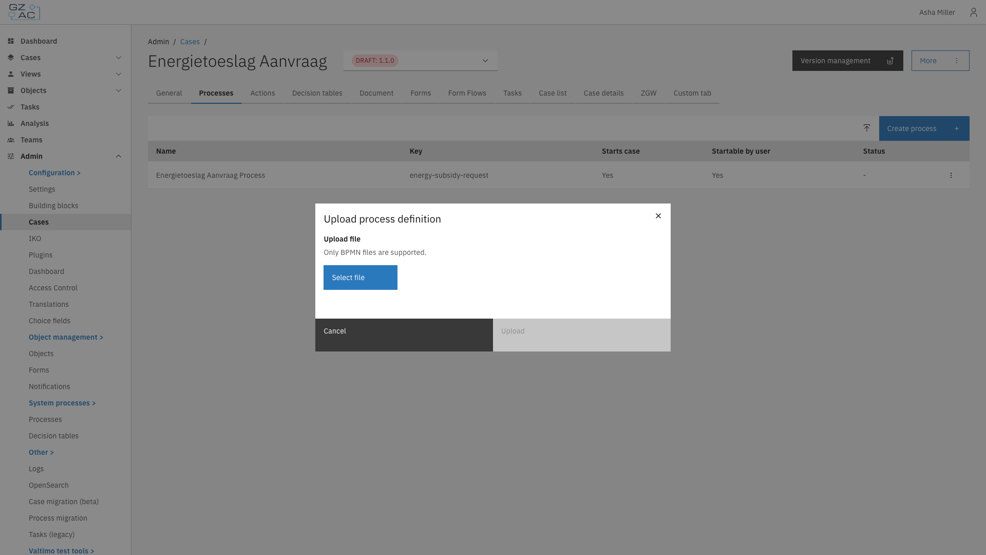
Select a `.bpmn` file from your computer

<figure><img src="https://3330064618-files.gitbook.io/~/files/v0/b/gitbook-x-prod.appspot.com/o/spaces%2Fq5dx9HWFJGshztp4binE%2Fuploads%2Fgit-blob-2424078c6a13a369f8ee207bb4da488708ac913c%2F02-upload-modal.png?alt=media" alt=""><figcaption><p>Upload process modal</p></figcaption></figure>
{% endstep %}

{% step %}
Click **Upload**
{% endstep %}
{% endstepper %}

{% hint style="info" %}
If you upload a process with a key that already exists, the existing process will be replaced.
{% endhint %}

### Editing a process

{% stepper %}
{% step %}
Click on a process row to open the process builder
{% endstep %}

{% step %}
Make changes in the BPMN modeler
{% endstep %}

{% step %}
Click **Save** to deploy changes
{% endstep %}
{% endstepper %}

### Deleting a process

{% stepper %}
{% step %}
Hover over the process row to reveal the overflow menu
{% endstep %}

{% step %}
Click the overflow menu (three dots)
{% endstep %}

{% step %}
Select **Delete**
{% endstep %}

{% step %}
Confirm deletion in the confirmation dialog
{% endstep %}
{% endstepper %}

## Process settings

The process builder header contains toggles to configure process behavior:

| Toggle                | Description                                                                                                     |
| --------------------- | --------------------------------------------------------------------------------------------------------------- |
| **Draft**             | When enabled, the process is saved as a draft and requires additional confirmation before it can be started     |
| **Starts case**       | When enabled, starting this process creates a new case instance. A start form must be linked to the first step. |
| **Startable by user** | When enabled, users can start this process from the case detail page via the start menu                         |

## Process validation

Click **Validate** to check for errors before saving. Validation errors appear in a collapsible panel showing the element and issue. Fix any errors before deploying.

***

## Access control

Runtime access to processes is controlled through the following permissions.

### Resources and actions

| Resource type                                           | Action   | Effect                                              |
| ------------------------------------------------------- | -------- | --------------------------------------------------- |
| `com.ritense.document.domain.impl.JsonSchemaDocument`   | `view`   | Required to view process instances linked to a case |
| `com.ritense.valtimo.operaton.domain.OperatonExecution` | `create` | Required to start a process                         |

### Examples

<details>

<summary>Permission to view process instances for cases</summary>

```json
{
    "resourceType": "com.ritense.document.domain.impl.JsonSchemaDocument",
    "action": "view",
    "conditions": []
}
```

</details>

<details>

<summary>Permission to start any process</summary>

```json
{
    "resourceType": "com.ritense.valtimo.operaton.domain.OperatonExecution",
    "action": "create",
    "conditions": []
}
```

</details>

<details>

<summary>Permission to start a specific process</summary>

```json
{
    "resourceType": "com.ritense.valtimo.operaton.domain.OperatonExecution",
    "action": "create",
    "conditions": [
        {
            "type": "field",
            "field": "processDefinitionKey",
            "operator": "==",
            "value": "my-process-key"
        }
    ]
}
```

</details>


# Actions

The Actions tab lets you configure startable items — processes and building blocks that end users can trigger directly from a case. These actions appear under the start button when viewing an existing case.

Actions provide a way for users to initiate additional workflows from within an existing case. This is useful for:

* Starting follow-up processes related to the current case
* Triggering reusable building blocks that perform common operations
* Providing users with context-specific actions without requiring them to navigate elsewhere

There are two types of actions:

| Type               | Description                                                                                                                                                     |
| ------------------ | --------------------------------------------------------------------------------------------------------------------------------------------------------------- |
| **Process**        | A BPMN process definition linked to the case. Starting this action runs the process in the context of the current case.                                         |
| **Building block** | A reusable building block that can be configured with input/output mappings. See [Building blocks](/configuration-guides/building-blocks) for more information. |

***

## Configuring actions

{% stepper %}
{% step %}
Expand **Admin** in the left sidebar
{% endstep %}

{% step %}
Click **Cases** under the Configuration section
{% endstep %}

{% step %}
Click a case definition to open it
{% endstep %}

{% step %}
Click the **Actions** tab

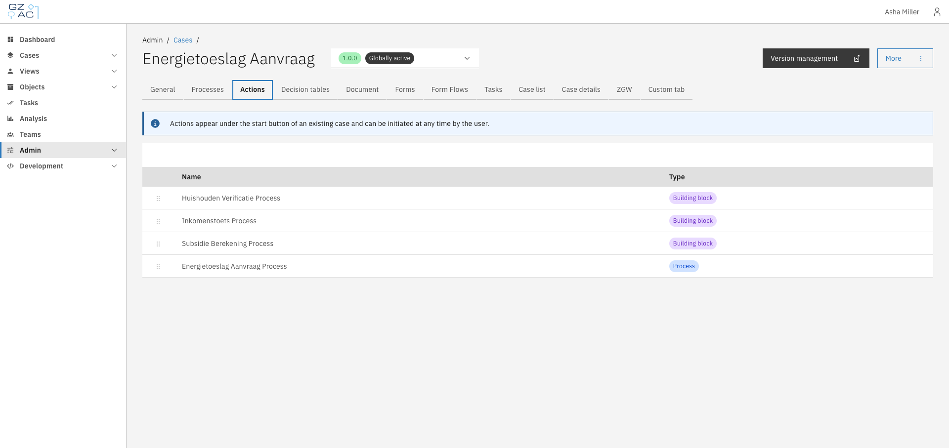
<figure><img src="https://3330064618-files.gitbook.io/~/files/v0/b/gitbook-x-prod.appspot.com/o/spaces%2Fq5dx9HWFJGshztp4binE%2Fuploads%2Fgit-blob-08e1cfa14a065aa5ec7b3b74b56ed033034bf27b%2F01-actions-tab-overview.png?alt=media" alt="Actions tab showing a list of configured actions"><figcaption></figcaption></figure>
{% endstep %}
{% endstepper %}

The list shows all configured actions with their names and types.

### Adding an action

{% stepper %}
{% step %}
Click **Create an action**
{% endstep %}

{% step %}
Select the action type: **Process** or **Building block**

<figure><img src="https://3330064618-files.gitbook.io/~/files/v0/b/gitbook-x-prod.appspot.com/o/spaces%2Fq5dx9HWFJGshztp4binE%2Fuploads%2Fgit-blob-53851783d9f304db2bc7524596b431d34b3e7626%2F02-add-action-modal-type-selection.png?alt=media" alt="Action type selection modal"><figcaption></figcaption></figure>
{% endstep %}

{% step %}
Select the specific process or building block from the dropdown

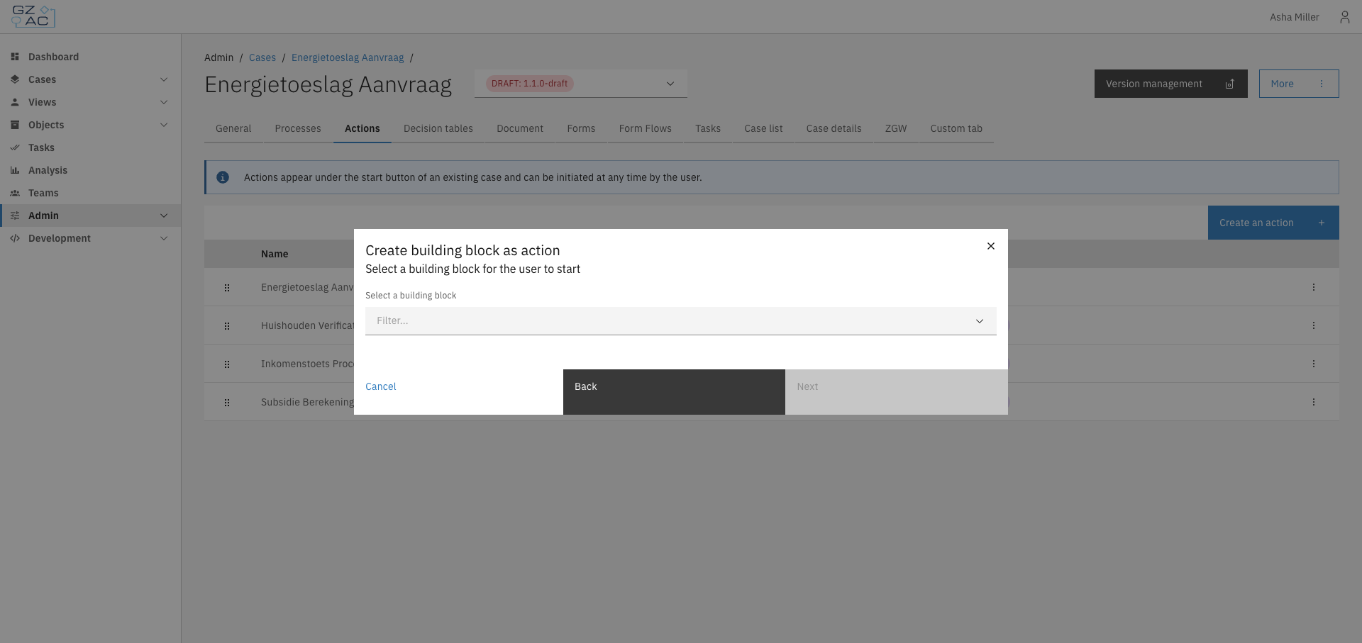
<figure><img src="https://3330064618-files.gitbook.io/~/files/v0/b/gitbook-x-prod.appspot.com/o/spaces%2Fq5dx9HWFJGshztp4binE%2Fuploads%2Fgit-blob-f4a9f23e9ecd5257fa3fc3be85eba63fc6d80f71%2F03-add-building-block-selection.png?alt=media" alt="Building block selection dropdown"><figcaption></figcaption></figure>
{% endstep %}

{% step %}
For building blocks, click **Next** to configure input/output mappings if needed
{% endstep %}

{% step %}
Click **Add** to save the action
{% endstep %}
{% endstepper %}

{% hint style="info" %}
Each process or building block can only be added once per case. Items already configured as actions will not appear in the selection dropdown.
{% endhint %}

### Reordering actions

Actions can be reordered by dragging and dropping rows in the list. The order determines how actions appear to end users in the case view.

### Editing an action

{% stepper %}
{% step %}
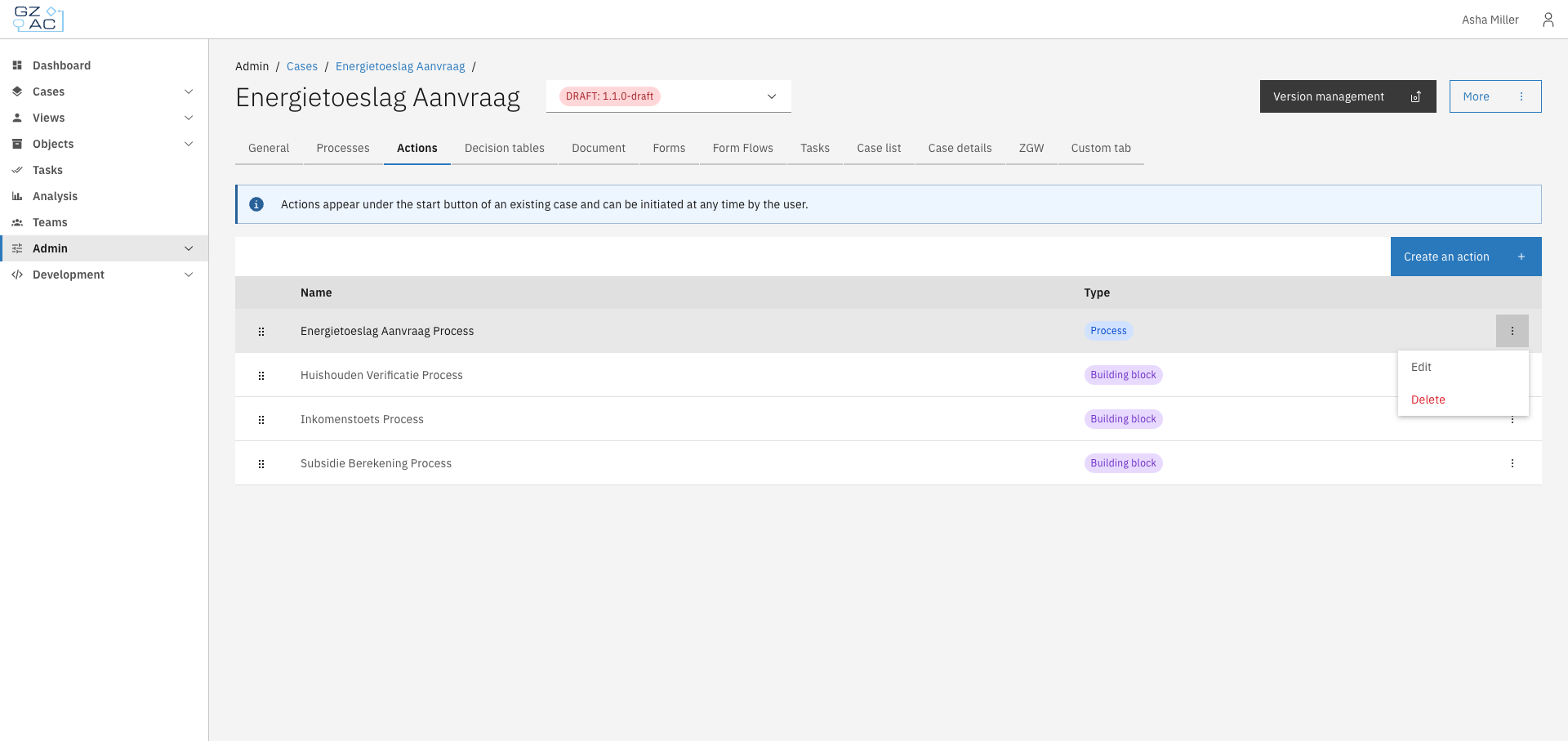
Click a row or use the overflow menu (⋮) on the right side of the row
{% endstep %}

{% step %}
Select **Edit**

<figure><img src="https://3330064618-files.gitbook.io/~/files/v0/b/gitbook-x-prod.appspot.com/o/spaces%2Fq5dx9HWFJGshztp4binE%2Fuploads%2Fgit-blob-967f928628ce971a435a4167f64ddd9970050497%2F04-row-actions-menu.png?alt=media" alt="Row actions menu showing Edit and Delete options"><figcaption></figcaption></figure>
{% endstep %}

{% step %}
For processes, change which process is linked; for building blocks, update the input/output mappings
{% endstep %}

{% step %}
Save your changes
{% endstep %}
{% endstepper %}

### Deleting an action

{% stepper %}
{% step %}
Click the overflow menu (⋮) on the row you want to delete
{% endstep %}

{% step %}
Select **Delete**
{% endstep %}

{% step %}
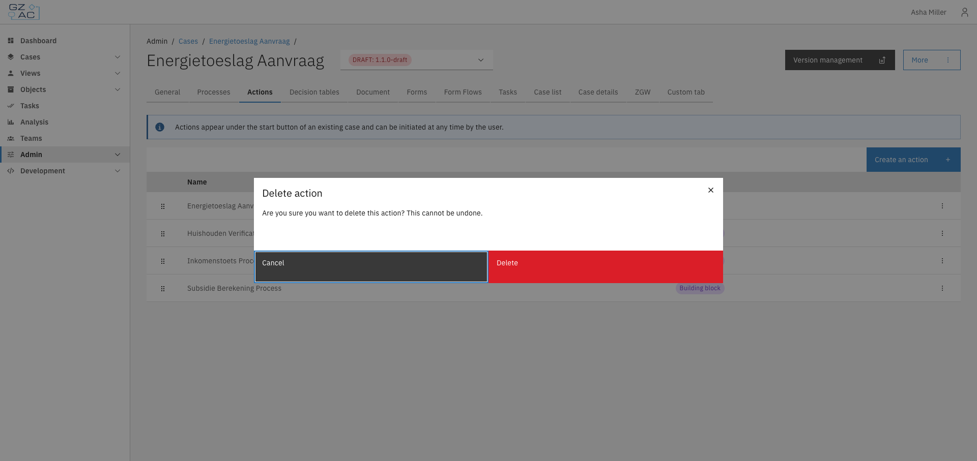
Confirm the deletion in the confirmation dialog

<figure><img src="https://3330064618-files.gitbook.io/~/files/v0/b/gitbook-x-prod.appspot.com/o/spaces%2Fq5dx9HWFJGshztp4binE%2Fuploads%2Fgit-blob-d6ce9f651fc8d611c166490c942e4ac683e8fb26%2F05-delete-confirmation-modal.png?alt=media" alt="Delete confirmation dialog"><figcaption></figcaption></figure>
{% endstep %}
{% endstepper %}

***

## Access control

Actions are filtered based on the user's permissions. An action only appears to users who have permission to execute it.

### Resources and actions

| Resource type                                           | Action   | Effect                                                                                                                                                             |
| ------------------------------------------------------- | -------- | ------------------------------------------------------------------------------------------------------------------------------------------------------------------ |
| `com.ritense.valtimo.operaton.domain.OperatonExecution` | `create` | Required to start the process associated with the action. This applies to both process actions and building block actions (which have an underlying main process). |

When an action is triggered from within a case, the permission check includes the current document as context. This allows permissions to be scoped based on the specific case instance using [context conditions](/configuration-guides/access-control/context-conditions).

### Examples

<details>

<summary>Permission to start any process action</summary>

```json
{
    "resourceType": "com.ritense.valtimo.operaton.domain.OperatonExecution",
    "action": "create",
    "conditions": []
}
```

</details>

<details>

<summary>Permission to start a specific process</summary>

```json
{
    "resourceType": "com.ritense.valtimo.operaton.domain.OperatonExecution",
    "action": "create",
    "conditions": [
        {
            "type": "field",
            "field": "processDefinitionKey",
            "operator": "==",
            "value": "my-follow-up-process"
        }
    ]
}
```

</details>


# Decision tables

The Decision tables tab lets you manage DMN decision tables for automated business decisions within the case definition.

A decision table encodes business rules as a structured table: given one or more input values (process variables), the table evaluates the matching rule and returns an output. Decision tables follow the [DMN (Decision Model and Notation)](https://www.omg.org/dmn/) standard and are executed automatically as part of a process.

Use decision tables to separate business logic from process flow — for example, to determine eligibility, calculate a fee, or classify a request based on its attributes.

***

## Configuring decision tables

{% stepper %}
{% step %}
Expand **Admin** in the left sidebar
{% endstep %}

{% step %}
Click **Cases** under the Configuration section
{% endstep %}

{% step %}
Click a case definition to open it
{% endstep %}

{% step %}
Click the **Decision tables** tab

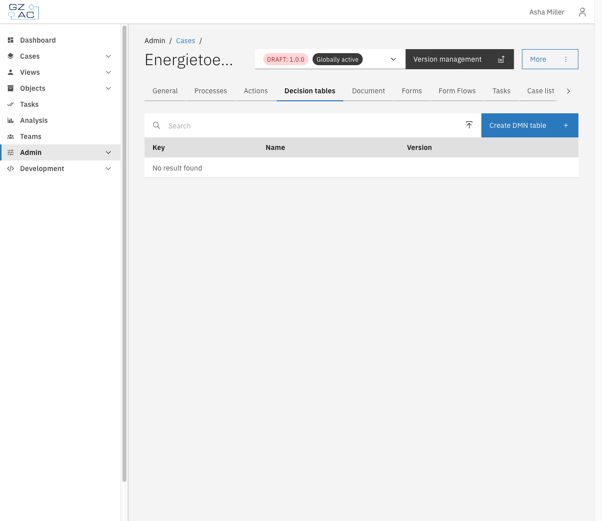
<figure><img src="https://3330064618-files.gitbook.io/~/files/v0/b/gitbook-x-prod.appspot.com/o/spaces%2Fq5dx9HWFJGshztp4binE%2Fuploads%2Fgit-blob-7d3bf9c7d63a6b9b8d5faed0f01880ae1e10f67c%2F02-decision-tables-empty.png?alt=media" alt=""><figcaption><p>Decision tables tab empty state</p></figcaption></figure>
{% endstep %}
{% endstepper %}

### Creating a new decision table

{% stepper %}
{% step %}
Click **Create DMN table** in the toolbar
{% endstep %}

{% step %}
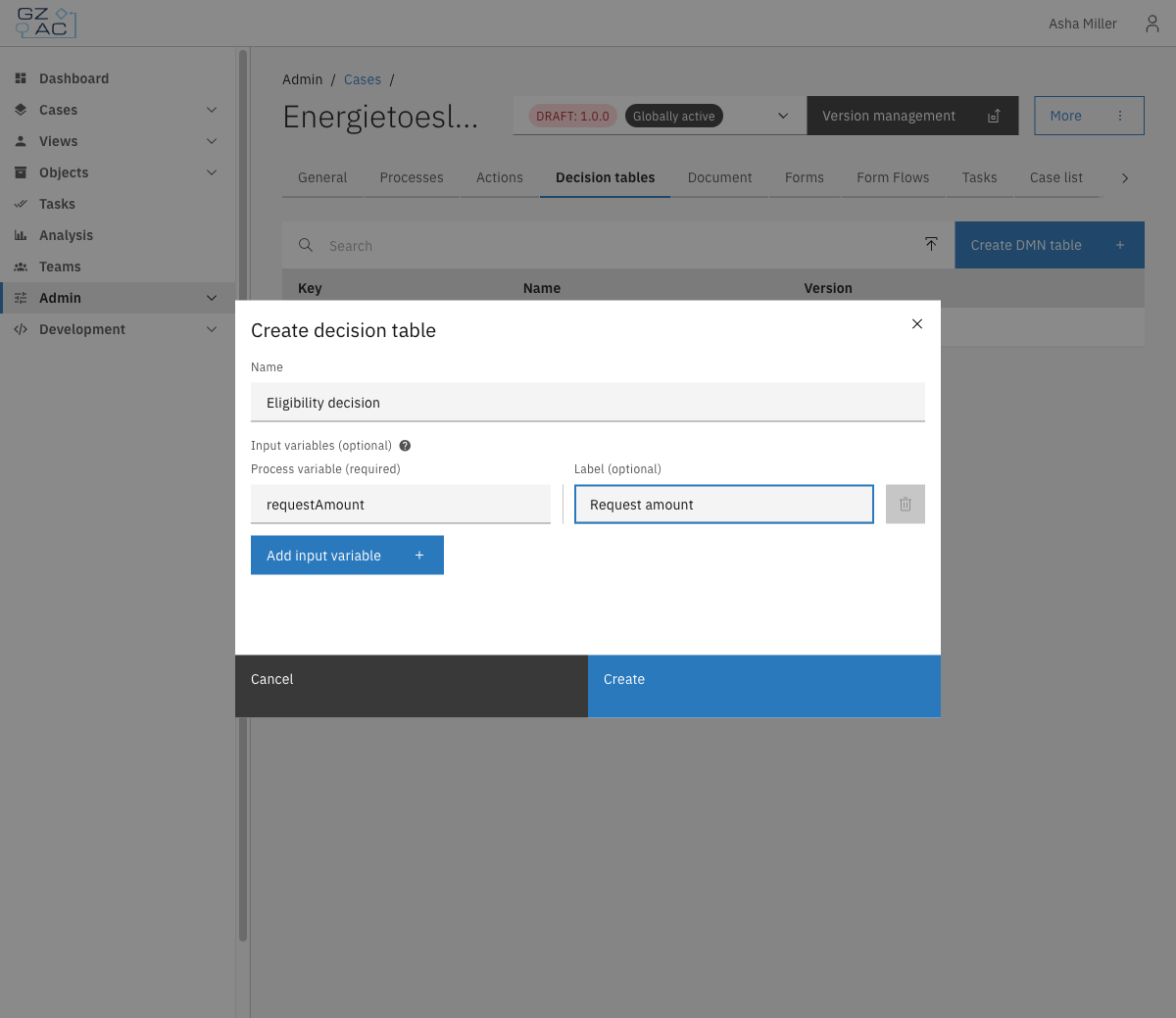
Fill in the form:

* **Name** — Display name for the decision table (e.g. *Eligibility decision*)
* **Input variables (optional)** — Add one row per process variable that will be used as input in the table. For each row, enter:
  * **Process variable** (required) — The variable name from the process (e.g. `requestAmount`)
  * **Label** (optional) — A human-readable column header shown in the DMN editor

| Property         | Description                                                                 |
| ---------------- | --------------------------------------------------------------------------- |
| Name             | Display name for the decision table                                         |
| Process variable | Name of the process variable used as an input column (e.g. `requestAmount`) |
| Label            | Human-readable column header shown in the DMN editor (optional)             |

<figure><img src="https://3330064618-files.gitbook.io/~/files/v0/b/gitbook-x-prod.appspot.com/o/spaces%2Fq5dx9HWFJGshztp4binE%2Fuploads%2Fgit-blob-17378b831e32b8a78e5207fb2a6c9f3ceb8febd8%2F05-create-modal-filled.png?alt=media" alt=""><figcaption><p>Create decision table modal</p></figcaption></figure>
{% endstep %}

{% step %}
Click **Create**

The DMN modeler opens. Design the decision logic in the editor and click **Save** to deploy the table.
{% endstep %}
{% endstepper %}

### Uploading an existing DMN file

{% stepper %}
{% step %}
Click the upload icon in the toolbar (next to the search field)
{% endstep %}

{% step %}
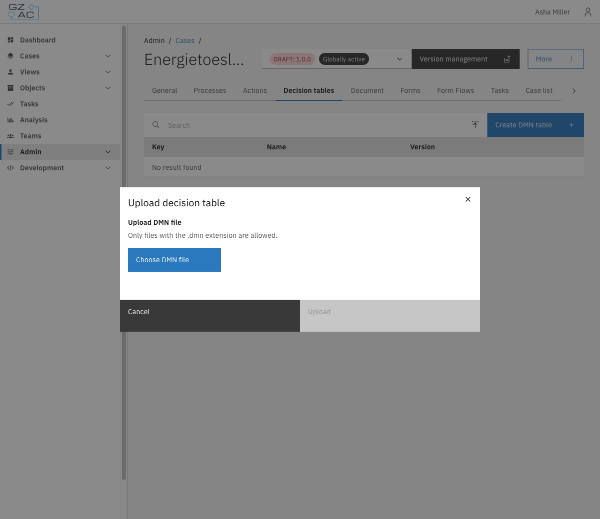
Click **Choose DMN file** and select a `.dmn` file from your system

<figure><img src="https://3330064618-files.gitbook.io/~/files/v0/b/gitbook-x-prod.appspot.com/o/spaces%2Fq5dx9HWFJGshztp4binE%2Fuploads%2Fgit-blob-3d7757b0b2770c4aa34343a756c6f62b486ef5f5%2F03-upload-modal.png?alt=media" alt=""><figcaption><p>Upload decision table modal</p></figcaption></figure>
{% endstep %}

{% step %}
Click **Upload**

The file is deployed immediately and appears in the list.
{% endstep %}
{% endstepper %}

### Decision tables list

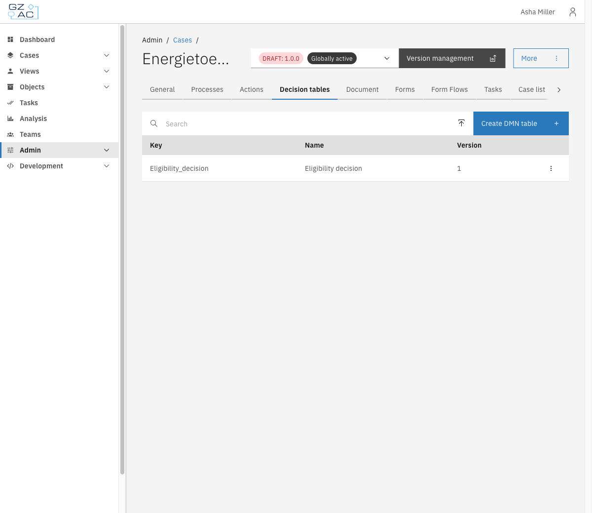
After adding one or more decision tables, the list shows each table's **Key**, **Name**, and **Version**.

<figure><img src="https://3330064618-files.gitbook.io/~/files/v0/b/gitbook-x-prod.appspot.com/o/spaces%2Fq5dx9HWFJGshztp4binE%2Fuploads%2Fgit-blob-c6973dfb53015543c6fcf9f7a5533f1ace3c62c3%2F06-decision-tables-list.png?alt=media" alt=""><figcaption><p>Decision tables list</p></figcaption></figure>

### Editing a decision table

To edit a decision table's properties:

{% stepper %}
{% step %}
Open the overflow menu (⋮) on the row
{% endstep %}

{% step %}
Click **Edit**

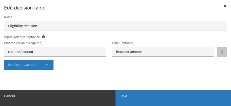
<figure><img src="https://3330064618-files.gitbook.io/~/files/v0/b/gitbook-x-prod.appspot.com/o/spaces%2Fq5dx9HWFJGshztp4binE%2Fuploads%2Fgit-blob-37236a6a67ed178a9d92cbe11cac7c74a8499669%2F09-edit-modal.png?alt=media" alt=""><figcaption><p>Edit decision table modal</p></figcaption></figure>
{% endstep %}

{% step %}
Modify the decision table properties:

* **Name** — Update the display name
* **Input variables** — Add, remove, or modify input columns
  {% endstep %}

{% step %}
Click **Save**
{% endstep %}
{% endstepper %}

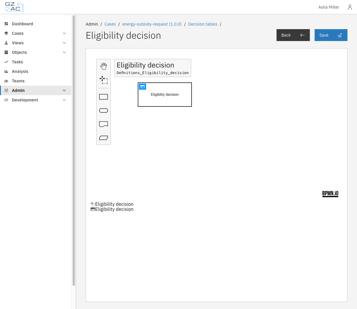
To edit the decision logic itself, click directly on the row to open the DMN modeler.

<figure><img src="https://3330064618-files.gitbook.io/~/files/v0/b/gitbook-x-prod.appspot.com/o/spaces%2Fq5dx9HWFJGshztp4binE%2Fuploads%2Fgit-blob-bc62c730606a5ae2de226c544e307d94686b6876%2F07-decision-modeler.png?alt=media" alt=""><figcaption><p>DMN modeler</p></figcaption></figure>

Modify the decision logic in the editor, then click **Save** to deploy the changes.

### Deleting a decision table

{% stepper %}
{% step %}
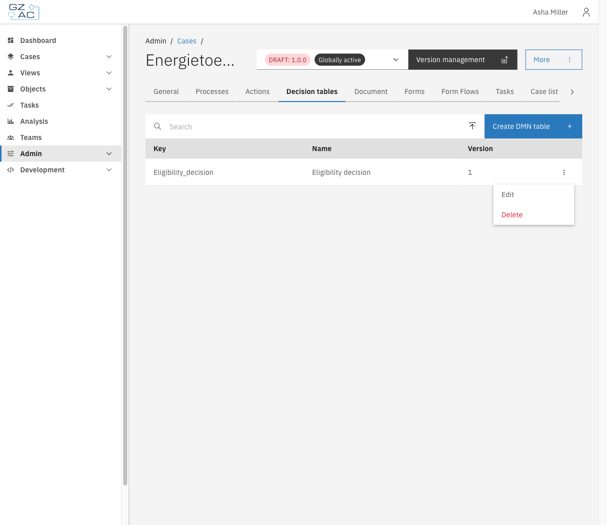
Open the overflow menu (⋮) on the row

<figure><img src="https://3330064618-files.gitbook.io/~/files/v0/b/gitbook-x-prod.appspot.com/o/spaces%2Fq5dx9HWFJGshztp4binE%2Fuploads%2Fgit-blob-c1913cc456b940939a036de4d37f761cead0856c%2F08-overflow-menu.png?alt=media" alt=""><figcaption><p>Row overflow menu</p></figcaption></figure>
{% endstep %}

{% step %}
Click **Delete**
{% endstep %}

{% step %}
Confirm the deletion in the modal
{% endstep %}
{% endstepper %}

{% hint style="warning" %}
Deleting a decision table cannot be undone. Any process that relies on it will stop functioning correctly.
{% endhint %}


# Document

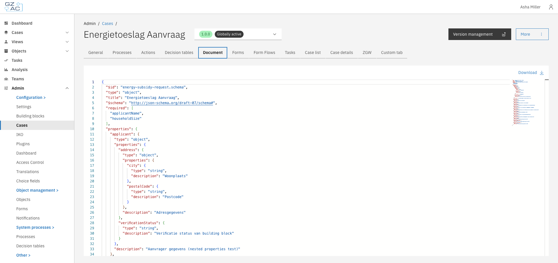
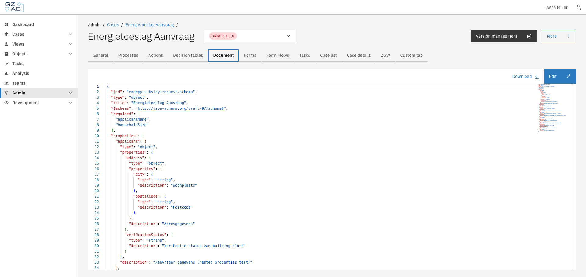
The Document tab displays and allows editing of the JSON schema that defines the case's data structure. This schema determines what data fields are available in the case and their types, validation rules, and descriptions.

Every case type in Valtimo has a document definition — a JSON Schema that describes the structure of data stored in each case instance. The Document tab provides a JSON editor to view and modify this schema directly.

The schema follows the [JSON Schema](https://json-schema.org/) specification (draft-07) and defines:

* **Properties** — The data fields available in the case (strings, numbers, objects, arrays)
* **Required fields** — Which properties must have values
* **Nested structures** — Objects within objects for organizing related data
* **Descriptions** — Human-readable explanations shown in forms and UI

***

## Configuring a document definition

{% stepper %}
{% step %}
Expand **Admin** in the left sidebar
{% endstep %}

{% step %}
Click **Cases** under the Configuration section
{% endstep %}

{% step %}
Click a case definition to open it
{% endstep %}

{% step %}
Click the **Document** tab

<figure><img src="https://3330064618-files.gitbook.io/~/files/v0/b/gitbook-x-prod.appspot.com/o/spaces%2Fq5dx9HWFJGshztp4binE%2Fuploads%2Fgit-blob-4bd4f3d621b72c76712f93e616a92d6852be3b1b%2F01-document-tab-overview.png?alt=media" alt="Document tab showing the JSON schema editor"><figcaption></figcaption></figure>
{% endstep %}
{% endstepper %}

{% hint style="info" %}
On final (published) versions, the schema is read-only. Only the **Download** button is available.
{% endhint %}

### Editing the schema

To edit the document definition, you must be viewing a draft version of the case.

<figure><img src="https://3330064618-files.gitbook.io/~/files/v0/b/gitbook-x-prod.appspot.com/o/spaces%2Fq5dx9HWFJGshztp4binE%2Fuploads%2Fgit-blob-e755f6955b5fa974f4cdaa8308c3e396f9f15414%2F02-document-tab-draft.png?alt=media" alt="Document tab on a draft version"><figcaption></figcaption></figure>

{% stepper %}
{% step %}
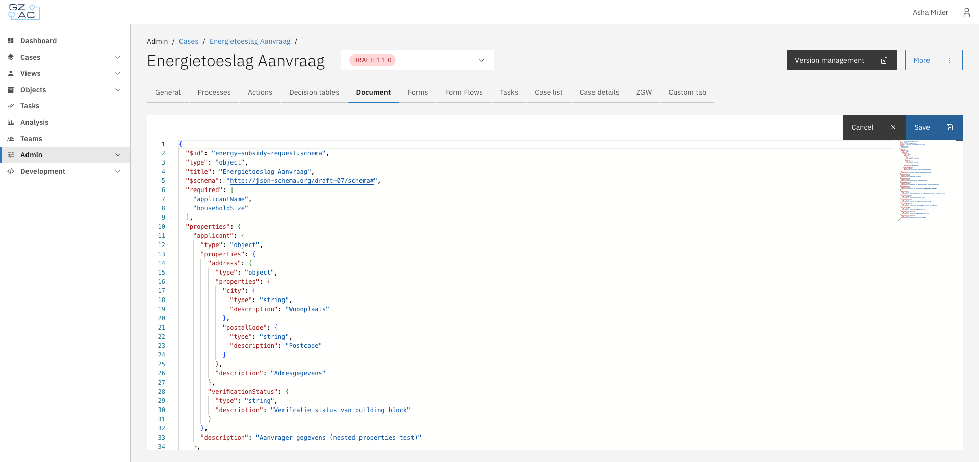
Click **Edit** to enter edit mode
{% endstep %}

{% step %}
Modify the JSON schema in the editor
{% endstep %}

{% step %}
Click **Save** to apply changes, or **Cancel** to discard

<figure><img src="https://3330064618-files.gitbook.io/~/files/v0/b/gitbook-x-prod.appspot.com/o/spaces%2Fq5dx9HWFJGshztp4binE%2Fuploads%2Fgit-blob-a3136d433b6cd0043189da9d01af3203bd790fa7%2F03-document-tab-edit-mode.png?alt=media" alt="Document tab in edit mode"><figcaption></figcaption></figure>
{% endstep %}
{% endstepper %}

{% hint style="warning" %}
Changes to the document definition affect how case data is stored and displayed. Ensure your schema is valid JSON Schema before saving. Invalid schemas may cause errors in forms and case views.
{% endhint %}

### Downloading the schema

Click **Download** to save the schema as a JSON file. The file is named `{case-key}-v{version}.json` (e.g., `energy-subsidy-request-v1.0.0.json`).

This is useful for:

* Backing up the schema before making changes
* Sharing definitions between environments
* Version control in external repositories

***

## Schema structure

A typical document definition includes:

```json
{
  "$id": "my-case.schema",
  "$schema": "http://json-schema.org/draft-07/schema#",
  "title": "My Case",
  "type": "object",
  "required": ["applicantName"],
  "properties": {
    "applicantName": {
      "type": "string",
      "description": "Name of the applicant"
    },
    "status": {
      "type": "string",
      "description": "Current case status"
    }
  }
}
```

| Field        | Description                                                         |
| ------------ | ------------------------------------------------------------------- |
| `$id`        | Unique identifier for the schema                                    |
| `$schema`    | JSON Schema version (use `http://json-schema.org/draft-07/schema#`) |
| `title`      | Display name for the case type                                      |
| `type`       | Always `object` for document definitions                            |
| `required`   | Array of property names that must have values                       |
| `properties` | Object containing field definitions                                 |


# Forms

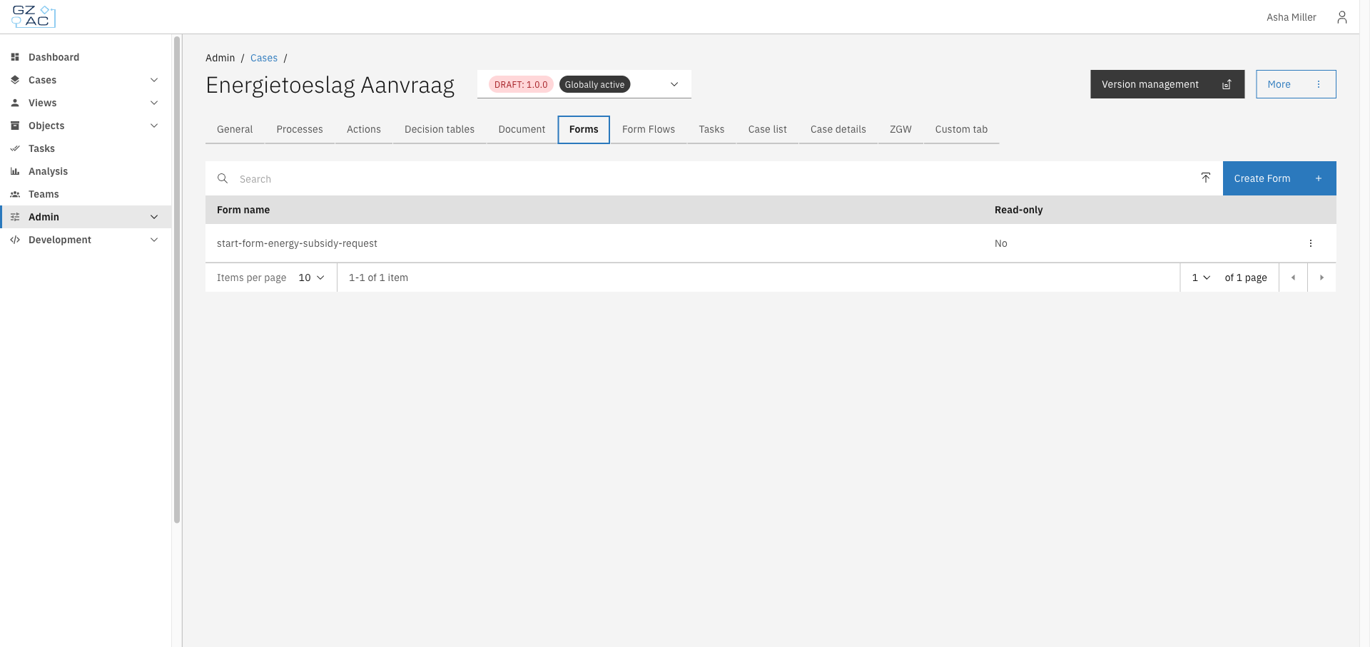
The Forms tab lets you manage the Form.io form definitions available for the case. These forms are used as start forms, user task forms, and other form-driven steps within the case's processes.

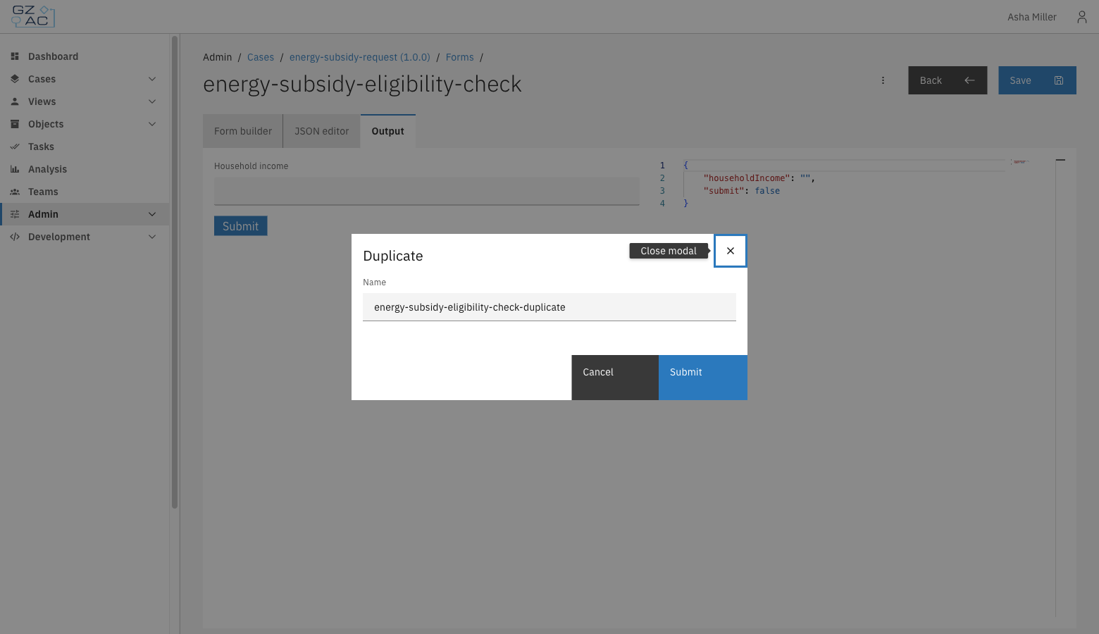
Each form definition is a [Form.io](https://form.io) form: a JSON structure describing input fields, layout, and validation, built with a drag-and-drop builder. Forms can be created from scratch, uploaded from a `.json` file, or duplicated from an existing form.

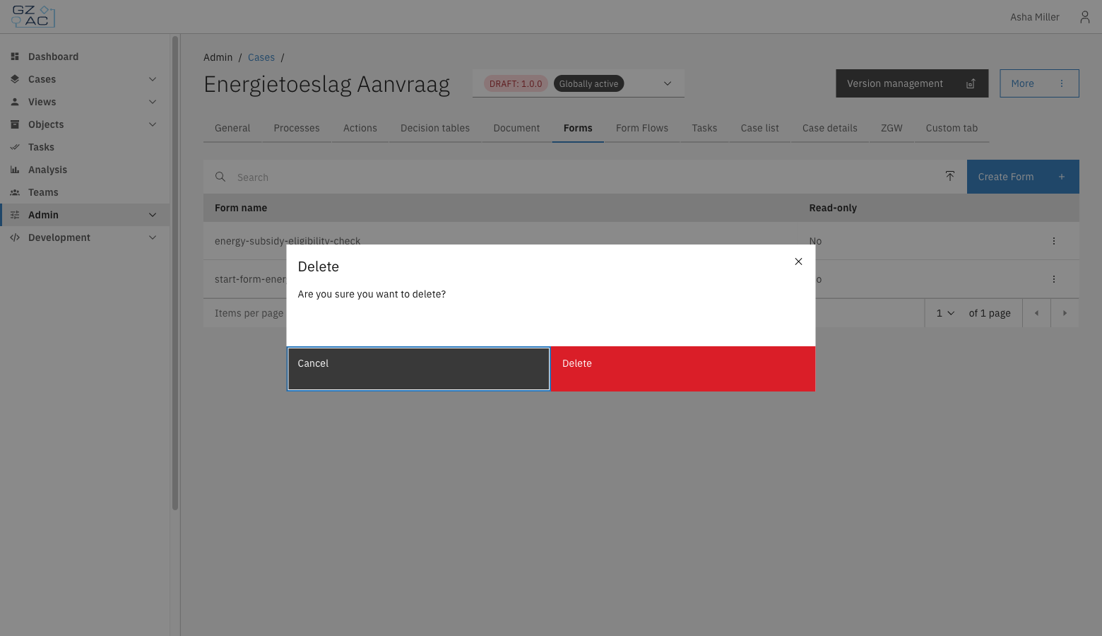
Some forms are marked **Read-only** — for example, forms that are deployed from the classpath as part of a case's default configuration. Read-only forms can be viewed and downloaded but not edited, uploaded to, or deleted.

***

## Configuring forms

{% stepper %}
{% step %}
Expand **Admin** in the left sidebar
{% endstep %}

{% step %}
Click **Cases** under the Configuration section
{% endstep %}

{% step %}
Click a case definition to open it
{% endstep %}

{% step %}
Click the **Forms** tab

<figure><img src="https://3330064618-files.gitbook.io/~/files/v0/b/gitbook-x-prod.appspot.com/o/spaces%2Fq5dx9HWFJGshztp4binE%2Fuploads%2Fgit-blob-06ef25bfb680779ebc761a102a9d64f9acb17a03%2F01-forms-tab-list.png?alt=media" alt="Forms tab showing the list of form definitions"><figcaption></figcaption></figure>
{% endstep %}
{% endstepper %}

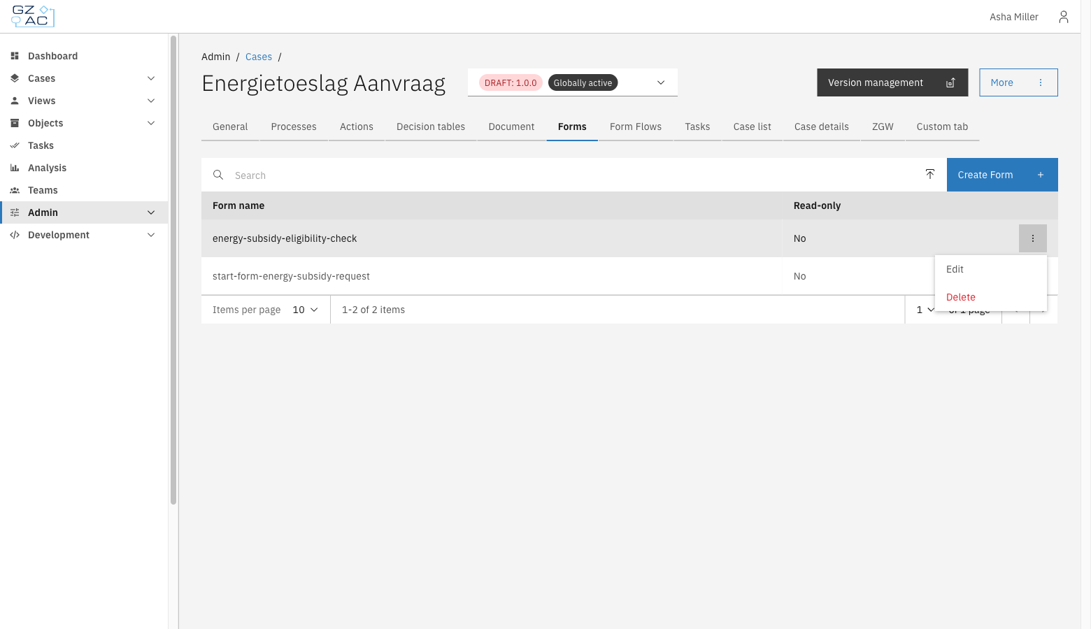
The list shows every form definition available to the case, with its **Form name** and whether it's **Read-only**. Use the search field to filter by name.

{% hint style="info" %}
Forms can only be created, uploaded, duplicated, or deleted on a draft case version. Published versions are read-only.
{% endhint %}

### Creating a form

{% stepper %}
{% step %}
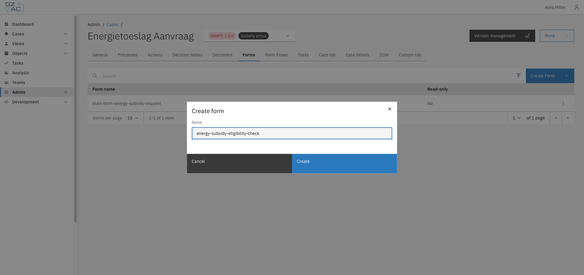
Click **Create Form**
{% endstep %}

{% step %}
Enter a **Name** for the form

<figure><img src="https://3330064618-files.gitbook.io/~/files/v0/b/gitbook-x-prod.appspot.com/o/spaces%2Fq5dx9HWFJGshztp4binE%2Fuploads%2Fgit-blob-fefd8504adeeee8f2b0449c9d484bd47c27a4beb%2F02-create-form-modal.png?alt=media" alt="Create form modal"><figcaption></figcaption></figure>
{% endstep %}

{% step %}
Click **Create**
{% endstep %}
{% endstepper %}

An empty form definition is created and opens directly in the form editor.

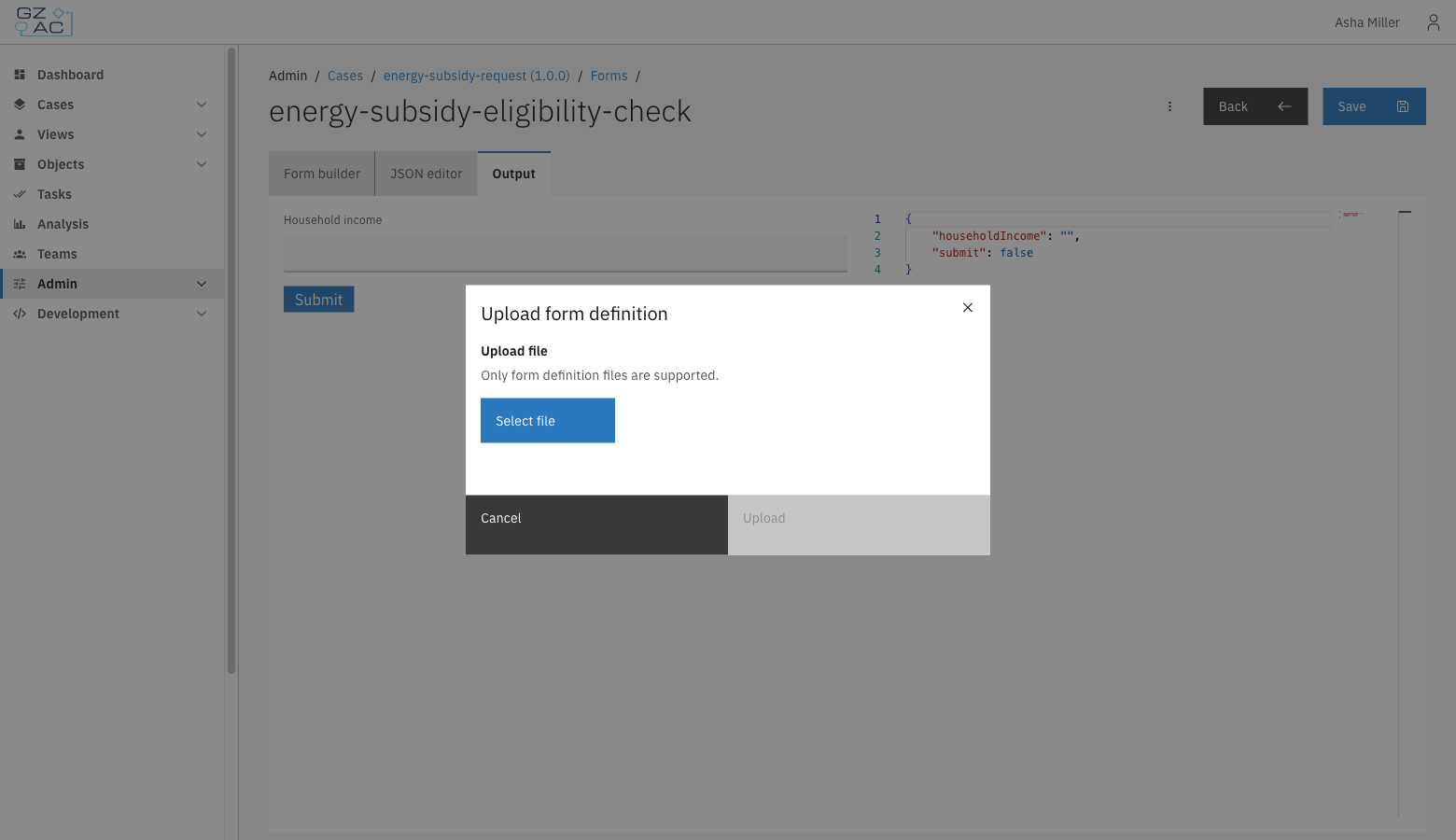
### Uploading a form

To upload an existing form definition from a `.json` file:

{% stepper %}
{% step %}
Click the upload icon in the toolbar, next to **Create Form**
{% endstep %}

{% step %}
Enter a **Name** for the form and click **Create**
{% endstep %}

{% step %}
Select the `.json` file to upload

<figure><img src="https://3330064618-files.gitbook.io/~/files/v0/b/gitbook-x-prod.appspot.com/o/spaces%2Fq5dx9HWFJGshztp4binE%2Fuploads%2Fgit-blob-d7acc1770df7987f549721f3e8ac0aee12f20226%2F07-upload-form-modal.png?alt=media" alt="Upload form definition modal"><figcaption></figcaption></figure>
{% endstep %}

{% step %}
Click **Upload**
{% endstep %}
{% endstepper %}

The uploaded file replaces the (empty) content of the newly created form.

{% hint style="info" %}
Only Form.io form definition files (`.json`) are supported.
{% endhint %}

### Editing a form

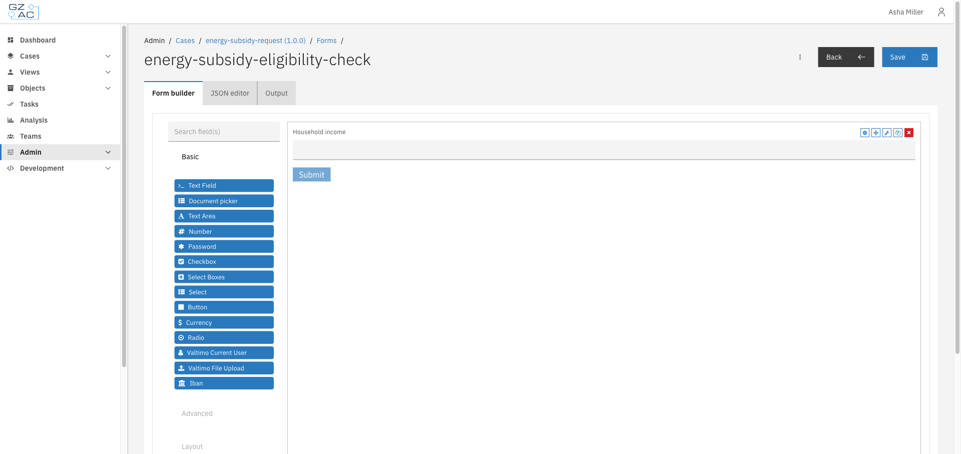
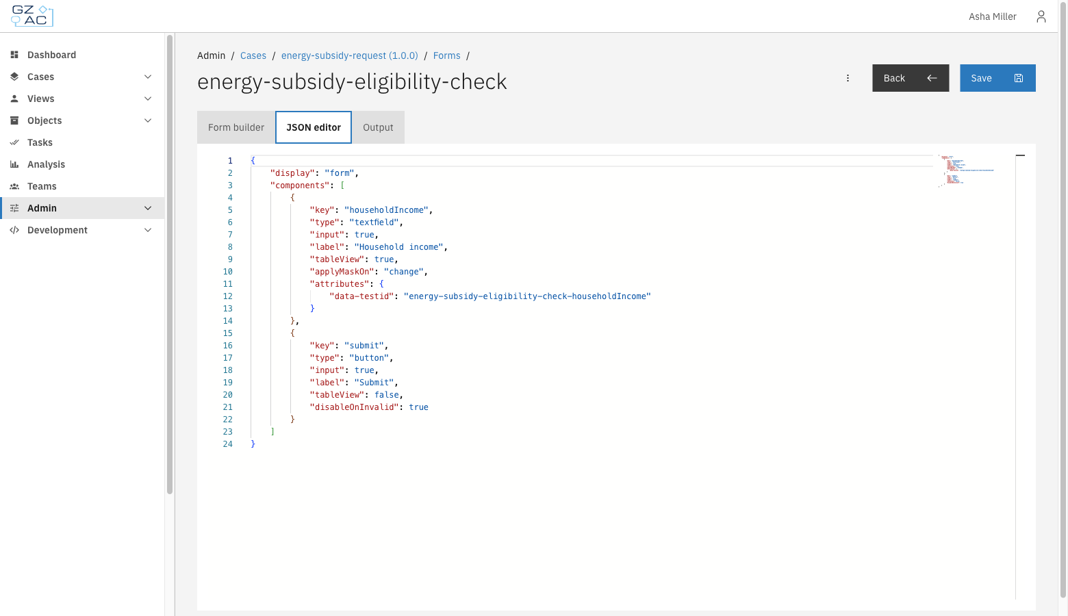
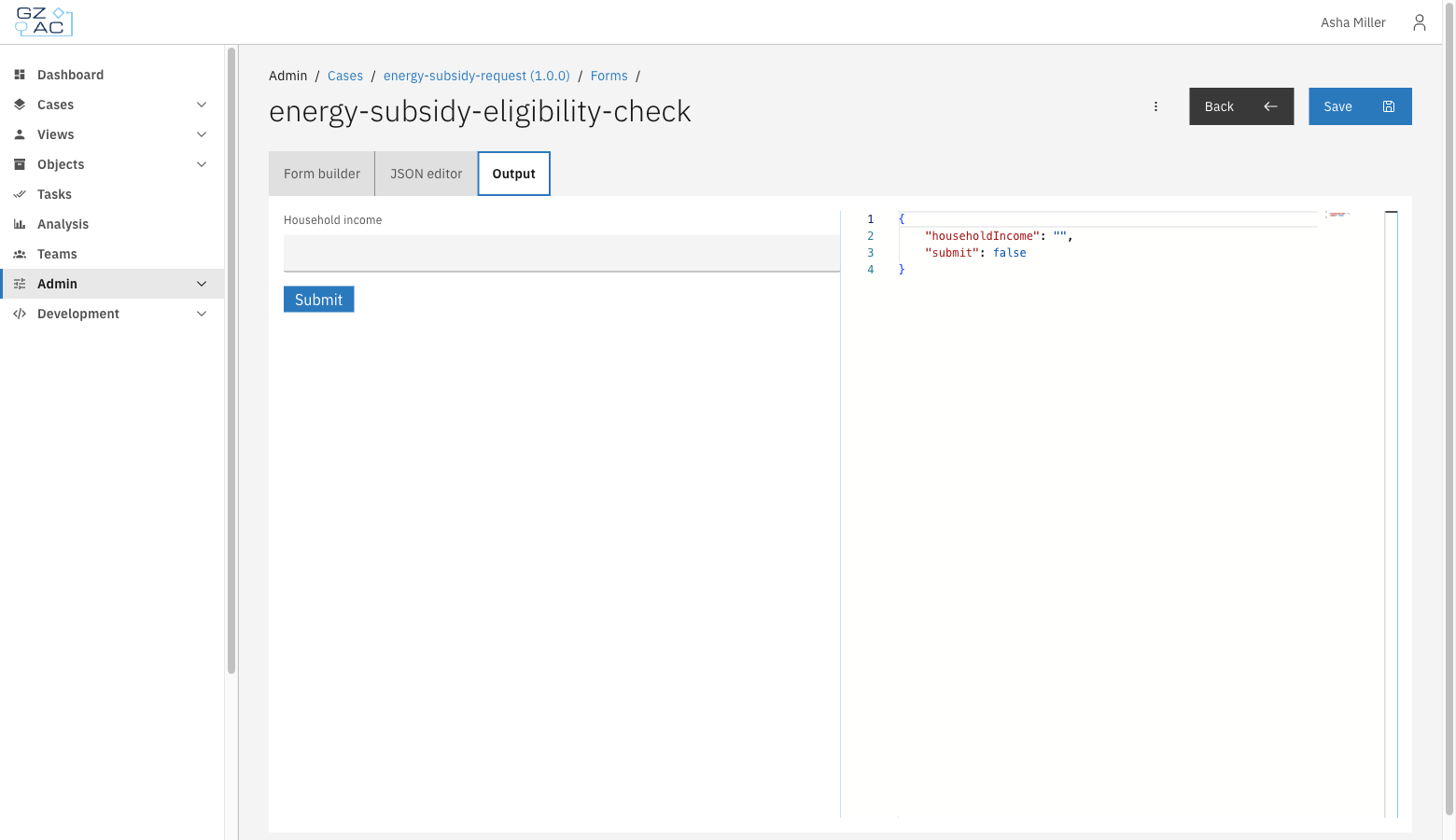
Click a row, or use **Edit** from the row's overflow menu (⋮), to open a form in the editor. The editor has three tabs:

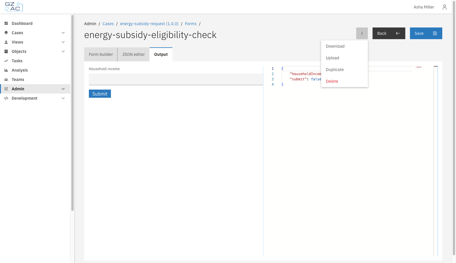
**Form builder** — drag components from the palette onto the canvas to compose the form.

<figure><img src="https://3330064618-files.gitbook.io/~/files/v0/b/gitbook-x-prod.appspot.com/o/spaces%2Fq5dx9HWFJGshztp4binE%2Fuploads%2Fgit-blob-bf8773aa315bc93d173a80acddac501862a39907%2F03-edit-form-builder-tab.png?alt=media" alt="Form builder tab with a field added to the canvas"><figcaption></figcaption></figure>

**JSON editor** — view and edit the raw Form.io JSON definition directly.

<figure><img src="https://3330064618-files.gitbook.io/~/files/v0/b/gitbook-x-prod.appspot.com/o/spaces%2Fq5dx9HWFJGshztp4binE%2Fuploads%2Fgit-blob-e036ddbe5585b63017df739b122dddf6f1e57042%2F04-edit-json-editor-tab.png?alt=media" alt="JSON editor tab showing the raw form definition"><figcaption></figcaption></figure>

**Output** — preview the rendered form and see the JSON output it would produce on submission.

<figure><img src="https://3330064618-files.gitbook.io/~/files/v0/b/gitbook-x-prod.appspot.com/o/spaces%2Fq5dx9HWFJGshztp4binE%2Fuploads%2Fgit-blob-7119eeea7ecbb236bc17c10ed2d406436d12c986%2F05-edit-output-tab.png?alt=media" alt="Output tab with a live form preview and JSON output"><figcaption></figcaption></figure>

Click **Save** to persist changes. The **Save** button, and the JSON editor, are disabled when the form is read-only or the case version isn't a draft — in that case a blue **Read-only** tag appears next to the form name.

### Form actions

Use the overflow menu (⋮) in the editor header for additional actions:

<figure><img src="https://3330064618-files.gitbook.io/~/files/v0/b/gitbook-x-prod.appspot.com/o/spaces%2Fq5dx9HWFJGshztp4binE%2Fuploads%2Fgit-blob-276ce563ff759a2c4bfbb782e523b1a90a602ca7%2F06-edit-overflow-menu.png?alt=media" alt="Overflow menu with Download, Upload, Duplicate, and Delete options"><figcaption></figcaption></figure>

* **Download** — download the form definition as a `.json` file
* **Upload** — replace the current form's content by uploading a `.json` file
* **Duplicate** — copy the form under a new name

<figure><img src="https://3330064618-files.gitbook.io/~/files/v0/b/gitbook-x-prod.appspot.com/o/spaces%2Fq5dx9HWFJGshztp4binE%2Fuploads%2Fgit-blob-dc023ed63adab7a19897114b122e1dbbcdf245d4%2F08-duplicate-form-modal.png?alt=media" alt="Duplicate modal with a pre-filled name"><figcaption></figcaption></figure>

* **Delete** — remove the form definition

### Managing forms in the list

From the list, use the row's overflow menu (⋮) to **Edit** or **Delete** a form directly, without opening it first.

<figure><img src="https://3330064618-files.gitbook.io/~/files/v0/b/gitbook-x-prod.appspot.com/o/spaces%2Fq5dx9HWFJGshztp4binE%2Fuploads%2Fgit-blob-67af32d06d8e9f673a908b9f82224de7ef7fa9f1%2F09-row-overflow-menu.png?alt=media" alt="Row overflow menu with Edit and Delete options"><figcaption></figcaption></figure>

Deleting a form, whether from the list or from within the editor, requires confirmation:

<figure><img src="https://3330064618-files.gitbook.io/~/files/v0/b/gitbook-x-prod.appspot.com/o/spaces%2Fq5dx9HWFJGshztp4binE%2Fuploads%2Fgit-blob-d3828d94bf816706bb836c7bc9b1939fefd66327%2F10-delete-confirmation-modal.png?alt=media" alt="Delete confirmation modal"><figcaption></figcaption></figure>

{% hint style="warning" %}
Deleting a form cannot be undone. Any process link or case configuration that references the deleted form will stop working correctly.
{% endhint %}


# E-mail preview component

Display a rendered preview of an e-mail inside a form.

## Overview

The E-mail preview component is a custom Form.io component that renders e-mail HTML from a case or process variable inside a form. This allows a case worker to see the exact e-mail — for example an automatically generated confirmation — directly in a user task, before it is sent or after it has been stored on the case.

The component is read-only: it does not collect input, it only renders the HTML value found at the configured variable key.

## How it works

The component key is automatically set to the configured **Variabele sleutel** (variable key). Because the key matches the data path of the variable, the standard Valtimo form prefilling fills the component with the e-mail HTML stored at that path, and the component renders it as an e-mail preview.

* When a value is present, it is rendered as HTML inside a bordered preview area, below an **E-MAILVOORBEELD** header.
* When no value is available yet, a placeholder text is shown instead (*Hier wordt het e-mailvoorbeeld getoond.*).
* In the form builder, the configured variable key is displayed underneath the header as a reminder of which variable is previewed. On rendered forms this key is hidden.

<figure><img src="https://3330064618-files.gitbook.io/~/files/v0/b/gitbook-x-prod.appspot.com/o/spaces%2Fq5dx9HWFJGshztp4binE%2Fuploads%2Fgit-blob-8a31f3cdf35255bb5df85dd238df65cf761d55d4%2F03-rendered-preview.png?alt=media" alt="A rendered e-mail preview on a form"><figcaption><p>A rendered e-mail preview on a form</p></figcaption></figure>

{% hint style="warning" %}
The component renders the variable value as raw HTML. Only point it at trusted content that is generated by your own implementation (for example e-mail templates filled by a process), never at free user input.
{% endhint %}

## Registration

The component must be registered in the application module before it can be used in forms.

```typescript
import {registerFormioMailPreviewComponent} from '@valtimo/components';

@NgModule({
  // ...
})
export class AppModule {
  constructor(private readonly injector: Injector) {
    registerFormioMailPreviewComponent(injector);
  }
}
```

After registration, the **E-mail preview** component appears in the Form.io form builder under the **Advanced** section.

## Adding the component to a form

{% stepper %}
{% step %}
Open a form in the form editor, for example from the case's [Forms](/configuration-guides/cases/forms) tab
{% endstep %}

{% step %}
In the form builder, expand the **Advanced** group in the component palette and drag **E-mail preview** onto the form

<figure><img src="https://3330064618-files.gitbook.io/~/files/v0/b/gitbook-x-prod.appspot.com/o/spaces%2Fq5dx9HWFJGshztp4binE%2Fuploads%2Fgit-blob-d2979becfdc1a33a1c0256e4c7e7e40a0f01ebe8%2F01-form-builder.png?alt=media" alt="The E-mail preview component in the form builder"><figcaption><p>The E-mail preview component in the form builder</p></figcaption></figure>
{% endstep %}

{% step %}
Configure the component and press **Save**, then save the form
{% endstep %}
{% endstepper %}

## Configuration

<figure><img src="https://3330064618-files.gitbook.io/~/files/v0/b/gitbook-x-prod.appspot.com/o/spaces%2Fq5dx9HWFJGshztp4binE%2Fuploads%2Fgit-blob-9407f9c4ee49387caa4f0edc9967a86099798705%2F02-component-settings.png?alt=media" alt="The E-mail preview component settings"><figcaption><p>The E-mail preview component settings</p></figcaption></figure>

| Field             | Required | Description                                                                                                                                                 |
| ----------------- | -------- | ----------------------------------------------------------------------------------------------------------------------------------------------------------- |
| Variabele sleutel | Yes      | The data path of the variable that contains the e-mail HTML (e.g. `mailPreview.ontvangstbevestiging`). The component key is automatically set to this path. |
| Table View        | No       | If checked, the value shows up in the table view of the submissions list.                                                                                   |

### Form JSON example

```json
{
  "type": "valtimo-mail-preview",
  "key": "mailPreview.ontvangstbevestiging",
  "label": "E-mail preview",
  "hideLabel": true,
  "input": true,
  "customOptions": {
    "variableKey": "mailPreview.ontvangstbevestiging"
  }
}
```

## Dark mode

E-mails are authored against a light background. Like an e-mail client, the preview surface therefore always stays light, regardless of the active Valtimo theme, so the e-mail keeps displaying exactly as the recipient sees it. The rest of the component follows the active theme.

<figure><img src="https://3330064618-files.gitbook.io/~/files/v0/b/gitbook-x-prod.appspot.com/o/spaces%2Fq5dx9HWFJGshztp4binE%2Fuploads%2Fgit-blob-1344f43e0d0e273fa0f6721b7d21639f5faeaac1%2F04-dark-mode.png?alt=media" alt="The e-mail preview in dark mode"><figcaption><p>The e-mail preview in dark mode</p></figcaption></figure>

## Related

* [Forms](/configuration-guides/cases/forms)
* [What is a form?](/valtimo-fundamentals/form)


# Form flows

The Form flows tab lets you configure multi-step form sequences for complex data collection workflows.

A form flow guides a user through a sequence of forms, like a wizard. Use it to break a single task into several screens, to branch based on user input (for example, showing different follow-up forms for approved and denied requests), and to run actions when a step opens, completes, or the user goes back. A form flow is normally linked to a BPMN user task via a [process link](/configuration-guides/cases/processes).

Each form flow definition is JSON against a schema. The form flow editor has two tabs that work on the same definition: a **JSON editor** (the default) with autocomplete and validation, and a visual **Editor (beta)** that shows the steps, transitions, and actions as a form-based UI.

***

## Configuring form flows

{% stepper %}
{% step %}
Expand **Admin** in the left sidebar
{% endstep %}

{% step %}
Click **Cases** under the Configuration section
{% endstep %}

{% step %}
Click a case definition to open it
{% endstep %}

{% step %}
Click the **Form Flows** tab

<figure><img src="https://3330064618-files.gitbook.io/~/files/v0/b/gitbook-x-prod.appspot.com/o/spaces%2Fq5dx9HWFJGshztp4binE%2Fuploads%2Fgit-blob-a7b5dd9bbc0da87a6baebb32f63bc7f5395589f0%2F01-form-flows-tab-empty.png?alt=media" alt="Form Flows tab showing the empty state"><figcaption><p>The Form Flows tab lists all form flow definitions configured for the case.</p></figcaption></figure>
{% endstep %}
{% endstepper %}

### Adding a form flow

{% stepper %}
{% step %}
Click **Create new form flow**
{% endstep %}

{% step %}
Enter a unique **Key** for the form flow

<figure><img src="https://3330064618-files.gitbook.io/~/files/v0/b/gitbook-x-prod.appspot.com/o/spaces%2Fq5dx9HWFJGshztp4binE%2Fuploads%2Fgit-blob-8eab4c1e500bdd2d7a97079dec69571c7eea2685%2F02-add-form-flow-modal-filled.png?alt=media" alt="Create new form flow modal with the key field filled in"><figcaption><p>The key identifies the form flow definition and is used to link it from a process.</p></figcaption></figure>
{% endstep %}

{% step %}
Click **Create**

You're taken to the form flow editor, which opens on the **JSON editor** tab with a minimal default definition: a single `start-step` and an empty `steps` array.

<figure><img src="https://3330064618-files.gitbook.io/~/files/v0/b/gitbook-x-prod.appspot.com/o/spaces%2Fq5dx9HWFJGshztp4binE%2Fuploads%2Fgit-blob-27e62d68864f0f27e76b24bc82630d7af7fdfc88%2F03-editor-default-stub.png?alt=media" alt="Form flow editor showing the default JSON stub"><figcaption><p>A newly created form flow starts with an empty steps array.</p></figcaption></figure>
{% endstep %}
{% endstepper %}

### Editing in the JSON editor

Add and configure steps directly in the JSON editor. The editor validates your changes against the form flow schema as you type and offers autocomplete for property names and values.

<figure><img src="https://3330064618-files.gitbook.io/~/files/v0/b/gitbook-x-prod.appspot.com/o/spaces%2Fq5dx9HWFJGshztp4binE%2Fuploads%2Fgit-blob-b8ce24056fa67588e6db7672052823f9ee470e10%2F04-editor-with-steps.png?alt=media" alt="Form flow editor with multiple steps, a conditional transition, and an onComplete action"><figcaption><p>A form flow with a personal-details step that branches to one of two follow-up steps depending on the submitted age, and completes the surrounding task once finished.</p></figcaption></figure>

Click **Save** once the JSON is valid (the button is disabled otherwise). Use the overflow menu (⋮) to **Export** the definition as a JSON file or **Delete** the form flow.

<figure><img src="https://3330064618-files.gitbook.io/~/files/v0/b/gitbook-x-prod.appspot.com/o/spaces%2Fq5dx9HWFJGshztp4binE%2Fuploads%2Fgit-blob-37a08a4d3aa795ca6d32ecf08193cc0e7d0bb7b9%2F05-editor-overflow-menu.png?alt=media" alt="Editor overflow menu with Export and Delete options"><figcaption><p>Export downloads the form flow definition as a JSON file; Delete removes it.</p></figcaption></figure>

#### Form flow definition fields

| Field       | Description                                                                                                                            |
| ----------- | -------------------------------------------------------------------------------------------------------------------------------------- |
| `key`       | Identifier of the form flow definition. Overwritten with the key from the URL when you save, so it doesn't need to be edited manually. |
| `startStep` | The step shown first when the form flow starts. Must match the `key` of one of the entries in `steps`.                                 |
| `steps`     | All steps in the form flow. At least one step is required, and step keys must be unique.                                               |

#### Step fields

| Field        | Description                                                                                                                                                                                                                                     |
| ------------ | ----------------------------------------------------------------------------------------------------------------------------------------------------------------------------------------------------------------------------------------------- |
| `key`        | Identifier of the step, referenced from `startStep` and from `nextSteps`.                                                                                                                                                                       |
| `title`      | Optional. Label shown in the breadcrumb trail at the top of the form flow (when breadcrumbs are enabled). Falls back to a translation key if left empty.                                                                                        |
| `type`       | What is rendered for the step — see [step types](#step-types) below.                                                                                                                                                                            |
| `nextSteps`  | Where the user can go after completing the step. Entries are evaluated in order; the first one whose `condition` is true is taken. At most one entry may omit its condition — that one is the default. If no entry matches, the form flow ends. |
| `onOpen`     | Actions run when the user opens the step.                                                                                                                                                                                                       |
| `onBack`     | Actions run when the user navigates back from the step.                                                                                                                                                                                         |
| `onComplete` | Actions run when the user completes the step (submits the form).                                                                                                                                                                                |

`onOpen`, `onBack`, and `onComplete` are each an array of [SpEL](https://docs.spring.io/spring-framework/reference/core/expressions.html) expressions wrapped in `${...}`, evaluated in order. Common examples:

```json
"onComplete": [
    "${valtimoFormFlow.completeTask(additionalProperties, step.submissionData)}",
    "${valtimoFormFlow.startCase(instance.id, {'doc:/target':'/source'})}",
    "${valtimoFormFlow.startSupportingProcess(instance.id, {'doc:/target':'/source'})}"
]
```

#### Step types

| `type.name`        | `type.properties`                     | Description                                                                                                                              |
| ------------------ | ------------------------------------- | ---------------------------------------------------------------------------------------------------------------------------------------- |
| `form`             | `{ "definition": "<form key>" }`      | Renders a Form.io form. `definition` must match the key of a form defined for the case (see [Forms](/configuration-guides/cases/forms)). |
| `custom-component` | `{ "componentId": "<component id>" }` | Renders a custom Angular component instead of a form, identified by `componentId` as registered in the frontend.                         |

#### Next step fields

| Field       | Description                                                                                                                                                                                                    |
| ----------- | -------------------------------------------------------------------------------------------------------------------------------------------------------------------------------------------------------------- |
| `step`      | The `key` of the step to transition to. Must match one of the entries in `steps`.                                                                                                                              |
| `condition` | Optional. A SpEL expression wrapped in `${...}` evaluated against the current step's submission data, e.g. `${step.submissionData.personalDetails.age >= 21}`. Omit to make this entry the default transition. |

### Editing in the visual editor (beta)

{% hint style="success" %}
Available since Valtimo `13.44.0`
{% endhint %}

The **Editor (beta)** tab offers a visual alternative to writing the JSON by hand. Both tabs work on the same definition, so you can switch between them at any time.

<figure><img src="https://3330064618-files.gitbook.io/~/files/v0/b/gitbook-x-prod.appspot.com/o/spaces%2Fq5dx9HWFJGshztp4binE%2Fuploads%2Fgit-blob-22dc474814aedc6a806f1e10b378f5dbe55d9b9a%2F09-visual-editor.png?alt=media" alt="Visual form flow editor with a step list and the configuration of the selected step"><figcaption><p>The visual editor shows the steps of the flow in a sidebar and the configuration of the selected step next to it.</p></figcaption></figure>

The left panel lists the steps of the flow; **Add step** adds a new one. Selecting a step shows its configuration on the right:

* **Step details** — The key identifies the step; renaming it automatically updates the start step and every transition that references it. The optional title is shown in the breadcrumb trail while a user walks through the form flow. The type determines what the step shows: for a `form` step, the **Form** dropdown lists the forms of this case definition; for a `custom-component` step, the **Component ID** dropdown lists the custom components registered by the implementation (the `custom-component` type is unavailable when none are registered).
* **Start step** — The step where the form flow begins carries a *Start step* tag. Any other step can be made the start step with the **Make start step** button.
* **Navigation** — Transitions define where the user can go after completing the step. Each transition points to another step and can have a SpEL condition. Transitions are evaluated from top to bottom — the first one whose condition holds is taken, and a transition without a condition is the default. The order can be changed with the arrow buttons.
* **Actions** — Expressions that run when the step opens, when it is completed, or when the user navigates back. The **Add action** menu lists the registered form flow functions with their parameters, next to the option to write a blank expression.

<figure><img src="https://3330064618-files.gitbook.io/~/files/v0/b/gitbook-x-prod.appspot.com/o/spaces%2Fq5dx9HWFJGshztp4binE%2Fuploads%2Fgit-blob-63d7f90a5397e0682486a13b2336fd6cb9f6a5c4%2F10-visual-editor-actions.png?alt=media" alt="Add action menu listing the registered form flow functions"><figcaption><p>The Add action menu lists the registered form flow functions, such as valtimoFormFlow.completeTask.</p></figcaption></figure>

The **How do expressions work?** link opens a help dialog explaining conditions and actions, including exactly which data is available in `additionalProperties` for this application.

<figure><img src="https://3330064618-files.gitbook.io/~/files/v0/b/gitbook-x-prod.appspot.com/o/spaces%2Fq5dx9HWFJGshztp4binE%2Fuploads%2Fgit-blob-aeacede4c49def2d6d8c3a272419b40bcf3771e9%2F11-visual-editor-help.png?alt=media" alt="Help dialog explaining how expressions work"><figcaption><p>The help dialog documents the expression syntax and the available context data.</p></figcaption></figure>

The editor validates the definition while editing — duplicate step keys, a missing start step, transitions to unknown steps, and multiple default transitions are reported — and warns when leaving the page with unsaved changes.

### Managing existing form flows

Form flows already created for the case appear in the list on the Form Flows tab.

<figure><img src="https://3330064618-files.gitbook.io/~/files/v0/b/gitbook-x-prod.appspot.com/o/spaces%2Fq5dx9HWFJGshztp4binE%2Fuploads%2Fgit-blob-ad8827f81fc925ed2cd5782b6eab8613ad12fe1a%2F06-form-flows-tab-list.png?alt=media" alt="Form Flows tab showing a list with one form flow"><figcaption><p>Existing form flows are listed with their key, version, and read-only status.</p></figcaption></figure>

Use the overflow menu on a row to **Edit** (opens the editor) or **Delete** the form flow.

<figure><img src="https://3330064618-files.gitbook.io/~/files/v0/b/gitbook-x-prod.appspot.com/o/spaces%2Fq5dx9HWFJGshztp4binE%2Fuploads%2Fgit-blob-23d7cec0774bcf5f11c67c3e540662d57db7b982%2F07-row-overflow-menu.png?alt=media" alt="Row overflow menu with Edit and Delete options"><figcaption><p>Edit and Delete options for a form flow in the list.</p></figcaption></figure>

Deleting a form flow requires confirmation.

<figure><img src="https://3330064618-files.gitbook.io/~/files/v0/b/gitbook-x-prod.appspot.com/o/spaces%2Fq5dx9HWFJGshztp4binE%2Fuploads%2Fgit-blob-8262616f986db48b4ca7ec681dac6002e103b789%2F08-delete-confirmation-modal.png?alt=media" alt="Delete confirmation dialog for a form flow"><figcaption><p>Confirm deletion of a form flow.</p></figcaption></figure>


# Tasks

The Tasks tab configures how tasks appear in the end-user task list for a specific case type. This includes the columns displayed in the list and the search fields available for filtering.

This includes:

* [**Columns**](/configuration-guides/cases/tasks/columns) — Columns displayed in the task list
* [**Search fields**](/configuration-guides/cases/tasks/search-fields) — Search fields available for filtering tasks

***

## Configuring tasks

{% stepper %}
{% step %}
Expand **Admin** in the left sidebar
{% endstep %}

{% step %}
Click **Cases** under the Configuration section
{% endstep %}

{% step %}
Click a case definition to open it
{% endstep %}

{% step %}
Click the **Tasks** tab

<figure><img src="https://3330064618-files.gitbook.io/~/files/v0/b/gitbook-x-prod.appspot.com/o/spaces%2Fq5dx9HWFJGshztp4binE%2Fuploads%2Fgit-blob-b1775b3760a14dd1f30459e90ea320185fc4b181%2F01-tasks-tab-overview.png?alt=media" alt=""><figcaption><p>Tasks tab overview</p></figcaption></figure>
{% endstep %}
{% endstepper %}

{% hint style="info" %}
Task columns and search fields apply to **all** versions of the case definition, not just the currently selected version. Changes made here affect how all tasks for this case type appear in the task list.
{% endhint %}

***

## Access control

Access to tasks can be configured through access control. More information about access control can be found [here](/configuration-guides/access-control).

### Resources and actions

| Resource type                                      | Action       | Effect                                       |
| -------------------------------------------------- | ------------ | -------------------------------------------- |
| `com.ritense.valtimo.operaton.domain.OperatonTask` | `view_list`  | Allows viewing tasks in the task list        |
|                                                    | `view`       | Allows viewing individual task details       |
|                                                    | `claim`      | Allows claiming unclaimed tasks              |
|                                                    | `assign`     | Allows assigning tasks to users              |
|                                                    | `assignable` | Allows being a candidate for task assignment |
|                                                    | `complete`   | Allows completing tasks                      |

### Examples

<details>

<summary>Permission to view tasks in the list</summary>

```json
{
    "resourceType": "com.ritense.valtimo.operaton.domain.OperatonTask",
    "action": "view_list",
    "conditions": []
}
```

</details>

<details>

<summary>Permission to complete tasks</summary>

```json
{
    "resourceType": "com.ritense.valtimo.operaton.domain.OperatonTask",
    "action": "complete",
    "conditions": []
}
```

</details>


# Columns

Task list columns determine which data fields are visible in the end-user task list for a specific case type. Each column displays a value from the task, case document, case metadata, or linked zaak data, and can be configured with sorting and display options.

***

## Configuring columns

{% stepper %}
{% step %}
Expand **Admin** in the left sidebar
{% endstep %}

{% step %}
Click **Cases** under the Configuration section
{% endstep %}

{% step %}
Click a case definition to open it
{% endstep %}

{% step %}
Click the **Tasks** tab, then the **Columns** sub-tab

<figure><img src="https://3330064618-files.gitbook.io/~/files/v0/b/gitbook-x-prod.appspot.com/o/spaces%2Fq5dx9HWFJGshztp4binE%2Fuploads%2Fgit-blob-3c7f45db9287c6177c1e2cf9cd720c8f3acdfaa4%2F04-columns-list-with-item.png?alt=media" alt=""><figcaption><p>Columns configuration</p></figcaption></figure>
{% endstep %}
{% endstepper %}

The list shows all configured columns with their key, path, display type, and sorting options. Drag the handle on the left of each row to reorder columns.

### Creating a column

{% stepper %}
{% step %}
Click the **Create column** button
{% endstep %}

{% step %}
Fill in the column properties and select a path from the dropdown

<figure><img src="https://3330064618-files.gitbook.io/~/files/v0/b/gitbook-x-prod.appspot.com/o/spaces%2Fq5dx9HWFJGshztp4binE%2Fuploads%2Fgit-blob-3543214fa5d5dae10e99f24cddd2491ccc823111%2F03-add-column-modal-filled.png?alt=media" alt=""><figcaption><p>Filled column form</p></figcaption></figure>
{% endstep %}

{% step %}
Select a display type and configure additional options (sortable, default sort)
{% endstep %}

{% step %}
Click **Create** to add the column
{% endstep %}
{% endstepper %}

#### Column properties

| Property     | Description                                                                              |
| ------------ | ---------------------------------------------------------------------------------------- |
| Title        | Optional display name for the column header. If not set, the key is used.                |
| Key          | Unique identifier for the column                                                         |
| Path         | Path to the data value (e.g., `task:name`, `case:createdOn`)                             |
| Display type | How the value is rendered in the list                                                    |
| Sortable     | Whether users can sort the list by this column                                           |
| Default sort | The default sort direction when the list loads (only one column can have a default sort) |

#### Display types

| Type                  | Description                      | Additional parameters                      |
| --------------------- | -------------------------------- | ------------------------------------------ |
| Text                  | Plain text display               | None                                       |
| Date                  | Formatted date                   | Date format (optional, e.g., `DD-MM-YYYY`) |
| Yes/no                | Boolean display as Yes or No     | None                                       |
| Enumeration           | Maps values to display labels    | Key-value pairs for mapping                |
| Count                 | Shows the count of array items   | None                                       |
| Underscores to spaces | Replaces underscores with spaces | None                                       |
| Tags                  | Displays values as tags          | Tag amount (how many tags to show)         |

#### Path prefixes

| Prefix  | Description                 | Example                                        |
| ------- | --------------------------- | ---------------------------------------------- |
| `task:` | Task fields                 | `task:name`, `task:createTime`, `task:dueDate` |
| `doc:`  | Document (JSON) data fields | `doc:applicantName`                            |
| `case:` | Case metadata fields        | `case:createdOn`, `case:assigneeFullName`      |
| `zaak:` | Linked zaak data (ZGW)      | `zaak:identificatie`                           |

### Editing a column

Click a column row to open the edit modal. Modify the properties and click **Save** to apply changes.

### Deleting a column

Click the overflow menu (three dots) on the right side of a column row and select **Delete**.

### Reordering columns

Drag the handle on the left side of each row to change the column order. The order in the configuration list matches the order in the end-user task list.


# Search fields

Search fields allow end users to filter the task list by specific data fields. Each search field can be configured with a data type, match behavior, and field type to control how users interact with the filter.

***

## Configuring search fields

{% stepper %}
{% step %}
Expand **Admin** in the left sidebar
{% endstep %}

{% step %}
Click **Cases** under the Configuration section
{% endstep %}

{% step %}
Click a case definition to open it
{% endstep %}

{% step %}
Click the **Tasks** tab, then the **Search fields** sub-tab

<figure><img src="https://3330064618-files.gitbook.io/~/files/v0/b/gitbook-x-prod.appspot.com/o/spaces%2Fq5dx9HWFJGshztp4binE%2Fuploads%2Fgit-blob-528a0b9a651a7832d8101d84e6f5a7a18c96f308%2F07-search-fields-list-with-item.png?alt=media" alt=""><figcaption><p>Search fields configuration</p></figcaption></figure>
{% endstep %}
{% endstepper %}

The list shows all configured search fields with their key, path, data type, and field type. Drag the handle on the left of each row to reorder fields.

### Creating a search field

{% stepper %}
{% step %}
Click the **Create search field** button
{% endstep %}

{% step %}
Fill in the search field properties and select a path from the dropdown

<figure><img src="https://3330064618-files.gitbook.io/~/files/v0/b/gitbook-x-prod.appspot.com/o/spaces%2Fq5dx9HWFJGshztp4binE%2Fuploads%2Fgit-blob-0ba19b4202bd0b9d48adb059e10258d3828b483f%2F06-add-search-field-modal-filled.png?alt=media" alt=""><figcaption><p>Filled search field form</p></figcaption></figure>
{% endstep %}

{% step %}
Select a data type and field type, then configure additional options based on the data type
{% endstep %}

{% step %}
Click **Create** to add the search field
{% endstep %}
{% endstepper %}

#### Search field properties

| Property               | Description                                            |
| ---------------------- | ------------------------------------------------------ |
| Title                  | Display name for the search field                      |
| Key                    | Unique identifier for the search field                 |
| Path                   | Path to the searchable data value                      |
| Data type              | The type of data being searched                        |
| Match                  | How search values are matched (text fields only)       |
| Field type             | How the search input is presented to users             |
| Dropdown data provider | Source of dropdown options (dropdown field types only) |

#### Data types

| Type          | Description                     |
| ------------- | ------------------------------- |
| Text          | Text/string values              |
| Number        | Numeric values                  |
| Date          | Date values (without time)      |
| Date and time | Date values with time component |
| Time          | Time values only                |
| Yes / no      | Boolean values                  |

#### Field types

| Type                   | Description                           |
| ---------------------- | ------------------------------------- |
| Single                 | Single value text input               |
| Range                  | Two inputs for from/to values         |
| Single select dropdown | Dropdown with single selection        |
| Multi select dropdown  | Dropdown allowing multiple selections |

#### Match types (text fields only)

| Type     | Description                        |
| -------- | ---------------------------------- |
| Exact    | Value must match exactly           |
| Contains | Value must contain the search term |

#### Dropdown data providers

When using dropdown field types, you can configure where the dropdown options come from:

| Provider  | Description                                           |
| --------- | ----------------------------------------------------- |
| Database  | Fixed values stored in the database                   |
| JSON file | Values loaded from a configuration file on the server |

### Editing a search field

Click a search field row to open the edit modal. Modify the properties and click **Save** to apply changes.

### Deleting a search field

Click the overflow menu (three dots) on the right side of a search field row and select **Delete**.

### Reordering search fields

Drag the handle on the left side of each row to change the field order. The order in the configuration list matches the order in the end-user search panel.


# Case list

The Case list tab configures how cases appear in the end-user case list view for a specific case type. This includes the columns displayed in the list and the search fields available for filtering.

This includes:

* [**List columns**](/configuration-guides/cases/case-list/list-columns) — Columns displayed in the case list
* [**Search fields**](/configuration-guides/cases/case-list/search-fields) — Search fields available for filtering cases

***

## Configuring the case list

{% stepper %}
{% step %}
Expand **Admin** in the left sidebar
{% endstep %}

{% step %}
Click **Cases** under the Configuration section
{% endstep %}

{% step %}
Click a case definition to open it
{% endstep %}

{% step %}
Click the **Case list** tab

<figure><img src="https://3330064618-files.gitbook.io/~/files/v0/b/gitbook-x-prod.appspot.com/o/spaces%2Fq5dx9HWFJGshztp4binE%2Fuploads%2Fgit-blob-7867bf1f704e0f4626cc42219edce82e697c4852%2F01-case-list-tab-overview.png?alt=media" alt=""><figcaption><p>Case list tab overview</p></figcaption></figure>
{% endstep %}
{% endstepper %}

{% hint style="info" %}
List columns and search fields apply to **all** versions of the case definition, not just the currently selected version. Changes made here affect how all cases of this type appear in the case list.
{% endhint %}


# List columns

List columns determine which data fields are visible in the end-user case list for a specific case type. Each column displays a value from the case document, case metadata, or linked zaak data, and can be configured with sorting and display options.

***

## Configuring list columns

{% stepper %}
{% step %}
Expand **Admin** in the left sidebar
{% endstep %}

{% step %}
Click **Cases** under the Configuration section
{% endstep %}

{% step %}
Click a case definition to open it
{% endstep %}

{% step %}
Click the **Case list** tab, then the **List columns** sub-tab

<figure><img src="https://3330064618-files.gitbook.io/~/files/v0/b/gitbook-x-prod.appspot.com/o/spaces%2Fq5dx9HWFJGshztp4binE%2Fuploads%2Fgit-blob-f10b132ab9e8bb491b8a6c93a597b9e04d459f8d%2F02-list-columns-tab.png?alt=media" alt=""><figcaption><p>List columns configuration</p></figcaption></figure>
{% endstep %}
{% endstepper %}

The list shows all configured columns with their key, path, display type, and sorting options. Drag the handle on the left of each row to reorder columns.

### Creating a column

{% stepper %}
{% step %}
Click the **Create column** button
{% endstep %}

{% step %}
Fill in the column properties

<figure><img src="https://3330064618-files.gitbook.io/~/files/v0/b/gitbook-x-prod.appspot.com/o/spaces%2Fq5dx9HWFJGshztp4binE%2Fuploads%2Fgit-blob-55b6ded6f5dcbdc13fd4f9e17ecbb34fa9174f07%2F03-add-column-modal-empty.png?alt=media" alt=""><figcaption><p>Create column modal</p></figcaption></figure>
{% endstep %}

{% step %}
Select a path from the dropdown to specify which data field to display
{% endstep %}

{% step %}
Select a display type

<figure><img src="https://3330064618-files.gitbook.io/~/files/v0/b/gitbook-x-prod.appspot.com/o/spaces%2Fq5dx9HWFJGshztp4binE%2Fuploads%2Fgit-blob-a8eb308140157dd2010d564eedcdeb95eab5dd19%2F04-display-type-dropdown.png?alt=media" alt=""><figcaption><p>Display type options</p></figcaption></figure>
{% endstep %}

{% step %}
Configure additional options (sortable, default sort, exportable)

<figure><img src="https://3330064618-files.gitbook.io/~/files/v0/b/gitbook-x-prod.appspot.com/o/spaces%2Fq5dx9HWFJGshztp4binE%2Fuploads%2Fgit-blob-7341bd9171fd04930f264be2c387fcf7e2aa62a4%2F05-add-column-modal-filled.png?alt=media" alt=""><figcaption><p>Filled column form</p></figcaption></figure>
{% endstep %}

{% step %}
Click **Create** to add the column
{% endstep %}
{% endstepper %}

#### Column properties

| Property     | Description                                                                              |
| ------------ | ---------------------------------------------------------------------------------------- |
| Title        | Optional display name for the column header. If not set, the key is used.                |
| Key          | Unique identifier for the column                                                         |
| Path         | Path to the data value (e.g., `doc:applicantName`, `case:createdOn`)                     |
| Display type | How the value is rendered in the list                                                    |
| Sortable     | Whether users can sort the list by this column                                           |
| Default sort | The default sort direction when the list loads (only one column can have a default sort) |
| Exportable   | Whether the column is included when exporting the case list                              |

#### Display types

| Type                  | Description                      | Additional parameters                      |
| --------------------- | -------------------------------- | ------------------------------------------ |
| Text                  | Plain text display               | None                                       |
| Date                  | Formatted date                   | Date format (optional, e.g., `DD-MM-YYYY`) |
| Yes/no                | Boolean display as Yes or No     | None                                       |
| Enumeration           | Maps values to display labels    | Key-value pairs for mapping                |
| Count                 | Shows the count of array items   | None                                       |
| Underscores to spaces | Replaces underscores with spaces | None                                       |
| Tags                  | Displays values as tags          | Tag amount (how many tags to show)         |

#### Path prefixes

| Prefix  | Description                 | Example                                   |
| ------- | --------------------------- | ----------------------------------------- |
| `doc:`  | Document (JSON) data fields | `doc:applicantName`                       |
| `case:` | Case metadata fields        | `case:createdOn`, `case:assigneeFullName` |
| `zaak:` | Linked zaak data (ZGW)      | `zaak:identificatie`                      |

### Editing a column

Click a column row to open the edit modal. Modify the properties and click **Save** to apply changes.

### Deleting a column

Click the overflow menu (three dots) on the right side of a column row and select **Delete**.

### Reordering columns

Drag the handle on the left side of each row to change the column order. The order in the configuration list matches the order in the end-user case list.

***

## JSON editor

Click the **JSON editor** button to view and edit the column configuration as JSON. This is useful for bulk changes or copying configurations between case types.

***

## Exporting configuration

Click the download button to export the current column configuration as a JSON file.


# Search fields

Search fields allow end users to filter the case list by specific data fields. Each search field can be configured with a data type, match behavior, and field type to control how users interact with the filter.

***

## Configuring search fields

{% stepper %}
{% step %}
Expand **Admin** in the left sidebar
{% endstep %}

{% step %}
Click **Cases** under the Configuration section
{% endstep %}

{% step %}
Click a case definition to open it
{% endstep %}

{% step %}
Click the **Case list** tab, then the **Search fields** sub-tab

<figure><img src="https://3330064618-files.gitbook.io/~/files/v0/b/gitbook-x-prod.appspot.com/o/spaces%2Fq5dx9HWFJGshztp4binE%2Fuploads%2Fgit-blob-90533d4e51e7a4fdc759a8c3f1fdcb91698b5334%2F06-search-fields-tab.png?alt=media" alt=""><figcaption><p>Search fields configuration</p></figcaption></figure>
{% endstep %}
{% endstepper %}

The list shows all configured search fields with their key, path, data type, and field type. Drag the handle on the left of each row to reorder fields.

### Creating a search field

{% stepper %}
{% step %}
Click the **Create search field** button
{% endstep %}

{% step %}
Fill in the search field properties

<figure><img src="https://3330064618-files.gitbook.io/~/files/v0/b/gitbook-x-prod.appspot.com/o/spaces%2Fq5dx9HWFJGshztp4binE%2Fuploads%2Fgit-blob-6282b1e033594ed6ba843ada6597f89ca27d74c5%2F07-add-search-field-modal-empty.png?alt=media" alt=""><figcaption><p>Create search field modal</p></figcaption></figure>
{% endstep %}

{% step %}
Select a path from the dropdown to specify which data field to search
{% endstep %}

{% step %}
Select a data type

<figure><img src="https://3330064618-files.gitbook.io/~/files/v0/b/gitbook-x-prod.appspot.com/o/spaces%2Fq5dx9HWFJGshztp4binE%2Fuploads%2Fgit-blob-8558de434a4a7e3964689c6cb19484a4674be946%2F08-data-type-dropdown.png?alt=media" alt=""><figcaption><p>Data type options</p></figcaption></figure>
{% endstep %}

{% step %}
Select a field type

<figure><img src="https://3330064618-files.gitbook.io/~/files/v0/b/gitbook-x-prod.appspot.com/o/spaces%2Fq5dx9HWFJGshztp4binE%2Fuploads%2Fgit-blob-832f9d61ed7b35d23f1befabd8be737b4b1cd4df%2F09-field-type-dropdown.png?alt=media" alt=""><figcaption><p>Field type options</p></figcaption></figure>
{% endstep %}

{% step %}
Configure additional options based on the data type (e.g., match type for text fields)

<figure><img src="https://3330064618-files.gitbook.io/~/files/v0/b/gitbook-x-prod.appspot.com/o/spaces%2Fq5dx9HWFJGshztp4binE%2Fuploads%2Fgit-blob-8b9e0299a995d38e04b90e640ec51838b5833e67%2F10-add-search-field-modal-filled.png?alt=media" alt=""><figcaption><p>Filled search field form</p></figcaption></figure>
{% endstep %}

{% step %}
Click **Create** to add the search field
{% endstep %}
{% endstepper %}

#### Search field properties

| Property               | Description                                            |
| ---------------------- | ------------------------------------------------------ |
| Title                  | Display name for the search field                      |
| Key                    | Unique identifier for the search field                 |
| Path                   | Path to the searchable data value                      |
| Data type              | The type of data being searched                        |
| Match                  | How search values are matched (text fields only)       |
| Field type             | How the search input is presented to users             |
| Dropdown data provider | Source of dropdown options (dropdown field types only) |

#### Data types

| Type          | Description                     |
| ------------- | ------------------------------- |
| Text          | Text/string values              |
| Number        | Numeric values                  |
| Date          | Date values (without time)      |
| Date and time | Date values with time component |
| Yes / no      | Boolean values                  |

#### Field types

| Type                   | Description                           |
| ---------------------- | ------------------------------------- |
| Single                 | Single value text input               |
| Range                  | Two inputs for from/to values         |
| Single select dropdown | Dropdown with single selection        |
| Multi select dropdown  | Dropdown allowing multiple selections |

#### Match types (text fields only)

| Type     | Description                        |
| -------- | ---------------------------------- |
| Exact    | Value must match exactly           |
| Contains | Value must contain the search term |

#### Dropdown data providers

When using dropdown field types, you can configure where the dropdown options come from:

| Provider  | Description                                           |
| --------- | ----------------------------------------------------- |
| Database  | Fixed values stored in the database                   |
| JSON file | Values loaded from a configuration file on the server |

### Editing a search field

Click a search field row to open the edit modal. Modify the properties and click **Save** to apply changes.

### Deleting a search field

Click the overflow menu (three dots) on the right side of a search field row and select **Delete**.

### Reordering search fields

Drag the handle on the left side of each row to change the field order. The order in the configuration list matches the order in the end-user search panel.

***

## JSON editor

Click the **JSON editor** button to view and edit the search field configuration as JSON.

***

## Exporting configuration

Click the download button to export the current search field configuration as a JSON file.

***

## Access control

Access to search fields can be configured through access control. More information about access control can be found [here](/configuration-guides/access-control).

### Resources and actions

| Resource type                                              | Action      | Effect                                                     |
| ---------------------------------------------------------- | ----------- | ---------------------------------------------------------- |
| `com.ritense.document.domain.impl.searchfield.SearchField` | `view_list` | Allows viewing search fields in the case list filter panel |

<details>

<summary>Permission to view search fields</summary>

```json
{
    "resourceType": "com.ritense.document.domain.impl.searchfield.SearchField",
    "action": "view_list",
    "conditions": []
}
```

</details>


# Case details

The Case details tab configures how case information is presented to end users — internal statuses, tags, and the tabs and header shown on a case's detail page.

This includes:

* [**Tabs**](/configuration-guides/cases/case-details/tabs) — Which tabs appear on a case's detail page, and their content
* [**Statuses**](/configuration-guides/cases/case-details/statuses) — Internal status labels for cases of this type
* [**Tags**](/configuration-guides/cases/case-details/tags) — Labels users can attach to individual cases
* [**Header**](/configuration-guides/cases/case-details/header) — Fields shown in the case detail header

***

## Configuring case details

{% stepper %}
{% step %}
Expand **Admin** in the left sidebar
{% endstep %}

{% step %}
Click **Cases** under the Configuration section
{% endstep %}

{% step %}
Click a case definition to open it
{% endstep %}

{% step %}
Click the **Case details** tab

<figure><img src="https://3330064618-files.gitbook.io/~/files/v0/b/gitbook-x-prod.appspot.com/o/spaces%2Fq5dx9HWFJGshztp4binE%2Fuploads%2Fgit-blob-345bbaf518c0cf9b9392a3a567cd094b77886476%2F01-case-details-tab-overview.png?alt=media" alt=""><figcaption><p>Case details tab overview</p></figcaption></figure>
{% endstep %}
{% endstepper %}

{% hint style="info" %}
Tabs, Tags, and Header apply to the selected case definition version and can only be edited on a draft version. Statuses are the exception — they apply globally to **all** versions of the case type, regardless of which version is selected. See [Statuses](/configuration-guides/cases/case-details/statuses) for details.
{% endhint %}


# Tabs

The Tabs sub-tab configures which tabs appear on the case detail page and what content each tab displays.

Each tab on a case detail page can display different types of content. Valtimo supports several tab types to cover common use cases:

| Type         | Description                                                                               |
| ------------ | ----------------------------------------------------------------------------------------- |
| **Standard** | Built-in tabs for common case views: Summary, Progress, Audit, Documents, and Notes       |
| **FormIO**   | Display a Form.io form pre-filled with case data                                          |
| **Custom**   | Use a custom Angular component registered in the application                              |
| **Widgets**  | Build flexible layouts using configurable widgets (Fields, Tables, Collections, and more) |

{% hint style="info" %}
Tabs can only be created, edited, or deleted on a draft case version. Published versions are read-only.
{% endhint %}

***

## Configuring tabs

{% stepper %}
{% step %}
Expand **Admin** in the left sidebar
{% endstep %}

{% step %}
Click **Cases** under the Configuration section
{% endstep %}

{% step %}
Click a case definition to open it
{% endstep %}

{% step %}
Click the **Case details** tab, then the **Tabs** sub-tab

<figure><img src="https://3330064618-files.gitbook.io/~/files/v0/b/gitbook-x-prod.appspot.com/o/spaces%2Fq5dx9HWFJGshztp4binE%2Fuploads%2Fgit-blob-6ad78530a25729b7739d9f07e765668ddac7d816%2F01-tabs-list.png?alt=media" alt=""><figcaption><p>Tabs list</p></figcaption></figure>
{% endstep %}
{% endstepper %}

The list shows every configured tab with its name, key, type, content, and whether the task list is visible. Drag a row by its handle to reorder tabs.

### Tab types

<details>

<summary><strong>Standard tabs</strong> — Built-in components for common case views</summary>

Standard tabs use built-in components for common case views.

<figure><img src="https://3330064618-files.gitbook.io/~/files/v0/b/gitbook-x-prod.appspot.com/o/spaces%2Fq5dx9HWFJGshztp4binE%2Fuploads%2Fgit-blob-eb521541171484dda068362d95b0ddbc56aaae71%2F03-add-standard-tab-dropdown.png?alt=media" alt=""><figcaption><p>Standard tab form</p></figcaption></figure>

| Property                 | Description                                                   |
| ------------------------ | ------------------------------------------------------------- |
| Tab name                 | Optional display name for the tab (can be translated)         |
| Key                      | Unique identifier for the tab (alphanumeric and hyphens only) |
| Choose standard content  | Select from: Summary, Progress, Audit, Documents, or Notes    |
| Task list visible on tab | Whether to show the task list alongside the tab content       |

**Standard content types:**

| Content   | Description                                   |
| --------- | --------------------------------------------- |
| Summary   | Overview of case data with configured widgets |
| Progress  | Timeline view of the case workflow            |
| Audit     | History of all changes made to the case       |
| Documents | List of documents attached to the case        |
| Notes     | User notes and comments on the case           |

{% hint style="info" %}
Each standard content type can only be used once per case. The dropdown only shows content types that haven't been configured yet.
{% endhint %}

</details>

<details>

<summary><strong>FormIO tabs</strong> — Display a Form.io form pre-filled with case data</summary>

FormIO tabs display a Form.io form definition, pre-filled with case data. This is useful for showing structured data or creating read-only views of submitted forms.

<figure><img src="https://3330064618-files.gitbook.io/~/files/v0/b/gitbook-x-prod.appspot.com/o/spaces%2Fq5dx9HWFJGshztp4binE%2Fuploads%2Fgit-blob-6b96e4902cd886c4a6167a0a3dacd5ce54f7c906%2F05-add-formio-tab-dropdown.png?alt=media" alt=""><figcaption><p>FormIO tab form</p></figcaption></figure>

| Property                 | Description                                                        |
| ------------------------ | ------------------------------------------------------------------ |
| Tab name                 | Optional display name for the tab                                  |
| Key                      | Unique identifier for the tab                                      |
| Choose FormIO component  | Select from available Form.io form definitions linked to this case |
| Task list visible on tab | Whether to show the task list alongside the form                   |

</details>

<details>

<summary><strong>Custom tabs</strong> — Use a custom Angular component</summary>

Custom tabs use Angular components registered in the application. This requires frontend development to create and register the component.

| Property                 | Description                                           |
| ------------------------ | ----------------------------------------------------- |
| Tab name                 | Optional display name for the tab                     |
| Key                      | Unique identifier for the tab                         |
| Choose custom component  | Select from registered custom components              |
| Task list visible on tab | Whether to show the task list alongside the component |

{% hint style="warning" %}
Custom components must be registered in the frontend application before they appear in the dropdown. See the developer documentation for details on creating custom tab components.
{% endhint %}

</details>

<details>

<summary><strong>Widget tabs</strong> — Build flexible layouts using configurable widgets</summary>

Widget tabs provide the most flexibility — you can build custom layouts using multiple widgets, each displaying different types of content.

<figure><img src="https://3330064618-files.gitbook.io/~/files/v0/b/gitbook-x-prod.appspot.com/o/spaces%2Fq5dx9HWFJGshztp4binE%2Fuploads%2Fgit-blob-ad99cb000b0bab19579e616dd33064e347d82738%2F06-add-widgets-tab-form.png?alt=media" alt=""><figcaption><p>Widget tab form</p></figcaption></figure>

| Property                 | Description                                         |
| ------------------------ | --------------------------------------------------- |
| Tab name                 | Optional display name for the tab                   |
| Key                      | Unique identifier for the tab                       |
| Task list visible on tab | Whether to show the task list alongside the widgets |

After creating a widget tab, click it in the list to open the widget editor and configure its content. See [Configuring widget tabs](#configuring-widget-tabs) for details.

</details>

### Creating a tab

{% stepper %}
{% step %}
Click **Create tab**
{% endstep %}

{% step %}
Select a tab type

<figure><img src="https://3330064618-files.gitbook.io/~/files/v0/b/gitbook-x-prod.appspot.com/o/spaces%2Fq5dx9HWFJGshztp4binE%2Fuploads%2Fgit-blob-8a34bf73a459ef0a195875d7f732f1ee488980ce%2F02-create-tab-type-selection.png?alt=media" alt=""><figcaption><p>Create tab type selection</p></figcaption></figure>
{% endstep %}

{% step %}
Fill in the tab configuration — see the [Tab types](#tab-types) section for details on each tab type's configuration options
{% endstep %}

{% step %}
Click **Create**
{% endstep %}
{% endstepper %}

### Editing or deleting a tab

Click a row to edit the tab or open the widget editor (for widget tabs). Use the row's overflow menu (⋮) to access **Edit** or **Delete** options.

{% hint style="warning" %}
Deleting a tab cannot be undone.
{% endhint %}

***

## Configuring widget tabs

Widget tabs are configured through a dedicated editor that lets you add, arrange, and configure individual widgets.

<figure><img src="https://3330064618-files.gitbook.io/~/files/v0/b/gitbook-x-prod.appspot.com/o/spaces%2Fq5dx9HWFJGshztp4binE%2Fuploads%2Fgit-blob-3de22f0ec0f181dfe7ce823febfd71c47df1dbba%2F07-widget-tab-editor.png?alt=media" alt=""><figcaption><p>Widget tab editor</p></figcaption></figure>

The editor shows:

* **Visual editor** / **JSON editor** tabs — switch between graphical and code-based editing
* A list of configured widgets with their properties
* **Add divider** and **Add widget** buttons

### Widget types

Widgets are organized into two categories:

**Generic widgets** — Broadly applicable widgets that can be configured for any data structure:

<details>

<summary><strong>Fields</strong> — Display labeled text data in columns</summary>

The Fields widget displays case data as labeled field-value pairs, organized into columns.

**Use cases:**

* Display applicant details, case metadata, or calculation results
* Show structured data from the case document
* Create summary views of key information

**Content configuration:**

* **Widget title** — Title displayed above the widget
* **Columns** — Organize fields into 1–4 columns (based on widget width)
* **Fields per column** — Add multiple fields to each column

For each field:

| Property            | Description                                                                           |
| ------------------- | ------------------------------------------------------------------------------------- |
| Title               | Label shown above the value                                                           |
| Display type        | Text, Yes/No, Currency, Date, Date and time, Enumeration, Number, Percentage, or Link |
| Value               | Path to the case or document property (e.g., `doc:applicant.name`)                    |
| Ellipsis char limit | Truncate long text values after this many characters                                  |
| Hide when empty     | Hide the field if its resolved value is empty                                         |

</details>

<details>

<summary><strong>Custom component</strong> — Use a custom Angular component</summary>

The Custom component widget embeds a custom Angular component registered in the application.

**Use cases:**

* Display complex visualizations or interactive content
* Integrate third-party components
* Build specialized views not covered by standard widgets

**Content configuration:**

* **Widget title** — Title displayed above the widget
* **Component name** — Select from registered custom widget components

{% hint style="warning" %}
Custom widget components must be registered in the frontend application before they appear in the selection. See the developer documentation for implementation details.
{% endhint %}

</details>

<details>

<summary><strong>Form.io</strong> — Display a pre-filled Form.io form</summary>

The Form.io widget renders a Form.io form definition with fields pre-populated from case data.

**Use cases:**

* Show submitted form data in a structured layout
* Display read-only views of complex forms
* Reuse existing form definitions as display widgets

**Content configuration:**

* **Widget title** — Title displayed above the widget
* **Form definition** — Select from available Form.io forms linked to the case

</details>

<details>

<summary><strong>Table</strong> — Display data in a table format</summary>

The Table widget displays array data from the case document as a table with configurable columns.

**Use cases:**

* Display lists of items (e.g., uploaded documents, related objects)
* Show tabular data from external systems
* Present collections with sortable columns

**Content configuration:**

* **Widget title** — Title displayed above the widget
* **Data path** — Path to the array in the case document (e.g., `doc:items`)
* **Columns** — Define columns to display

For each column:

| Property     | Description                                 |
| ------------ | ------------------------------------------- |
| Title        | Column header text                          |
| Value path   | Path to the property within each array item |
| Display type | How to format the value                     |

</details>

<details>

<summary><strong>Collection</strong> — Display a list of items with configurable templates</summary>

The Collection widget displays array data as a list of cards or items, with flexible templates for each item.

**Use cases:**

* Display related records with expandable details
* Show lists with rich formatting per item
* Present collections where each item needs its own layout

**Content configuration:**

* **Widget title** — Title displayed above the widget
* **Data path** — Path to the array in the case document
* **Item template** — Configure fields to display for each item
* **Layout options** — Card style, spacing, and arrangement

</details>

<details>

<summary><strong>Map</strong> — Display a map with markers</summary>

The Map widget displays an interactive map with markers based on location data from the case.

**Use cases:**

* Show property or site locations
* Display delivery addresses or service areas
* Visualize geographic data

**Content configuration:**

* **Widget title** — Title displayed above the widget
* **Location data path** — Path to coordinates (latitude/longitude) in the case document
* **Marker configuration** — Icon, color, and popup content
* **Map options** — Initial zoom level and center point

</details>

<details>

<summary><strong>Image</strong> — Display an uploaded image</summary>

The Image widget displays an image stored as part of the case.

**Use cases:**

* Show uploaded photos or scanned documents
* Display logos or visual references
* Present image attachments inline

**Content configuration:**

* **Widget title** — Title displayed above the widget
* **Image path** — Path to the image data or URL in the case document
* **Alt text** — Accessibility text for the image
* **Size options** — Width constraints and aspect ratio

</details>

**Specific widgets** — Purpose-built widgets for particular data types:

<details>

<summary><strong>Metroline</strong> — Show progression through steps</summary>

The Metroline widget displays case progression as a visual timeline, similar to a metro/subway line with stations representing steps.

**Use cases:**

* Show workflow progress through defined stages
* Display case status in a visual format
* Present milestone completion

**Content configuration:**

* **Widget title** — Title displayed above the widget
* **Steps** — Define the steps/stations in the metroline
* **Current step path** — Path to the current step value in the case document
* **Completed steps path** — Path to completed steps array (optional)

</details>

<details>

<summary><strong>Person card</strong> — Display a person with their details</summary>

The Person card widget displays information about a person in a card format with contact details and key information.

**Use cases:**

* Show applicant or contact information
* Display case handler or assignee details
* Present stakeholder profiles

**Content configuration:**

* **Widget title** — Title displayed above the widget
* **Name path** — Path to the person's name
* **Contact details** — Paths to email, phone, address
* **Additional fields** — Role, department, or other attributes
* **Photo path** — Optional path to a profile image

</details>

<details>

<summary><strong>Highlight</strong> — Highlight a single value or count</summary>

The Highlight widget displays a single prominent value, ideal for key metrics or status indicators.

**Use cases:**

* Show case priority or status
* Display counts (e.g., "3 open tasks")
* Highlight important deadlines or values

**Content configuration:**

* **Widget title** — Title displayed above the widget
* **Value path** — Path to the value to display
* **Label** — Text shown above or below the value
* **Display type** — Number, currency, date, or text
* **Style** — Color and size options for emphasis

</details>

### Adding widgets

{% stepper %}
{% step %}
**Choose widget type**

Select the type of widget to add.

<figure><img src="https://3330064618-files.gitbook.io/~/files/v0/b/gitbook-x-prod.appspot.com/o/spaces%2Fq5dx9HWFJGshztp4binE%2Fuploads%2Fgit-blob-7ddbd6b0e2e35b7db72f9445fc13840201b768fc%2F08-add-widget-type-selection.png?alt=media" alt=""><figcaption><p>Widget type selection</p></figcaption></figure>
{% endstep %}

{% step %}
**Choose widget width**

Select the desired width for the widget.

<figure><img src="https://3330064618-files.gitbook.io/~/files/v0/b/gitbook-x-prod.appspot.com/o/spaces%2Fq5dx9HWFJGshztp4binE%2Fuploads%2Fgit-blob-08b27a27047a8011a9a6fc69d5619ec69d23535b%2F09-widget-wizard-width.png?alt=media" alt=""><figcaption><p>Widget wizard width step</p></figcaption></figure>

| Width         | Columns | Description                |
| ------------- | ------- | -------------------------- |
| Small         | 1       | Single column of content   |
| Medium        | 2       | Up to 2 columns of content |
| Large         | 3       | Up to 3 columns of content |
| Xtra large    | 4       | Up to 4 columns of content |
| {% endstep %} |         |                            |

{% step %}
**Choose widget density**

Select how compact the widget content appears.

| Density       | Description                        |
| ------------- | ---------------------------------- |
| Default       | Standard spacing between elements  |
| Compact       | Reduced spacing for denser content |
| {% endstep %} |                                    |

{% step %}
**Choose widget appearance**

Configure the visual styling of the widget.

| Property      | Description                                                                                                               |
| ------------- | ------------------------------------------------------------------------------------------------------------------------- |
| Color         | Background color style: Default, High Contrast, Blue, Periwinkle, Purple, Turquoise, Green, Brown, Red, Orange, or Yellow |
| High contrast | Use high-contrast styling for better visibility                                                                           |
| {% endstep %} |                                                                                                                           |

{% step %}
**Choose widget content**

Configure the widget-specific content. The available options vary by widget type — see the [Widget types](#widget-types) section for details on each widget's content configuration.
{% endstep %}

{% step %}
**Set display conditions**

Optionally configure conditions that control when the widget is shown or hidden based on case data values. If no conditions are set, the widget is always visible.

Conditions allow you to show widgets only when specific criteria are met — for example, showing an "Approval Details" widget only when the case status is "Approved".
{% endstep %}

{% step %}
Click **Save** to add the widget to the tab
{% endstep %}
{% endstepper %}

### Editing or deleting widgets

Click a widget row to edit its configuration. Use the row's overflow menu (⋮) to access **Edit** or **Delete** options.

Drag widgets by their handle to reorder them on the page.

### Adding dividers

Click **Add divider** to insert a horizontal divider between widgets, helping to visually separate content sections.

***

## Access control

Access to tabs and widgets can be configured through access control to control which users can see specific tabs or widgets on the case detail page.

More information about access control can be found [here](/configuration-guides/access-control).

### Resources and actions

| Resource type                                      | Action | Effect                                                |
| -------------------------------------------------- | ------ | ----------------------------------------------------- |
| `com.ritense.case.domain.CaseTab`                  | `view` | Allows viewing a specific tab on the case detail page |
| `com.ritense.case_.domain.tab.CaseWidgetTabWidget` | `view` | Allows viewing case widget tabs                       |

### Examples

<details>

<summary>Permission to view a specific tab</summary>

```json
{
    "resourceType": "com.ritense.case.domain.CaseTab",
    "action": "view",
    "conditions": [
        {
            "type": "field",
            "field": "key",
            "operator": "==",
            "value": "summary"
        }
    ]
}
```

</details>

<details>

<summary>Permission to view all tabs for a case type</summary>

```json
{
    "resourceType": "com.ritense.case.domain.CaseTab",
    "action": "view",
    "conditions": [
        {
            "type": "field",
            "field": "caseDefinitionName",
            "operator": "==",
            "value": "energy-subsidy-request"
        }
    ]
}
```

</details>

<details>

<summary>Permission to view a specific widget tab</summary>

```json
{
    "resourceType": "com.ritense.case_.domain.tab.CaseWidgetTabWidget",
    "action": "view",
    "conditions": [
        {
            "type": "field",
            "field": "key",
            "operator": "==",
            "value": "applicant-details"
        }
    ]
}
```

</details>


# Statuses

The Statuses sub-tab manages the internal status labels that can be assigned to cases of this type. Statuses are shown on the case detail page and can be used to filter the case list.

Each status has a name, a color, and an optional retention period that determines when cases with that status are automatically deleted.

{% hint style="warning" %}
Statuses apply to **all versions** of the case type, not just the version you're currently viewing. Updating a status changes it everywhere the case type is used.
{% endhint %}

***

## Configuring statuses

{% stepper %}
{% step %}
Expand **Admin** in the left sidebar
{% endstep %}

{% step %}
Click **Cases** under the Configuration section
{% endstep %}

{% step %}
Click a case definition to open it
{% endstep %}

{% step %}
Click the **Case details** tab, then the **Statuses** sub-tab

<figure><img src="https://3330064618-files.gitbook.io/~/files/v0/b/gitbook-x-prod.appspot.com/o/spaces%2Fq5dx9HWFJGshztp4binE%2Fuploads%2Fgit-blob-0767756f416832e21052fc9c452f136cf49f44e2%2F01-statuses-list.png?alt=media" alt=""><figcaption><p>Statuses list</p></figcaption></figure>
{% endstep %}
{% endstepper %}

The list shows every configured status with its name, key, default visibility, retention period, and color. Drag a row by its handle to reorder statuses.

### Creating a status

{% stepper %}
{% step %}
Click **Create status**
{% endstep %}

{% step %}
Fill in the status details:

<figure><img src="https://3330064618-files.gitbook.io/~/files/v0/b/gitbook-x-prod.appspot.com/o/spaces%2Fq5dx9HWFJGshztp4binE%2Fuploads%2Fgit-blob-e2d0b60b0a9574b6ff27b8763178126e76c6a47f%2F02-create-status-modal-empty.png?alt=media" alt=""><figcaption><p>Create status modal</p></figcaption></figure>

| Property                        | Description                                                                                                                      |
| ------------------------------- | -------------------------------------------------------------------------------------------------------------------------------- |
| Status name                     | Display name for the status. The **Status key** is generated from this automatically; click the pencil icon to edit it manually. |
| Label (Optional)                | Alternate text shown instead of the status name, if needed                                                                       |
| Color                           | Tag color used to display the status                                                                                             |
| Default visibility in case list | Whether cases with this status are shown in the case list by default                                                             |
| Set retention period            | Enables the **Retention period in days** field                                                                                   |

<figure><img src="https://3330064618-files.gitbook.io/~/files/v0/b/gitbook-x-prod.appspot.com/o/spaces%2Fq5dx9HWFJGshztp4binE%2Fuploads%2Fgit-blob-3311469aa55037f885bd24f01466f8e7eb50caad%2F03-create-status-modal-filled.png?alt=media" alt=""><figcaption><p>Create status modal with retention</p></figcaption></figure>

| Retention period in days | Effect                                                                        |
| ------------------------ | ----------------------------------------------------------------------------- |
| `0` or higher            | The case is automatically deleted this many days after reaching the status    |
| `-1` (default)           | No retention period — the case is never automatically deleted for this status |
| {% endstep %}            |                                                                               |

{% step %}
Click **Create**
{% endstep %}
{% endstepper %}

{% hint style="info" %}
Changing the retention period on an existing status does not retroactively update cases that already have that status.
{% endhint %}

### Editing or deleting a status

{% stepper %}
{% step %}
Click a row, or use its overflow menu (⋮), to **Edit** or **Delete** a status

<figure><img src="https://3330064618-files.gitbook.io/~/files/v0/b/gitbook-x-prod.appspot.com/o/spaces%2Fq5dx9HWFJGshztp4binE%2Fuploads%2Fgit-blob-fa1f88c9462033f09d38f077b009fc6f7af9c870%2F04-row-overflow-menu.png?alt=media" alt=""><figcaption><p>Row overflow menu</p></figcaption></figure>
{% endstep %}

{% step %}
Deleting a status requires confirmation:

<figure><img src="https://3330064618-files.gitbook.io/~/files/v0/b/gitbook-x-prod.appspot.com/o/spaces%2Fq5dx9HWFJGshztp4binE%2Fuploads%2Fgit-blob-cf4bf7f43122cada9b2899fe146d0376ac1b3c8d%2F05-delete-confirmation-modal.png?alt=media" alt=""><figcaption><p>Delete confirmation modal</p></figcaption></figure>
{% endstep %}
{% endstepper %}

{% hint style="warning" %}
Deleting a status cannot be undone. Cases already assigned that status keep it as an unrecognized value.
{% endhint %}


# Tags

The Tags sub-tab manages the labels that users can attach to individual cases from the case detail page, to mark them for follow-up, categorization, or filtering purposes.

Tags apply only to the case definition version you're configuring.

***

## Configuring tags

{% stepper %}
{% step %}
Expand **Admin** in the left sidebar
{% endstep %}

{% step %}
Click **Cases** under the Configuration section
{% endstep %}

{% step %}
Click a case definition to open it
{% endstep %}

{% step %}
Click the **Case details** tab, then the **Tags** sub-tab

<figure><img src="https://3330064618-files.gitbook.io/~/files/v0/b/gitbook-x-prod.appspot.com/o/spaces%2Fq5dx9HWFJGshztp4binE%2Fuploads%2Fgit-blob-9def5decaedd0e32e3634144497b0c3e8e1131a0%2F01-tags-list.png?alt=media" alt=""><figcaption><p>Tags list</p></figcaption></figure>
{% endstep %}
{% endstepper %}

The list shows every configured tag with its name, key, and color. Drag a row by its handle to reorder tags.

{% hint style="info" %}
Tags can only be created, edited, or deleted on a draft case version. Published versions are read-only.
{% endhint %}

### Creating a tag

{% stepper %}
{% step %}
Click **Create tag**
{% endstep %}

{% step %}
Fill in the tag details:

<figure><img src="https://3330064618-files.gitbook.io/~/files/v0/b/gitbook-x-prod.appspot.com/o/spaces%2Fq5dx9HWFJGshztp4binE%2Fuploads%2Fgit-blob-0199ed2428f2c3aab6e9f769ae79c71738bd01fb%2F02-create-tag-modal.png?alt=media" alt=""><figcaption><p>Create tag modal</p></figcaption></figure>

| Property      | Description                                                                                                            |
| ------------- | ---------------------------------------------------------------------------------------------------------------------- |
| Name          | Display name for the tag. The **Key** is generated from this automatically; click the pencil icon to edit it manually. |
| Color         | Tag color                                                                                                              |
| {% endstep %} |                                                                                                                        |

{% step %}
Click **Create**
{% endstep %}
{% endstepper %}

### Editing or deleting a tag

{% stepper %}
{% step %}
Click a row, or use its overflow menu (⋮), to **Edit** or **Delete** a tag
{% endstep %}

{% step %}
Deleting a tag requires confirmation:

<figure><img src="https://3330064618-files.gitbook.io/~/files/v0/b/gitbook-x-prod.appspot.com/o/spaces%2Fq5dx9HWFJGshztp4binE%2Fuploads%2Fgit-blob-de485c18887baa95592439ac6090af7e2992494f%2F03-delete-confirmation-modal.png?alt=media" alt=""><figcaption><p>Delete confirmation modal</p></figcaption></figure>
{% endstep %}
{% endstepper %}

{% hint style="warning" %}
Deleting a tag cannot be undone. Cases that had the tag attached lose it.
{% endhint %}


# Header

The Header sub-tab configures the fields shown at the top of a case's detail page — for example, key applicant or case details that should be visible at a glance, regardless of which tab is selected.

The header supports exactly one **Fields** widget, laid out in up to four columns. Each column can contain any number of fields, each showing a label and a value resolved from a path on the case or document.

***

## Configuring a header

{% stepper %}
{% step %}
Expand **Admin** in the left sidebar
{% endstep %}

{% step %}
Click **Cases** under the Configuration section
{% endstep %}

{% step %}
Click a case definition to open it
{% endstep %}

{% step %}
Click the **Case details** tab, then the **Header** sub-tab

<figure><img src="https://3330064618-files.gitbook.io/~/files/v0/b/gitbook-x-prod.appspot.com/o/spaces%2Fq5dx9HWFJGshztp4binE%2Fuploads%2Fgit-blob-7524526e27a29a4218e13a27566c5183ad6ad470%2F01-header-empty-state.png?alt=media" alt=""><figcaption><p>Header sub-tab empty state</p></figcaption></figure>
{% endstep %}
{% endstepper %}

### Adding a header widget

{% stepper %}
{% step %}
Click **Add widget**
{% endstep %}

{% step %}
Since Fields is the only available widget type for the header, select it and click **Next**

<figure><img src="https://3330064618-files.gitbook.io/~/files/v0/b/gitbook-x-prod.appspot.com/o/spaces%2Fq5dx9HWFJGshztp4binE%2Fuploads%2Fgit-blob-61563b13e987d473cf66f01b11e676a16c624400%2F02-add-widget-type-step.png?alt=media" alt=""><figcaption><p>Add widget wizard type step</p></figcaption></figure>
{% endstep %}

{% step %}
Configure the widget content. Fields are organized into columns — use the **+** tab to add another column (up to four), and **Add field** to add a field row within a column:

<figure><img src="https://3330064618-files.gitbook.io/~/files/v0/b/gitbook-x-prod.appspot.com/o/spaces%2Fq5dx9HWFJGshztp4binE%2Fuploads%2Fgit-blob-499306900860600bc74f1b8ce84398c31af329bd%2F03-add-widget-content-step-filled.png?alt=media" alt=""><figcaption><p>Add widget wizard content step</p></figcaption></figure>

| Property                 | Description                                                                                                       |
| ------------------------ | ----------------------------------------------------------------------------------------------------------------- |
| Title                    | Label shown above the field's value                                                                               |
| Display type             | How the value is formatted: Text, Yes/No, Currency, Date, Date and time, Enumeration, Number, Percentage, or Link |
| Value                    | Path to the case or document property to display, selected from a dropdown of available paths or typed manually   |
| Ellipsis character limit | For Text fields, truncates long values with an ellipsis after this many characters                                |
| Hide when empty          | Hides the field entirely if its resolved value is empty                                                           |

Some display types reveal additional options, such as a currency code for Currency, a date format for Date, or repeatable value pairs for Enumeration.
{% endstep %}

{% step %}
Click **Save**

Only one widget can exist in the header. Once configured, **Add widget** is disabled — edit or delete the existing widget via its row's overflow menu (⋮) instead:

<figure><img src="https://3330064618-files.gitbook.io/~/files/v0/b/gitbook-x-prod.appspot.com/o/spaces%2Fq5dx9HWFJGshztp4binE%2Fuploads%2Fgit-blob-97ace635ad9328de77f9ccf6d11f6395770d91f9%2F04-header-widget-configured-list.png?alt=media" alt=""><figcaption><p>Header with configured widget</p></figcaption></figure>
{% endstep %}
{% endstepper %}

{% hint style="info" %}
The header widget has no separate widget title, icon, width, or JSON editor options — it always spans the full header width and is edited only through this form.
{% endhint %}


# ZGW

The ZGW tab connects a case to Dutch government ZGW (Zaakgericht Werken) services — linking the case to a zaaktype, synchronizing case and zaak data, and configuring how case documents are listed, uploaded, and tagged.

This includes:

* [**General**](/configuration-guides/cases/zgw/general) — Link the case to a zaaktype, configure zaak and case detail synchronization, and check the detected Documenten API version
* [**Document columns**](/configuration-guides/cases/zgw/document-columns) — Which columns appear in the case's document list, and their default sort order
* [**Document upload fields**](/configuration-guides/cases/zgw/document-upload-fields) — Default values and visibility of the fields shown when uploading a document
* [**Document tags**](/configuration-guides/cases/zgw/document-tags) — Reusable keywords ("trefwoorden") that can be attached to documents

***

## Configuring ZGW settings

{% stepper %}
{% step %}
Expand **Admin** in the left sidebar
{% endstep %}

{% step %}
Click **Cases** under the Configuration section
{% endstep %}

{% step %}
Click a case definition to open it
{% endstep %}

{% step %}
Click the **ZGW** tab

<figure><img src="https://3330064618-files.gitbook.io/~/files/v0/b/gitbook-x-prod.appspot.com/o/spaces%2Fq5dx9HWFJGshztp4binE%2Fuploads%2Fgit-blob-3f0784b510e153a78994041dad82e7619ed9f2bf%2F01-zgw-tab-overview.png?alt=media" alt=""><figcaption><p>ZGW tab overview</p></figcaption></figure>
{% endstep %}
{% endstepper %}

{% hint style="info" %}
Document columns and Document upload fields apply to the case definition as a whole — changes affect every version, not just the version currently selected. General is scoped to the selected case definition version and can only be edited on a draft.
{% endhint %}


# General

The General sub-tab links the case to a Dutch government zaaktype and configures how case and zaak data synchronize with the Objecten API and Zaken API.

Four independent tiles make up this sub-tab:

* **Zaak detail synchronisation** — synchronizes case details to an object in the Objecten API, based on an Object management configuration
* **Zaak synchronisation** — synchronizes the case's assignee and notes to zaak roles and zaak notes in the Zaken API
* **Documenten API** — shows the Documenten API plugin version detected for the case (read-only)
* **Connected zaak type** — links the case type to a zaaktype and a Zaken API plugin configuration, used to create a zaak for each case

***

## Configuring general ZGW settings

{% stepper %}
{% step %}
Expand **Admin** in the left sidebar
{% endstep %}

{% step %}
Click **Cases** under the Configuration section
{% endstep %}

{% step %}
Click a case definition to open it
{% endstep %}

{% step %}
Click the **ZGW** tab, then the **General** sub-tab

<figure><img src="https://3330064618-files.gitbook.io/~/files/v0/b/gitbook-x-prod.appspot.com/o/spaces%2Fq5dx9HWFJGshztp4binE%2Fuploads%2Fgit-blob-3f0784b510e153a78994041dad82e7619ed9f2bf%2F01-tiles-overview.png?alt=media" alt=""><figcaption><p>General sub-tab tiles</p></figcaption></figure>
{% endstep %}
{% endstepper %}

{% hint style="info" %}
These settings apply to the selected case definition version and can only be edited on a draft version.
{% endhint %}

### Connecting a zaak type

{% stepper %}
{% step %}
On the **Connected zaak type** tile, click **Link zaak type** (or **Edit** if a zaak type is already connected)
{% endstep %}

{% step %}
Fill in the zaak type details:

<figure><img src="https://3330064618-files.gitbook.io/~/files/v0/b/gitbook-x-prod.appspot.com/o/spaces%2Fq5dx9HWFJGshztp4binE%2Fuploads%2Fgit-blob-20065564a0ea9df89c0108e44bc7a56f42645245%2F02-connected-zaaktype-modal.png?alt=media" alt=""><figcaption><p>Connect zaak type modal</p></figcaption></figure>

| Property                                          | Description                                                                           |
| ------------------------------------------------- | ------------------------------------------------------------------------------------- |
| Select zaak type for case                         | The zaaktype from the linked Open Zaak / catalogi registration                        |
| Select Zaken Api plugin for case                  | The Zaken API plugin configuration used to create the zaak                            |
| RSIN used when creating the Zaak in the Zaken Api | The organisation's RSIN                                                               |
| Automatically create for each case                | When enabled, a zaak is created automatically whenever a case of this type is started |
| {% endstep %}                                     |                                                                                       |

{% step %}
Click **Save**
{% endstep %}
{% endstepper %}

Click **Delete** on the tile to remove the link. This takes effect immediately, without a confirmation step.

### Configuring zaak detail synchronisation

{% stepper %}
{% step %}
On the **Zaak detail synchronisation** tile, click **Configure case detail synchronisation**
{% endstep %}

{% step %}
Select an **Object management configuration** and enable synchronisation:

<figure><img src="https://3330064618-files.gitbook.io/~/files/v0/b/gitbook-x-prod.appspot.com/o/spaces%2Fq5dx9HWFJGshztp4binE%2Fuploads%2Fgit-blob-de13f4b464d407c5be90b5e97d63d096fabee4f4%2F03-case-detail-sync-modal.png?alt=media" alt=""><figcaption><p>Case detail synchronisation modal</p></figcaption></figure>
{% endstep %}

{% step %}
Click **Create**
{% endstep %}
{% endstepper %}

Once configured, use **Edit** or **Delete** on the tile to change or remove the synchronisation.

### Configuring zaak synchronisation

{% stepper %}
{% step %}
On the **Zaak synchronisation** tile, click **Configure zaak synchronisation**
{% endstep %}

{% step %}
Configure which case data synchronizes to the zaak:

| Property                       | Description                                                      |
| ------------------------------ | ---------------------------------------------------------------- |
| Sync case assignee as ZaakRol  | Toggle, plus the Roltype URL to use when creating the role       |
| Sync case notes as ZaakNotitie | Toggle, plus the ZaakNotitie subject to use when creating a note |
| {% endstep %}                  |                                                                  |

{% step %}
Click **Create**
{% endstep %}
{% endstepper %}

### Documenten API version

The **Documenten API** tile shows the version of the Documenten API plugin detected for the case, based on the process linked for file uploads (see [Link upload process to case](/configuration-guides/cases/general#link-upload-process-to-case)). This tile is read-only. If no version is detected, or multiple conflicting versions are detected, a warning explains what needs to be configured.


# Document columns

The Document columns sub-tab configures which columns appear in the case's document list, and which column is used as the default sort order.

Each configured column corresponds to a Documenten API document property, such as **Title**, **Creation date**, or **Author**. Not every column supports sorting — attempting to set a non-sortable column as the default sort shows a warning instead of sort options.

***

## Configuring ZGW document columns

{% stepper %}
{% step %}
Expand **Admin** in the left sidebar
{% endstep %}

{% step %}
Click **Cases** under the Configuration section
{% endstep %}

{% step %}
Click a case definition to open it
{% endstep %}

{% step %}
Click the **ZGW** tab, then the **Document columns** sub-tab

<figure><img src="https://3330064618-files.gitbook.io/~/files/v0/b/gitbook-x-prod.appspot.com/o/spaces%2Fq5dx9HWFJGshztp4binE%2Fuploads%2Fgit-blob-b3c2b78806ca00788ce02f6a585e4f8ae972cad3%2F01-columns-list.png?alt=media" alt=""><figcaption><p>Document columns list</p></figcaption></figure>
{% endstep %}
{% endstepper %}

The list shows every configured column with its default sort direction. Drag a row by its handle to reorder columns.

{% hint style="info" %}
Document columns apply to the case definition as a whole. Changes affect every version of the case, not just the version currently selected.
{% endhint %}

### Creating a column

{% stepper %}
{% step %}
Click **Create column**
{% endstep %}

{% step %}
Select a **Column** from the list of properties not yet configured
{% endstep %}

{% step %}
If the column supports sorting, choose a **Default sort** — **No default sort**, **Descending**, or **Ascending**

<figure><img src="https://3330064618-files.gitbook.io/~/files/v0/b/gitbook-x-prod.appspot.com/o/spaces%2Fq5dx9HWFJGshztp4binE%2Fuploads%2Fgit-blob-f203fd965da7c5e5bda03a79f358ba24ccf5c996%2F02-create-column-modal.png?alt=media" alt=""><figcaption><p>Create column modal</p></figcaption></figure>

{% hint style="warning" %}
Only one column can be the default sort at a time. Selecting a default sort on a new or edited column overwrites the previous default.
{% endhint %}
{% endstep %}

{% step %}
Click **Create**
{% endstep %}
{% endstepper %}

### Editing or deleting a column

Click a row, or use its overflow menu (⋮), to **Edit** or **Delete** a column. When editing, the **Column** field is locked to the existing property. Deleting a column requires confirmation:

<figure><img src="https://3330064618-files.gitbook.io/~/files/v0/b/gitbook-x-prod.appspot.com/o/spaces%2Fq5dx9HWFJGshztp4binE%2Fuploads%2Fgit-blob-c97133983f645c963e565fc426e4df676f025c4c%2F03-delete-confirmation-modal.png?alt=media" alt=""><figcaption><p>Delete confirmation</p></figcaption></figure>


# Document upload fields

The Document upload fields sub-tab configures the default value, visibility, and read-only state of the fields shown to users when uploading a document to a case.

Unlike [Document columns](/configuration-guides/cases/zgw/document-columns), the list of upload fields is fixed — fields cannot be added or removed, only edited. Each field corresponds to a Documenten API document property, such as **Title**, **Language**, or **Status**.

***

## Configuration

{% stepper %}
{% step %}
Expand **Admin** in the left sidebar
{% endstep %}

{% step %}
Click **Cases** under the Configuration section
{% endstep %}

{% step %}
Click a case definition to open it
{% endstep %}

{% step %}
Click the **ZGW** tab, then the **Document upload fields** sub-tab

<figure><img src="https://3330064618-files.gitbook.io/~/files/v0/b/gitbook-x-prod.appspot.com/o/spaces%2Fq5dx9HWFJGshztp4binE%2Fuploads%2Fgit-blob-6bbce87b83e62538987807b8954a59fadc1b455b%2F01-upload-fields-list.png?alt=media" alt=""><figcaption><p>Document upload fields list</p></figcaption></figure>
{% endstep %}
{% endstepper %}

The list shows every upload field with its configured **Default value**, **Visible**, and **Readonly** state.

{% hint style="info" %}
Document upload fields apply to the case definition as a whole. Changes affect every version of the case, not just the version currently selected.
{% endhint %}

### Editing a field

Click a row, or use its overflow menu (⋮), to edit a field:

<figure><img src="https://3330064618-files.gitbook.io/~/files/v0/b/gitbook-x-prod.appspot.com/o/spaces%2Fq5dx9HWFJGshztp4binE%2Fuploads%2Fgit-blob-d1b968bcfea94b5b61130c4e70dfe9fd61713b14%2F02-edit-language-modal.png?alt=media" alt=""><figcaption><p>Edit upload field modal</p></figcaption></figure>

| Property      | Description                                                                                                                                                                                                                    |
| ------------- | ------------------------------------------------------------------------------------------------------------------------------------------------------------------------------------------------------------------------------ |
| Default value | Pre-filled value for this field on the upload form. The input type depends on the field — for example, a language or document status picker, or a plain text input. Fields such as creation date have no default value option. |
| Visible       | Whether the field appears on the upload form                                                                                                                                                                                   |
| Readonly      | Whether users can change the field's value on the upload form                                                                                                                                                                  |

Click **Save** to apply changes.

{% hint style="info" %}
The **Information object type** field can always be edited, regardless of whether the case definition version is a draft.
{% endhint %}


# Document tags

The Document tags sub-tab manages reusable keywords ("trefwoorden") that can be attached to case documents.

A tag is a single free-text keyword. Tags are managed centrally on this sub-tab and can then be selected on individual documents elsewhere in the application.

{% hint style="info" %}
The Document tags sub-tab only appears when the case's configured Documenten API plugin version supports keywords. If the linked Documenten API plugin doesn't support this, the sub-tab is hidden entirely.
{% endhint %}

***

## Configuring ZGW document tags

{% stepper %}
{% step %}
Expand **Admin** in the left sidebar
{% endstep %}

{% step %}
Click **Cases** under the Configuration section
{% endstep %}

{% step %}
Click a case definition to open it
{% endstep %}

{% step %}
Click the **ZGW** tab, then the **Document tags** sub-tab
{% endstep %}
{% endstepper %}

The list shows every configured tag. Use the search field to filter, and the checkboxes to select multiple tags for bulk actions.

{% hint style="info" %}
Document tags apply to the case definition as a whole. Changes affect every version of the case, not just the version currently selected.
{% endhint %}

### Creating a tag

{% stepper %}
{% step %}
Click **Create tag**
{% endstep %}

{% step %}
Enter a **Tag** value (up to 50 characters)
{% endstep %}

{% step %}
Click **Create**
{% endstep %}
{% endstepper %}

### Deleting tags

* To delete a single tag, use **Delete** from its overflow menu (⋮), then confirm
* To delete multiple tags at once, select their checkboxes and click **Delete** in the toolbar, then confirm

{% hint style="warning" %}
Deleting a tag cannot be undone. Documents that had the tag attached lose it.
{% endhint %}


# Building blocks

Building blocks are reusable configuration bundles that package processes, forms, form flows, decision tables, and document schemas together. They allow you to create modular, versioned components that can be shared across cases or imported into other Valtimo implementations.

This section covers:

* [**General**](/configuration-guides/building-blocks/general) — Name, description, and artwork configuration
* [**Document**](/configuration-guides/building-blocks/document) — JSON schema for building block data
* [**Processes**](/configuration-guides/building-blocks/processes) — BPMN process definitions
* [**Forms**](/configuration-guides/building-blocks/forms) — Form definitions for user tasks
* [**Form flows**](/configuration-guides/building-blocks/form-flows) — Multi-step form wizards
* [**Decision tables**](/configuration-guides/building-blocks/decision-tables) — DMN decision tables

***

## Configuring building blocks

{% stepper %}
{% step %}
Go to **Admin** > **Building blocks**

<figure><img src="https://3330064618-files.gitbook.io/~/files/v0/b/gitbook-x-prod.appspot.com/o/spaces%2Fq5dx9HWFJGshztp4binE%2Fuploads%2Fgit-blob-a61a8ff83bc0c94d13419421540ea73af9160970%2F01-building-blocks-list.png?alt=media" alt=""><figcaption><p>Building blocks list</p></figcaption></figure>
{% endstep %}

{% step %}
Click on a building block to configure it, or click **Create** to add a new one

<figure><img src="https://3330064618-files.gitbook.io/~/files/v0/b/gitbook-x-prod.appspot.com/o/spaces%2Fq5dx9HWFJGshztp4binE%2Fuploads%2Fgit-blob-0466f7e965814f2177f28228972faf5d0c1717b6%2F02-building-block-detail.png?alt=media" alt=""><figcaption><p>Building block detail view</p></figcaption></figure>
{% endstep %}
{% endstepper %}

***

## Version selector

Each building block has a version tag (e.g., `1.0.0`). The version selector in the page header shows the current version.

***

## Read-only state

When a building block version is marked as **final**, all tabs become read-only. Configuration (general information, document schema, processes, forms, form flows, and decision tables) can no longer be modified.

To make changes, create a new draft version of the building block.

***

## Import and export

Building blocks can be exported as ZIP files containing all related configuration (processes, forms, decision tables, etc.). Use the **Upload** button on the list page to import a building block ZIP file.

***

## Linking to cases

Building blocks can be linked to cases via the case configuration. When a building block is linked to a case, its processes become available as actions within that case context.


# General

The General tab contains core configuration for a building block: metadata (name, key, description), plugin dependencies, and artwork. This tab is always the first one displayed when opening a building block.

***

## Configuring general information

{% stepper %}
{% step %}
Navigate to **Admin** in the sidebar
{% endstep %}

{% step %}
Click **Building blocks**
{% endstep %}

{% step %}
Select a building block from the list
{% endstep %}

{% step %}
The **General** tab is selected by default
{% endstep %}
{% endstepper %}

<figure><img src="https://3330064618-files.gitbook.io/~/files/v0/b/gitbook-x-prod.appspot.com/o/spaces%2Fq5dx9HWFJGshztp4binE%2Fuploads%2Fgit-blob-f4c7e62eefe330a08ed368a2487889ae42abc192%2F01-general-tab-editable.png?alt=media" alt="General tab in editable state"><figcaption></figcaption></figure>

***

### General information

The metadata section contains the building block's identity fields.

| Property    | Description                                                         |
| ----------- | ------------------------------------------------------------------- |
| Name        | Display name shown in the UI (required)                             |
| Key         | Unique identifier for the building block (read-only after creation) |
| Description | Optional text explaining the building block's purpose               |

Click **Save** after making changes to the name or description.

***

### Plugins used

This read-only section displays which plugins the building block depends on. Plugin dependencies are determined by the processes and configurations within the building block.

For more information about plugins, see [Plugins](https://github.com/valtimo-platform/valtimo/tree/v13-stable/documentation/configuration-guides/plugins/README.md).

***

### Artwork

Upload a PNG image to visually represent the building block.

| Requirement    | Value                        |
| -------------- | ---------------------------- |
| Format         | PNG only                     |
| Maximum size   | 10 MB                        |
| Recommendation | Use a transparent background |

To upload artwork:

{% stepper %}
{% step %}
Click **Choose file**
{% endstep %}

{% step %}
Select a PNG image
{% endstep %}

{% step %}
Click **Upload**
{% endstep %}
{% endstepper %}

If artwork is already uploaded, it will be displayed as a preview. Use the **Delete** button to remove existing artwork.


# Document

The Document tab defines the JSON schema for a building block's data structure. This schema specifies which data fields the building block uses, their types, and validation constraints. When a building block is linked to a case, its document schema is merged with the case's document schema.

***

## Configuring the document schema

{% stepper %}
{% step %}
Navigate to **Admin** in the sidebar
{% endstep %}

{% step %}
Click **Building blocks**
{% endstep %}

{% step %}
Select a building block from the list
{% endstep %}

{% step %}
Click the **Document** tab
{% endstep %}
{% endstepper %}

<figure><img src="https://3330064618-files.gitbook.io/~/files/v0/b/gitbook-x-prod.appspot.com/o/spaces%2Fq5dx9HWFJGshztp4binE%2Fuploads%2Fgit-blob-1e71e19d979204d03a06a0c4d4b3e7f898e2db50%2F01-document-tab.png?alt=media" alt="Document tab with schema editor"><figcaption></figcaption></figure>

***

### Schema editor

The schema editor displays the JSON schema in a tree view. Use the toolbar to navigate and modify the schema.

| Action                    | Description                           |
| ------------------------- | ------------------------------------- |
| text / tree / table       | Switch between view modes             |
| Expand all / Collapse all | Expand or collapse all nested objects |
| Sort                      | Sort properties alphabetically        |
| Search (Ctrl+F)           | Find text within the schema           |
| Undo / Redo               | Revert or reapply changes             |

Edit values by clicking on them directly in the tree. After making changes, click **Save** to persist the schema.

Use **Download** to export the schema as a JSON file.

***

### Managing required fields

The required fields panel provides a convenient way to mark properties as required without manually editing the `required` array in the schema.

{% stepper %}
{% step %}
Click **Manage required fields** in the toolbar
{% endstep %}

{% step %}
The panel displays all properties grouped by object level (root and nested objects)
{% endstep %}

{% step %}
Check or uncheck properties to mark them as required or optional
{% endstep %}

{% step %}
Click **Save** to apply the changes
{% endstep %}
{% endstepper %}

<figure><img src="https://3330064618-files.gitbook.io/~/files/v0/b/gitbook-x-prod.appspot.com/o/spaces%2Fq5dx9HWFJGshztp4binE%2Fuploads%2Fgit-blob-735034124a9a41c4b10d0059cfad9332a9cdf729%2F02-required-fields-panel.png?alt=media" alt="Required fields panel"><figcaption></figcaption></figure>


# Processes

The Processes tab manages BPMN process definitions within a building block. Processes define the automated workflows that execute when the building block is used.

Each building block can contain multiple process definitions. One process is designated as the **main process**, which serves as the entry point when the building block starts. Additional processes can be included as supporting workflows (e.g., sub-processes, call activities).

<figure><img src="https://3330064618-files.gitbook.io/~/files/v0/b/gitbook-x-prod.appspot.com/o/spaces%2Fq5dx9HWFJGshztp4binE%2Fuploads%2Fgit-blob-1e39709947c7e46e62044484ad5112747788af88%2F01-processes-tab.png?alt=media" alt=""><figcaption><p>Processes tab showing the process list</p></figcaption></figure>

The process list displays:

| Column | Description                                                                                             |
| ------ | ------------------------------------------------------------------------------------------------------- |
| Name   | Display name of the process definition                                                                  |
| Key    | Technical identifier used in BPMN references                                                            |
| Status | Shows **Main process** tag for the designated main process, and **Draft** tag for unpublished processes |

***

## Adding a process

Processes can be added by creating a new process in the BPMN modeler or by uploading an existing BPMN file.

### Creating a new process

{% stepper %}
{% step %}
Click **Create** in the toolbar
{% endstep %}

{% step %}
The BPMN modeler opens with an empty canvas

<figure><img src="https://3330064618-files.gitbook.io/~/files/v0/b/gitbook-x-prod.appspot.com/o/spaces%2Fq5dx9HWFJGshztp4binE%2Fuploads%2Fgit-blob-4ef71d64f3992153fe0d47acde563041dcb07025%2F03-bpmn-modeler.png?alt=media" alt=""><figcaption><p>BPMN modeler for creating a new process</p></figcaption></figure>
{% endstep %}

{% step %}
Design the process using the BPMN palette on the left. The properties panel on the right allows configuring element details.
{% endstep %}

{% step %}
Toggle **Draft** to save without validation, or leave it off to validate the process on save
{% endstep %}

{% step %}
Click **Save** to add the process to the building block
{% endstep %}
{% endstepper %}

### Uploading a BPMN file

{% stepper %}
{% step %}
Click **Upload** in the toolbar
{% endstep %}

{% step %}
The upload dialog appears

<figure><img src="https://3330064618-files.gitbook.io/~/files/v0/b/gitbook-x-prod.appspot.com/o/spaces%2Fq5dx9HWFJGshztp4binE%2Fuploads%2Fgit-blob-f42e7d80588d13671ff486149528ee2a7f2eb5df%2F02-upload-modal.png?alt=media" alt=""><figcaption><p>Upload process definition dialog</p></figcaption></figure>
{% endstep %}

{% step %}
Click **Select file** and choose a `.bpmn` file from your computer
{% endstep %}

{% step %}
Click **Upload** to import the process
{% endstep %}
{% endstepper %}

{% hint style="info" %}
If a process with the same key already exists, a confirmation dialog asks whether to replace the existing process.
{% endhint %}

***

## Managing processes

### Editing a process

Click on a process row to open it in the BPMN modeler. Make changes and click **Save** to update the process definition.

### Setting the main process

The main process is the entry point when the building block starts. To change which process is the main process:

{% stepper %}
{% step %}
Click the overflow menu (three dots) on the process row
{% endstep %}

{% step %}
Select **Mark as Main**
{% endstep %}
{% endstepper %}

{% hint style="info" %}
This action is disabled when the process is already the main process, or when there is only one process in the building block.
{% endhint %}

### Deleting a process

{% stepper %}
{% step %}
Click the overflow menu (three dots) on the process row
{% endstep %}

{% step %}
Select **Delete**
{% endstep %}

{% step %}
Confirm the deletion in the dialog
{% endstep %}
{% endstepper %}

{% hint style="info" %}
Deletion is disabled when the process is the main process, or when there is only one process in the building block.
{% endhint %}

***

## Process links

Process links connect BPMN activities to external functionality. When you select a linkable element in the modeler, a **Process link** panel appears in the properties sidebar with a **Create** button.

| Type           | Use case                                                      |
| -------------- | ------------------------------------------------------------- |
| Form           | Link to form definitions for collecting user input            |
| Form flow      | Multi-step form workflows for complex user interactions       |
| Building block | Invoke another building block via Call Activity               |
| Plugin         | Execute plugin actions (e.g., API calls, document generation) |
| UI component   | Custom Angular UI components for specialized interfaces       |

To create a process link, select an element in the modeler and click **Create** in the Process link panel. To remove an existing link, click **Unlink**.

***

## Building block call activities

A call activity can run a building block. This works in any process editor: a case process can call a building block, and a building block process can call another building block. The linked building block runs in its own isolated context, with its own document.

### Linking a building block to a call activity

{% stepper %}
{% step %}
Select the call activity in the modeler and click **Create** in the **Process link** panel. For an existing link, click **Edit**.

<figure><img src="https://3330064618-files.gitbook.io/~/files/v0/b/gitbook-x-prod.appspot.com/o/spaces%2Fq5dx9HWFJGshztp4binE%2Fuploads%2Fgit-blob-8012e09c70a9f3d2a593e25c14d6f0d385a746d1%2F04-call-activity-process-link.png?alt=media" alt=""><figcaption><p>Call activity with a building block link</p></figcaption></figure>
{% endstep %}

{% step %}
Choose **Building block** as the link type and select the building block to call

<figure><img src="https://3330064618-files.gitbook.io/~/files/v0/b/gitbook-x-prod.appspot.com/o/spaces%2Fq5dx9HWFJGshztp4binE%2Fuploads%2Fgit-blob-ace19203cfb66a2480e26d5b62a4dd6096e4f726%2F05-select-building-block.png?alt=media" alt=""><figcaption><p>Building block selection</p></figcaption></figure>
{% endstep %}

{% step %}
Choose the building block version and select a plugin configuration for every plugin the building block requires

<figure><img src="https://3330064618-files.gitbook.io/~/files/v0/b/gitbook-x-prod.appspot.com/o/spaces%2Fq5dx9HWFJGshztp4binE%2Fuploads%2Fgit-blob-f94729ff36655bdf0e777b59c4f2c577cebdd620%2F06-configure-plugin-mappings.png?alt=media" alt=""><figcaption><p>Plugin mappings</p></figcaption></figure>
{% endstep %}

{% step %}
Map the inputs and outputs of the building block in the **Input & Sync** step

<figure><img src="https://3330064618-files.gitbook.io/~/files/v0/b/gitbook-x-prod.appspot.com/o/spaces%2Fq5dx9HWFJGshztp4binE%2Fuploads%2Fgit-blob-be0db8c805e5f508622b8f2bf4aa85c83e7026e9%2F07-input-and-sync-mappings.png?alt=media" alt=""><figcaption><p>Input and sync mappings</p></figcaption></figure>
{% endstep %}

{% step %}
Click **Complete** to save the link, then click **Save** to save the process
{% endstep %}
{% endstepper %}

***

## How data flows in and out of a building block

A building block does not read case data directly. Values enter and leave a building block through its own document, based on the mappings of the call activity link:

| Mapping | Direction               | Building block side                                                       |
| ------- | ----------------------- | ------------------------------------------------------------------------- |
| Input   | Caller → building block | Written to a building block field (`doc:`) when the building block starts |
| Sync    | Building block → caller | Read from a building block field (`doc:`) and written back to the caller  |

The caller side of a mapping can be any value: a case document field, a process variable, or a fixed value. The building block side is always a building block field. Each sync mapping has a timing:

| Sync timing | Behavior                                                                                  |
| ----------- | ----------------------------------------------------------------------------------------- |
| End         | The value is written back when the building block completes (default)                     |
| Continuous  | The value is written back on every saved change while the building block is still running |

{% hint style="warning" %}
Inside a building block, always reference values with the `doc:` prefix (for example `doc:/applicantName`). Mapped inputs never become process variables of the building block process: a `pv:` reference inside a building block only resolves process variables that the building block sets itself, and resolves to empty for caller data.
{% endhint %}

***

## The business key mapping

The called building block process runs under the building block document id as its business key. Everything inside the building block resolves its context through this business key; with a wrong or missing mapping the building block silently runs against the wrong document.

The editor configures this automatically when a building block is linked: the **Business key** option under **Called element** is enabled with the expression `#{buildingBlockDocumentId}`.

<figure><img src="https://3330064618-files.gitbook.io/~/files/v0/b/gitbook-x-prod.appspot.com/o/spaces%2Fq5dx9HWFJGshztp4binE%2Fuploads%2Fgit-blob-39b4820aba28076b032de318c64b27706c977efa%2F08-business-key-mapping.png?alt=media" alt=""><figcaption><p>Business key mapping</p></figcaption></figure>

{% hint style="warning" %}
For uploaded BPMN files, mind the XML namespaces on the call activity. The process engine ignores all `camunda:` extension elements as soon as one `operaton:` element of the same type is present — a common leftover of a Camunda-to-Operaton migration. A correct `camunda:in` business key mapping next to any `operaton:in` element is dead configuration.
{% endhint %}

***

## Validation of building block links

{% hint style="success" %}
Available since Valtimo `13.43.0`
{% endhint %}

The configuration of a building block call activity is validated when the process is saved, and again when the call activity starts. This includes the business key mapping and the rule that the building block side of every input and sync mapping is a building block field.

When validation fails, the save is blocked: the editor highlights the call activity and shows a message that explains how to fix the configuration.

<figure><img src="https://3330064618-files.gitbook.io/~/files/v0/b/gitbook-x-prod.appspot.com/o/spaces%2Fq5dx9HWFJGshztp4binE%2Fuploads%2Fgit-blob-527de5c617ab94f855b48a782ae36d2a62db4766%2F09-validation-error-on-save.png?alt=media" alt=""><figcaption><p>Validation error on save</p></figcaption></figure>

***

## Passing files and attachments

Files are passed to a building block *by reference*, using the resource id of the file in the temporary resource storage. The temporary resource storage is not bound to a case, so a resource id remains usable inside any building block. For example, to send a generated document as an email attachment from a building block:

{% stepper %}
{% step %}
In the case process, generate the document (for example with the SmartDocuments plugin). The generated file is stored in the temporary resource storage and its resource id is written to a process variable.
{% endstep %}

{% step %}
Give the building block a field for the attachment list (for example `attachmentIds`) and map the process variable to it as an input.
{% endstep %}

{% step %}
In the mail action inside the building block, reference the field as `doc:/attachmentIds`.
{% endstep %}
{% endstepper %}


# Forms

The Forms tab manages form definitions included in the building block. Forms defined here can be linked to user tasks in the building block's processes.

***

## Configuring forms

{% stepper %}
{% step %}
Go to **Admin** > **Building blocks**
{% endstep %}

{% step %}
Click on a building block to open its configuration
{% endstep %}

{% step %}
Click the **Forms** tab

<figure><img src="https://3330064618-files.gitbook.io/~/files/v0/b/gitbook-x-prod.appspot.com/o/spaces%2Fq5dx9HWFJGshztp4binE%2Fuploads%2Fgit-blob-aee6274f268bd799ace9379eb9456181770a17ae%2F01-forms-tab.png?alt=media" alt=""><figcaption><p>Forms tab showing list of forms</p></figcaption></figure>
{% endstep %}
{% endstepper %}

The forms list displays all forms included in the building block. Each row shows:

| Column    | Description                                              |
| --------- | -------------------------------------------------------- |
| Name      | The form definition name                                 |
| Read-only | Tag indicating if the form is read-only (imported forms) |

***

### Creating a form

{% stepper %}
{% step %}
Click the **Create** button in the action bar
{% endstep %}

{% step %}
Enter a name for the form

<figure><img src="https://3330064618-files.gitbook.io/~/files/v0/b/gitbook-x-prod.appspot.com/o/spaces%2Fq5dx9HWFJGshztp4binE%2Fuploads%2Fgit-blob-c18e0006087b116c0525f330ae966100a89a52a0%2F02-create-modal.png?alt=media" alt=""><figcaption><p>Create form modal</p></figcaption></figure>
{% endstep %}

{% step %}
Click **Create** to open the form builder
{% endstep %}
{% endstepper %}

***

### Editing a form

Click on a form row to open the form builder.

<figure><img src="https://3330064618-files.gitbook.io/~/files/v0/b/gitbook-x-prod.appspot.com/o/spaces%2Fq5dx9HWFJGshztp4binE%2Fuploads%2Fgit-blob-c2993af83e1a587bdb0ae73abf4ef0df257f2f90%2F03-form-builder.png?alt=media" alt=""><figcaption><p>Form builder</p></figcaption></figure>

The form builder has three tabs:

| Tab          | Description                                |
| ------------ | ------------------------------------------ |
| Form builder | Visual drag-and-drop form designer         |
| JSON editor  | Direct JSON editing of the form definition |
| Output       | Preview of the form's JSON output          |

The left panel contains available field types organized by category:

* **Basic** — Text Field, Text Area, Number, Select, Checkbox, Radio, Button, etc.
* **Advanced** — Email, URL, Phone Number, Date/Time, etc.
* **Layout** — HTML Element, Content, Columns, Panel, Tabs, etc.
* **Data** — Hidden, Container, Data Map, etc.
* **Premium** — File, Nested Form, etc.

Drag fields from the left panel onto the form canvas to add them. Click on a field to configure its properties.

Click **Save** to save changes to the form.

***

### Uploading a form

{% stepper %}
{% step %}
Click the **Upload** button (icon next to Create)
{% endstep %}

{% step %}
Enter a name for the form
{% endstep %}

{% step %}
Click **Create** to open the form builder
{% endstep %}

{% step %}
Use the JSON editor tab to paste an existing form definition
{% endstep %}

{% step %}
Click **Save**
{% endstep %}
{% endstepper %}

***

### Deleting a form

Forms can be deleted via the overflow menu (three dots) on each row. Read-only forms and forms in finalized building block versions cannot be deleted.

***

***

## Form scope

Forms in a building block are scoped to that building block. They can reference fields from the building block's document schema and will be available for process links within the building block's processes.


# Form flows

Form flows are multi-step form wizards that guide users through a sequence of forms. They enable complex data collection by chaining multiple forms together, with support for conditional navigation, branching logic, and step transitions.

In the context of building blocks, form flows allow you to package reusable wizard-style interactions that can be linked to user tasks in BPMN processes.

Form flows of a building block are edited in the same form flow editor as case form flows, with a **JSON editor** tab (the default) and a visual **Editor (beta)** tab. The **Form** dropdown of a step lists the forms of the building block. See the [form flow editor documentation](/configuration-guides/cases/form-flows#editing-in-the-json-editor) for how to configure steps, transitions and actions.

***

## Configuring form flows

{% stepper %}
{% step %}
Navigate to **Admin** > **Building blocks** and select a building block
{% endstep %}

{% step %}
Click the **Form flows** tab

<figure><img src="https://3330064618-files.gitbook.io/~/files/v0/b/gitbook-x-prod.appspot.com/o/spaces%2Fq5dx9HWFJGshztp4binE%2Fuploads%2Fgit-blob-521c90579afb98a70dfe0aa1e89b98894bbb18fb%2F01-form-flows-tab.png?alt=media" alt=""><figcaption><p>Form flows tab showing the list of form flows</p></figcaption></figure>
{% endstep %}
{% endstepper %}

The form flows list displays all form flows defined within this building block:

| Column    | Description                                      |
| --------- | ------------------------------------------------ |
| Key       | Unique identifier for the form flow              |
| Version   | Current version number (or `-` if not versioned) |
| Read only | Whether the form flow can be edited              |

### Adding a form flow

{% stepper %}
{% step %}
Click **Create new form flow**
{% endstep %}

{% step %}
Enter a unique key for the form flow

<figure><img src="https://3330064618-files.gitbook.io/~/files/v0/b/gitbook-x-prod.appspot.com/o/spaces%2Fq5dx9HWFJGshztp4binE%2Fuploads%2Fgit-blob-d9333ba195d55aa1d0f50bb386902a8afcf1a96b%2F02-create-modal.png?alt=media" alt=""><figcaption><p>Create new form flow modal</p></figcaption></figure>
{% endstep %}

{% step %}
Click **Create** to open the JSON editor
{% endstep %}
{% endstepper %}

| Property | Description                                                                                                       |
| -------- | ----------------------------------------------------------------------------------------------------------------- |
| Key      | Unique identifier for the form flow within this building block. Use lowercase with hyphens (e.g., `my-form-flow`) |

### Editing a form flow

Click on a form flow row to open the form flow editor, which opens on the JSON editor tab. The editor provides syntax highlighting and validation against the form flow JSON schema.

<figure><img src="https://3330064618-files.gitbook.io/~/files/v0/b/gitbook-x-prod.appspot.com/o/spaces%2Fq5dx9HWFJGshztp4binE%2Fuploads%2Fgit-blob-edc56f96c783995c28d68057068ca354c0b41ad5%2F03-form-flow-editor.png?alt=media" alt=""><figcaption><p>Form flow JSON editor</p></figcaption></figure>

Form flows are defined in JSON with the following structure:

| Property    | Description                                  |
| ----------- | -------------------------------------------- |
| `key`       | Unique identifier matching the form flow key |
| `startStep` | Key of the first step to display             |
| `steps`     | Array of step definitions                    |

Each step contains:

| Property     | Description                                              |
| ------------ | -------------------------------------------------------- |
| `key`        | Unique step identifier                                   |
| `type`       | Step type configuration (e.g., `form` to display a form) |
| `onComplete` | Array of expressions to execute when the step completes  |

### Deleting a form flow

{% stepper %}
{% step %}
Click the overflow menu (three dots) on the form flow row
{% endstep %}

{% step %}
Select **Delete**
{% endstep %}

{% step %}
Confirm the deletion in the dialog
{% endstep %}
{% endstepper %}

{% hint style="info" %}
Form flows marked as read-only cannot be deleted.
{% endhint %}

***

## Form flow scope

Form flows in a building block can reference forms defined within the same building block.


# Decision tables

The Decision tables tab manages DMN (Decision Model and Notation) decision definitions within a building block. Decision tables allow you to define business rules in a tabular format that can be evaluated during process execution.

***

## Configuring decision tables

{% stepper %}
{% step %}
Go to **Admin** > **Building blocks**
{% endstep %}

{% step %}
Click on a building block to open its configuration
{% endstep %}

{% step %}
Click the **Decision tables** tab

<figure><img src="https://3330064618-files.gitbook.io/~/files/v0/b/gitbook-x-prod.appspot.com/o/spaces%2Fq5dx9HWFJGshztp4binE%2Fuploads%2Fgit-blob-380fe805ecc0b666494efd9f912aa1bb1a57d19d%2F01-decision-tables-tab.png?alt=media" alt=""><figcaption><p>Decision tables tab showing list of decision tables</p></figcaption></figure>
{% endstep %}
{% endstepper %}

The decision table list displays:

| Column | Description                                     |
| ------ | ----------------------------------------------- |
| Key    | Technical identifier used in process references |
| Name   | Display name of the decision table              |

***

### Creating a decision table

{% stepper %}
{% step %}
Click **Create DMN table** in the toolbar
{% endstep %}

{% step %}
Enter the decision table details

<figure><img src="https://3330064618-files.gitbook.io/~/files/v0/b/gitbook-x-prod.appspot.com/o/spaces%2Fq5dx9HWFJGshztp4binE%2Fuploads%2Fgit-blob-097bd0694cf708775b5d435900ff696eb1f829ff%2F02-create-modal.png?alt=media" alt=""><figcaption><p>Create decision table modal</p></figcaption></figure>
{% endstep %}

{% step %}
Click **Create** to open the DMN modeler
{% endstep %}
{% endstepper %}

| Property        | Description                                                                                                                                      |
| --------------- | ------------------------------------------------------------------------------------------------------------------------------------------------ |
| Name            | Display name for the decision table (required)                                                                                                   |
| Input variables | Process variables to use as inputs in the decision table (optional). Each variable has a process variable name (required) and a label (optional) |

***

### Uploading a decision table

{% stepper %}
{% step %}
Click the upload button (icon) next to **Create DMN table**
{% endstep %}

{% step %}
The upload dialog appears

<figure><img src="https://3330064618-files.gitbook.io/~/files/v0/b/gitbook-x-prod.appspot.com/o/spaces%2Fq5dx9HWFJGshztp4binE%2Fuploads%2Fgit-blob-ca139f54910ea2e3252a58097ab49c8a1abcf12a%2F04-upload-modal.png?alt=media" alt=""><figcaption><p>Upload decision table modal</p></figcaption></figure>
{% endstep %}

{% step %}
Click **Choose DMN file** and select a `.dmn` file from your computer
{% endstep %}

{% step %}
Click **Upload** to import the decision table
{% endstep %}
{% endstepper %}

***

### Editing a decision table

Click on a decision table row to open it in the DMN modeler.

<figure><img src="https://3330064618-files.gitbook.io/~/files/v0/b/gitbook-x-prod.appspot.com/o/spaces%2Fq5dx9HWFJGshztp4binE%2Fuploads%2Fgit-blob-9abd960a48ed793a0e6a7ab46b03bce61e985663%2F03-dmn-modeler.png?alt=media" alt=""><figcaption><p>DMN modeler showing the Decision Requirements Diagram</p></figcaption></figure>

The modeler provides:

| Element             | Description                                                                        |
| ------------------- | ---------------------------------------------------------------------------------- |
| DRD view            | Visual diagram showing decision elements and their relationships                   |
| Decision table view | Tabular editor for defining rules (click on a decision element to open)            |
| Save button         | Saves changes to the decision table                                                |
| Toolbar             | Tools for creating additional decision elements, input data, and knowledge sources |

Click the decision element in the diagram to switch to the table view and edit the decision rules.

***

### Deleting a decision table

{% stepper %}
{% step %}
Click the overflow menu (three dots) on the decision table row
{% endstep %}

{% step %}
Select **Delete**
{% endstep %}

{% step %}
Confirm the deletion in the dialog
{% endstep %}
{% endstepper %}

{% hint style="info" %}
Decision tables cannot be edited or deleted when the building block version is finalized.
{% endhint %}

***

## Using decision tables

Decision tables can be invoked from processes using the DMN Business Rule Task. The task evaluates the decision table with input variables from the process context and returns the output values for use in subsequent process steps.


# System processes

System processes are [processes](/valtimo-fundamentals/process) that stand on their own. Unlike the processes of a [case](/configuration-guides/cases/processes) or a [building block](/configuration-guides/building-blocks/processes), they are not tied to a case definition. They handle work that supports the platform as a whole, such as uploading a document to a registration or creating a zaakdossier.

They are managed from **Admin** > **System processes** > **Processes**. The same menu group also contains **Decision tables**, which manages standalone DMN decision tables in the same way.

Some system processes are critical to the functioning of Valtimo itself. Because they must be handled with care, they can be marked as read-only: a read-only process can be used, but not changed.

{% stepper %}
{% step %}
Expand **Admin** in the left sidebar
{% endstep %}

{% step %}
Click **Processes** under **System processes**

<figure><img src="https://3330064618-files.gitbook.io/~/files/v0/b/gitbook-x-prod.appspot.com/o/spaces%2Fq5dx9HWFJGshztp4binE%2Fuploads%2Fgit-blob-952d10a4eba04770b0bce508b043b67b8cd2a2a1%2F01-admin-menu-processes.png?alt=media" alt=""><figcaption><p>Processes in the System processes menu</p></figcaption></figure>
{% endstep %}
{% endstepper %}

The list shows every standalone process on the environment.

| Column | Description                                                                                                                             |
| ------ | --------------------------------------------------------------------------------------------------------------------------------------- |
| Name   | Display name of the process                                                                                                             |
| Key    | Technical identifier used in BPMN references                                                                                            |
| Status | Shows a **Read-only** tag for a protected system process, and a **Draft** tag for an unpublished process. A dash means neither applies. |

***

## Creating and editing a process

Click **Create process** to add a new process, or click a row to open an existing one. Both open the process in the BPMN modeler, with the palette on the left and the properties panel on the right.

<figure><img src="https://3330064618-files.gitbook.io/~/files/v0/b/gitbook-x-prod.appspot.com/o/spaces%2Fq5dx9HWFJGshztp4binE%2Fuploads%2Fgit-blob-cd89ff55ed42f2a0c9ea5191bb494b0801fb53b6%2F05-process-modeler.png?alt=media" alt=""><figcaption><p>BPMN modeler</p></figcaption></figure>

The header of the modeler contains the following controls:

| Control          | Description                                                                                             |
| ---------------- | ------------------------------------------------------------------------------------------------------- |
| Version selector | Selects which version of the process to show. Disabled when only one version exists.                    |
| **Draft**        | When enabled, the process is saved as a draft. Draft processes are not validated and cannot be started. |
| **Validate**     | Checks the process for errors and warnings without saving.                                              |
| **Save**         | Deploys the process. Enabled once there are unsaved changes.                                            |

***

## Read-only system processes

A process is marked as a system process by adding an extension property named `systemProcess` with the value `true` to the process. Select the process in the diagram so the **PROCESS** properties are shown, then add the property under **Extension properties**.

<figure><img src="https://3330064618-files.gitbook.io/~/files/v0/b/gitbook-x-prod.appspot.com/o/spaces%2Fq5dx9HWFJGshztp4binE%2Fuploads%2Fgit-blob-4a1a81553cb1f511174812a45ce6d0b9c0e6cd70%2F06-extension-property.png?alt=media" alt=""><figcaption><p>The systemProcess extension property</p></figcaption></figure>

| Property        | Value  | Description                                                                                                                |
| --------------- | ------ | -------------------------------------------------------------------------------------------------------------------------- |
| `systemProcess` | `true` | Marks the process as a system process. It becomes read-only unless system processes are made updatable on the environment. |

When a process is a system process, the modeler shows a blue **Read-only** tag and a red **System process** tag, and **Save** is unavailable.

The diagram opens in a viewer instead of the modeler. There is no palette, and elements cannot be added, moved, or deleted.

While a process is read-only, the following is not possible:

* Changing the diagram or deploying a new version of it
* Migrating running process instances to it from **Admin** > **Process migration**
* Overwriting it by importing a package (see [Importing a process](#importing-a-process))

Process links are not part of this restriction. Activities of a read-only system process can still be linked and unlinked, and those changes can be saved.

{% hint style="warning" %}
A read-only system process can be used but not modified. To change one, system processes have to be made updatable first.
{% endhint %}

***

## Exporting a process

A process is exported from the overflow menu in the modeler. Exporting is always allowed, including for a read-only system process.

<figure><img src="https://3330064618-files.gitbook.io/~/files/v0/b/gitbook-x-prod.appspot.com/o/spaces%2Fq5dx9HWFJGshztp4binE%2Fuploads%2Fgit-blob-d215e77a7d79e76f50967610b36fb98d0559b699%2F07-export-menu.png?alt=media" alt=""><figcaption><p>Export options</p></figcaption></figure>

| Option                     | Result                                                                                                                   |
| -------------------------- | ------------------------------------------------------------------------------------------------------------------------ |
| **Export**                 | A package (`.zip`) containing the process, its process links, and the sub-processes, decision tables and forms it calls. |
| **Export BPMN definition** | The diagram only, as a `.bpmn` file. Process links are not included.                                                     |

The version selected in the version selector is the version that is exported.

A package lets a process keep working after it is imported on another environment, because everything the process refers to travels with it.

{% hint style="warning" %}
Exporting a package fails when a sub-process, decision table or form that the process refers to is not available on this environment. The message reports which elements are missing.
{% endhint %}

***

## Importing a process

{% stepper %}
{% step %}
On the **Processes** list, click the upload icon in the top-right corner
{% endstep %}

{% step %}
Click **Select file** and choose a BPMN file or an exported process package (`.zip`)

<figure><img src="https://3330064618-files.gitbook.io/~/files/v0/b/gitbook-x-prod.appspot.com/o/spaces%2Fq5dx9HWFJGshztp4binE%2Fuploads%2Fgit-blob-65f57625f0d26e1fe902071b32734bae05808c7e%2F08-upload-modal.png?alt=media" alt=""><figcaption><p>Upload process definition</p></figcaption></figure>
{% endstep %}

{% step %}
Click **Upload**
{% endstep %}
{% endstepper %}

A BPMN file is deployed directly. When a process with the same key already exists, a confirmation asks whether to replace it.

A package opens a preview first, so it is clear what the import changes before it runs. When there is nothing to review, the import runs immediately.

### Reviewing what will be replaced

Everything in the package that already exists on this environment is replaced by the import. The preview lists these elements per type, because a decision table or form can be shared with other processes.

The preview also warns about elements the package refers to but does not contain. Sub-processes and decision tables that use a dynamic or deployment binding cannot be included and have to be imported separately. These warnings do not block the import.

### Mapping plugin configurations

When a package contains process links that use plugins, the preview asks which configuration of this environment each plugin configuration in the package corresponds to.

Each row maps a configuration **From the package** to one **On this environment**:

* A matching configuration on this environment is selected automatically when one exists. Otherwise, choose one from the list.
* If the plugin is not installed on this environment, the row shows **Plugin not installed** and no configuration can be selected.
* If it cannot be determined which plugin a configuration belongs to, those links have to be set manually after importing.

### When an import is blocked

Some findings stop the import altogether. **Upload** stays unavailable until they are resolved.

| Message                                 | Meaning                                                                                                                                        |
| --------------------------------------- | ---------------------------------------------------------------------------------------------------------------------------------------------- |
| **Process is managed by configuration** | The process already exists on this environment as a read-only system process and cannot be overwritten. Make system processes updatable first. |
| **Missing forms**                       | The package refers to forms that do not exist on this environment. Import those forms first.                                                   |
| **Form flows are not supported**        | Form flows cannot be linked to a process outside a case definition.                                                                            |

A blocking message and the plugin configuration mapping can appear together. The mapping rows are still shown, but the import is refused until the blocking message is resolved.


# Plugins


# Dashboard


# Access control

Access control allows administrators to define roles and assign permissions that determine what users can see and do within the application.

This includes:

* [**Configurable elements**](/configuration-guides/access-control/configurable-elements) — Overview of resources and actions available for access control
* [**Roles**](/configuration-guides/access-control/roles) — Creating and managing roles
* [**Permissions**](/configuration-guides/access-control/permissions) — Granting permissions to roles
* [**Conditions**](/configuration-guides/access-control/conditions) — Restricting permissions with field and expression conditions
* [**Context conditions**](/configuration-guides/access-control/context-conditions) — Context-aware permission rules

***

## Accessing access control

{% stepper %}
{% step %}
Navigate to **Admin** in the sidebar
{% endstep %}

{% step %}
Click **Access Control**
{% endstep %}
{% endstepper %}

<figure><img src="https://3330064618-files.gitbook.io/~/files/v0/b/gitbook-x-prod.appspot.com/o/spaces%2Fq5dx9HWFJGshztp4binE%2Fuploads%2Fgit-blob-5a9f4180d9690d83f46a6189c0c38735588c5d7e%2F01-overview.png?alt=media" alt=""><figcaption><p>Access control overview</p></figcaption></figure>

{% hint style="info" %}
Roles configured here apply platform-wide and affect all users with the corresponding role assignment in Keycloak.
{% endhint %}

***

## How access control works

Valtimo uses permission-based access control (PBAC). Each role can have multiple permissions that grant access to specific resources (such as cases, tasks, or documents) and actions (such as view, create, modify, or delete).

Permissions can be further refined using:

* **Conditions** — Restrict access based on field values (e.g., only cases with a specific status)
* **Context conditions** — Restrict access based on related resources (e.g., processes can only be started within the context of an active loan request case)

***

## Export

Roles and their permissions can be exported as JSON files for backup or migration purposes. Select one or more roles and click **Export** to download the configuration.


# Configurable elements

This page lists all resources and actions available for access control configuration. Each resource type can have permissions configured with specific actions.

***

## Resources

### Core

| Display name                 | Resource type                                                          | Actions                                                                                                                   |
| ---------------------------- | ---------------------------------------------------------------------- | ------------------------------------------------------------------------------------------------------------------------- |
| Case                         | `com.ritense.document.domain.impl.JsonSchemaDocument`                  | `view`, `view_list`, `create`, `modify`, `delete`, `claim`, `assign`, `assignable`, `export`, `inspect`, `inspect_modify` |
| CaseDefinition               | `com.ritense.case_.domain.definition.CaseDefinition`                   | `view`, `view_list`                                                                                                       |
| CaseTab                      | `com.ritense.case.domain.CaseTab`                                      | `view`                                                                                                                    |
| CaseWidgetTabWidget          | `com.ritense.case_.domain.tab.CaseWidgetTabWidget`                     | `view`                                                                                                                    |
| Dashboard                    | `com.ritense.dashboard.domain.Dashboard`                               | `view`, `view_list`                                                                                                       |
| JsonSchemaDocumentDefinition | `com.ritense.document.domain.impl.JsonSchemaDocumentDefinition`        | `view`, `view_list`, `create`, `modify`, `delete`                                                                         |
| JsonSchemaDocumentSnapshot   | `com.ritense.document.domain.impl.snapshot.JsonSchemaDocumentSnapshot` | `view`, `view_list`                                                                                                       |
| Note                         | `com.ritense.note.domain.Note`                                         | `view_list`, `create`, `modify`, `delete`                                                                                 |
| OperatonExecution            | `com.ritense.valtimo.operaton.domain.OperatonExecution`                | `create`                                                                                                                  |
| OperatonTask                 | `com.ritense.valtimo.operaton.domain.OperatonTask`                     | `view`, `view_list`, `assign`, `assignable`, `claim`, `complete`                                                          |
| ResourcePermission           | `com.ritense.resource.domain.ResourcePermission`                       | `view`, `view_list`, `create`, `modify`, `delete`                                                                         |
| SearchField                  | `com.ritense.document.domain.search.SearchField`                       | `view_list`                                                                                                               |
| Team                         | `com.ritense.team.domain.Team`                                         | `view`, `view_list`, `create`, `modify`, `delete`, `assign`                                                               |
| User                         | `com.valtimo.keycloak.domain.User`                                     | `view`, `view_list`                                                                                                       |

### ZGW

| Display name     | Resource type                                          | Actions                                           |
| ---------------- | ------------------------------------------------------ | ------------------------------------------------- |
| Object           | `com.ritense.objectenapi.domain.Object`                | `view`, `view_list`, `create`, `modify`, `delete` |
| ObjectManagement | `com.ritense.objectmanagement.domain.ObjectManagement` | `view_list`                                       |
| Zaak             | `com.ritense.zakenapi.domain.Zaak`                     | `view`                                            |
| ZgwDocument      | `com.ritense.documentenapi.domain.ZgwDocument`         | `view`, `view_list`, `create`, `modify`, `delete` |

***

## Actions

| Action           | Description                                   |
| ---------------- | --------------------------------------------- |
| `view`           | View a single resource                        |
| `view_list`      | View a list of resources                      |
| `create`         | Create a new resource                         |
| `modify`         | Modify an existing resource                   |
| `delete`         | Delete a resource                             |
| `claim`          | Claim a resource (e.g., claim a task or case) |
| `assign`         | Assign a resource to another user             |
| `assignable`     | Appear in assignee dropdowns                  |
| `complete`       | Complete a task                               |
| `export`         | Export a resource                             |
| `inspect`        | View document data in the inspector           |
| `inspect_modify` | Modify document data via the inspector        |

***

## Resource descriptions

### Case (JsonSchemaDocument)

The main case entity. Controls what users can do with individual cases.

| Action           | Effect                                       |
| ---------------- | -------------------------------------------- |
| `view`           | View case details                            |
| `view_list`      | View cases in the case list                  |
| `create`         | Create new cases                             |
| `modify`         | Update case data                             |
| `delete`         | Delete cases                                 |
| `claim`          | Claim a case for yourself                    |
| `assign`         | Assign a case to another user                |
| `assignable`     | Appear as an option in the assignee dropdown |
| `export`         | Export case data                             |
| `inspect`        | View raw case data in the inspector tab      |
| `inspect_modify` | Edit raw case data in the inspector tab      |

### Task (OperatonTask)

User tasks from running processes.

| Action       | Effect                                       |
| ------------ | -------------------------------------------- |
| `view`       | View task details                            |
| `view_list`  | View tasks in task lists                     |
| `claim`      | Claim a task for yourself                    |
| `assign`     | Assign a task to another user                |
| `assignable` | Appear as an option in the assignee dropdown |
| `complete`   | Complete a task                              |

### Process execution (OperatonExecution)

Controls who can start processes.

| Action   | Effect                       |
| -------- | ---------------------------- |
| `create` | Start a new process instance |

### Dashboard

Dashboard visibility.

| Action      | Effect                          |
| ----------- | ------------------------------- |
| `view`      | View dashboard content          |
| `view_list` | See dashboard in the navigation |

### Note

Case notes/comments.

| Action      | Effect               |
| ----------- | -------------------- |
| `view_list` | View notes on a case |
| `create`    | Add notes to a case  |
| `modify`    | Edit existing notes  |
| `delete`    | Delete notes         |

### Team

Team management.

| Action      | Effect                |
| ----------- | --------------------- |
| `view`      | View team details     |
| `view_list` | View list of teams    |
| `create`    | Create new teams      |
| `modify`    | Edit team settings    |
| `delete`    | Delete teams          |
| `assign`    | Assign users to teams |

***

## Context resources

Some resources support [context conditions](/configuration-guides/access-control/context-conditions), which restrict permissions based on how the resource is accessed. When a resource is accessed within the scope of a case, permissions can be configured to apply only in that context.

| Resource            | Actions  | Context resource | Use case                                  |
| ------------------- | -------- | ---------------- | ----------------------------------------- |
| CaseTab             | `view`   | Case             | Viewing tabs within a specific case       |
| CaseWidgetTabWidget | `view`   | Case             | Viewing widgets within a specific case    |
| OperatonExecution   | `create` | Case             | Starting processes within a specific case |

All context resources are `Case` (`JsonSchemaDocument`). Context conditions are evaluated when resources are accessed from within a case, such as viewing case tabs or starting a process from the case details page.


# Roles

Roles are containers for permissions. Each role maps to a Keycloak role — users with a given Keycloak role inherit all permissions configured for that role in Valtimo.

***

## Creating a role

{% stepper %}
{% step %}
Navigate to **Admin** in the sidebar
{% endstep %}

{% step %}
Click **Access Control**
{% endstep %}

{% step %}
Click **Add new role**
{% endstep %}

{% step %}
Select a role from the dropdown, or click **Enter manually** to type a custom role key

<figure><img src="https://3330064618-files.gitbook.io/~/files/v0/b/gitbook-x-prod.appspot.com/o/spaces%2Fq5dx9HWFJGshztp4binE%2Fuploads%2Fgit-blob-eb35c07b5e951c383d40d2dc9746a36d09852228%2F01-add-role-modal.png?alt=media" alt=""><figcaption><p>Add role modal</p></figcaption></figure>
{% endstep %}

{% step %}
Click **Create**
{% endstep %}
{% endstepper %}

{% hint style="info" %}
The dropdown shows roles from Keycloak that are not yet configured in Valtimo. Use **Enter manually** when the role does not exist in Keycloak yet or when you need a custom key.
{% endhint %}

***

## Editing a role

To rename a role:

{% stepper %}
{% step %}
Click on the role in the list to open its editor
{% endstep %}

{% step %}
Click the **More** menu (three dots) in the header
{% endstep %}

{% step %}
Select **Edit**
{% endstep %}

{% step %}
Enter the new role key and click **Save**
{% endstep %}
{% endstepper %}

***

## Deleting roles

{% stepper %}
{% step %}
Select one or more roles using the checkboxes
{% endstep %}

{% step %}
Click **Delete** in the action bar
{% endstep %}

{% step %}
Confirm the deletion
{% endstep %}
{% endstepper %}

{% hint style="danger" %}
Deleting a role removes all its permissions. This action cannot be undone.
{% endhint %}

***

## Exporting roles

Roles and their permissions can be exported as JSON files for backup or migration.

{% stepper %}
{% step %}
Select one or more roles using the checkboxes
{% endstep %}

{% step %}
Click **Export** in the action bar
{% endstep %}

{% step %}
Choose an export format

<figure><img src="https://3330064618-files.gitbook.io/~/files/v0/b/gitbook-x-prod.appspot.com/o/spaces%2Fq5dx9HWFJGshztp4binE%2Fuploads%2Fgit-blob-a2b06712ceb699ca33cdf10b6a393476aa1fc8a3%2F02-export-modal.png?alt=media" alt=""><figcaption><p>Export options</p></figcaption></figure>
{% endstep %}

{% step %}
Click **Export** to download the file(s)
{% endstep %}
{% endstepper %}

| Option                  | Description                                           |
| ----------------------- | ----------------------------------------------------- |
| One JSON file           | All selected roles in a single file                   |
| Separate files per role | One JSON file per role (downloaded as separate files) |


# Permissions

Permissions define what actions a role can perform on specific resources. Each permission consists of a resource type, one or more actions, and optional conditions that further restrict access.

***

## Accessing the permission editor

{% stepper %}
{% step %}
Navigate to **Admin** in the sidebar
{% endstep %}

{% step %}
Click **Access Control**
{% endstep %}

{% step %}
Click on a role to open its editor
{% endstep %}
{% endstepper %}

The editor has three tabs:

* **Editor** — Visual interface for managing permissions
* **Summary** — Read-only overview of all permissions
* **JSON editor** — Direct JSON editing for advanced users

***

## Visual editor

The visual editor displays permissions in a sidebar on the left and a detail panel on the right.

<figure><img src="https://3330064618-files.gitbook.io/~/files/v0/b/gitbook-x-prod.appspot.com/o/spaces%2Fq5dx9HWFJGshztp4binE%2Fuploads%2Fgit-blob-cc652d63aad5b84969fee79afd488a5af34e1f58%2F01-permission-editor.png?alt=media" alt=""><figcaption><p>Permission editor</p></figcaption></figure>

Each permission in the sidebar shows:

* **Resource name** — The short name of the resource type (e.g., "Dashboard")
* **Actions** — Colored tags indicating which actions are granted
* **Indicators** — Tags showing if the permission has conditions or context restrictions

***

## Summary tab

The Summary tab provides a read-only overview of all permissions for the role. Each resource type is listed with its allowed actions and any conditions that apply.

<figure><img src="https://3330064618-files.gitbook.io/~/files/v0/b/gitbook-x-prod.appspot.com/o/spaces%2Fq5dx9HWFJGshztp4binE%2Fuploads%2Fgit-blob-022d93722e381af7e7c12bba28d7354e37333af2%2F04-summary-tab.png?alt=media" alt=""><figcaption><p>Summary tab</p></figcaption></figure>

Permissions are displayed in natural language format:

* **can \[action]** — The role is granted this action
* **cannot \[action]** — The role is explicitly denied this action
* **without conditions** — The permission applies unconditionally
* **when \[condition]** — The permission is restricted by the specified condition

Clicking on a resource type or action navigates to the JSON editor filtered to that specific permission.

***

## Adding a permission

{% stepper %}
{% step %}
Click **New permission** in the sidebar
{% endstep %}

{% step %}
Select a **Resource type** from the dropdown
{% endstep %}

{% step %}
Check the **Allowed actions** you want to grant

<figure><img src="https://3330064618-files.gitbook.io/~/files/v0/b/gitbook-x-prod.appspot.com/o/spaces%2Fq5dx9HWFJGshztp4binE%2Fuploads%2Fgit-blob-47de70c0d6e77ce0e5db61b949913e27f0c5f968%2F03-permission-configured.png?alt=media" alt=""><figcaption><p>Configured permission</p></figcaption></figure>
{% endstep %}

{% step %}
Optionally, expand **Conditions** or **Context** to add restrictions (see [Conditions](/configuration-guides/access-control/conditions) and [Context conditions](/configuration-guides/access-control/context-conditions))
{% endstep %}

{% step %}
Click **Save** in the page header
{% endstep %}
{% endstepper %}

***

## Editing a permission

{% stepper %}
{% step %}
Click on the permission in the sidebar
{% endstep %}

{% step %}
Modify the resource type, actions, conditions, or context as needed
{% endstep %}

{% step %}
Click **Save**
{% endstep %}
{% endstepper %}

***

## Removing a permission

{% stepper %}
{% step %}
Click on the permission in the sidebar
{% endstep %}

{% step %}
Click **Remove permission** at the bottom of the detail panel
{% endstep %}

{% step %}
Confirm the removal
{% endstep %}

{% step %}
Click **Save** to persist the change
{% endstep %}
{% endstepper %}

{% hint style="info" %}
Changes are not persisted until you click **Save**. You can undo removals by navigating away without saving.
{% endhint %}

***

## JSON editor

For advanced users or bulk editing, the JSON editor provides direct access to the raw permission configuration.

<figure><img src="https://3330064618-files.gitbook.io/~/files/v0/b/gitbook-x-prod.appspot.com/o/spaces%2Fq5dx9HWFJGshztp4binE%2Fuploads%2Fgit-blob-809426cf967c250fc518b33485ae0454470c9286%2F02-json-editor.png?alt=media" alt=""><figcaption><p>JSON editor</p></figcaption></figure>

The JSON format is an array of permission objects:

```json
{
  "resourceType": "com.ritense.dashboard.domain.Dashboard",
  "actions": ["view", "view_list"],
  "conditions": []
}
```

| Property       | Description                                                                                    |
| -------------- | ---------------------------------------------------------------------------------------------- |
| `resourceType` | Fully qualified class name of the resource                                                     |
| `actions`      | Array of action keys (e.g., `view`, `create`, `modify`, `delete`)                              |
| `conditions`   | Array of condition objects (see [Conditions](/configuration-guides/access-control/conditions)) |

{% hint style="warning" %}
Invalid JSON will prevent saving. The editor validates the structure before allowing you to save.
{% endhint %}


# Conditions

Conditions restrict when a permission applies. Without conditions, a permission grants access unconditionally. With conditions, access is only granted when all conditions are met.

***

## Condition types

There are three types of conditions:

| Type                 | Description                                                   |
| -------------------- | ------------------------------------------------------------- |
| **Field**            | Compares a direct property of the resource to a value         |
| **JSON field**       | Reads a value from a JSON path inside a field and compares it |
| **Related resource** | Checks conditions on a linked resource (supports nesting)     |

***

## Field conditions

Field conditions compare a property of the resource to a specified value.

<figure><img src="https://3330064618-files.gitbook.io/~/files/v0/b/gitbook-x-prod.appspot.com/o/spaces%2Fq5dx9HWFJGshztp4binE%2Fuploads%2Fgit-blob-20921c8cf684a24adb64543e527753cb47d42fe1%2F01-field-condition.png?alt=media" alt=""><figcaption><p>Field condition configuration</p></figcaption></figure>

| Property                 | Description                                                  |
| ------------------------ | ------------------------------------------------------------ |
| Field to read from       | The resource property to compare (e.g., `key`, `assigneeId`) |
| Operator to compare with | The comparison operator (see [Operators](#operators))        |
| Value to compare to      | The value to compare against                                 |

### JSON format

```json
{
  "type": "field",
  "field": "key",
  "operator": "==",
  "value": "user-dashboard"
}
```

***

## JSON field conditions

JSON field conditions read a value from a JSON path inside a field. Use this when the field contains JSON data and you need to check a nested value.

| Property                 | Description                                                                |
| ------------------------ | -------------------------------------------------------------------------- |
| Field to read from       | The resource property containing JSON data                                 |
| Path                     | JSON path to the value (e.g., `/status`, `/address/city`)                  |
| Operator to compare with | The comparison operator                                                    |
| Value to compare to      | The value to compare against                                               |
| Value type               | The Java type of the value (e.g., `java.lang.String`, `java.lang.Boolean`) |

### JSON format

```json
{
  "type": "expression",
  "field": "content",
  "path": "/request/status",
  "operator": "==",
  "value": "APPROVED",
  "clazz": "java.lang.String"
}
```

### Supported value types

| Type                      | Description                |
| ------------------------- | -------------------------- |
| `java.lang.String`        | Text values (default)      |
| `java.lang.Boolean`       | `true` or `false`          |
| `java.lang.Integer`       | Whole numbers              |
| `java.lang.Long`          | Large whole numbers        |
| `java.lang.Double`        | Decimal numbers            |
| `java.math.BigDecimal`    | Precise decimal numbers    |
| `java.util.Collection`    | Lists or arrays            |
| `java.time.LocalDate`     | Dates (e.g., `2024-01-15`) |
| `java.time.LocalDateTime` | Date and time              |

Custom types can be entered manually using the toggle in the editor.

***

## Related resource conditions

Related resource conditions check conditions on a linked resource. This enables permission rules that span multiple entities.

<figure><img src="https://3330064618-files.gitbook.io/~/files/v0/b/gitbook-x-prod.appspot.com/o/spaces%2Fq5dx9HWFJGshztp4binE%2Fuploads%2Fgit-blob-6e8dd8b79002da9a4b6ca8d009de2245e2ef57a6%2F03-container-condition.png?alt=media" alt=""><figcaption><p>Related resource condition with nested field condition</p></figcaption></figure>

| Property          | Description                                    |
| ----------------- | ---------------------------------------------- |
| Related resource  | The linked resource type to check              |
| Nested conditions | Conditions to evaluate on the related resource |

Related resource conditions can be nested to any depth, allowing complex permission rules across multiple entity relationships.

### JSON format

```json
{
  "type": "container",
  "resourceType": "com.ritense.case_.domain.definition.CaseDefinition",
  "conditions": [
    {
      "type": "field",
      "field": "id.key",
      "operator": "==",
      "value": "bezwaar"
    }
  ]
}
```

***

## Operators

| Operator        | Label                       | Description                        |
| --------------- | --------------------------- | ---------------------------------- |
| `==`            | equals                      | Value must match exactly           |
| `!=`            | does not equal              | Value must not match               |
| `>`             | is greater than             | Value must be greater              |
| `>=`            | is greater than or equal to | Value must be greater or equal     |
| `<`             | is less than                | Value must be less                 |
| `<=`            | is less than or equal to    | Value must be less or equal        |
| `in`            | is one of                   | Value must be in the provided list |
| `list_contains` | contains                    | List must contain the value        |

***

## Special value placeholders

Placeholders allow dynamic values based on the current user's context.

| Placeholder           | Description                                 |
| --------------------- | ------------------------------------------- |
| `${currentUserId}`    | The current user's ID                       |
| `${currentUsername}`  | The current user's username                 |
| `${currentUserEmail}` | The current user's email address            |
| `${currentUserRoles}` | List of the current user's roles            |
| `${currentUserTeams}` | List of the current user's team memberships |

### Example

To grant access only to cases assigned to the current user:

```json
{
  "type": "field",
  "field": "assigneeId",
  "operator": "==",
  "value": "${currentUserId}"
}
```

***

## Adding a condition

{% stepper %}
{% step %}
Open a permission in the Editor tab
{% endstep %}

{% step %}
Expand the **Conditions** accordion
{% endstep %}

{% step %}
Click **Add condition**
{% endstep %}

{% step %}
Select the condition type
{% endstep %}

{% step %}
Configure the condition fields

<figure><img src="https://3330064618-files.gitbook.io/~/files/v0/b/gitbook-x-prod.appspot.com/o/spaces%2Fq5dx9HWFJGshztp4binE%2Fuploads%2Fgit-blob-b0c1ae0e3d9393767f3b65ae04ade5dcd9eb8785%2F05-configuring-condition.png?alt=media" alt=""><figcaption><p>Configuring a field condition</p></figcaption></figure>
{% endstep %}

{% step %}
Click **Save** in the page header
{% endstep %}
{% endstepper %}

***

## Removing a condition

{% stepper %}
{% step %}
Open a permission in the Editor tab
{% endstep %}

{% step %}
Expand the **Conditions** accordion
{% endstep %}

{% step %}
Click the trash icon next to the condition
{% endstep %}

{% step %}
Click **Save** to persist the change
{% endstep %}
{% endstepper %}

***

## JSON editor

For advanced editing, use the JSON editor tab to directly modify condition configurations.

<figure><img src="https://3330064618-files.gitbook.io/~/files/v0/b/gitbook-x-prod.appspot.com/o/spaces%2Fq5dx9HWFJGshztp4binE%2Fuploads%2Fgit-blob-85b4457df83b7e0ea24ff01715b25f7543fc200c%2F02-json-editor.png?alt=media" alt=""><figcaption><p>JSON editor showing condition structure</p></figcaption></figure>

{% hint style="warning" %}
Invalid JSON will prevent saving. The editor validates the structure before allowing you to save.
{% endhint %}


# Context conditions

Context conditions control when a permission applies based on how a resource is accessed. A resource can be accessed directly (e.g., starting a new case from the case list) or within the context of another resource (e.g., starting a process from within a case).

***

## Context modes

The Context section in the permission editor provides three modes:

<figure><img src="https://3330064618-files.gitbook.io/~/files/v0/b/gitbook-x-prod.appspot.com/o/spaces%2Fq5dx9HWFJGshztp4binE%2Fuploads%2Fgit-blob-79dc5b247b2f475d95bae74f812078ddb980c937%2F01-no-restriction.png?alt=media" alt=""><figcaption><p>Context mode selector</p></figcaption></figure>

| Mode                     | Description                                                                                  |
| ------------------------ | -------------------------------------------------------------------------------------------- |
| **No restriction**       | Context is not considered — permission applies regardless of how the resource is accessed    |
| **Only without context** | Permission only applies when the resource is accessed directly, not within a parent resource |
| **Specific context**     | Permission only applies when accessed within a specific parent resource type                 |

***

## No restriction

The default mode. The permission applies whether the resource is accessed directly or within a parent resource. Context is ignored entirely.

Use this when the permission should apply universally, regardless of navigation path.

***

## Only without context

<figure><img src="https://3330064618-files.gitbook.io/~/files/v0/b/gitbook-x-prod.appspot.com/o/spaces%2Fq5dx9HWFJGshztp4binE%2Fuploads%2Fgit-blob-1aacfacb44a8fd5b481448d44409ba4033632dc1%2F02-only-without-context.png?alt=media" alt=""><figcaption><p>Only without context mode</p></figcaption></figure>

The permission only applies when the resource is accessed on its own — not within any related resource.

### Example

A permission on `OperatonExecution` (process start) with "Only without context" would:

* **Apply** when starting a standalone process from the process overview
* **Not apply** when starting a process from within a case

***

## Specific context

<figure><img src="https://3330064618-files.gitbook.io/~/files/v0/b/gitbook-x-prod.appspot.com/o/spaces%2Fq5dx9HWFJGshztp4binE%2Fuploads%2Fgit-blob-c64a6743cddaa3723ebc77a0ccc7fd91c7f41047%2F03-specific-context.png?alt=media" alt=""><figcaption><p>Specific context mode with resource selection</p></figcaption></figure>

The permission only applies when the resource is accessed within a specific parent resource type. You can optionally add conditions on the context resource to further restrict access.

### Configuration

| Property         | Description                                                                                                                        |
| ---------------- | ---------------------------------------------------------------------------------------------------------------------------------- |
| Context resource | The parent resource type that must be present                                                                                      |
| Conditions       | Optional conditions on the context resource (same syntax as regular [conditions](/configuration-guides/access-control/conditions)) |

### Example

A permission on `OperatonExecution` (process start) with context resource `CaseDefinition` and a condition `id.key = bezwaar` would allow processes to only be started within the context of a specific case type:

<figure><img src="https://3330064618-files.gitbook.io/~/files/v0/b/gitbook-x-prod.appspot.com/o/spaces%2Fq5dx9HWFJGshztp4binE%2Fuploads%2Fgit-blob-89095123e30d6d9878d7d0134d86d721780c7684%2F04-specific-context-with-condition.png?alt=media" alt=""><figcaption><p>Specific context with condition configured</p></figcaption></figure>

* **Apply** when starting a process from within a "bezwaar" case
* **Not apply** when starting a process from other case types
* **Not apply** when starting a process without a case context


# Translations

Translation Management allows administrators to customize UI labels, messages, and text without code changes. Translations stored in the database override or extend the static translation files bundled with the application.

***

## Accessing Translation Management

{% stepper %}
{% step %}
Navigate to **Admin** in the sidebar
{% endstep %}

{% step %}
Click **Translations**

<figure><img src="https://3330064618-files.gitbook.io/~/files/v0/b/gitbook-x-prod.appspot.com/o/spaces%2Fq5dx9HWFJGshztp4binE%2Fuploads%2Fgit-blob-1fe24ce5721ab8c2fec8deb120d903a0ebe23a40%2F01-navigation.png?alt=media" alt=""><figcaption><p>Translation Management in the Admin menu</p></figcaption></figure>
{% endstep %}
{% endstepper %}

***

## How translations work

Valtimo uses a two-layer translation system:

1. **Static translations** — Bundled with the application in JSON files (e.g., `en.json`, `nl.json`)
2. **Database translations** — Managed through this UI

When the application loads, database translations are merged with static translations. Database values take precedence, allowing you to override any default text.

{% hint style="info" %}
To revert a translation to its default value, delete the database entry. The static translation will then be used.
{% endhint %}

***

## Managing translations

The Translation Management page displays a grid with columns for the translation key and each configured language.

<figure><img src="https://3330064618-files.gitbook.io/~/files/v0/b/gitbook-x-prod.appspot.com/o/spaces%2Fq5dx9HWFJGshztp4binE%2Fuploads%2Fgit-blob-5183f100da3b520c823221daec1ffc168b33fbb9%2F02-overview.png?alt=media" alt=""><figcaption><p>Translation Management overview</p></figcaption></figure>

### Adding a translation

{% stepper %}
{% step %}
Click **Add translation** at the bottom of the list

<figure><img src="https://3330064618-files.gitbook.io/~/files/v0/b/gitbook-x-prod.appspot.com/o/spaces%2Fq5dx9HWFJGshztp4binE%2Fuploads%2Fgit-blob-ed0da3e0c889e6539960e8052a41295e406d613f%2F03-add-translation.png?alt=media" alt=""><figcaption><p>New translation row</p></figcaption></figure>
{% endstep %}

{% step %}
Enter the translation key in the **Key** column

Use dot notation for hierarchical keys (e.g., `case.customLabel`).
{% endstep %}

{% step %}
Enter the translated text for each language

<figure><img src="https://3330064618-files.gitbook.io/~/files/v0/b/gitbook-x-prod.appspot.com/o/spaces%2Fq5dx9HWFJGshztp4binE%2Fuploads%2Fgit-blob-a5452a0b81a0ff6be2a3b293e88ed0ff7f022e9f%2F04-editing.png?alt=media" alt=""><figcaption><p>Filled translation row</p></figcaption></figure>
{% endstep %}

{% step %}
Click **Save** in the header
{% endstep %}

{% step %}
Choose a save option in the confirmation modal

<figure><img src="https://3330064618-files.gitbook.io/~/files/v0/b/gitbook-x-prod.appspot.com/o/spaces%2Fq5dx9HWFJGshztp4binE%2Fuploads%2Fgit-blob-ec2d6434e8d2eaf519f3b7ed353ba4f5884f0c3f%2F05-save-modal.png?alt=media" alt=""><figcaption><p>Save confirmation modal</p></figcaption></figure>
{% endstep %}
{% endstepper %}

### Editing a translation

{% stepper %}
{% step %}
Locate the translation key in the list
{% endstep %}

{% step %}
Click the text field for the language you want to modify
{% endstep %}

{% step %}
Update the text and click **Save**
{% endstep %}
{% endstepper %}

### Deleting a translation

{% stepper %}
{% step %}
Click the delete icon (trash) on the row you want to remove
{% endstep %}

{% step %}
Click **Save** to persist the deletion
{% endstep %}
{% endstepper %}

{% hint style="warning" %}
Deleting a translation reverts that key to the static file value. If no static value exists, the key itself will be displayed in the UI.
{% endhint %}

***

## Save options

| Option          | Description                                                                                           |
| --------------- | ----------------------------------------------------------------------------------------------------- |
| Save            | Saves translations to the database. Changes appear after the next page navigation or browser refresh. |
| Save and reload | Saves translations and immediately reloads the page to apply changes.                                 |

{% hint style="info" %}
Use **Save and reload** when you want to verify your changes immediately.
{% endhint %}

***

## Translation key patterns

Understanding common key conventions helps you find and customize the right text.

### Common prefixes

| Prefix        | Description          | Example                                      |
| ------------- | -------------------- | -------------------------------------------- |
| `case.`       | Case-related labels  | `case.title`, `case.tabs.summary`            |
| `task.`       | Task-related labels  | `task.title`, `task.pagination.itemsPerPage` |
| `interface.`  | Common UI elements   | `interface.save`, `interface.cancel`         |
| `listColumn.` | Table column headers | `listColumn.key`, `listColumn.name`          |

### Key structure

Translation keys use dot notation to create a hierarchy:

```
domain.feature.element
```

Examples:

* `case.bulkAssign.modal.title` — Title of the bulk assign modal
* `task.pagination.totalItems` — Pagination text for tasks

### Parameterized translations

Some translations include placeholders for dynamic values using double curly braces:

```
{{start}}-{{end}} of {{total}} cases
```

When customizing these translations, preserve the placeholders:

```
Showing {{start}} to {{end}} out of {{total}} cases
```

***

## Use cases

<details>

<summary><strong>Customizing case type names</strong></summary>

To display a custom name for a case type, add a translation using the case definition name as the key:

| Key                      | EN                     | NL                       |
| ------------------------ | ---------------------- | ------------------------ |
| `loan-application`       | Loan Application       | Leningaanvraag           |
| `energy-subsidy-request` | Energy Subsidy Request | Energiesubsidie Aanvraag |

</details>

<details>

<summary><strong>Translating form field labels</strong></summary>

Form.io forms automatically translate labels. Add keys matching the form field labels exactly:

| Key             | EN            | NL            |
| --------------- | ------------- | ------------- |
| `First name`    | First name    | Voornaam      |
| `Date of birth` | Date of birth | Geboortedatum |

{% hint style="info" %}
Form translation matches label text exactly. Use the same capitalization and spacing as the form definition.
{% endhint %}

</details>

<details>

<summary><strong>Customizing tab names</strong></summary>

Tab names can be translated using the pattern `case.tabs.{tabKey}`:

| Key                   | EN        | NL         |
| --------------------- | --------- | ---------- |
| `case.tabs.summary`   | Overview  | Overzicht  |
| `case.tabs.documents` | Documents | Documenten |

</details>

***

## Troubleshooting

<details>

<summary><strong>Translation not appearing after save</strong></summary>

**Issue:** Changed translations don't appear in the UI.

**Solutions:**

1. Use **Save and reload** instead of **Save**
2. Clear browser cache (Ctrl+Shift+R / Cmd+Shift+R)
3. Verify the translation key matches exactly (case-sensitive)

</details>

<details>

<summary><strong>Translation key displayed instead of text</strong></summary>

**Issue:** The UI shows `case.myKey` instead of the translated text.

**Causes:**

* Translation key doesn't exist in the database or static files
* Key has a typo or incorrect casing
* Translation exists for one language but not the current UI language

**Solution:** Add the translation for all configured languages.

</details>

<details>

<summary><strong>Parameterized text showing placeholders</strong></summary>

**Issue:** Text displays `Hello {{name}}` instead of `Hello John`.

**Cause:** The placeholder name doesn't match what the application expects.

**Solution:** Check existing translations for the correct placeholder syntax and names.

</details>


# 13.x.x


# 13.45.0

Release date: 09-09-2026

***

## Migration

* [Front-end migration](https://github.com/valtimo-platform/valtimo/tree/v13-stable/documentation/release-notes/13.x.x/13.45.0/front-end-migration.md) — optional steps to get the full first-page-load improvement in your own implementation

***

## New Features

### Manual task list refresh

The task list updates itself as soon as tasks change. With the new **Enable manual task list refresh** toggle under **Admin** > **Settings** > **Feature toggles**, the list keeps its contents until a case worker presses the new **Refresh tasks** button in the list toolbar instead — useful for teams that work through a list top to bottom and do not want rows to move while they do.

***

## Enhancements

### Faster first page load

Opening Valtimo for the first time, or the first time after an update, now downloads roughly half as much data: 2.0 MB instead of 4.1 MB. The Swagger viewer, the DMN editor, the JSON schema editor and the map widget are fetched only when the screen that uses them is opened, and several scripts that were loaded on every page but never used have been removed. The deployed image is also considerably smaller, because only the part of the code editor that is actually used is shipped.

### Task list updates without interrupting

The task list no longer shows a loading state when it picks up changed tasks by itself. The rows are replaced in place, so searching, sorting and reading are not interrupted.

### System processes can always be edited

A process marked as a system process can now be changed and saved like any other process, which creates a new version of it. Importing a process package also overwrites an existing system process instead of being refused. Finalised case definitions keep using the version of the system process they were configured with, so an existing case is not affected by the change.

The setting that could block changes to system processes no longer has any effect and will be removed. Installations that still use it get a warning when the application starts.

### Refreshed process migration screen

Admin > Other > Process migration has the standard Valtimo look and feel, with clearer labels for the source and target process, the versions, and the activities to map.

***

## Bugfixes

| Area              | Fix                                                                                                                                                                                         |
| ----------------- | ------------------------------------------------------------------------------------------------------------------------------------------------------------------------------------------- |
| Case definitions  | The version picker lists every version of a case again, instead of only the active one, and its pagination works                                                                            |
| Case definitions  | Versions are ordered by version number rather than alphabetically, so 1.0.10 comes after 1.0.9                                                                                              |
| Case migration    | The source and target version dropdowns offer every version of the selected case again, instead of only one                                                                                 |
| Case migration    | When upgrading from Valtimo 12, a sub-process that several cases reach through the same shared process is now linked to every one of those cases instead of only the first                  |
| Cases             | A case can be deleted when the zaak it is linked to has already been removed in the Zaken API                                                                                               |
| Documenten API    | A file uploaded with the Documenten API upload field in a form flow is added to the case when the form flow finishes                                                                        |
| Documents         | A document is added to a case once, however many times Save is clicked in the metadata window                                                                                               |
| Forms             | A currency field with a default value shows the full amount, instead of one hundredth of it                                                                                                 |
| Forms             | The default value of a currency field is kept and shown in the form builder, instead of being reset to zero once the component is saved                                                     |
| Plugins           | Creating a zaakdossier via the verzoek plugin with an empty initiator type no longer fails when creating the initiator zaakrol                                                              |
| Plugins           | The verzoek plugin offers every case version again when picking one, instead of only the active one                                                                                         |
| Process links     | Reopening a configured plugin action shows the plugin it was set up with, instead of another plugin using the same action name                                                              |
| Process migration | A system process can be migrated after it was changed                                                                                                                                       |
| Processes         | Completing or cancelling a process with a message no longer logs an error when the process ends while a user task is still open                                                             |
| Task list         | The **All cases** task list picks up new and completed tasks by itself, like a list for a single case definition already did                                                                |
| Plugins           | Notificaties API abonnementen configured through the admin UI now receive notifications without restarting GZAC, and their subscription is removed when the plugin configuration is deleted |

## Breaking Changes (minimum)

A separate task create-initiator-zaak-rol-kvk has been added to the create-zaakdossier BPMN to handle the create-niet-natuurlijk-persoon-zaak-rol plugin action. The existing process link to create-niet-natuurlijk-persoon-zaak-rol should be rerouted to this new task.


# 13.44.0

Release date: 02-09-2026

***

## New Features

### Visual form flow editor (beta)

Form flows can now be built visually instead of by hand-writing JSON. A new **Editor (beta)** tab sits beside the existing **JSON editor** tab — both work on the same definition, so you can switch at any time. The visual editor lists the flow's steps in a sidebar and, per step, lets you set the key, title, type, start step, transitions (with their SpEL conditions and order), and the actions that run on open, complete, or back. It validates the definition as you edit and warns about unsaved changes. See the [form flow documentation](/configuration-guides/cases/form-flows#editing-in-the-visual-editor-beta) for details.

### E-mail preview form component

Show a rendered preview of an e-mail inside a form. The new **E-mail preview** Form.io component renders the e-mail HTML stored in a case or process variable — for example an automatically generated confirmation — so a case worker can review the exact e-mail in a user task. The preview keeps its light, e-mail client-like appearance in dark mode. See the [E-mail preview component documentation](/configuration-guides/cases/forms/email-preview-component) for configuration details.

***

## Enhancements

### Clearing a case field follows the case model

Emptying a field now follows what the case model allows: the field is either set to empty or removed, and a field the model requires is refused instead of silently leaving the case invalid.

### Faster document handling

Creating and updating cases, resolving document values and opening task forms are all faster, most noticeably on configurations with large document schemas or many process links.

### Searchable building block overview

The building block overview is now sorted by name, paginated, and searchable by name or key, so a large collection of building blocks stays workable.

***

## Bugfixes

| Area               | Fix                                                                                                                                |
| ------------------ | ---------------------------------------------------------------------------------------------------------------------------------- |
| Admin screens      | Dropdown lists open in the right place, instead of on top of their own search box                                                  |
| Admin screens      | Field pickers no longer come up empty when more than one is shown on a screen                                                      |
| Case configuration | A field path the case model does not allow is rejected instead of accepted                                                         |
| Case definitions   | A new draft based on an existing version of a case with building blocks can be created again                                       |
| Case management    | A process in a finalised case version shows all of its settings, read-only, instead of only the process link                       |
| Case search        | Permissions based on case status or tags now filter OpenSearch search results                                                      |
| Cases              | The process selector on the Progress tab shows long process names in full instead of cutting them off                              |
| Cases              | The progress tab shows the name of every process, instead of leaving some blank                                                    |
| List columns       | The **Path** field is empty again when the column modal is reopened after cancelling                                               |
| Process links      | Every version of a building block is offered when picking one                                                                      |
| Plugins            | Re-saving a plugin configuration removes settings from older versions that are no longer used                                      |
| Plugins            | Required fields such as the authentication configuration have to be filled in before a plugin configuration can be saved           |
| Process links      | Changing the form flow definition on an existing form flow process link is now saved (previously the change was silently ignored). |
| Field pickers      | A case model with an unreadable reference no longer stops every field picker from loading                                          |
| Field pickers      | Lists in a case can be picked as a field, not only as a collection                                                                 |
| Building blocks    | Selecting a field for a mapping works again when the document schema refers to itself                                              |
| Process links      | Changing the building block version keeps the configuration that still applies to the new version                                  |


# 13.43.0

Release date: 26-08-2026

***

## New Features

### Complete process export

Export a process together with everything it needs: process links, called sub-processes, decision tables, and forms. Import the package on another environment and it works without recreating those elements by hand.

Use **Export** in the process menu to download a package, then upload it on the target environment. The package contains a manifest naming the process, its version, and the plugins its links need. During import:

* The preview lists which existing processes, decision tables, and forms will be replaced
* Plugin links can be mapped to the plugin configurations available

### Process bean selection

Configure expressions without knowing bean names or method signatures. Expression fields in the BPMN modeler now offer a dropdown mode: select a service, pick a method, fill in the parameters. Descriptions explain what each method does.

### Activity markers

Small badges on BPMN elements show configuration at a glance: **P** for process link, **E** for execution listener, **T** for task listener. A toggle in the bottom-right corner of the canvas shows or hides the markers.

### Autofill tracking

Elements with values auto-filled by Valtimo show a blue indicator on the canvas and a notification in the properties panel. Dismiss the notification after reviewing to acknowledge the auto-fill.

***

## Enhancements

### Smarter start event validation

Start events without forms no longer trigger warnings when the process is not user-startable.

### Standardized validation error codes

Validation messages use a consistent error code format for easier troubleshooting.

### Case definition key and version in case inspection

The metadata tab of the case inspection page now displays the case definition key and version.

### Building block call activities are now validated

The configuration of a building block call activity is checked when the process is saved and when the call activity starts. Mistakes that previously made a building block silently work on the wrong case data — such as a missing or wrong business key mapping — now block the save, and the process editor highlights the call activity with a message that explains how to fix it. See the [building block documentation](/configuration-guides/building-blocks/processes) for the call activity requirements.

### Clearer rules for building block input and output mappings

Values passed to a building block are stored in its document, and results are read back from it. Mappings that do not follow this are now rejected when the process is saved, with the offending activity highlighted in the process editor, instead of being silently ignored at runtime. How data flows in and out of a building block is described in the [building block documentation](/configuration-guides/building-blocks/processes).

### Better diagnostics for plugin actions

When a plugin action property resolves to no value, a debug log entry now names the property, the activity and the process definition, making it easier to trace why an action behaves as if a value was never provided.

***

## Bugfixes

| Area               | Fix                                                                                            |
| ------------------ | ---------------------------------------------------------------------------------------------- |
| BPMN modeler       | Orphaned invisible elements cleaned up on save                                                 |
| Case export        | Forms shown in a widget are included in the case export                                        |
| Case definitions   | Configuration warnings disappear when the offending process links or process are removed       |
| Case notes         | The options menu of a note is now correctly translated                                         |
| Case widgets       | Long texts wrap correctly without overlapping other content                                    |
| Cases              | A case that cannot be found no longer stops a process, an assignment, or a note                |
| Cases              | A case with building blocks can be deleted again                                               |
| Cases              | The case list title and breadcrumb show the name of the active case version, matching the menu |
| Choice fields      | Deprecated choice field values no longer appear in form dropdowns                              |
| Dashboard          | Donut charts with many categories display the circle correctly                                 |
| Document schemas   | Recursive schema references no longer crash the server                                         |
| Draft environments | Default Spring profiles now correctly enable draft mode                                        |
| Forms              | The IBAN component keeps the entered value when the IBAN is invalid                            |
| Notificaties API   | Subscription registration no longer causes a restart loop on startup                           |
| Process editor     | Exported process definition now named after the process instead of `diagram.bpmn`              |
| Process links      | Links no longer leak into another case definition or building block                            |
| Process upload     | File dialog filters on supported types again; drag-and-drop works for BPMN files and packages  |
| Search fields      | Date searches return results with correct date format                                          |
| Tasks              | Tasks of cases that were already running before the upgrade to 13 can be opened again          |
| Widgets            | Image widget no longer offers `task:` fields it cannot show                                    |


# Frequently asked questions


# Troubleshooting


# Training and learning resources


# Feedback


# Welcome to Valtimo

Welcome to the Valtimo documentation! Valtimo is the open source low-code platform for Business Process Automation and Case Management. Our goal is to make implementing case management and process automation easy. This documentation provides everything you need to know about Valtimo; if you are a business analyst, administrator or implementation developer.

Valtimo is open source under [EUPL 1.2](https://commission.europa.eu/content/european-union-public-licence_en) license.

{% hint style="info" %}
The previous version of the Valtimo documentation can be found on [GitBook](https://valtimo.gitbook.io/valtimo-documentation/). Feedback on this documentation is very welcome, via [Slack](https://valtimo.slack.com) or by creating a [Github issue](https://github.com/valtimo-platform/valtimo-issues/issues).
{% endhint %}

### Other sources

<table data-view="cards"><thead><tr><th></th><th></th><th></th><th data-hidden data-card-target data-type="content-ref"></th><th data-hidden data-card-cover data-type="files"></th></tr></thead><tbody><tr><td><strong>Valtimo Academy</strong></td><td>Online courses on how to use Valtimo (in Dutch).</td><td></td><td><a href="https://academy.valtimo.nl/collections">https://academy.valtimo.nl/collections</a></td><td><a href="https://3348485295-files.gitbook.io/~/files/v0/b/gitbook-x-prod.appspot.com/o/spaces%2FGVh8ZudZXQZAtqCQlSKR%2Fuploads%2Fgit-blob-68974b7237691dd81f0fafd4c92b0bee50acc258%2FAcademyDocs.png?alt=media">AcademyDocs.png</a></td></tr><tr><td><strong>Support</strong></td><td>Need help?</td><td></td><td><a href="https://valtimo.slack.com/">https://valtimo.slack.com/</a></td><td><a href="https://3348485295-files.gitbook.io/~/files/v0/b/gitbook-x-prod.appspot.com/o/spaces%2FGVh8ZudZXQZAtqCQlSKR%2Fuploads%2Fgit-blob-4c9b8a6623e478213afba68d17bdd5567492cae1%2FSupportDocs.png?alt=media">SupportDocs.png</a></td></tr><tr><td><strong>Process Exchange</strong></td><td>Examples and ready to use building blocks and blue prints.</td><td></td><td><a href="https://exchange.gzac.nl/">https://exchange.gzac.nl/</a></td><td><a href="https://3348485295-files.gitbook.io/~/files/v0/b/gitbook-x-prod.appspot.com/o/spaces%2FGVh8ZudZXQZAtqCQlSKR%2Fuploads%2Fgit-blob-8b05fc2c2e73054a223606101262b8875faafa58%2FExchangeDocs.png?alt=media">ExchangeDocs.png</a></td></tr></tbody></table>


# What is Valtimo

For years, Ritense has worked on building custom process management solutions, solving the same problems with every project. Every project needed a task list, a solution for storing data, an answer to access and entitlement. Valtimo is the result of bundling this knowledge and code into one platform. It is an opinionated Business Process Implementation, based on the accumulated experience from working on BPMN projects for the past years.

## Philosophy

Valtimo does not strive to support a broad tech stack: it is an opinionated Business Process Automation implementation - often following trends in the market.

The core team uses the following guidelines:

1. Use before make. Do not reinvent the wheel.
2. Use microservices with a thin integration layer, making them replaceable in the future.
3. Keep things simple.
4. Use upcoming, but proven technology.

## When to use Valtimo?

There is no universal, broadly accepted definition of Business Process Automation categories. A possible categorization of types is:

1. **Workflow**. Being the simplest form of Business Process Automation, often largely consisting of sequential steps in a predefined process. Examples are the approval flow for holidays requests or onboarding new employees. Using Valtimo for these types of processes is not recommended. Using a point solution is often the better option.
2. **Service Orchestration**. In large scale microservice landscapes, communication between services can be a challenge. To step away from point-to-point connections, communication can be handled with a choreography pattern with a message bus solution like Kafka, AWS SQS or RabbitMQ. The alternative option is to use an orchestration pattern using a BPMN engine. These types of processes are typically seen in enterprise environments, focussing on eliminating manual work. Typically high volume processes with no or minimal manual work. Using Valtimo for service orchestration is not recommended. Using a scalable BPMN engine is advised.
3. **Case Management**. This is a more complex form of Business Process Automation. Typically, the course of a Case is not predictable. Based on events that take place, the handling of the case differs. Typically, there will be a mix of automated tasks and user tasks and often complex and event based processes. Multiple processes can work with one case. Valtimo has been designed for this scenario.


# Architectural overview

### Core elements of the open source technology stack

Valtimo is a Java & [Kotlin](https://kotlinlang.org/) based product, with [Angular](https://angular.dev/) for the frontend. The basis of any implementation is a [Spring Boot](https://spring.io/projects/spring-boot) project. For extending the product or adding plugins, developers can use the Kotlin/Java en Angular ecosystem.

[IBM Carbon](https://carbondesignsystem.com/) is the design system used as basis for the UX design. When extending Valtimo, developers can rely on the well maintained and extensive library of components.

[Postgres](https://www.postgresql.org/) is used as the relational database system, and [Formio](https://formio.com/) is the basis for the no-code forms functionality. [Operaton](https://github.com/operaton/operaton) is the process engine for BPMN and DMN support.

### Scope

Valtimo is designed to run in a services oriented landscape. To keep Valtimo lean, tasks outside the domain of business process automation are typically handled outside the Valtimo product. Examples are documenten generation and sending transactional (notification) emails: Valtimo relies on third party components for these tasks. Plugins help to interact with third party components.

### Deployment

Valtimo can be used both as a standalone process automation system or as a Development Framework for building tailored applications.

When using Valtimo as development framework, a traditional CI/CD approach is used. In this scenario, typically the complete application is build on test, acceptance and production, with use of tools like [Jenkins](https://www.jenkins.io/) or simular. When using Valtimo as a standalone product, only the case configurations are deployed in multiple environments, without the need for building the product. Both options have their up- and downsides, discussed further in this documentation.


# Choosing the right setup

Valtimo is a flexible framework that can be utilised in different setups. This section provides an overview of the three options available. The decision for a setup will influence the flexibility to extend the product, running- and maintenance costs and staffing requirements for the team.

There are essentially three options for using Valtimo:

1. Building business processes in Valtimo via the User Interface
2. Building business processes in Valtimo via an integrated development environment (IDE)
3. Developing business processes with using Valtimo as Development Framework

#### **Configuring Business Processes in the Product, via the User Interface**

Instead of being programmed, processes in Valtimo are configured. Processes with BPMN, decision models in DMN and forms are built using drag-and-drop interfaces. In other cases, configurations are written directly in JSON files, such as roles and permissions. In all these cases, the result is captured in JSON or XML.

If there is a need for business logic, JavaScript and DMN can be used.

The typical roles that perform these tasks are the business process engineer or a technical process consultant. These are individuals with a good understanding of web technologies, experience with scripting or limited programming experience, and the ability to tackle complex challenges.

<figure><img src="https://3348485295-files.gitbook.io/~/files/v0/b/gitbook-x-prod.appspot.com/o/spaces%2FGVh8ZudZXQZAtqCQlSKR%2Fuploads%2Fgit-blob-5b8d9d165c537b4b3ee4086f3365668a8f7564d8%2Fimage%20(26)%20(1).png?alt=media" alt=""><figcaption><p>Using the User Interface for building a business process.</p></figcaption></figure>

If there is a need for extending Valtimo, the plugin framework is available. Developers have the option to use this framework to add functionality to the product, often used for integrations with third party systems.

Advantages of this setup:

* Most simple and cost effective.
* No need for professional, full time developers.
* No custom code code, low maintenance costs.

And on the downside:

* No automated testing.
* No automated deployment.
* No hard boundaries between test, acceptance and production.
* Less flexibel: only UI available options.

#### **Configuring Business Processes via an Integrated Development Environment (IDE)**

Building business processes via the User Interface is the most accessible way to build processes. However, it is also the most limiting: not all functionality available in the product can be configured or modeled via the User Interface. More possibilities are available by working with a development environment—an IDE, Integrated Development Environment.

The most important advantages are:

* All configuration files are stored in a versioning system, usually Git. It is precisely documented which changes were made by whom—sometimes necessary for compliance.
* Multiple people can work on building a single business process, and even on a single file. This adds value when building large-scale business processes.
* Working with an IDE is generally faster for experienced business process engineers.
* Automated testing possible.
* Works with continuous integration and continuous delivery/deployment frameworks.

#### **Building a Task Application Based on Valtimo as a Development Framework**

When Valtimo is used as a development framework, all the advantages and disadvantages mentioned above apply. However, one major advantage is added: the ability to program. This means that unlimited possibilities arise to extend or customize the frontend (user interface) and the backend. Some organisations build a completely custom frontend on the Valtimo backend or develop a domain-specific application based on the standard product.

There are disadvantages:

* The more code, the more complex maintenance is. Upgrading Valtimo becomes more difficult and expensive, while updating is crucial for the platform's security and stability.
* More expertise is required from developers.
* The result is harder to share with others for reuse. A basic process without code can be easily exported and offered to other organisations, but a repository with code is more complex and often specific to a particular use case.

#### **The boundary between use as a product and development framework: compiling**

The primary advantage of utilising Valtimo as a development framework is access to all capabilities Kotlin/Java and Angular offer. These programming languages require compilation, which requires experience with programming, branching, version control, and other related tasks. A CI/CD pipeline must be implemented to build (compile) and deploy the code.

When using Valtimo as a Product, compilation is not necessary: the result of changes is immediately visible. A business process is defined in the form of JSON, XML, and JavaScript. This can be done via the User Interface or through a development environment (IDE). A CI/CD pipeline is recommended but not mandatory. *Note: Deploying processes (packages) via a central repository is expected in the future.*


# Available modules

## Core

![Core modules](https://3348485295-files.gitbook.io/~/files/v0/b/gitbook-x-prod.appspot.com/o/spaces%2FGVh8ZudZXQZAtqCQlSKR%2Fuploads%2Fgit-blob-27a41d267a38d59208bbc43587e9e56327f74faa%2Fmodule-dependencies-core.svg?alt=media)

### Audit

Auditing is used to check a users actions in the system after the fact. It can be used to check if authorisation is set up correctly, or being able to follow a trail in data changes.

Audit provides a framework to record and store actions performed by users. Certain actions in the other modules of Valtimo - like completing a task or uploading a file - are audited by default. It is possible to audit other actions by using this feature in the implementation code. The audit trail is available for each case to show the history of actions of that case.

### Authorization

Valtimo supports Policy-Based Access Control (PBAC) as an authorization layer via this module. This layer allows you to restrict access to functionality or data based on policies. Other modules that utilize the authorization module can define their own resource types (e.g. Operaton tasks), so they can be used to grant access to certain functionality in Valtimo.

### Connector

Connectors are Valtimo configurable components that can be used to connect to external systems. This module provides a framework to create, configure, and use connectors. Certain Valtimo modules include their own connectors that become available automatically for configuration when starting a Valtimo instance.

> ***NOTE:*** Connectors will be replaced by Plugins in the future

### Contract

Contract contains certain interfaces and events that Valtimo uses in several other modules. Consider it the 'glue' between a module and Core.

Apart from this, contract sanitizes endpoint output when exceptions occur. A liquibase runner is available that allows other modules to define liquibase configuration that is run on startup. Finally, Contract includes several helper that can be used in criteria queries to call DBMS specific functions in a generic way (e.g. finding JSON data). query.

### Core

Core is the main module of Valtimo. It contains and builds upon the Operaton process engine that enables Valtimo to run processes. Several endpoints and functions are available that provide task data and process data.

It also includes choice fields, a generic way to create lists of values that can be used by the application (e.g. selectboxes or radiobuttons). Some security features used to control access to any Valtimo endpoints are also part of this module.

### Dashboards

Dashboards give users quick insight into the current state of the application. Usually by giving the user statistical information about cases and processes. Using this information, the user will be enabled to prioritize and focus on specific tasks.

### Documents

A document is the main data storage entity that contains data of a case. Processes can act upon and change the data that is contained in the document, which allows for the document to be created when the case is started.

The content of the document is defined in a document definition, in JSON schema. Users interact with the document via user tasks; document data can be loaded into task forms, and user input can be stored in the document after completing a task.

### Document generation

Document generation provides an interface in Valtimo for generating files like (like PDF) using given data. An implementation needs to be provided by another module or the Valtimo application that this is used in.

### Exporter

The exporter module provides export functionality for Valtimo. By default, Valtimo provides a way to export case definitions, but this can be used for other kinds of exports as well.

### Flowmailer

[Flowmailer](https://flowmailer.com/) is a SaaS email service that Valtimo uses to send transactional emails. By including this module in a Valtimo application, it will be used automatically as the email solution of the application.

### Form

Forms can be used to complete user tasks in Valtimo with a visual interface where the user can validate an/or input data. These forms can be composed using [Form.io](https://www.form.io/).

Forms can be managed by using the provided endpoints, or loaded from a configuration file at application startup.

### Form flow

Form flow allows users to create a sequence of forms, similar to a flow chart or a form wizard. A form flow definition contains the configuration for each step, what the subsequent steps are, and the conditions under which they can be reached. A form flow can be linked to a task, which consequently allows for more forms for the same task. Form flow supports forwards and backwards movement between steps without completing the task, reducing complexity in a BPMN model.

For information on how to create form flow definitions, see the [form flow documentation](/valtimo-docs-v3/features/case/form-flow).

### Form flow Valtimo

Form flow Valtimo is the glue between Valtimo and form flow. It adds the required dependencies to use the form flow module in a Valtimo application.

### Importer

The importer module provides import functionality for Valtimo. By default, Valtimo provides a way to import case definitions, but this can be used for other kinds of imports as well.

### Keycloak IAM

Valtimo uses [Keycloak](https://www.keycloak.org/) for user management and IAM (Identity and Access Management)

Keycloak IAM enables Valtimo to use Keycloak as the OAuth authentication server. When using this module, the default Keycloak JWT tokens can be used. It also allows Valtimo to get users from Keycloak for features that require this (e.g. task assignment).

### Local document generation

The local document generation module is a stub implementation of the [document generation module](#document-generation). It is used as a local test implementation that allows the application to start without having to call external services when generating a document. This does *not* generate an actual document, but writes the calls to the application log instead.

### Local mail

The local mail module is a stub implementation of the [mail module](#mail). It is used as a local test implementation that allows the application to start without having to provide an actual implementation. This does *not* actually send emails.

### Mail

Mail is the base module for mail implementations like [Local mail](#local-mail) and [Mandrill](#mandrill).

It orchestrates how Valtimo sends emails in a consistent way. Emails are filtered based on configured filters. For example, emails to blacklisted addresses can be filtered out. Dispatching the email after filtering is facilitated by another module.

### Mandrill

Mailchimp is a SaaS solution for sending emails. Mandrill is the name of the [transactional mail addon](https://mailchimp.com/features/transactional-email/) that Mailchimp provides. The Valtimo Mandrill module provides a mail implementation of [Mail](#mail) that Valtimo uses to send emails.

### Milestones

The milestones module offers a framework to keep a track of how a process is progressing. It can be used to communicate linear progress to the user without communication each specific step between milestones.

### Notes

Notes make it easier to collaborate with users on a case. It offers the ability to attach messages to a case that can be read by other users.

### Outbox

The `outbox` module contains an implementation of the [transactional outbox pattern](https://microservices.io/patterns/data/transactional-outbox.html).

### Outbox RabbitMQ

The `outbox-rabbitmq` module adds support for publishing `outbox` messages to RabbitMQ ([AMQP 0.9.1](https://www.rabbitmq.com/protocol.html).

### Plugins

Plugins are extensions on the Valtimo platform. These are often connections to external services, such as transactional email and document generation. Plugins can be configured without writing code, and actions can be attached to BPMN activities.

Some plugins are provided by the platform, but developers can create their own plugins as well. A more in-depth description can be found in the [custom plugin definition documentation](broken://spaces/bcArISKZtxWk4tKpZb9P/pages/2snG5rInsfxg3dOwtG2R).

### Process document

Process document facilitates the link between [documents](#documents) and BPMN processes. In order to use a process with a document, the process needs to be linked to a document. Process document also provides access of document data from inside a process.

### Resource

Resource is a module that describes how files can be uploaded and downloaded. This implemented by other modules, such as the [temporary resource storage](#temporary-resource-storage) and [OpenZaak resource](#openzaak-resource).

### Temporary resource storage

Temporary resource storage provides a service for storing files locally, e.g. to process it during following tasks. These files are removed after a preconfigured time and should be processed further before that timer ends.

### Value resolvers

Value resolvers provide a framework to retrieve and/or store data at several sources like processvariables (pv:), documents (doc:) and more.

Custom resolvers can be created for external sources.

### Web

Web offers web related configuration, such as integration with [OpenAPI](https://www.openapis.org/) to provide REST API documentation, CORS configuration and sanitizing error messages and stacktraces).

## ZGW (Zaakgericht Werken)

![ZGW](https://3348485295-files.gitbook.io/~/files/v0/b/gitbook-x-prod.appspot.com/o/spaces%2FGVh8ZudZXQZAtqCQlSKR%2Fuploads%2Fgit-blob-10dd5fcb4f64626f236859982219f95df21d8660%2Fmodule-dependencies-zgw.svg?alt=media)

### Besluit (deprecated)

Besluit contains a connector used to connect to the [Besluiten API](https://vng-realisatie.github.io/gemma-zaken/standaard/besluiten/index), a Dutch government API standard for exchanging information around besluiten. It allows the creation of besluiten and their relation to documents from processes.

### Besluiten API

The [Besluiten API](https://vng-realisatie.github.io/gemma-zaken/standaard/besluiten/index) is a Dutch government API standard for exchanging information around besluiten. A plugin is provided that allows for the creation of besluiten and their relation to documents from processes.

### Catalogi API

The [Catalogi (Catalogues) API](https://vng-realisatie.github.io/gemma-zaken/standaard/catalogi/) is a Dutch government API standard for defining the types of zaken and documenten that can be used in the Documenten API and Zaken API. A plugin is provided that allows for connecting to applications that provide a Catalogi API.

### Contactmoment

The [Contactmomenten API](https://vng-realisatie.github.io/gemma-zaken/standaard/contactmomenten/index) is a Dutch government API standard for storage of and access to contactmomenten. A connector is provided that can be used to access the Contactmomenten API. This allows for the creation of contactmomenten. Any mail sent by Valtimo will be registered in this API.

### Documenten API

The [Documenten (Documents) API](https://vng-realisatie.github.io/gemma-zaken/standaard/documenten/) is a Dutch government API standard for storage of and access to documents and their metadata. A plugin is provided that allows for connecting to applications that provide a Documenten API.

### Haalcentraal BRP

The [Haal Centraal BRP](https://vng-realisatie.github.io/Haal-Centraal-BRP-bevragen/) (basisregistratie personen) is a Dutch government API standard for getting data on civilians. This module provides a connector that can request this information.

### Klant

The [Klanten API](https://vng-realisatie.github.io/gemma-zaken/standaard/klanten/index) is a Dutch government API standard for getting and storing data on customers. This module provides a connector that can request this information.

### Notificaties API

The [Notificaties (Notifications) API](https://github.com/VNG-Realisatie/notificaties-api) routes messages from components (publishers) to other components (subscribers) according to the publish-subscribe pattern. Messages are information-poor and therefore contain no substantive information.

### Objecten API

The [Objecten (Objects) API](https://vng.nl/projecten/overige-objecten-registratie-api) is a Dutch government API standard for storage of and access to objects and their metadata. A plugin is provided that allows for connecting to applications that provide an Objecten API.

### Objecten API authentication

The Objecten (Objects) API authentication provides the Object token authentication plugin for authenticating call to the Objecten API implementation by Maykin Media. This plugin is used by other plugins for the authentication.

### Objects API

Objects API is a deprecated connector module that contains functionality based on a connection to the Objecten API. It supports the *productaanvragen* workflow by receiving events through a connection with the Notificaties API. This module also includes the functionality to store user tasks as object in the Objecten API to be completed externally.

> ***NOTE:*** This module has been replaced by the [Objecten API](#objecten-api) plugin

### Objecttypen API

The [Objecttypeb (Object types) API](https://vng.nl/projecten/overige-objecten-registratie-api) is a Dutch government API standard for storage of and access to object types, without having to create a new API for each object. A plugin is provided that allows for connecting to applications that provide an Objecttypen API.

### OpenZaak

> ***NOTE:*** This module has been deprecated

[OpenZaak](https://openzaak.org/) is an application that implements APIs for the exchange of information concerning cases using the Dutch government API standards for ZGW (Zaakgericht Werken). This module provides a plugin that provides authentication for other ZGW plugins.

## OpenZaak Plugin Authentication

[OpenZaak Plugin Authentication](https://github.com/valtimo-platform/valtimo-docs-v3/tree/main/getting-started/modules/zgw/openzaak-plugin-authentication.md) contains the OpenZaakPlugin which can be used for authentication in several ZGW plugins.

### OpenZaak resource

[OpenZaak](https://openzaak.org/) resource is an implementation of the [resource module](#resource), providing a way to store a resource in OpenZaak as an *eenvoudig informatie object* (simple information object).

### Portaaltaak

This module provides a way of making BPMN user tasks available in an external portal. This allows these tasks to be completed by users that do not have accesss to the GZAC frontend.

### SmartDocuments

SmartDocuments itself is an external service that implements the [document generation module](#document-generation) and uses templates and placeholders to generate documents. This module offers a plugin which can connect to this service to generate documents.

### Verzoek

The Verzoek module contains the verzoek plugin. The verzoek plugin can create a zaak and a Valtimo case whenever a user has submitted a form in OpenFormulieren.

### Wordpress mail

The Wordpress mail plugin is a plugin for the [Wordpress CMS](https://wordpress.org/) that provides a REST API for sending emails. This module includes an implementation of the [mail module](#mail), which uses a [connector](#connector) to send emails through this API.

### Zaken API

The [Zaken (Cases) API](https://vng-realisatie.github.io/gemma-zaken/standaard/zaken/index) is a Dutch government API standard for exchanging information around cases and their related data. A plugin is provided that allows for connecting to applications that provide a Zaken API.


# Process Exchange

Instead of each organization reinventing the wheel, it is efficient to reuse what another organization has already created, under the motto "sharing is caring". At the moment of writing, an Exchange in Dutch for the 'GZAC' edition of Valtimo is available: [https://exchange.gzac.nl/](https://exchange.gzac.nl/catalog)

At the moment, there are three different types of reusable items:

1. **Process Blue Prints.** They help to make a quick start.

   A Process Blue Print is a starting point. Local configuration is always needed. Each organization has its own role structure, different document templates, a unique data set, its own email texts, and its own installations (and versions) of surrounding systems. In some cases, development is also necessary, such as creating a new plugin.

   Here is an [explanation](https://github.com/generiekzaakafhandelcomponent/Basisprocessen) of how to import and customize a basic process (for developers).
2. **Building Blocks** Building blocks are individual components of a basic process that can be used in another basic process. Examples of building blocks include forms, case definitions, or subprocesses.
3. **Plugins** Plugins allow additional functionality to be added to GZAC. GZAC comes with a selection of plug-ins by default. Plug-ins are often used to (generically) establish connections with other systems.


# Process blueprints

Process blueprints are a collection of files, that either form a starting point to speed up development for an implementation. There are two kinds of blueprints. Process blueprints that directly add value (e.g. a blueprint for City Pass applications), and process blueprints that are a part of the bigger picture (e.g. a process on handling change requests for a case). These can consist of one or more BPMNs, a document definition, forms, as well as less common things such as custom front-end and back-end code. These blueprints can be found in the [Basisprocessen GitHub repository](https://github.com/generiekzaakafhandelcomponent/Basisprocessen).

How to create a process blueprint from an existing project can be found in the [creating process blueprints for GZAC](#creating-process-blueprints-for-gzac) section.

### Prerequisites

This page assumes you have the following knowledge:

* How to add dependencies through Gradle/Maven.
* How to use Git.
* How to create and use Spring beans.
* Java/Kotlin knowledge.

## How to import a process blueprint

Importing a process blueprint and customizing it for a specific use case can be done by following the instructions on this page. Additionally, specific instructions for a blueprint can be found on GitHub for that particular process blueprint. These always take precedent over these general instructions.

### Copying files

This is the general structure of a blueprint:

```
|-- blueprints
|   |-- [name of the blueprint]
|   |   |-- backend
|   |   |   |-- main
|   |   |   |   |-- java
|   |   |   |   |-- kotlin
|   |   |   |   |-- resources
|   |   |   |       |-- bpmn
|   |   |   |       |-- dmn
|   |   |   |       |-- config
|   |   |   |           |-- document
|   |   |   |           |-- form
|   |   |   |           |-- form-flow
|   |   |   |           |-- formlink
|   |   |   |           |-- liquibase
|   |   |   |           |-- process-document-link
|   |   |   |           |-- application.yml
|   |   |   |-- build.gradle/pom.xml
|   |   |-- frontend
|   |   |   |-- app
|   |   |   |-- assets
|   |   |   |-- environments
|   |   |   |-- package.json
|   |   |-- README.md
|   |-- ...
|-- CONTRIBUTING.md
|-- README.md
```

Almost all the files in `backend` can be copied into the back-end of an implementation project. The exceptions are:

* `application.yml`. This only includes the configurations required by the process blueprint. These should be merged with the `application.yml` you already have.
* `build.gradle` or `pom.xml`. This only includes the dependencies required by the process blueprint. These should be merged with the `build.gradle` or `pom.xml` you already have.

Almost all files in `frontend` can be copied into the front-end of an implementation project. The exception is `package.json`. This only includes the dependencies required by the process blueprint. These should be merged with the `package.json` you already have.

### Configuring and customizing the process blueprint

A process blueprint will not work out of the box. Plugins might need to be configured, and process links need to be set. Each process blueprint comes with a README that explains the specifics that should be configured in order for the process blueprint to be used. In addition to this, consider the following checklist:

* Check each task in the BPMN definition. Are all tasks defined correctly?
* If a task relies on a method for a specific spring bean, are both the bean and the method present?
* Does this process blueprint rely on plugins? If so, these will have to be configured, and process links will have to be configured for the appropriate tasks as well.
* Does every user task have a form or form flow associated with it?
* If there are form flows, are all the forms it references present?

As always, be sure to follow the specific instructions that are included with the process blueprint.

## Creating process blueprints for GZAC

It is encouraged to share processes that can potentially be used by other organisations. Another organisation can then implement the same process with minimal effort.

### Privacy and intellectual property

Sharing these processes is done through a public repository. This has some effects that a publisher should know before you continue.

Shared resources should not contain:

* Any privacy- or security-sensitive information like:
  * Names, addresses or other data of real people.
  * Credentials of users or services
* The organisation name in code, labels, etc.
* Licensed code that conflicts with the repository code.

All submitted code will inherit the license of this repository. It is up to the publisher to include a copyright notice that is not in conflict with the license.

### Adding a process blueprint to the git repository

This is a step-by-step guide on how to submit a process blueprint to the git repository.

#### Checkout the latest code

You can find the latest version of the [Basisprocessen GitHub repository](https://github.com/generiekzaakafhandelcomponent/Basisprocessen).

After checking out the code, the folder structure should look similar to this:

```
|-- blueprints
|   |-- [name of the blueprint]
|   |   |-- backend
|   |   |   |-- main
|   |   |   |   |-- java
|   |   |   |   |-- kotlin
|   |   |   |   |-- resources
|   |   |   |       |-- bpmn
|   |   |   |       |-- dmn
|   |   |   |       |-- config
|   |   |   |           |-- document
|   |   |   |           |-- form
|   |   |   |           |-- form-flow
|   |   |   |           |-- formlink
|   |   |   |           |-- liquibase
|   |   |   |           |-- process-document-link
|   |   |   |           |-- application.yml
|   |   |   |-- build.gradle/pom.xml
|   |   |-- frontend
|   |   |   |-- app
|   |   |   |-- assets
|   |   |   |-- environments
|   |   |   |-- package.json
|   |   |-- README.md
|   |-- ...
|-- CONTRIBUTING.md
|-- README.md
```

#### Preparing your files

Before copying the files from the source project into the blueprints project, consider the following:

* Create a separate branch in your source project in which the blueprint can be prepared.
* Remove all code that does not adhere to the [Privacy and intellectual property](#privacy-and-intellectual-property) guidelines.
* Are there any references to project specific code (e.g. code that cannot be used by other organisations)?
  * Are there forms that contain organisation specific fields?
  * Are there form flows that rely on project specific code?
  * Are there tasks in your process(es) that rely on project specific code?
* Are there plugins that should be configured to use this process blueprint? Which tasks need to be configured via process links?
* Are there dependencies that are needed (both in front-end and back-end) that are required for this specific process blueprint?
  * Consider setting up Valtimo dependencies in a more generic way(e.g. `implementation "com.ritense.valtimo:contactmoment:${valtimo_version}"`), to make it easier to specify versions for modules that share a version.
* Are there any application specific properties that need to be set (e.g. in `application.yml` for back-end)?
* Please avoid any compile-time-processing dependencies like Lombok. They might not work correctly in other implementations and can often be replaced by code.

If some code cannot be shared, please provide an empty or simplified implementation in the code.

#### Copy your files

1. Create a new folder in the `blueprints` folder of the blueprints project with the name of your process blueprint.
2. Copy all files related to the new blueprint from the source project to the newly created folder.

* Please adhere to the given folder structure.
* Only include files or folders that are specific for this blueprint.

#### Write documentation

In your new blueprint folder, create a README.md file. It should cover the following topics:

* A summary of the process, including a visual representation of it.
* Technical notes
  * Which version of Valtimo has been tested with.
  * Which versions for plugins this was tested with.
* Instructions on how to implement the process blueprint for an implementation project. Consider the following:
  * Where to copy code to.
  * Code/tasks/forms that should be implemented.
  * Plugins that need to be configured.
  * Tasks that need to be configured (e.g. via process links).
  * Reliance on external services (e.g. OpenZaak).
  * How to use the process blueprint.

#### Pull request

Create a pull request according to the [contributing guidelines](https://github.com/generiekzaakafhandelcomponent/Basisprocessen/blob/main/CONTRIBUTING.md).


# Building blocks

Building blocks are a collection of files, that can be used to *supplement* a process or other parts of an implementation. For information on how to get started with blueprints, see [this page](/valtimo-docs-v3/fundamentals/process-exchange/blueprints). These can consist of bpmn process definitions, forms, form flows, plugins, custom front-end, and back-end code.\
For example, a plugin that allows sending messages via Slack could be a building block. Building blocks can be found in the [Bouwblokken GitHub repository](https://github.com/generiekzaakafhandelcomponent/Bouwblokken).

How to create a building block from an existing project can be found in the [creating building blocks](#creating-building-blocks) section.

### Prerequisites

This page assumes you have the following knowledge:

* How to add dependencies through Gradle/Maven.
* How to use Git.
* How to create and use Spring beans.
* Java/Kotlin knowledge.

## How to import a building block

Importing a building block and customizing it for a specific use case can be done by following the instructions on this page. Additionally, specific instructions for a building block can be found on GitHub for that particular building block. These always take precedent over these general instructions.

### Copying files

This is the general structure of a building block:

```
|-- building-blocks
|   |-- [name of the building block]
|   |   |-- backend
|   |   |   |-- main
|   |   |   |   |-- java
|   |   |   |   |-- kotlin
|   |   |   |   |-- resources
|   |   |   |       |-- bpmn
|   |   |   |       |-- dmn
|   |   |   |       |-- config
|   |   |   |           |-- form
|   |   |   |           |-- form-flow
|   |   |   |           |-- liquibase
|   |   |   |           |-- application.yml
|   |   |   |-- build.gradle/pom.xml
|   |   |-- frontend
|   |   |   |-- app
|   |   |   |-- assets
|   |   |   |-- environments
|   |   |   |-- package.json
|   |   |-- README.md
|   |-- ...
|-- CONTRIBUTING.md
|-- README.md
```

Almost all the files in `backend` can be copied into the back-end of an implementation project. The exceptions are:

* `application.yml`. This only includes the configurations required by the building block. These should be merged with the `application.yml` you already have.
* `build.gradle` or `pom.xml`. This only includes the dependencies required by the building block. These should be merged with the `build.gradle` or `pom.xml` you already have.

Almost all files in `frontend` can be copied into the front-end of an implementation project. The exception is `package.json`. This only includes the dependencies required by the building block. These should be merged with the `package.json` you already have.

### Configuring and customizing the building block

A building block will not always work out of the box (e.g. plugins need to be configured). Each building block comes with a README that explains the specifics that should be configured in order for the building block to be used. In addition to this, consider the following checklist:

* Does this building block rely on or contain plugins? If so, these will have to be configured.
* Are there dependencies or application properties that have to be configured?
* If there are form flows, are all the forms it references present?

As always, be sure to follow the specific instructions that are included with the building block.

## Creating building blocks

It is encouraged to share building blocks that can potentially be used by other organisations. Another organisation can then use this with minimal effort.

### Privacy and intellectual property

Sharing these building blocks is done through a public repository. This has some effects that a publisher should know before you continue.

Shared resources should not contain:

* Any privacy- or security-sensitive information like:
  * Names, addresses or other data of real people.
  * Credentials of users or services
* The organisation name in code, labels, etc.
* Licensed code that conflicts with the repository code.

All submitted code will inherit the license of this repository. It is up to the publisher to include a copyright notice that is not in conflict with the license.

### Adding a building block to the git repository

This is a step-by-step guide on how to submit a building block to the git repository.

#### Checkout the latest code

You can find the latest version of the [Bouwblokken GitHub repository](https://github.com/generiekzaakafhandelcomponent/Bouwblokken).

After checking out the code, the folder structure should look similar to this:

```
|-- building-blocks
|   |-- [name of the building block]
|   |   |-- backend
|   |   |   |-- main
|   |   |   |   |-- java
|   |   |   |   |-- kotlin
|   |   |   |   |-- resources
|   |   |   |       |-- dmn
|   |   |   |       |-- config
|   |   |   |           |-- form
|   |   |   |           |-- form-flow
|   |   |   |           |-- liquibase
|   |   |   |           |-- application.yml
|   |   |   |-- build.gradle/pom.xml
|   |   |-- frontend
|   |   |   |-- app
|   |   |   |-- assets
|   |   |   |-- environments
|   |   |   |-- package.json
|   |   |-- README.md
|   |-- ...
|-- CONTRIBUTING.md
|-- README.md
```

#### Preparing your files

Before copying the files from the source project into the building blocks project, consider the following:

* Create a separate branch in your source project in which the building block can be prepared.
* Remove all code that does not adhere to the [Privacy and intellectual property](#privacy-and-intellectual-property) guidelines.
* Are there any references to project specific code (e.g. code that cannot be used by other organisations)?
  * Are there forms that contain organisation specific fields?
  * Are there form flows that rely on project specific code?
* Are there plugins that should be configured to use this building block?
* Are there dependencies that are needed (both in front-end and back-end) that are required for this specific building block?
  * Consider setting up Valtimo dependencies in a more generic way(e.g. `implementation "com.ritense.valtimo:contactmoment:${valtimo_version}"`), to make it easier to specify versions for modules that share a version.
* Are there any application specific properties that need to be set (e.g. in `application.yml` for back-end)?
* Please avoid any compile-time-processing dependencies like Lombok. They might not work correctly in other implementations and can often be replaced by code.

If some code cannot be shared, please provide an empty or simplified implementation in the code.

#### Copy your files

1. Create a new folder in the `building-blocks` folder of the building blocks project with the name of your building block.
2. Copy all files related to the new building block from the source project to the newly created folder.

* Please adhere to the given folder structure.
* Only include files or folders that are specific for this building block.

#### Write documentation

In your new building block folder, create a README.md file. It should cover the following topics:

* A summary of the building block (what it is, and is meant to do).
* Technical notes
  * Which version of Valtimo has been tested with.
  * Which versions for plugins this was tested with.
* Instructions on how to implement the building block for an implementation project. Consider the following:
  * Where to copy code to.
  * Code/tasks/forms that should be implemented.
  * Plugins that need to be configured.
  * Reliance on external services (e.g. OpenZaak).
  * How to use the building block.

#### Pull request

Create a pull request according to the [contributing guidelines](https://github.com/generiekzaakafhandelcomponent/Bouwblokken/blob/main/CONTRIBUTING.md).


# How to use this documentation

Since there are multiple ways to approach case and process implementations in Valtimo we've structured the documentation to support this. The documentation structure is feature based. Documentation is written for each feature explaining the available functionality for that feature and how to configure the feature.\
\
Instructions are available for configuration via the User Interface (**UI**) or directly in the source code via an Integrated Development Environment (**IDE**).\
\
Within each feature the following subjects are documented:

* **Required knowledge indication**\
  \&#xNAN;*If applicable the knowledge pre-requisites for that feature are listed*
* **Feature description and explanation**\
  \&#xNAN;*What is the primary function of the feature, what does it do.*
* **Feature configuration via UI and IDE**\
  \&#xNAN;*Documentation on how to configure the feature.*
* **For developers**\
  \&#xNAN;*Technical documentation for the feature written primarily for software developers. These pages can help when altering a feature to your own needs or if you would like to extend certain features.*

{% hint style="info" %}
The "**For developers**" section in each feature always has the knowledge pre-requisite on software development. More detailed technical feature information on the Java/Kotlin and Angular code is given in these sections.
{% endhint %}

### Required knowledge indication

If certain skills are required to understand certain pages in the documentation then this will be displayed in a Hint at the top of the page like so:

{% hint style="info" %}
This page requires:

* Knowledge of \<subject x>
* Knowledge of \<subject y>
  {% endhint %}

### Written for multiple disciplines

If a page contains instructions for configurations in Valtimo then these instructions are displayed in Tabs for working via the UI and for working with an IDE like so:

{% tabs %}
{% tab title="Via UI" %}
These are the instructions for configuring via the UI.
{% endtab %}

{% tab title="Via IDE" %}
Follow these instructions to configure via the IDE.
{% endtab %}
{% endtabs %}

### Heads-up

Important information in a certain feature will be outlined in a Hint or Warning like so:

{% hint style="warning" %} <mark style="color:orange;">**Please note**</mark>

Changes to document definitions **have immediate effect on newly created cases** based on this document definition. Changing this file means changing the blueprint that is used to validate each case that is created in Valtimo based on this blueprint. Changes will have impact, so create backups when unsure of the result.
{% endhint %}


# Getting started

This section contains information on how to create a new Valtimo implementation. Instructions are available for two types of user groups that want to get started with Valtimo:

* Business Process Engineers
* Software Developers

The Valtimo platform consists of multiple services/containers. Depending on the edition (Valtimo or GZAC), a specific set of containers can be used for supporting a quick start-up. For both editions, a Docker Compose repository is available. These repositories include a guide on which Compose file(s) to use and how to use them.

## Business Process Engineers

Available documentation for users that want to use Valtimo as an "Off the Shelf" application and do not want to be bothered with technical documentation on the setup and configuration of the environment.

In order to enable these users, instruction video's are recorded and made available in the online [Valtimo Academy](https://academy.valtimo.nl) on how to make use of GIT and Docker Desktop to start up Valtimo on your own device (laptop or PC). The UI versions of the training material both have a first chapter that explains how to setup Valtimo on your own device in about 15 minutes.

* [Introduction training for Business Process Engineers](https://academy.valtimo.nl/courses/introductietraining-voor-business-process-engineers-ui-versie-v12)\*
* [Create a Case definition](https://academy.valtimo.nl/courses/maken-van-dossier-definitie-ui)\*

*\* This training material is recorded in Dutch.*

### Running GZAC locally with demo process

GZAC (Generieke Zaakafhandelcomponent) is the Dutch municipal variant of Valtimo. The demo process in this guide concerns an application for an event permit and is in Dutch. This guide helps you install and run GZAC locally on macOS or Windows.

{% hint style="info" %}
**What you'll need**

* A computer with macOS 11+ or Windows 10+
* An internet connection
* At least 3 GB of free disk space
* Software requirements:
  * macOS: Homebrew, Git, Docker Desktop
  * Windows: Git, Docker Desktop
    {% endhint %}

{% stepper %}
{% step %}

#### Install Homebrew, Git and Docker Desktop

{% tabs %}
{% tab title="MacOS" %}
**Step 1: Install Homebrew**

* Open Spotlight with Cmd + Space, then open Terminal.
* Go to <https://brew.sh> and copy the installation command.
* Paste it into the Terminal and press Enter.
* Follow the on-screen instructions.

👉 Already have Homebrew? You can skip this step.

**Step 2: Install Git**

* Run the following command in Terminal:

```
brew install git
```

**Step 3: Install Docker Desktop**

* Go to <https://www.docker.com/products/docker-desktop/>
* Download the macOS version (Intel or Apple Silicon).
* Open the .dmg file and drag Docker into Applications.
* Launch Docker via Launchpad or Spotlight.
* Wait until the whale icon appears in the menu bar.
  {% endtab %}

{% tab title="Windows" %}
**Step 1: Install Git**

* Go to <https://git-scm.com/>
* Download and install Git for Windows.
* Launch Git Bash from the Start menu after installation.

**Step 2: Install Docker Desktop**

* Visit <https://www.docker.com/products/docker-desktop/>
* Download and install the Windows version.
* Restart your computer if prompted.
* Open Docker Desktop and wait for the whale icon to appear in the system tray.
  {% endtab %}
  {% endtabs %}
  {% endstep %}

{% step %}

#### Start GZAC

* Open Terminal (macOS) or Git Bash / Windows Terminal (Windows).
* Clone the GZAC repository:

{% code overflow="wrap" %}

```
git clone https://github.com/generiekzaakafhandelcomponent/gzac-docker-compose.git
```

{% endcode %}

* Navigate into the directory:

```
cd gzac-docker-compose
```

* Start GZAC:

```
docker compose --profile zgw --profile demo up -d
```

⏳ The first startup can take 5–10 minutes.
{% endstep %}

{% step %}

#### Open GZAC in your browser

* Open your browser.
* Visit [http://localhost](http://localhost/)
* Log in with the following credentials:
  * Username: admin
  * Password: admin

🎉 You’re now inside the GZAC environment and can explore the demo process.
{% endstep %}

{% step %}

#### Shut down GZAC

* To stop GZAC, return to your terminal and run:

```
docker compose down
```

{% endstep %}
{% endstepper %}

### For experienced users

For users that are already familiar with GIT and Docker Desktop, instructions are available in the README files of below mentioned repositories. Depending on the Valtimo edition, a Github repository should be checked out that contains the Docker Compose file.

{% tabs %}
{% tab title="Valtimo" %}
For starting the Valtimo platform, the following repository should be checked out:

* [valtimo-docker-compose](https://github.com/valtimo-platform/valtimo-docker-compose)
  {% endtab %}

{% tab title="GZAC" %}
For starting the GZAC platform, the following repository should be checked out:

* [gzac-docker-compose](https://github.com/generiekzaakafhandelcomponent/gzac-docker-compose)
  {% endtab %}
  {% endtabs %}

When starting the Valtimo platform as Docker containers, all supporting services and the two Valtimo services are started up with above Docker Compose files. The containers are designed for evaluation purposes only.

## Software developers

Documentation for tech-savvy engineers and developers on which modules are available and what settings at minimum are required to use them. Some knowledge on java build tools such as [Maven](https://maven.apache.org/) or [Gradle](https://gradle.org/) is assumed for these users.

### Starting your own Valtimo implementation

When starting your own Valtimo implementation, the supporting services are started up with a Docker Compose file. The two Valtimo services are started up from their respective Git repositories using a command line interface (CLI) or integrated development environment (IDE).

### Supporting services

Both editions of Valtimo require a Keycloak instance for Identity and Access Management. The Valtimo backend application requires a database container. Both PostgreSQL and MySQL are supported.

### Application services <a href="#application-services" id="application-services"></a>

Valtimo consists of a frontend (Angular) and a backend (Java/Kotlin) application. Both services have their own Github repository with instructions on how the service can be started.

### **Repositories** <a href="#repositories" id="repositories"></a>

Depending on the Valtimo edition, three Github repositories should be checked out:

* Supporting Services
* Backend application
* Frontend application

{% tabs %}
{% tab title="Valtimo" %}
For starting a Valtimo implementation, the following Github repositories should be checked out:

* [valtimo-docker-compose](https://github.com/valtimo-platform/valtimo-docker-compose)
* [valtimo-backend-template](https://github.com/valtimo-platform/valtimo-backend-template)
* [valtimo-frontend-template](https://github.com/valtimo-platform/valtimo-frontend-template)

Instructions are available in the README files of above mentioned repositories.
{% endtab %}

{% tab title="GZAC" %}
For starting a GZAC implementation, the following Github repositories should be checked out:

* [gzac-docker-compose](https://github.com/generiekzaakafhandelcomponent/gzac-docker-compose)
* [gzac-backend-template](https://github.com/generiekzaakafhandelcomponent/gzac-backend-template)
* [gzac-frontend-template](https://github.com/generiekzaakafhandelcomponent/gzac-frontend-template)

Instructions are available in the README files of above mentioned repositories.
{% endtab %}
{% endtabs %}

\
Below pages contain additional information for engineers and developers for making choices in database type, available modules and an overview of tested versions in a compatibility matrix.

* [Configuring the database](/valtimo-docs-v3/fundamentals/getting-started/configure-database)
* [Modules](/valtimo-docs-v3/fundamentals/getting-started/modules)
* [Compatibility matrix](/valtimo-docs-v3/fundamentals/getting-started/compatibility-matrix)


# Configuring the database

Valtimo supports MySQL and PostgreSQL, and can be configured to make use of either one of these.

## How to configure Valtimo to use a particular DBMS

To determine the database type, the following property needs to be set in the application configuration:

```yaml
valtimo:
    database: postgres # or mysql
```

In addition, make sure the operaton database type does not conflict with the setting above. This setting is optional, and if not present, the value provided for `valtimo.database` will be used.

```yaml
operaton:
  bpm:
    database:
      type: postgres # or mysql
```


# Modules

### Valtimo Core edition modules

* [Audit](/valtimo-docs-v3/fundamentals/getting-started/modules/core/audit)
* [Authorization](/valtimo-docs-v3/fundamentals/getting-started/modules/core/authorization)
* [Case](/valtimo-docs-v3/fundamentals/getting-started/modules/core/case)
* [Contract](/valtimo-docs-v3/fundamentals/getting-started/modules/core/contract)
* [Core](/valtimo-docs-v3/fundamentals/getting-started/modules/core/core)
* [Dashboard](/valtimo-docs-v3/fundamentals/getting-started/modules/core/dashboard)
* [Document generation](/valtimo-docs-v3/fundamentals/getting-started/modules/core/document-generation)
* [Exporter](/valtimo-docs-v3/fundamentals/getting-started/modules/core/exporter)
* [Form](/valtimo-docs-v3/fundamentals/getting-started/modules/core/form)
* [Form flow](/valtimo-docs-v3/fundamentals/getting-started/modules/core/form-flow)
* [Importer](/valtimo-docs-v3/fundamentals/getting-started/modules/core/importer)
* [Local document generation](/valtimo-docs-v3/fundamentals/getting-started/modules/core/local-document-generation)
* [Local mail](/valtimo-docs-v3/fundamentals/getting-started/modules/core/local-mail)
* [Localization](/valtimo-docs-v3/fundamentals/getting-started/modules/core/localization)
* [Mail](/valtimo-docs-v3/fundamentals/getting-started/modules/core/mail)
* [Operaton](/valtimo-docs-v3/fundamentals/getting-started/modules/core/operaton-webapps)
* [Outbox](/valtimo-docs-v3/fundamentals/getting-started/modules/core/outbox)
* [Plugins](/valtimo-docs-v3/fundamentals/getting-started/modules/core/plugin)
* [Process document](/valtimo-docs-v3/fundamentals/getting-started/modules/core/process-document)
* [Resource](/valtimo-docs-v3/fundamentals/getting-started/modules/core/resource)
* [Team](/valtimo-docs-v3/fundamentals/getting-started/modules/core/team)
* [Temporary resource storage](/valtimo-docs-v3/fundamentals/getting-started/modules/core/temporary-resource-storage)
* [Test utils common](/valtimo-docs-v3/fundamentals/getting-started/modules/core/test-utils-common)
* [Value resolvers](/valtimo-docs-v3/fundamentals/getting-started/modules/core/value-resolver)
* [Web](/valtimo-docs-v3/fundamentals/getting-started/modules/core/web)

### Additional modules in Valtimo GZAC edition

* [Besluiten API](/valtimo-docs-v3/fundamentals/getting-started/modules/zgw/besluiten-api)
* [Catalogi API](/valtimo-docs-v3/fundamentals/getting-started/modules/zgw/catalogi-api)
* [Documenten API](/valtimo-docs-v3/fundamentals/getting-started/modules/zgw/documenten-api)
* [Notificaties API](/valtimo-docs-v3/fundamentals/getting-started/modules/zgw/notificaties-api)
* [Notificaties API authentication](/valtimo-docs-v3/fundamentals/getting-started/modules/zgw/notificaties-api-authentication)
* [Object management](/valtimo-docs-v3/fundamentals/getting-started/modules/zgw/object-management)
* [Objecten API](/valtimo-docs-v3/fundamentals/getting-started/modules/zgw/objecten-api)
* [Objecten API Authentication](/valtimo-docs-v3/fundamentals/getting-started/modules/zgw/objecten-api-authentication)
* [Objecttypen API](/valtimo-docs-v3/fundamentals/getting-started/modules/zgw/objecttypen-api)
* [OpenZaak Plugin Authentication](/valtimo-docs-v3/fundamentals/getting-started/modules/zgw/openzaak-plugin-authentication)
* [Portaaltaak](/valtimo-docs-v3/fundamentals/getting-started/modules/zgw/portaaltaak)
* [Smart documents](/valtimo-docs-v3/fundamentals/getting-started/modules/zgw/smartdocuments)
* [Verzoek](/valtimo-docs-v3/fundamentals/getting-started/modules/zgw/verzoek)
* [Zaken API](/valtimo-docs-v3/fundamentals/getting-started/modules/zgw/zaken-api)


# Core modules

### Valtimo Core edition modules

* [Audit](/valtimo-docs-v3/fundamentals/getting-started/modules/core/audit)
* [Authorization](/valtimo-docs-v3/fundamentals/getting-started/modules/core/authorization)
* [Case](/valtimo-docs-v3/fundamentals/getting-started/modules/core/case)
* [Contract](/valtimo-docs-v3/fundamentals/getting-started/modules/core/contract)
* [Core](/valtimo-docs-v3/fundamentals/getting-started/modules/core/core)
* [Dashboard](/valtimo-docs-v3/fundamentals/getting-started/modules/core/dashboard)
* [Document generation](/valtimo-docs-v3/fundamentals/getting-started/modules/core/document-generation)
* [Exporter](/valtimo-docs-v3/fundamentals/getting-started/modules/core/exporter)
* [Form](/valtimo-docs-v3/fundamentals/getting-started/modules/core/form)
* [Form flow](/valtimo-docs-v3/fundamentals/getting-started/modules/core/form-flow)
* [Importer](/valtimo-docs-v3/fundamentals/getting-started/modules/core/importer)
* [Local document generation](/valtimo-docs-v3/fundamentals/getting-started/modules/core/local-document-generation)
* [Local mail](/valtimo-docs-v3/fundamentals/getting-started/modules/core/local-mail)
* [Localization](/valtimo-docs-v3/fundamentals/getting-started/modules/core/localization)
* [Mail](/valtimo-docs-v3/fundamentals/getting-started/modules/core/mail)
* [Mandrill](https://github.com/valtimo-platform/valtimo-docs-v3/tree/main/fundamentals/getting-started/modules/core/mandrill.md)
* [Milestones](https://github.com/valtimo-platform/valtimo-docs-v3/tree/main/fundamentals/getting-started/modules/core/milestones.md)
* [Operaton](/valtimo-docs-v3/fundamentals/getting-started/modules/core/operaton-webapps)
* [Outbox](/valtimo-docs-v3/fundamentals/getting-started/modules/core/outbox)
* [Plugins](/valtimo-docs-v3/fundamentals/getting-started/modules/core/plugin)
* [Process document](/valtimo-docs-v3/fundamentals/getting-started/modules/core/process-document)
* [Resource](/valtimo-docs-v3/fundamentals/getting-started/modules/core/resource)
* [Team](/valtimo-docs-v3/fundamentals/getting-started/modules/core/team)
* [Temporary resource storage](/valtimo-docs-v3/fundamentals/getting-started/modules/core/temporary-resource-storage)
* [Test utils common](/valtimo-docs-v3/fundamentals/getting-started/modules/core/test-utils-common)
* [Value resolvers](/valtimo-docs-v3/fundamentals/getting-started/modules/core/value-resolver)
* [Web](/valtimo-docs-v3/fundamentals/getting-started/modules/core/web)


# Audit

## Dependencies

In order to audit actions, the audit module needs to be added as a dependency. The following can be added to your project, depending on whether Maven or Gradle is used:

### Backend

The samples below assume the [valtimo-dependency-versions](/valtimo-docs-v3/fundamentals/getting-started/modules/core/valtimo-dependency-versions) module is used. If not, please specify the artifact version as well.

#### Maven dependency:

```xml
<dependencies>
    <dependency>
        <groupId>com.ritense.valtimo</groupId>
        <artifactId>audit</artifactId>
    </dependency>
</dependencies>
```

#### Gradle dependency:

```kotlin
dependencies {
  implementation("com.ritense.valtimo:audit")
}
```


# Authorization

## Dependencies

The authorization module is a transitive dependency of `core`, so no action should be necessary to enable the feature.

However, if more control is needed the following can be added to your project:

### Backend

The samples below assume the [valtimo-dependency-versions](/valtimo-docs-v3/fundamentals/getting-started/modules/core/valtimo-dependency-versions) module is used. If not, please specify the artifact version as well.

#### Maven dependency:

```xml
<dependencies>
    <dependency>
        <groupId>com.ritense.valtimo</groupId>
        <artifactId>authorization</artifactId>
    </dependency>
</dependencies>
```

#### Gradle dependency:

```kotlin
dependencies {
  implementation("com.ritense.valtimo:authorization")
}
```


# Operaton

## Configuring Operaton webapps

By default, Valtimo includes the Operaton webapps, including the [cockpit](https://docs.operaton.org/docs/documentation/webapps/cockpit/). This is accessible by using the path `/operaton/app/` on the domain where Valtimo is hosted. e.g. `http://example.valtimo.com/operaton/app/`

### Configuring an admin user

The Operaton webapps use the default Operaton authentication mechanism. This means they cannot be accessed by keycloak users. Credentials can be configured in the default way Operaton provides when using Spring.

In order to create an admin user the following application configuration should be set:

```yaml
operaton.bpm.admin-user:
    id: admin # or another username of choice 
    password: # enter a newly generated password here
```

Note: The id (username) is unique. If you want to change the password, you can do it via the Operaton web interface: Dashboard => Users => Account

See the [Operaton documentation](https://docs.operaton.org/docs/documentation/user-guide/spring-boot-integration/configuration#operaton-engine-properties) for more configuration properties.

### Additional security

The Operaton webapps are available in a separate path (`/operaton/*`) from the other Valtimo APIs (`/api/*`). Since the Operaton webapps are a tool used to manage the internal it may be advisable to control access to this path on an infrastructure level.

To remove the Operaton webapps from Valtimo altogether the `org.operaton.bpm.springboot:operaton-bpm-spring-boot-starter-webapp:7.14.0` dependency can be excluded. This is a dependency in the Valtimo `core` module.

### IP whitelist

Access to the Operaton webapps is restricted by an IP whitelist. Only requests originating from whitelisted IP addresses are permitted. Requests from other IP addresses will receive a `403 Forbidden` response.

The whitelist is configured via the `valtimo.security.whitelist.hosts` application property:

```yaml
valtimo:
  security:
    whitelist:
      hosts:
        - localhost
```

The value can be a hostname (e.g. `localhost`) or a CIDR notation (e.g. `10.0.0.0/8`). Hostnames are resolved to IP addresses at startup. If `valtimo.security.whitelist.hosts` is not configured, empty, or contains only entries that cannot be resolved, access to Operaton webapps is denied (requests receive `403 Forbidden`).


# Case

## Dependencies

In order to use and configure cases, the case module needs to be added as a dependency. The following can be added to your project, depending on whether Maven or Gradle is used:

### Backend

The samples below assume the [valtimo-dependency-versions](/valtimo-docs-v3/fundamentals/getting-started/modules/core/valtimo-dependency-versions) module is used. If not, please specify the artifact version as well.

#### Maven dependency:

```xml
<dependencies>
    <dependency>
        <groupId>com.ritense.valtimo</groupId>
        <artifactId>case</artifactId>
    </dependency>
</dependencies>
```

#### Gradle dependency:

```kotlin
dependencies {
  implementation("com.ritense.valtimo:case")
}
```


# Case OpenSearch

The case-opensearch module provides OpenSearch as an optional search backend for case lists and document queries.

For configuration and usage documentation, see [OpenSearch](/valtimo-docs-v3/running-valtimo/application-configuration/opensearch).

## Dependencies

### Backend

The samples below assume the [valtimo-dependency-versions](/valtimo-docs-v3/fundamentals/getting-started/modules/core/valtimo-dependency-versions) module is used. If not, please specify the artifact version as well.

#### Maven dependency:

```xml
<dependencies>
    <dependency>
        <groupId>com.ritense.valtimo</groupId>
        <artifactId>case-opensearch</artifactId>
    </dependency>
</dependencies>
```

#### Gradle dependency:

```kotlin
dependencies {
  implementation("com.ritense.valtimo:case-opensearch")
}
```

## Auto-configuration

The module provides `DocumentOpenSearchAutoConfiguration` which is enabled when `valtimo.opensearch.enabled=true`.


# Contract

## Dependencies

In order to create and use custom Valtimo components, the contract module needs to be added as a dependency. The following can be added to your project, depending on whether Maven or Gradle is used:

### Backend

The samples below assume the [valtimo-dependency-versions](/valtimo-docs-v3/fundamentals/getting-started/modules/core/valtimo-dependency-versions) module is used. If not, please specify the artifact version as well.

#### Maven dependency:

```xml
<dependencies>
    <dependency>
        <groupId>com.ritense.valtimo</groupId>
        <artifactId>contract</artifactId>
    </dependency>
</dependencies>
```

#### Gradle dependency:

```kotlin
dependencies {
  implementation("com.ritense.valtimo:contract")
}
```


# Core

## Dependencies

In order to use Valtimo, the core module needs to be added as a dependency. The following can be added to your project, depending on whether Maven or Gradle is used:

### Backend

The samples below assume the [valtimo-dependency-versions](/valtimo-docs-v3/fundamentals/getting-started/modules/core/valtimo-dependency-versions) module is used. If not, please specify the artifact version as well.

#### Maven dependency:

```xml
<dependencies>
    <dependency>
        <groupId>com.ritense.valtimo</groupId>
        <artifactId>core</artifactId>
    </dependency>
</dependencies>
```

#### Gradle dependency:

```kotlin
dependencies {
  implementation("com.ritense.valtimo:core")
}
```

## Configuration

In order to run the web module, several properties need to be configured. The bare minimum that has to be added to the application properties is the following:

#### **`application.yml`**

```yaml
valtimo:
  jwt:
    base64encoding: false 
    tokenValidityInSeconds: 3600
    tokenValidityInSecondsForRememberMe: 2592000
    secret: "secret-goes-here"
```


# Dashboard

This module contains the dashboard REST APIs and widget REST APIs. This module also provides code for a generic setup for widgets including some default out-of-the-box widgets.

## Dependencies

In order to use dashboard and widgets, the dashboard module needs to be added as a dependency. The following can be added to your project, depending on whether Maven or Gradle is used:

### Backend

The samples below assume the [valtimo-dependency-versions](/valtimo-docs-v3/fundamentals/getting-started/modules/core/valtimo-dependency-versions) module is used. If not, please specify the artifact version as well.

#### Maven dependency:

```xml
<dependencies>
    <dependency>
        <groupId>com.ritense.valtimo</groupId>
        <artifactId>dashboard</artifactId>
    </dependency>
</dependencies>
```

#### Gradle dependency:

```kotlin
dependencies {
  implementation("com.ritense.valtimo:dashboard")
}
```

### Frontend

```json
{
    "dependencies": {
        "@valtimo/dashboard": "<valtimo_frontend_version>"
    }
}
```


# Document generation

## Dependencies

In order to create a custom document generation implementation, the document generation module needs to be added as a dependency. The following can be added to your project, depending on whether Maven or Gradle is used:

### Backend

The samples below assume the [valtimo-dependency-versions](/valtimo-docs-v3/fundamentals/getting-started/modules/core/valtimo-dependency-versions) module is used. If not, please specify the artifact version as well.

#### Maven dependency:

```xml
<dependencies>
    <dependency>
        <groupId>com.ritense.valtimo</groupId>
        <artifactId>document-generation</artifactId>
    </dependency>
</dependencies>
```

#### Gradle dependency:

```kotlin
dependencies {
  implementation("com.ritense.valtimo:document-generation")
}
```


# Exporter

## Dependencies

In order to do custom exports, the exporter module needs to be added as a dependency. The following can be added to your project, depending on whether Maven or Gradle is used:

### Backend

The samples below assume the [valtimo-dependency-versions](/valtimo-docs-v3/fundamentals/getting-started/modules/core/valtimo-dependency-versions) module is used. If not, please specify the artifact version as well.

#### Maven dependency:

```xml
<dependencies>
    <dependency>
        <groupId>com.ritense.valtimo</groupId>
        <artifactId>exporter</artifactId>
    </dependency>
</dependencies>
```

#### Gradle dependency:

```kotlin
dependencies {
    implementation("com.ritense.valtimo:exporter")
}
```


# Form

## Dependencies

In order to use forms, the form module needs to be added as a dependency. The following can be added to your project, depending on whether Maven or Gradle is used:

### Backend

The samples below assume the [valtimo-dependency-versions](/valtimo-docs-v3/fundamentals/getting-started/modules/core/valtimo-dependency-versions) module is used. If not, please specify the artifact version as well.

#### Maven dependency:

```xml
<dependencies>
    <dependency>
        <groupId>com.ritense.valtimo</groupId>
        <artifactId>form</artifactId>
    </dependency>
</dependencies>
```

#### Gradle dependency:

```kotlin
dependencies {
    implementation("com.ritense.valtimo:form")
}
```


# Form flow

## Dependencies

Form flow can be used without Valtimo. This module provides the bare minimum to implement form flows, without any dependencies to Valtimo or Operaton.

In order to use form flow, the `form-flow` module needs to be added as a dependency. The following can be added to your project, depending on whether Maven or Gradle is used:

### Backend

The samples below assume the [valtimo-dependency-versions](/valtimo-docs-v3/fundamentals/getting-started/modules/core/valtimo-dependency-versions) module is used. If not, please specify the artifact version as well.

#### Maven dependency:

```xml
<dependencies>
    <dependency>
        <groupId>com.ritense.valtimo</groupId>
        <artifactId>form-flow</artifactId>
    </dependency>
</dependencies>
```

#### Gradle dependency:

```kotlin
dependencies {
  implementation("com.ritense.valtimo:form-flow"
}
```


# Form flow Valtimo

## Dependencies

In order to use form flow in Valtimo, the `form-flow-valtimo` needs to be added as a dependency. The following can be added to your project, depending on whether Maven or Gradle is used:

### Backend

The samples below assume the [valtimo-dependency-versions](/valtimo-docs-v3/fundamentals/getting-started/modules/core/valtimo-dependency-versions) module is used. If not, please specify the artifact version as well.

#### Maven dependency:

```xml
<dependencies>
    <dependency>
        <groupId>com.ritense.valtimo</groupId>
        <artifactId>form-flow-valtimo</artifactId>
    </dependency>
</dependencies>
```

#### Gradle dependency:

```kotlin
dependencies {
  implementation("com.ritense.valtimo:form-flow-valtimo"
}
```


# Importer

## Dependencies

In order to do custom imports, the importer module needs to be added as a dependency. The following can be added to your project, depending on whether Maven or Gradle is used:

### Backend

The samples below assume the [valtimo-dependency-versions](/valtimo-docs-v3/fundamentals/getting-started/modules/core/valtimo-dependency-versions) module is used. If not, please specify the artifact version as well.

#### Maven dependency:

```xml
<dependencies>
    <dependency>
        <groupId>com.ritense.valtimo</groupId>
        <artifactId>importer</artifactId>
    </dependency>
</dependencies>
```

#### Gradle dependency:

```kotlin
dependencies {
    implementation("com.ritense.valtimo:importer")
}
```


# Localization

## Dependencies

In order to support user configurable localization, the localization module needs to be added as a dependency. The following can be added to your project, depending on whether Maven or Gradle is used:

### Backend

#### Maven dependency:

```xml
<dependencies>
    <dependency>
        <groupId>com.ritense.valtimo</groupId>
        <artifactId>localization</artifactId>
        <version>${valtimo_version}</version>
    </dependency>
</dependencies>
```

#### Gradle dependency:

```groovy
dependencies {
    implementation "com.ritense.valtimo:localization:${valtimo_version}"
}
```


# Local document generation

## Dependencies

In order to use local document generation (e.g. for testing purposes), the local document generation module needs to be added as a dependency. The following can be added to your project, depending on whether Maven or Gradle is used:

### Backend

The samples below assume the [valtimo-dependency-versions](/valtimo-docs-v3/fundamentals/getting-started/modules/core/valtimo-dependency-versions) module is used. If not, please specify the artifact version as well.

#### Maven dependency:

```xml
<dependencies>
    <dependency>
        <groupId>com.ritense.valtimo</groupId>
        <artifactId>local-document-generation</artifactId>
    </dependency>
</dependencies>
```

#### Gradle dependency:

```kotlin
dependencies {
  implementation("com.ritense.valtimo:local-document-generation")
}
```


# Local mail

## Dependencies

In order to use the local mail implementation (e.g. for testing purposes), the local mail module needs to be added as a dependency. The following can be added to your project, depending on whether Maven or Gradle is used:

### Backend

The samples below assume the [valtimo-dependency-versions](/valtimo-docs-v3/fundamentals/getting-started/modules/core/valtimo-dependency-versions) module is used. If not, please specify the artifact version as well.

#### Maven dependency:

```xml
<dependencies>
    <dependency>
        <groupId>com.ritense.valtimo</groupId>
        <artifactId>local-mail</artifactId>
    </dependency>
</dependencies>
```

#### Gradle dependency:

```kotlin
dependencies {
  implementation("com.ritense.valtimo:local-mail")
}
```


# Mail

## Dependencies

In order to create a custom mailing module, the mail module needs to be added as a dependency. The following can be added to your project, depending on whether Maven or Gradle is used:

### Backend

The samples below assume the [valtimo-dependency-versions](/valtimo-docs-v3/fundamentals/getting-started/modules/core/valtimo-dependency-versions) module is used. If not, please specify the artifact version as well.

#### Maven dependency:

```xml
<dependencies>
    <dependency>
        <groupId>com.ritense.valtimo</groupId>
        <artifactId>mail</artifactId>
    </dependency>
</dependencies>
```

#### Gradle dependency:

```kotlin
dependencies {
  implementation("com.ritense.valtimo:mail")
}
```


# Mandrill


# Milestones


# Plugins

## Dependencies

In order to use plugins or create custom plugin definitions, the plugin module needs to be added as a dependency. The following can be added to your project, depending on whether Maven or Gradle is used:

### Backend

The samples below assume the [valtimo-dependency-versions](/valtimo-docs-v3/fundamentals/getting-started/modules/core/valtimo-dependency-versions) module is used. If not, please specify the artifact version as well.

#### Maven dependency:

```xml
<dependencies>
    <dependency>
        <groupId>com.ritense.valtimo</groupId>
        <artifactId>plugin-valtimo</artifactId>
    </dependency>
</dependencies>
```

#### Gradle dependency:

```kotlin
dependencies {
    implementation("com.ritense.valtimo:plugin-valtimo")
}
```

### Frontend

```json
{
  "dependencies": {
    "@valtimo/plugin-management": "*.*.*",
    "@valtimo/plugin": "*.*.*"
  }
}
```

#### Adding a front-end plugin to the implementation

For each plugin configured in the backend, the frontend implementation needs to know what components to use in order to configure the plugin, and to configure the plugin's actions.

The library `@valtimo/plugin` exports several pre-made plugins. In order to use these in the implementation, the plugin's module and the plugin's specification need to be imported into the app module. Also, `PLUGINS_TOKEN` needs to be imported to inject the specification.

For example:

#### **`app.module.ts`**

```typescript
...

import {
    PLUGINS_TOKEN,
    SmartDocumentsPluginModule,
    smartDocumentsPluginSpecification
} from '@valtimo/plugin';

...
```

Next, add the plugin module to the `imports` array of the app module, and add the specification to the array provided by `PLUGINS_TOKEN` under the `providers` array in the app module.

For example:

#### **`app.module.ts`**

```typescript
...

@NgModule({
    ...
    imports: [
        ...
        SmartDocumentsPluginModule
    ],
    providers: [
        ...
        {
            provide: PLUGINS_TOKEN,
            useValue: [
                ...
                smartDocumentsPluginSpecification
            ],
        },
    ],
    ...
})
export class AppModule {
}
```

The implementation should now be able to display the plugin, configure it, configure its actions, and be able to link its actions to process activities.


# Outbox

## Dependencies

Valtimo contains an implementation of the [transactional outbox pattern](https://microservices.io/patterns/data/transactional-outbox.html). To make use of this pattern, the `outbox` module needs to be added as a dependency. The following can be added to your project, depending on whether Maven or Gradle is used:

### Backend

The samples below assume the [valtimo-dependency-versions](/valtimo-docs-v3/fundamentals/getting-started/modules/core/valtimo-dependency-versions) module is used. If not, please specify the artifact version as well.

#### Maven dependency:

```xml

<dependencies>
  <dependency>
    <groupId>com.ritense.valtimo</groupId>
    <artifactId>outbox</artifactId>
    <version>${valtimo_version}</version>
  </dependency>
</dependencies>
```

#### Gradle dependency:

```kotlin
dependencies {
    implementation("com.ritense.valtimo:outbox")
}
```

## Configuration

The outbox can be configured to better match the environment:

#### **`application.yml`**

```yaml
valtimo:
  outbox:
    publisher:
      polling:
        rate: "PT1M" # ISO 8601 duration format. Default: PT10S
        batch-size: 10 # Number of messages to fetch and publish per poll cycle
        circuit-breaker:
          enabled: true # Enable/disable the circuit breaker
          failure-rate-threshold: 50 # Percentage of failures that triggers the circuit to open
          minimum-number-of-calls: 5 # Minimum calls before failure rate is evaluated
          sliding-window-size: 10 # Number of calls tracked for failure rate calculation
          wait-duration-in-open-state-seconds: 60 # How long the circuit stays open
          permitted-number-of-calls-in-half-open-state: 3 # Test calls allowed in half-open state
```

### Disabling the outbox

It is possible to disable the outbox functionality without having to remove the module. This is useful for environments where you might not want the overhead this module adds.\
When disabled, a no-operation `OutboxService` implementation bean will be used. This will be the only `outbox` bean available to the application.

The outbox will be disabled by setting the following application property:

```yaml
valtimo.outbox.enabled: false
```


# Outbox RabbitMQ

## Dependencies

The `outbox-rabbitmq` module provides an outbox message publisher for RabbitMQ.

### Backend

The samples below assume the [valtimo-dependency-versions](/valtimo-docs-v3/fundamentals/getting-started/modules/core/valtimo-dependency-versions) module is used. If not, please specify the artifact version as well.

#### Maven dependency:

```xml

<dependencies>
  <dependency>
    <groupId>com.ritense.valtimo</groupId>
    <artifactId>outbox-rabbitmq</artifactId>
    <version>${valtimo_version}</version>
  </dependency>
</dependencies>
```

#### Gradle dependency:

```kotlin
dependencies {
    implementation("com.ritense.valtimo:outbox-rabbitmq")
}
```

## Configuration

In order to use this module, the following configuration properties need to be added to the application properties. Please adjust values to match the environment:

#### **`application.yml`**

```yaml
spring:
  rabbitmq:
    host: localhost
    port: 5672
    username: guest
    password: guest
    ssl.enabled: true # Optional. Defaults to false
    publisher-confirm-type: correlated # required value
    publisher-returns: true # required value

valtimo:
  outbox:
    publisher:
      rabbitmq:
        exchange: valtimo-events # Optional. Defaults to `spring.rabbitmq.template.exchange`.
        routing-key: valtimo-audit # Optional. Defaults `spring.rabbitmq.template.routing-key`.
        delivery-timeout: "PT0.5S" # ISO 8601 duration format
```

Using an exchange can be useful when you want more refined control over what targets (queues or topics) will receive the message. It is also possible to setup multiple targets via the RabbitMQ configuration.


# Process document

## Dependencies

In order to link a document to a process or reference document fields from inside a process , the process document module needs to be added as a dependency. The following can be added to your project, depending on whether Maven or Gradle is used:

### Backend

The samples below assume the [valtimo-dependency-versions](/valtimo-docs-v3/fundamentals/getting-started/modules/core/valtimo-dependency-versions) module is used. If not, please specify the artifact version as well.

#### Maven dependency:

```xml
<dependencies>
    <dependency>
        <groupId>com.ritense.valtimo</groupId>
        <artifactId>process-document</artifactId>
    </dependency>
</dependencies>
```

#### Gradle dependency:

```kotlin
dependencies {
    implementation("com.ritense.valtimo:process-document")
}
```


# Resource

## Dependencies

In order to create a custom resource implementation, the resource module needs to be added as a dependency. The following can be added to your project, depending on whether Maven or Gradle is used:

### Backend

The samples below assume the [valtimo-dependency-versions](/valtimo-docs-v3/fundamentals/getting-started/modules/core/valtimo-dependency-versions) module is used. If not, please specify the artifact version as well.

#### Maven dependency:

```xml
<dependencies>
    <dependency>
        <groupId>com.ritense.valtimo</groupId>
        <artifactId>resource</artifactId>
    </dependency>
</dependencies>
```

#### Gradle dependency:

```kotlin
dependencies {
  implementation("com.ritense.valtimo:resource")
}
```


# Temporary resource storage

## Dependencies

In order to use temporary resource storage, the temporary resource storage module needs to be added as a dependency. The following can be added to your project, depending on whether Maven or Gradle is used:

### Backend

The samples below assume the [valtimo-dependency-versions](/valtimo-docs-v3/fundamentals/getting-started/modules/core/valtimo-dependency-versions) module is used. If not, please specify the artifact version as well.

#### Maven dependency:

```xml
<dependencies>
    <dependency>
        <groupId>com.ritense.valtimo</groupId>
        <artifactId>temporary-resource-storage</artifactId>
    </dependency>
</dependencies>
```

#### Gradle dependency:

```kotlin
dependencies {
  implementation("com.ritense.valtimo:temporary-resource-storage")
}
```


# Team

The team module provides a way to group users and manage their membership.

## Dependencies

The team module is a transitive dependency of `case`, so no action should be necessary to enable the feature if the `case` module is used.

However, if more control is needed, the following can be added to your project:

### Backend

The samples below assume the [valtimo-dependency-versions](/valtimo-docs-v3/fundamentals/getting-started/modules/core/valtimo-dependency-versions) module is used. If not, please specify the artifact version as well.

#### Maven dependency:

```xml
<dependencies>
    <dependency>
        <groupId>com.ritense.valtimo</groupId>
        <artifactId>team</artifactId>
    </dependency>
</dependencies>
```

#### Gradle dependency:

```kotlin
dependencies {
  implementation("com.ritense.valtimo:team")
}
```


# Test utils common

## Dependencies

This module contains utilities that are useful when creating tests for Valtimo.

### Backend

The samples below assume the [valtimo-dependency-versions](/valtimo-docs-v3/fundamentals/getting-started/modules/core/valtimo-dependency-versions) module is used. If not, please specify the artifact version as well.

#### Maven dependency:

```xml
<dependencies>
    <dependency>
        <groupId>com.ritense.valtimo</groupId>
        <artifactId>test-utils-common</artifactId>
        <scope>test</scope>
    </dependency>
</dependencies>
```

#### Gradle dependency:

```kotlin
dependencies {
  testImplementation "com.ritense.valtimo:test-utils-common")
}
```


# Value resolvers

## Dependencies

In order to create custom value resolvers, the value resolver module needs to be added as a dependency. The following can be added to your project, depending on whether Maven or Gradle is used:

### Backend

The samples below assume the [valtimo-dependency-versions](/valtimo-docs-v3/fundamentals/getting-started/modules/core/valtimo-dependency-versions) module is used. If not, please specify the artifact version as well.

#### Maven dependency:

```xml
<dependencies>
    <dependency>
        <groupId>com.ritense.valtimo</groupId>
        <artifactId>value-resolver</artifactId>
    </dependency>
</dependencies>
```

#### Gradle dependency:

```kotlin
dependencies {
  implementation("com.ritense.valtimo:value-resolver")
}
```


---

[Next Page](/llms-full.txt/1)