> For the complete documentation index, see [llms.txt](https://docs.valtimo.nl/llms.txt). Markdown versions of documentation pages are available by appending `.md` to page URLs; this page is available as [Markdown](https://docs.valtimo.nl/configuration-guides/cases/case-details/header.md).
# Header
The Header sub-tab configures the fields shown at the top of a case's detail page — for example, key applicant or case details that should be visible at a glance, regardless of which tab is selected.
The header supports exactly one **Fields** widget, laid out in up to four columns. Each column can contain any number of fields, each showing a label and a value resolved from a path on the case or document.
***
## Configuring a header
{% stepper %}
{% step %}
Expand **Admin** in the left sidebar
{% endstep %}
{% step %}
Click **Cases** under the Configuration section
{% endstep %}
{% step %}
Click a case definition to open it
{% endstep %}
{% step %}
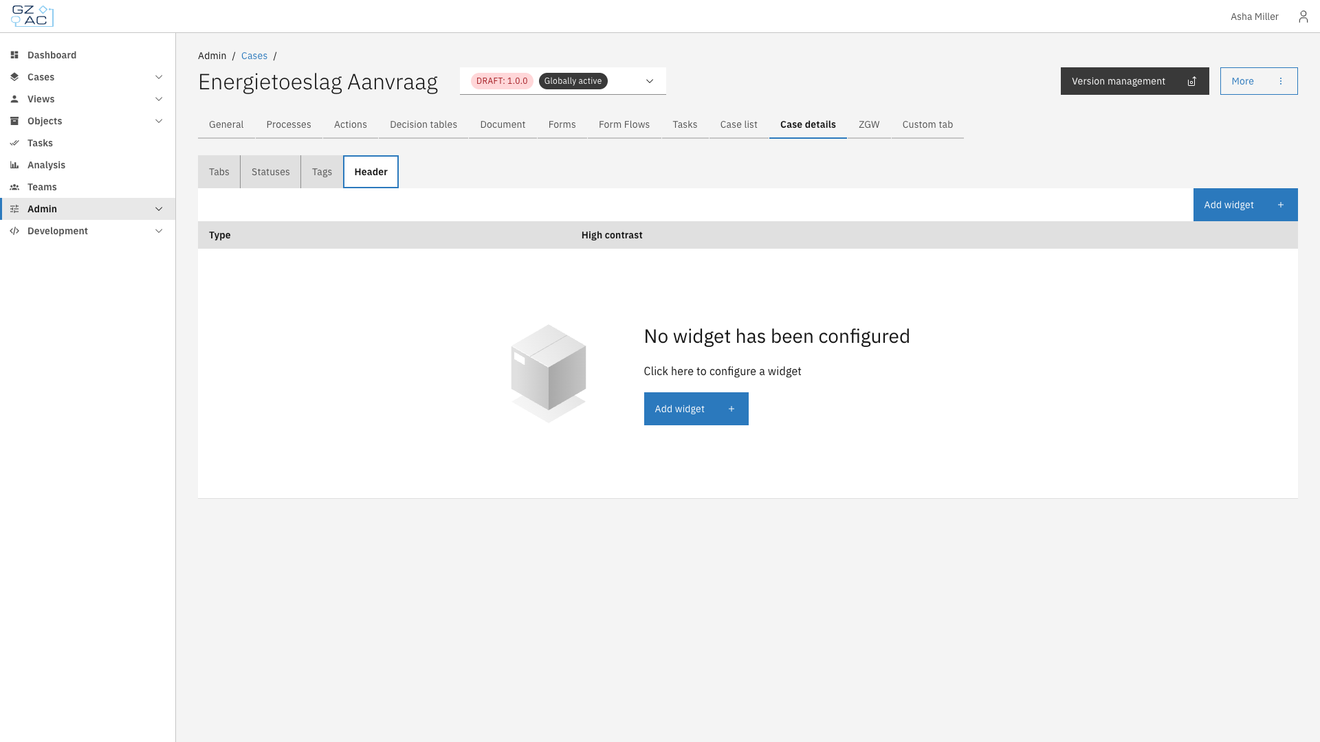
Click the **Case details** tab, then the **Header** sub-tab
Header sub-tab empty state
{% endstep %}
{% endstepper %}
### Adding a header widget
{% stepper %}
{% step %}
Click **Add widget**
{% endstep %}
{% step %}
Since Fields is the only available widget type for the header, select it and click **Next**
Add widget wizard type step
{% endstep %}
{% step %}
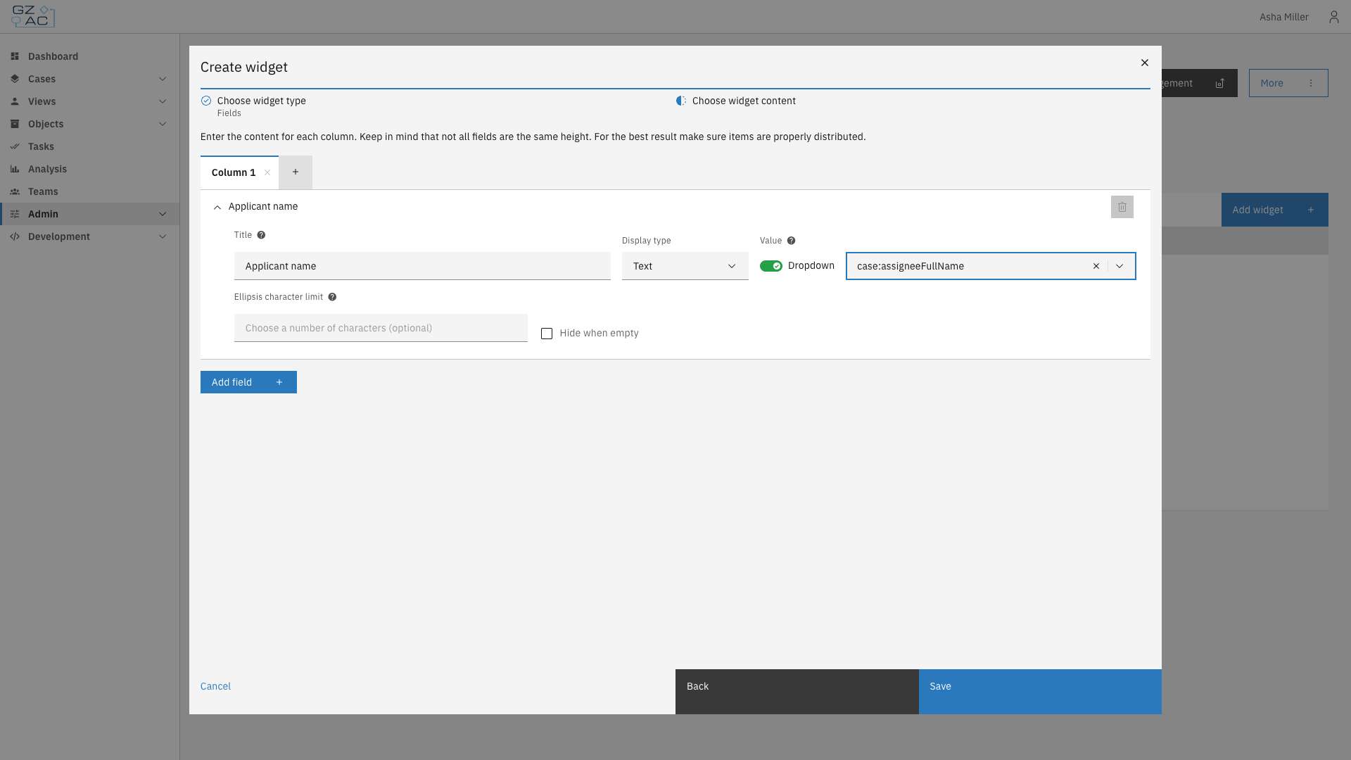
Configure the widget content. Fields are organized into columns — use the **+** tab to add another column (up to four), and **Add field** to add a field row within a column:
Add widget wizard content step
| Property | Description |
| ------------------------ | ----------------------------------------------------------------------------------------------------------------- |
| Title | Label shown above the field's value |
| Display type | How the value is formatted: Text, Yes/No, Currency, Date, Date and time, Enumeration, Number, Percentage, or Link |
| Value | Path to the case or document property to display, selected from a dropdown of available paths or typed manually |
| Ellipsis character limit | For Text fields, truncates long values with an ellipsis after this many characters |
| Hide when empty | Hides the field entirely if its resolved value is empty |
Some display types reveal additional options, such as a currency code for Currency, a date format for Date, or repeatable value pairs for Enumeration.
{% endstep %}
{% step %}
Click **Save**
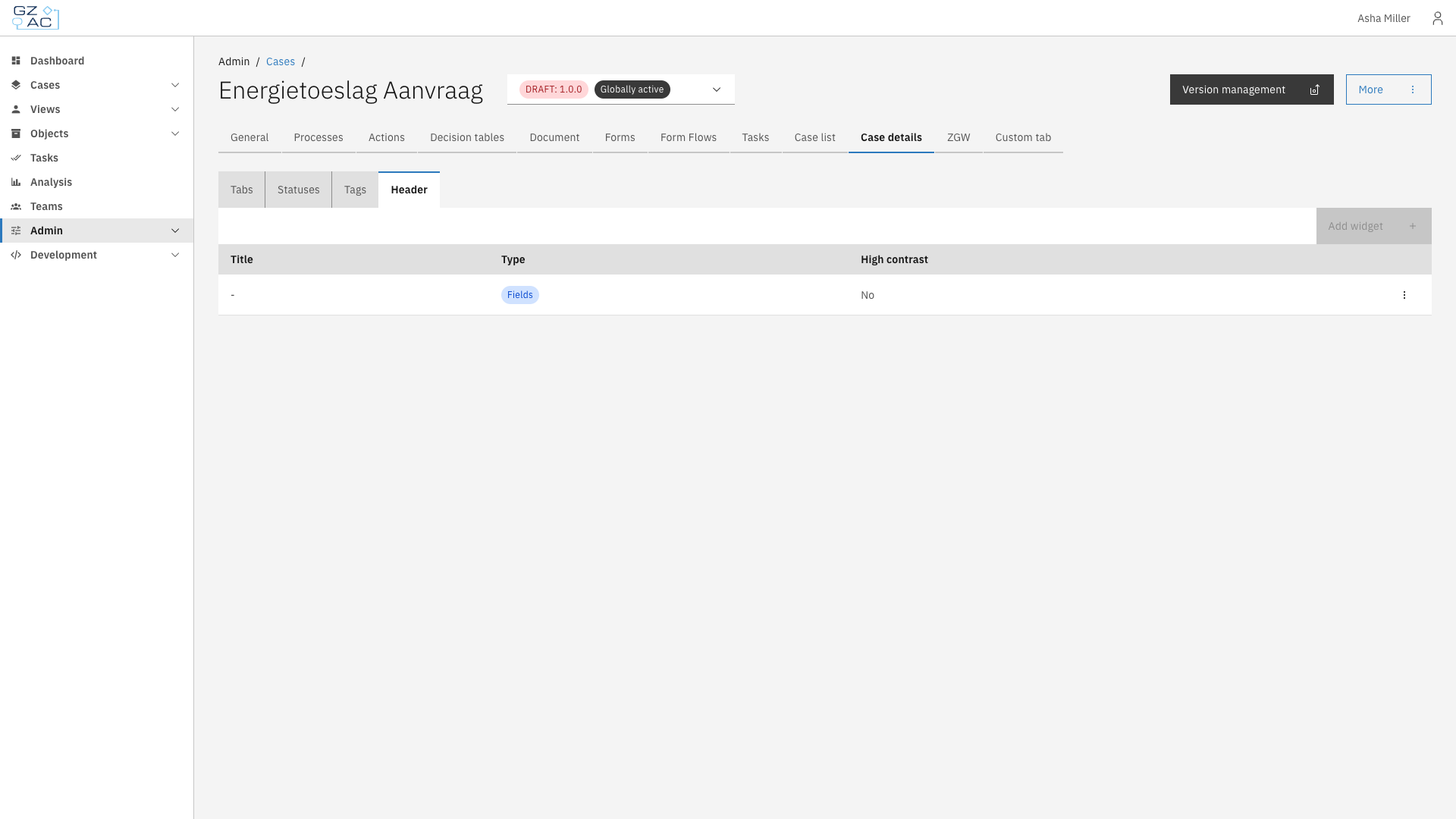
Only one widget can exist in the header. Once configured, **Add widget** is disabled — edit or delete the existing widget via its row's overflow menu (⋮) instead:
Header with configured widget
{% endstep %}
{% endstepper %}
{% hint style="info" %}
The header widget has no separate widget title, icon, width, or JSON editor options — it always spans the full header width and is edited only through this form.
{% endhint %}